Trip Planner & Itinerary App Store Screenshot Templates
Show travelers how your app organizes every detail from idea to on-trip execution.
Organize itineraries, packing lists, and routes. Help travelers visualize their perfect trip with clean, step-by-step layout designs.
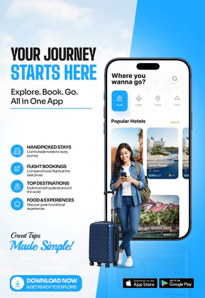
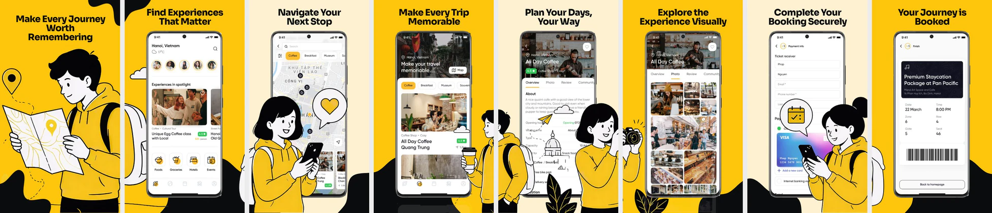
 App Store Screenshot Templates


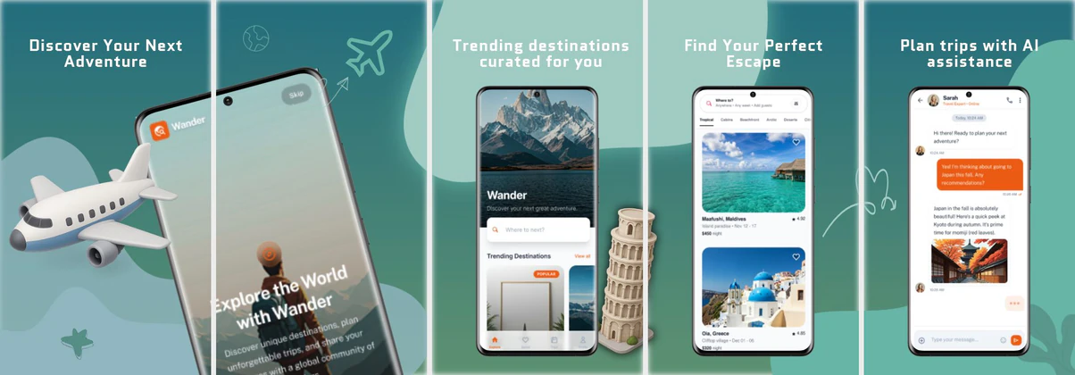
 Play Store Screenshot Templates

✨ App Mockups, Ads & ASO Marketing Graphics

ASO Guide: Designing Visual Schedules for Trip Planners
Trip planner screenshots should lead with structure. Start with a day-by-day itinerary, then show route mapping, booking aggregation, and checklist workflows. Users in this niche value control and reduced travel stress, so your first frames should communicate organization immediately. Keep timeline visuals readable and avoid dense overlays that hide practical details like times, stops, and reservations.
Listings perform better when planning value is explicit instead of implied through generic travel imagery. AppTweak benchmarks suggest conversion gains when utility-focused screenshots make task flow obvious at glance level. Show clear before-and-after planning outcomes: scattered details versus one connected itinerary. Nakxi helps teams create reusable timeline-driven layouts and adapt them for solo, family, or group travel campaigns without rebuilding assets from scratch.
Trip organizers reduce travel anxiety. Show how your app structures a day: timeline schedules, booking syncs, group collaborations, and packing checklists. Visual maps linking travel spots look great and convey utility.
Keep margins clear and highlight collaborative features with text like 'Plan Trips with Friends' or 'Keep All Bookings in One Place' to appeal to families and groups.
Trip planner teams often use Nakxi efficiently by keeping a fixed itinerary framework and swapping destination, group, and checklist modules per campaign segment.
Frequently Asked Questions
Can I show offline map access in trip planner screenshots?
Yes, featuring an offline badge or warning caption ('Access Maps Without Internet') is a massive sell for international travelers.
What layout works best for daily travel itineraries?
Show a clean chronological timeline (e.g. '9:00 AM Coffee, 10:30 AM Museum') inside a sleek mockup device to display planning clarity.
What screenshot order works best for itinerary apps?
A strong default order is itinerary first, map second, booking sync third, then collaboration or offline tools. This sequence mirrors how users mentally plan trips. It also avoids front-loading secondary features too early. Keep each step obvious and visually distinct.
Should trip planners include packing checklist screenshots?
Yes, if checklist functionality is a meaningful retention feature. Place it later in the sequence after core planning value is clear. A concise checklist frame can increase perceived completeness. Just avoid replacing core itinerary screens with secondary utilities.
How do I create trip planner app screenshots with Nakxi?
Pick a trip planner template from this page, open it in Nakxi's editor, swap in your UI captures, write outcome-led captions, and export App Store and Play Store sizes from one canvas. Most teams ship a first draft in under an hour without a design agency.
What screenshot sizes do trip planner apps need in 2026?
Apple requires up to three iPhone display families (including 6.9-inch and 6.5-inch) per Apple's screenshot specifications. Google Play accepts 16:9 or 9:16 phone layouts between 320px and 3840px per side, as documented in Google Play listing best practices. Nakxi exports both store formats from a single design.