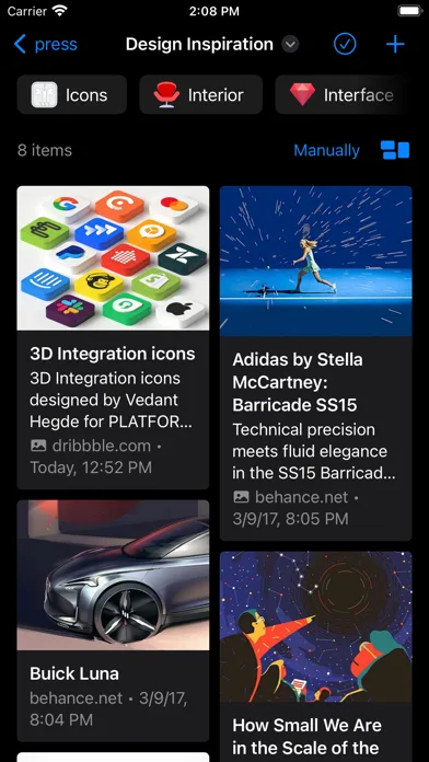
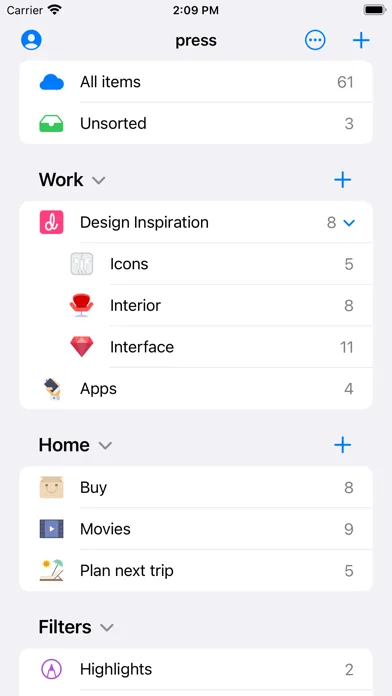
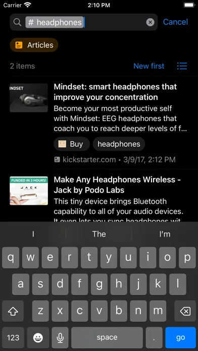
ScreenVault
Welcome to the ultimate app screenshot gallery. If you're looking for the best app store screenshots and ASO screenshot examples to inspire your next update, you're in the right place. We've curated a collection of high-converting storefront visuals from top developers on the Apple App Store and Google Play Store. Browse through these best-in-class screenshot systems, grouped by visual style—from minimal and dark mode to storytelling and premium layouts. Each app card includes a real screenshot pulled from the live store so you can quickly scan typography, layout, and composition patterns. Whether you are an indie developer aiming to stand out or a growth marketer looking for ASO screenshot examples that drive downloads, our gallery provides the practical inspiration you need to design winning creatives.
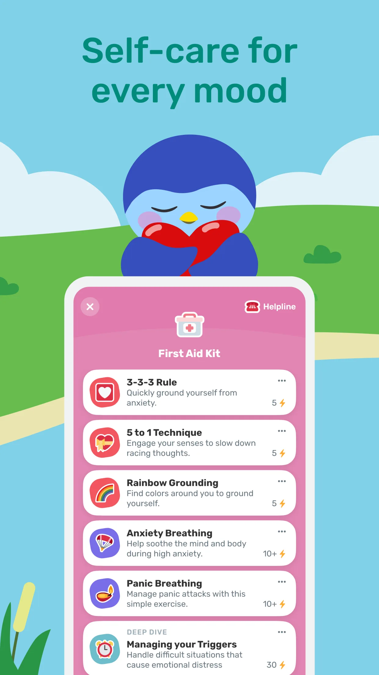
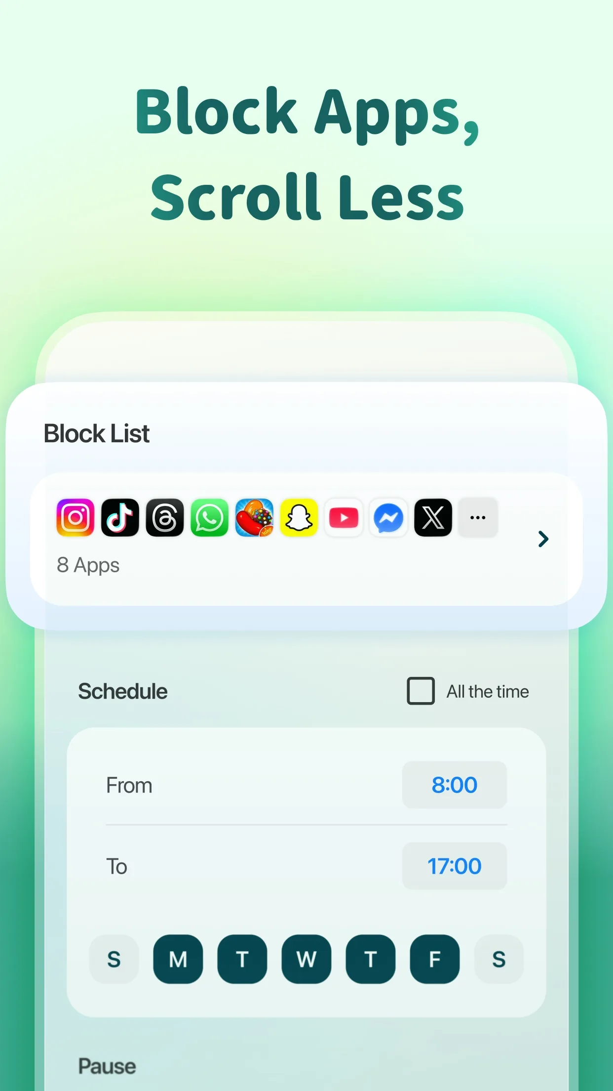
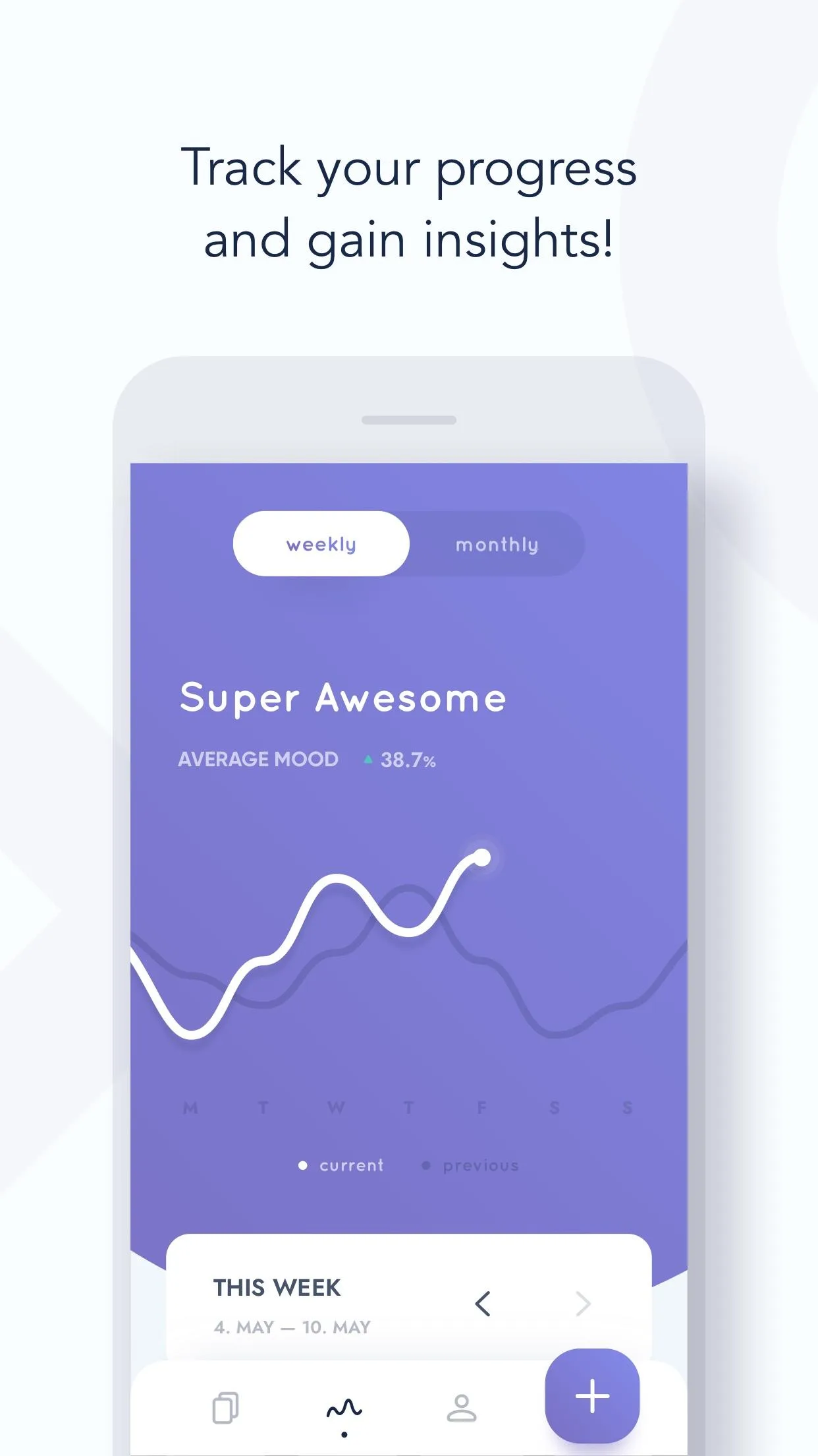
Minimal design
Whitespace, restraint, clear hierarchy. Great for calm, premium-feeling screenshot sets.
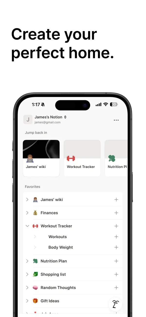
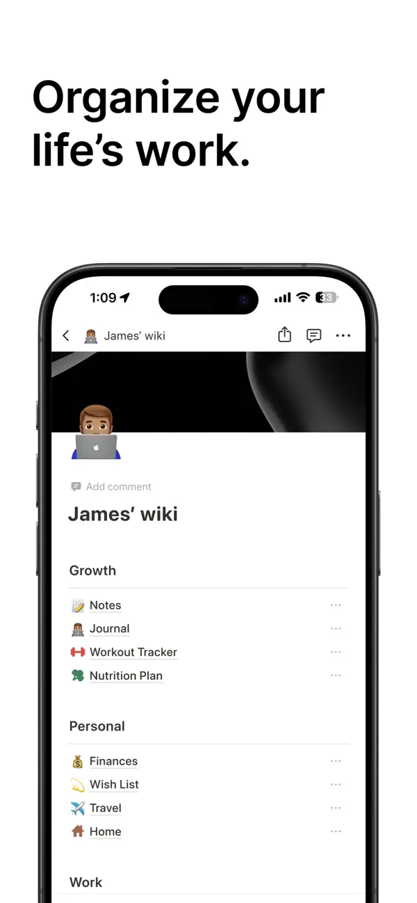
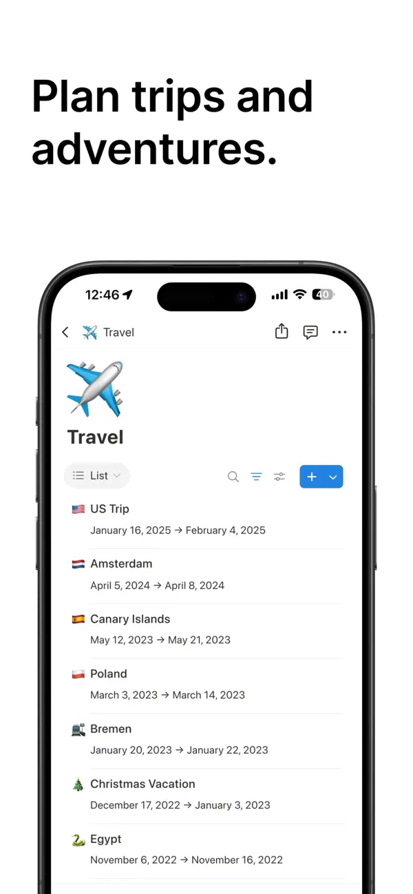
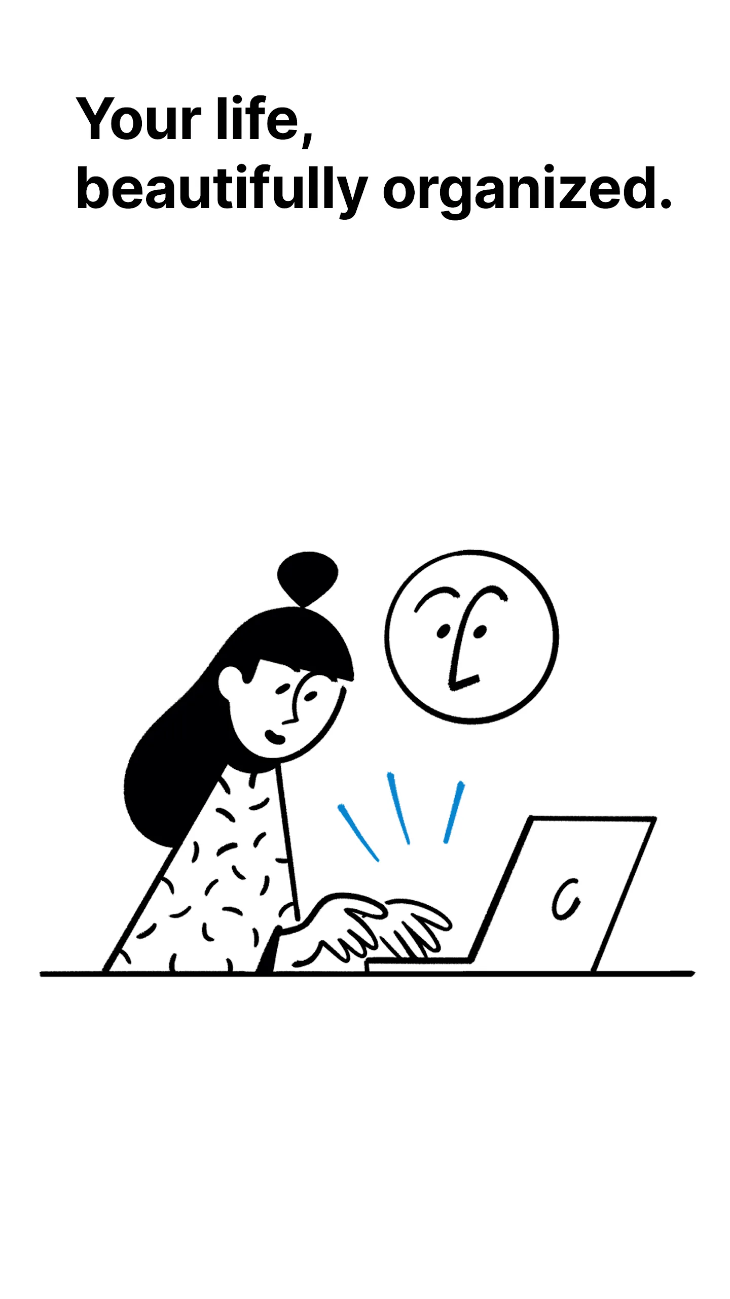
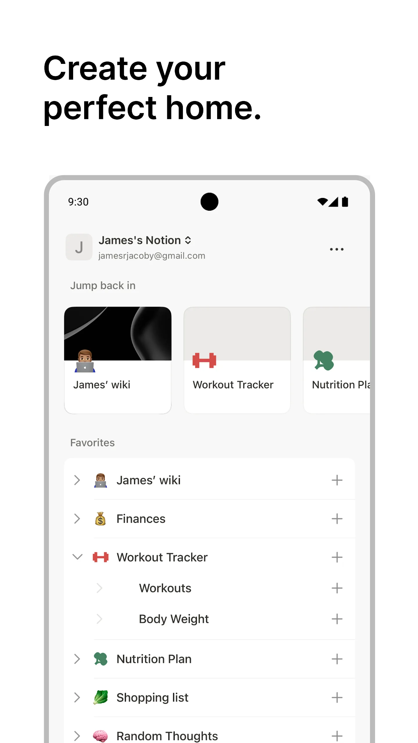
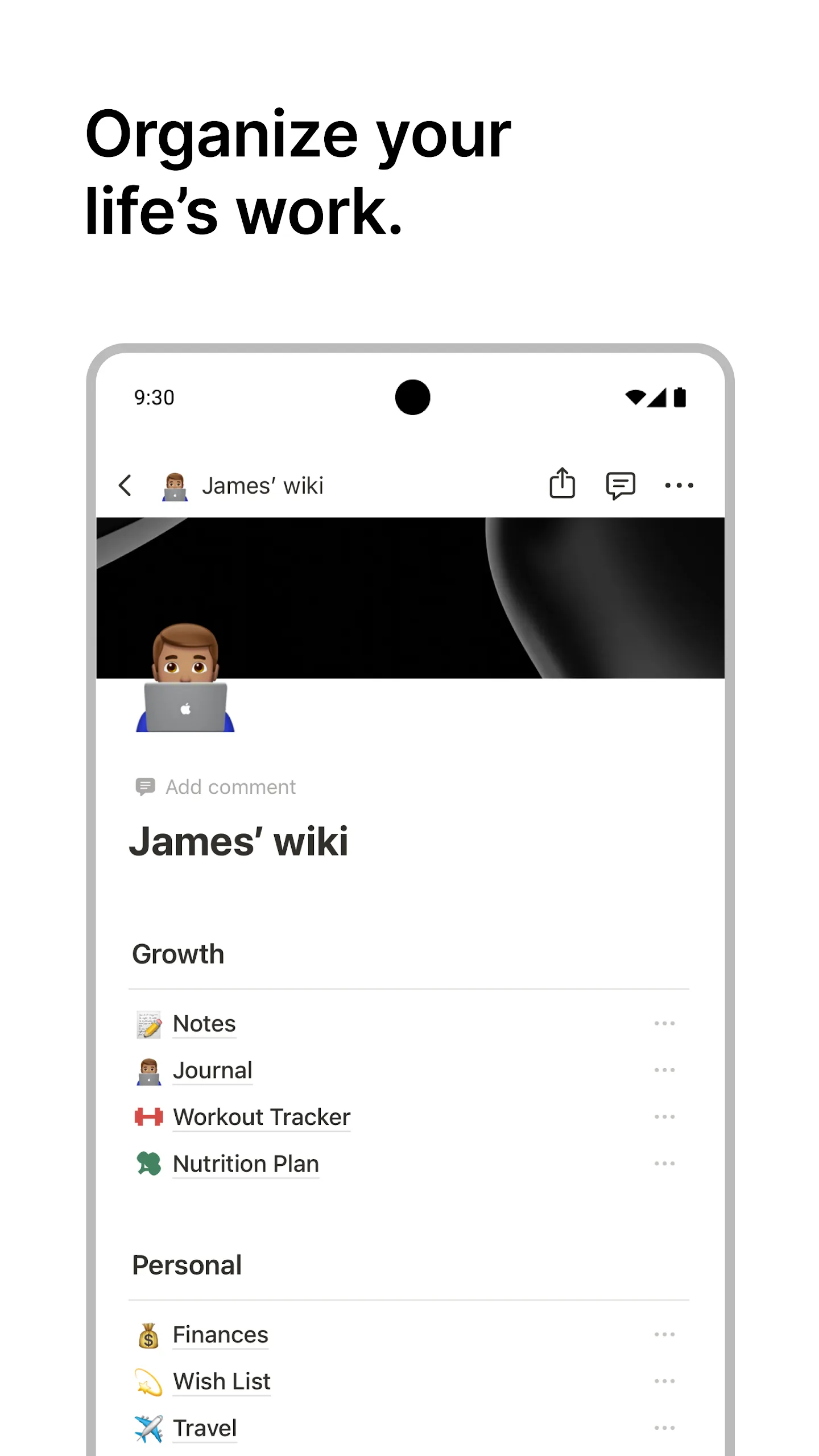
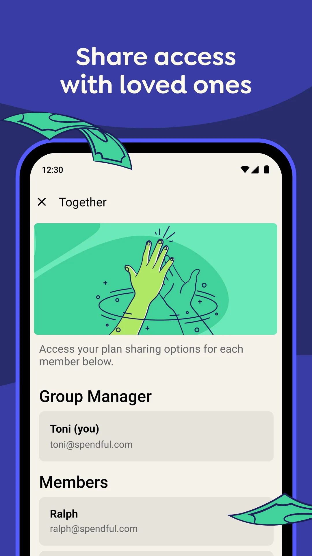
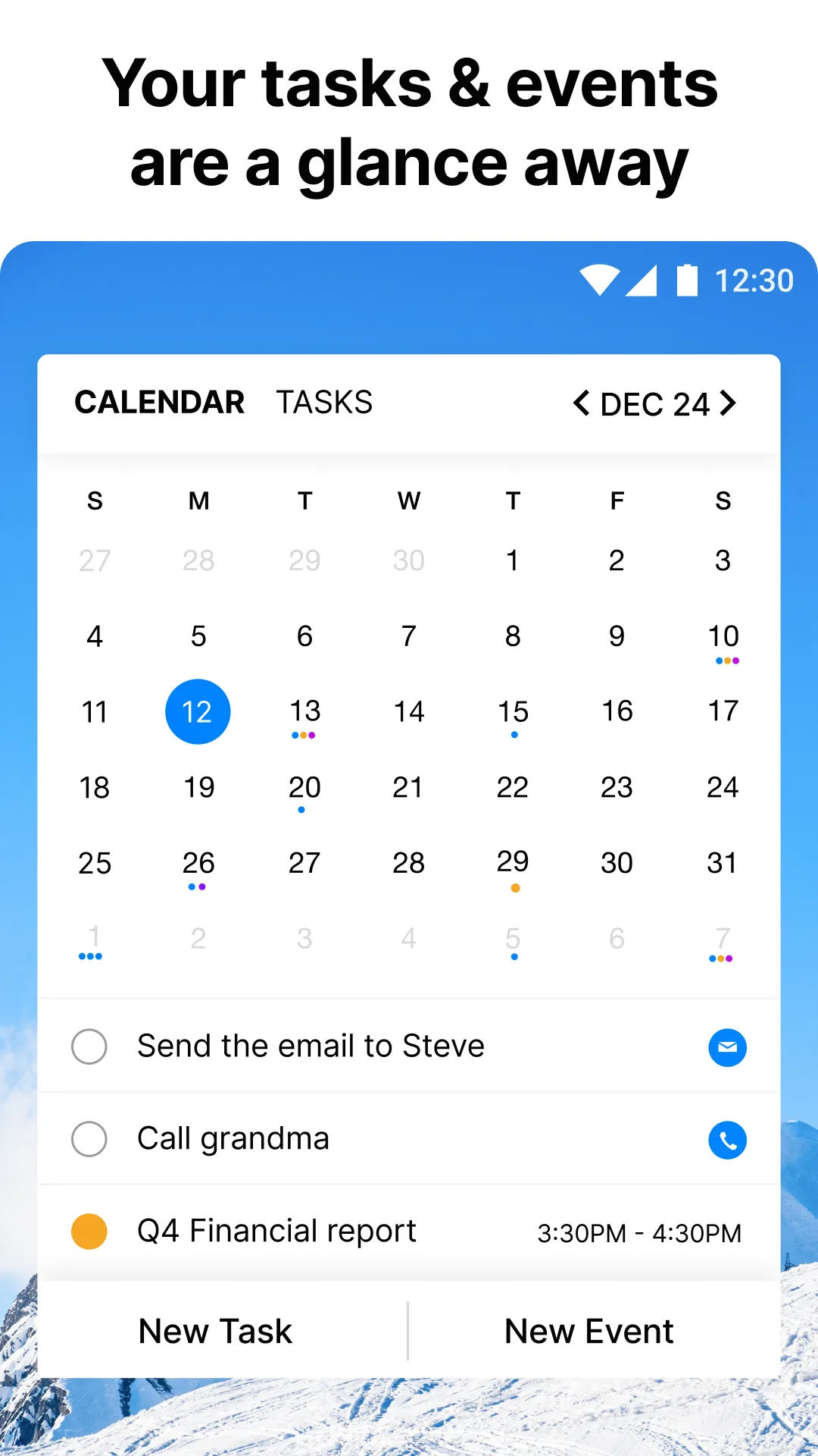
- NotionApp Store
 Play Store
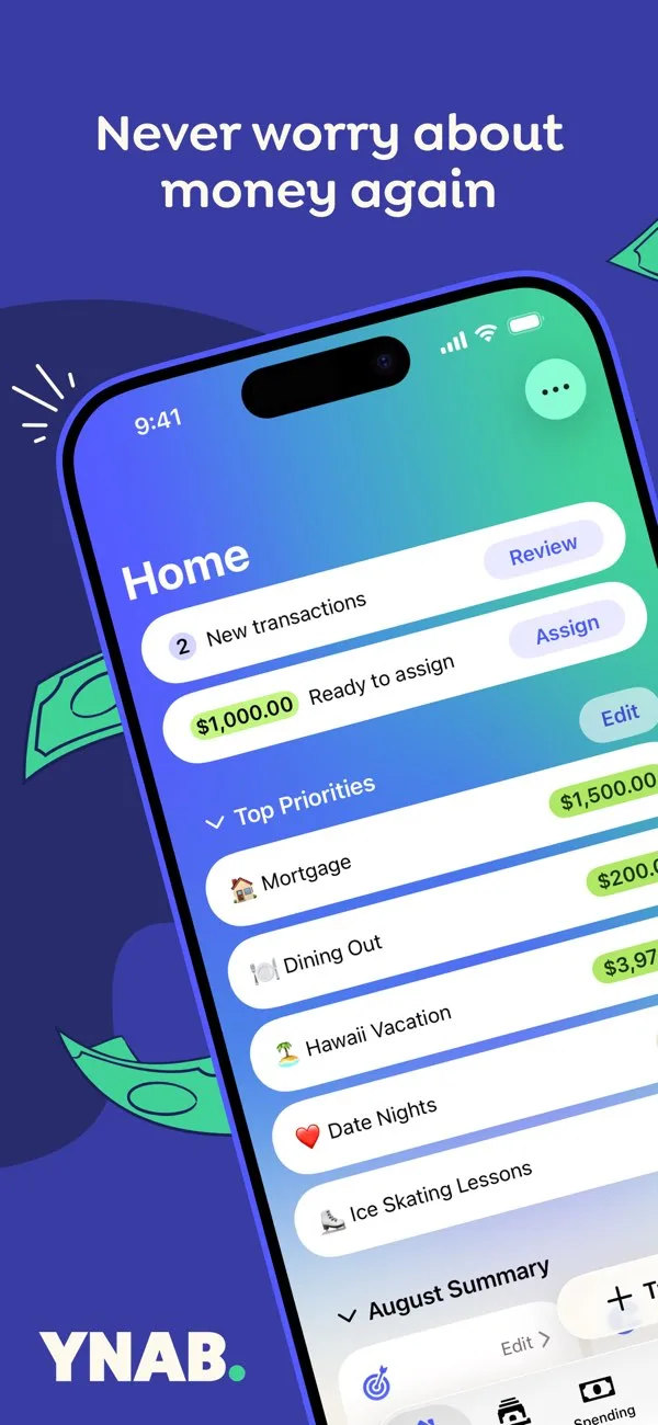
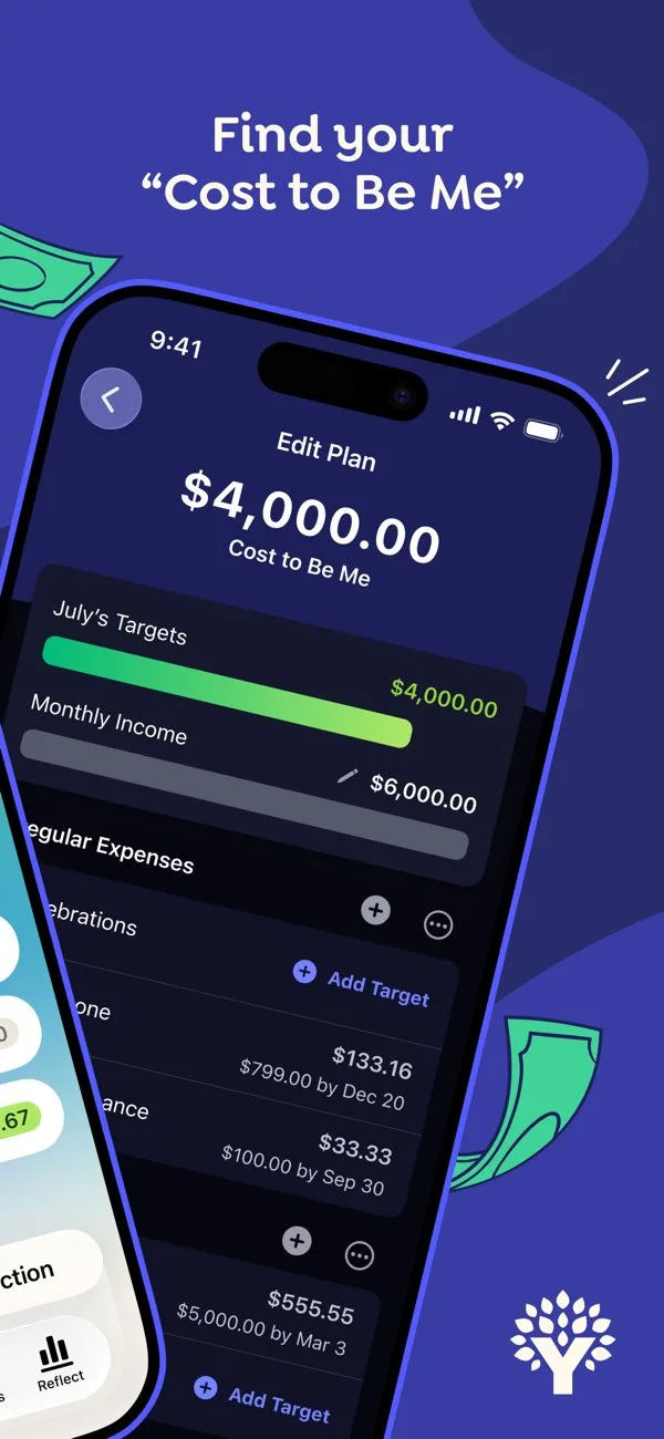
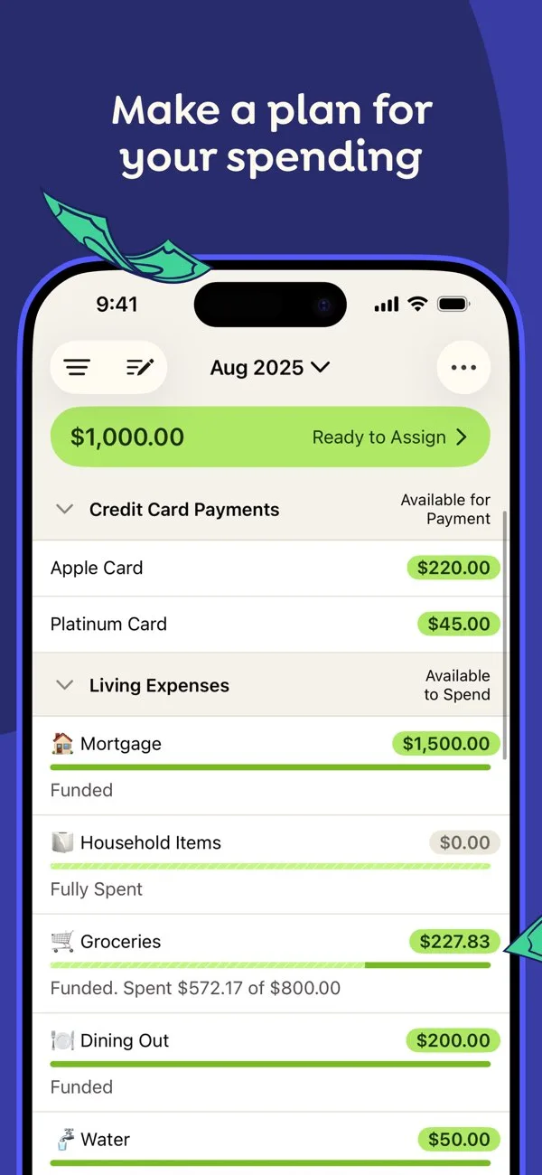
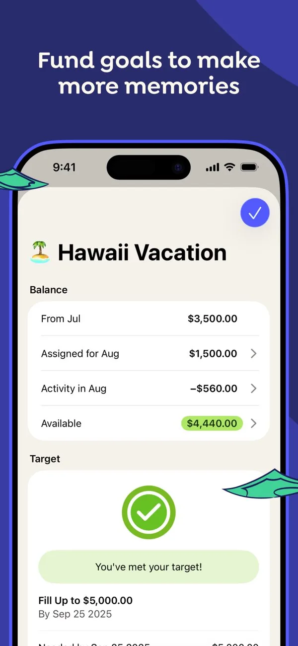
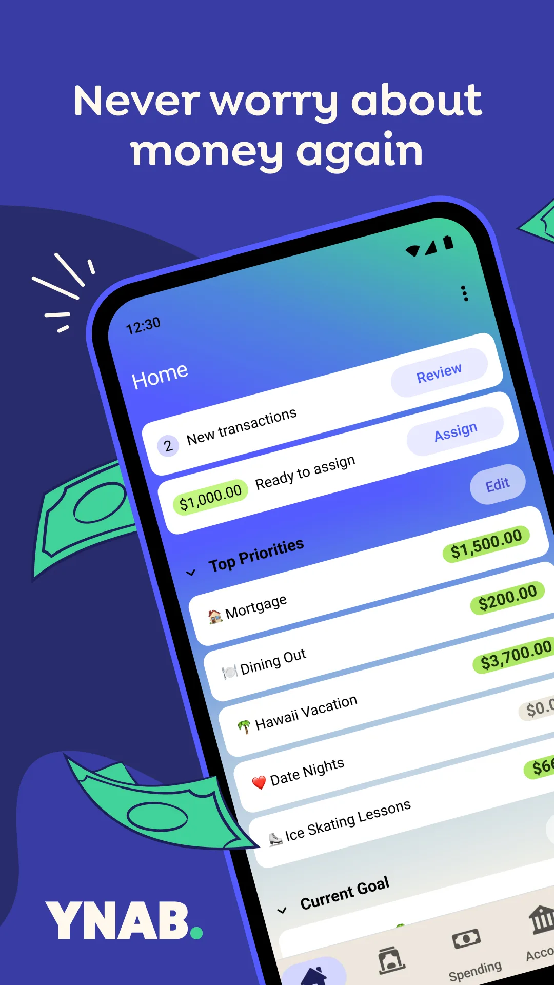
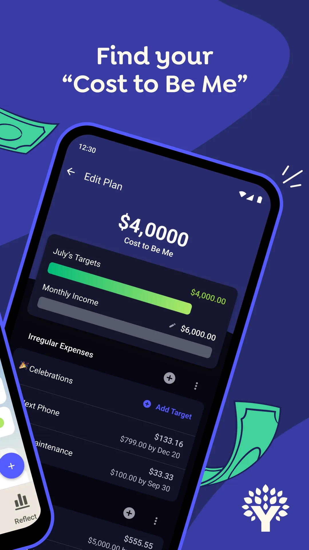
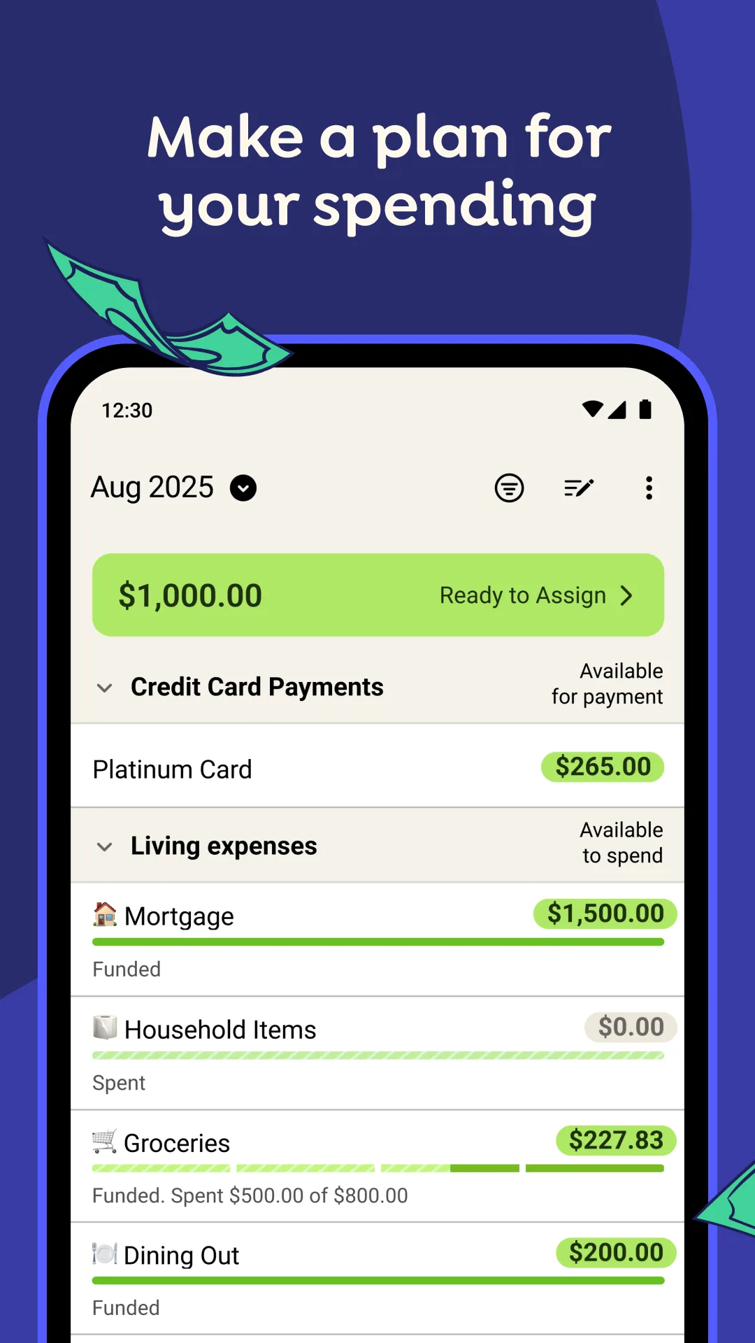
- YNABApp Store
 Play Store
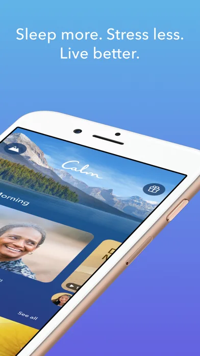
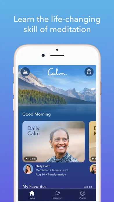
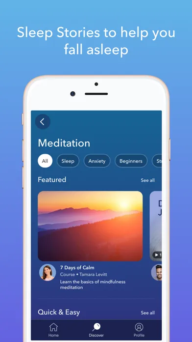
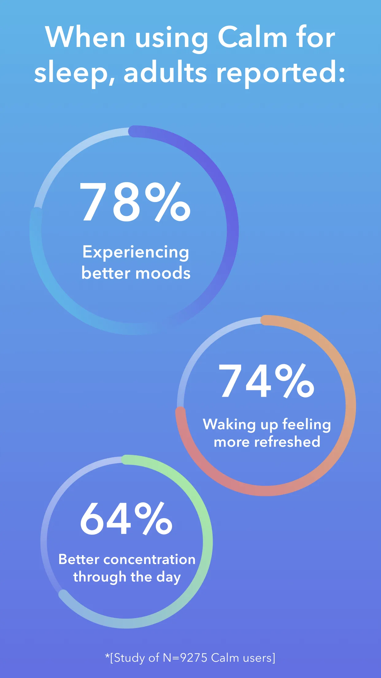
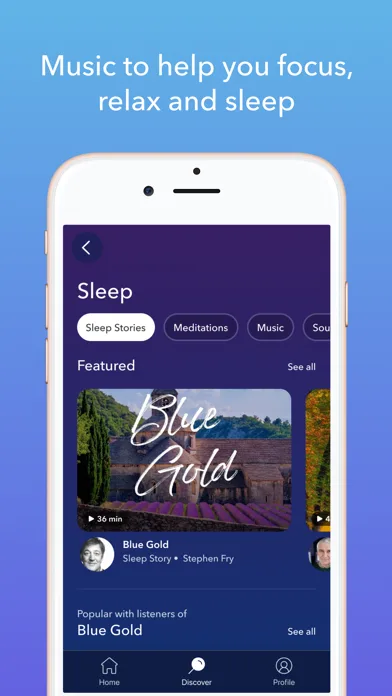
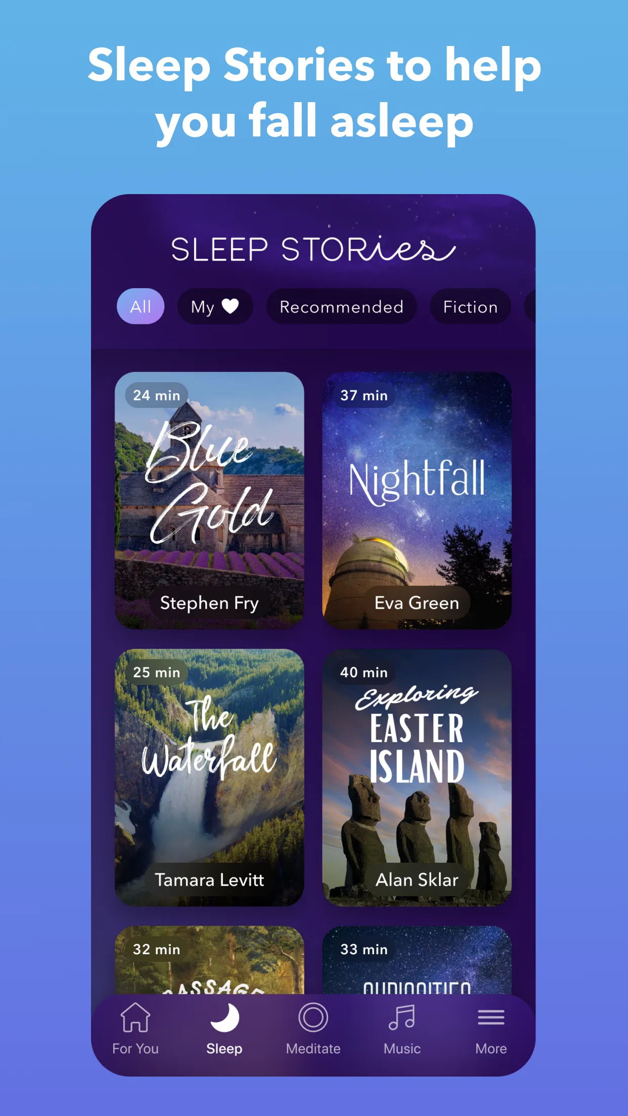
- CalmApp Store
 Play Store

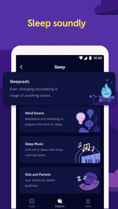
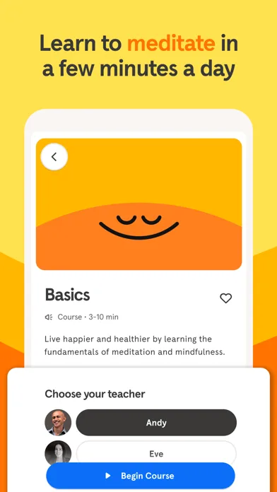
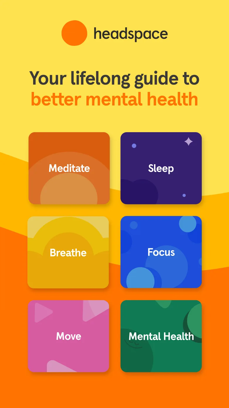
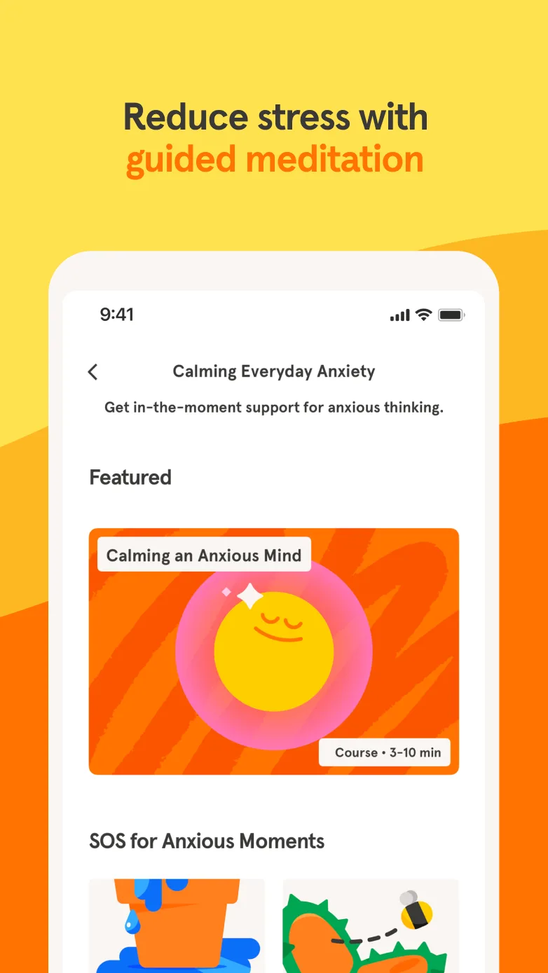
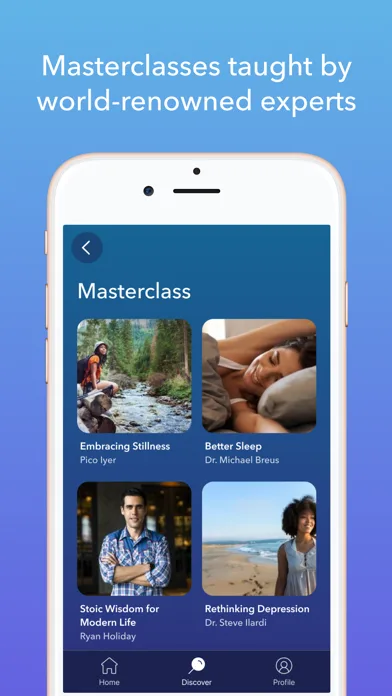
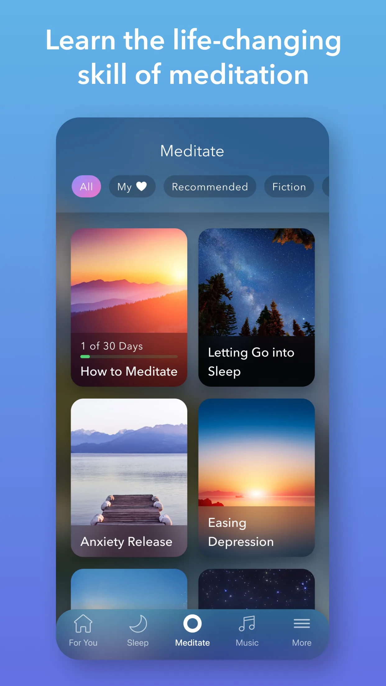
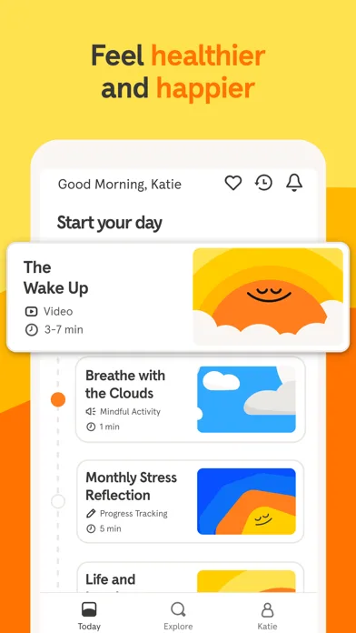
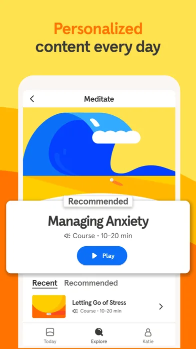
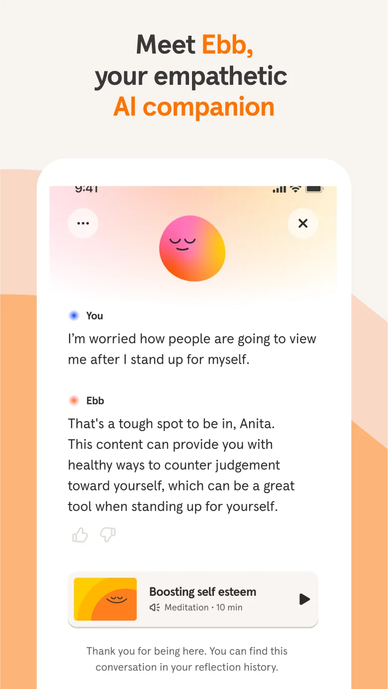
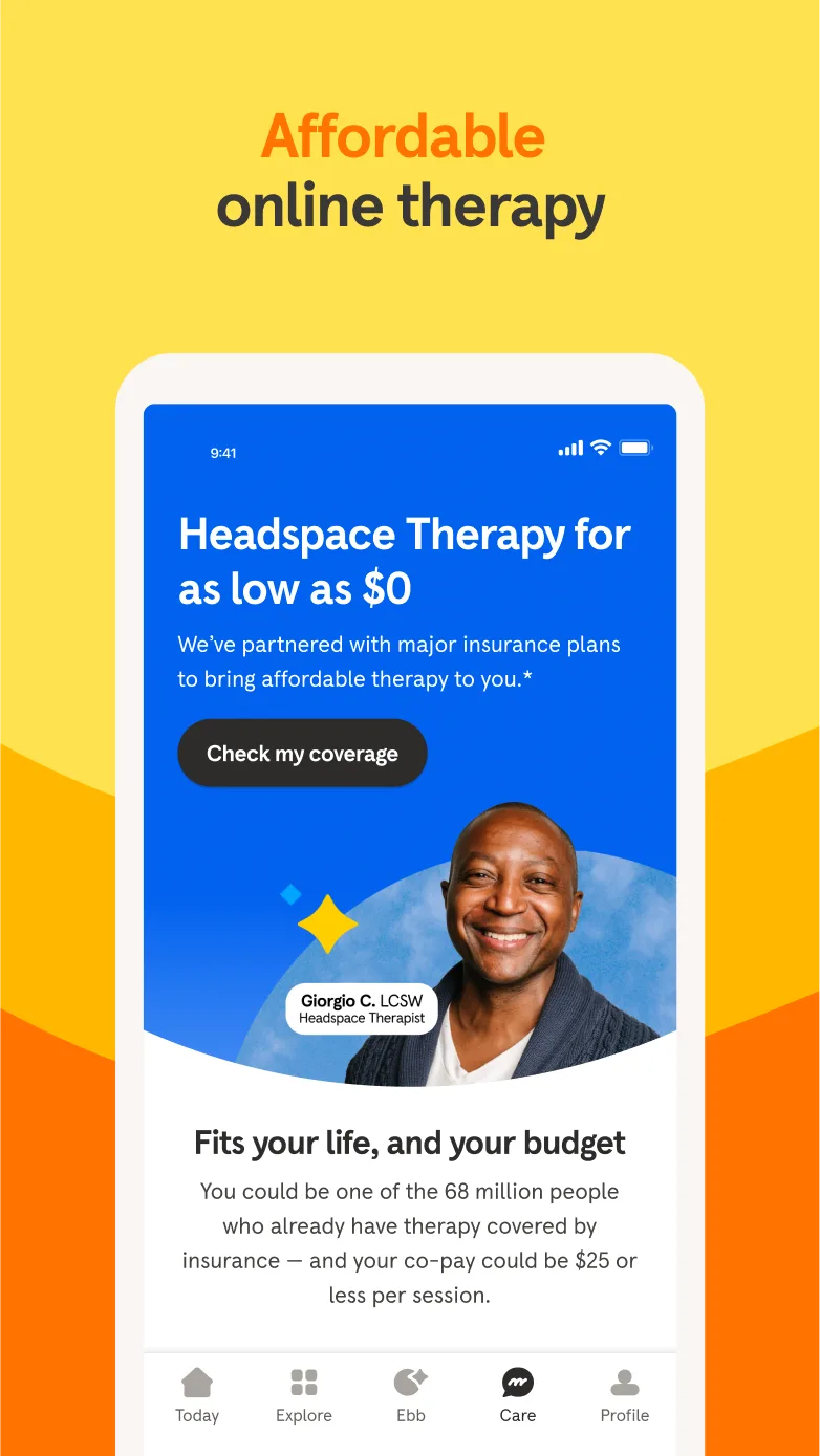
- HeadspaceApp Store
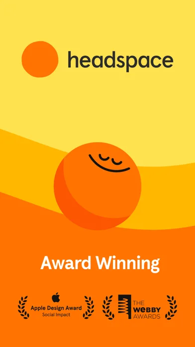
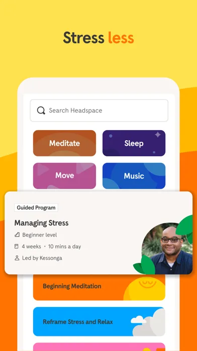
 Play Store
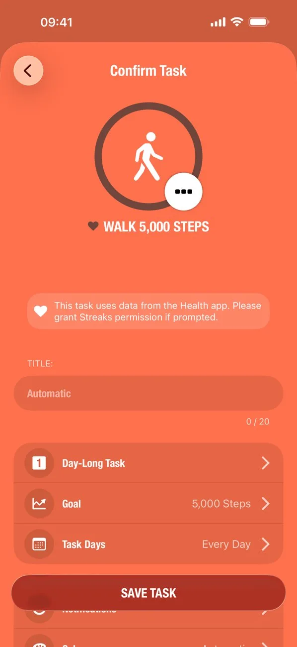
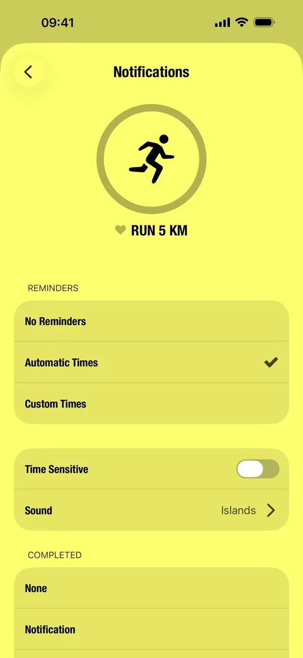
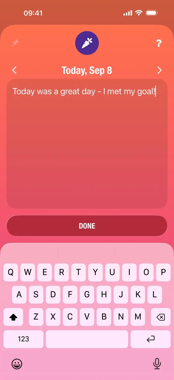
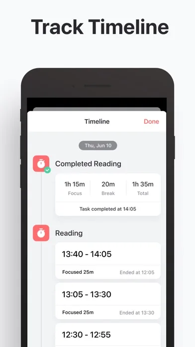
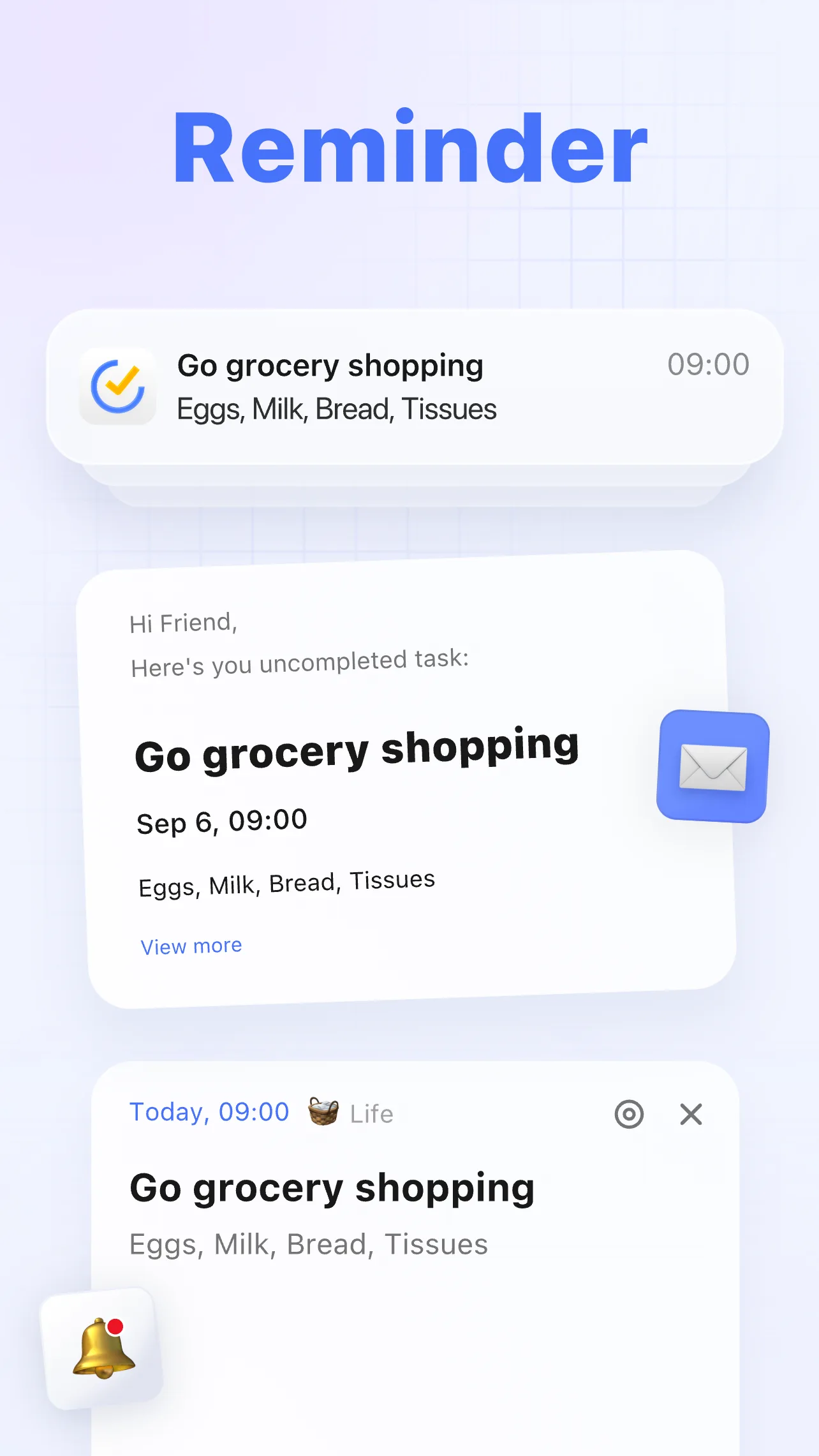
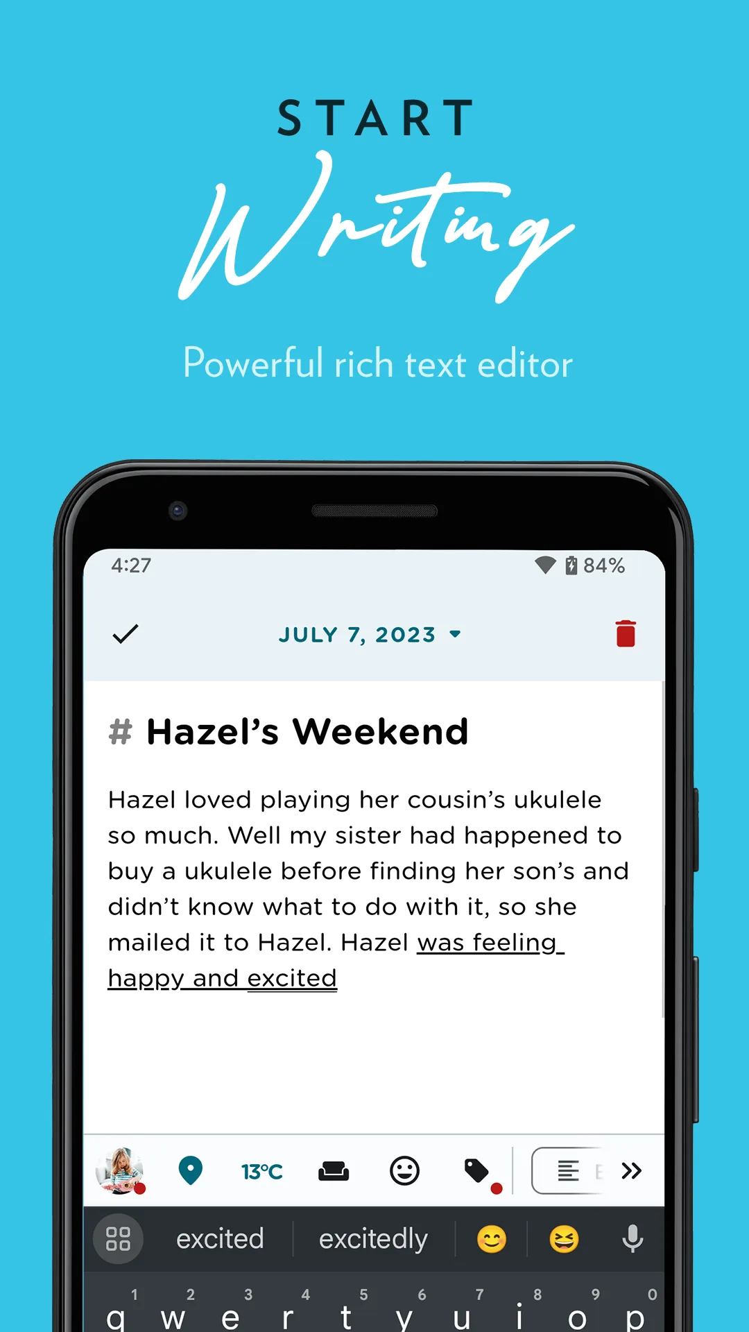
- StreaksApp Store


 Play Store
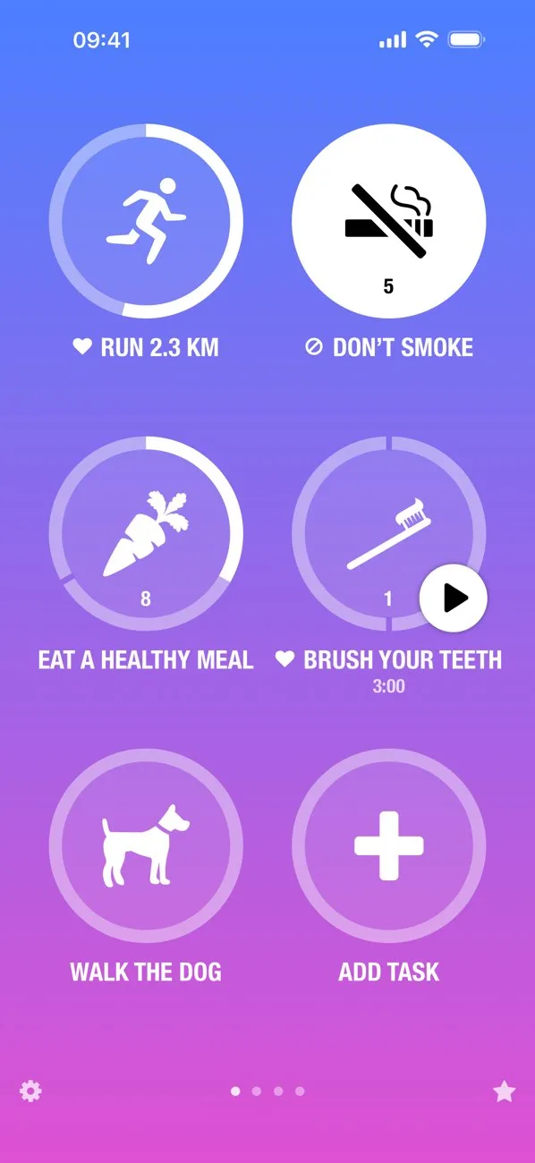


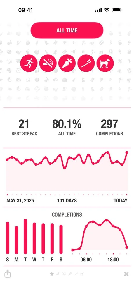
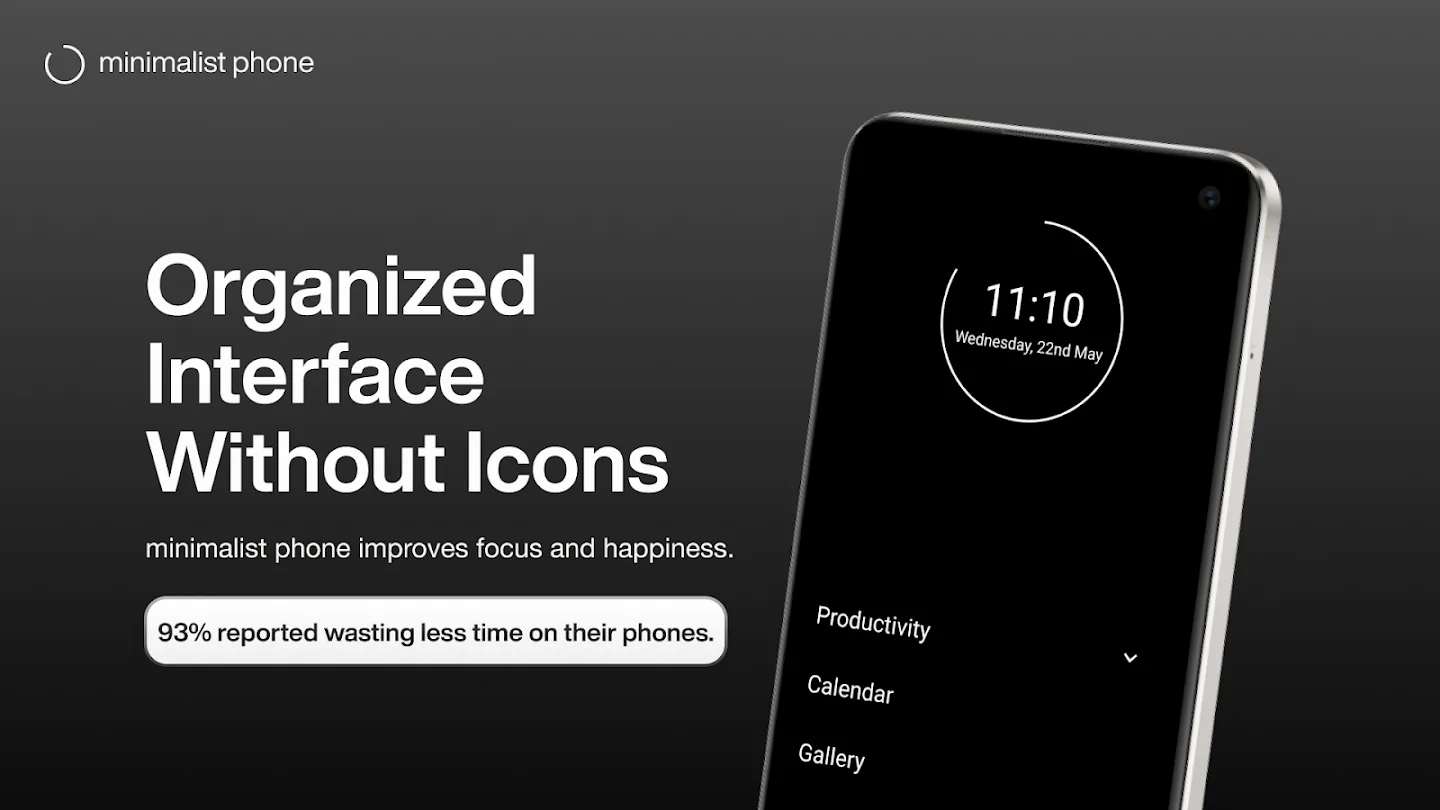
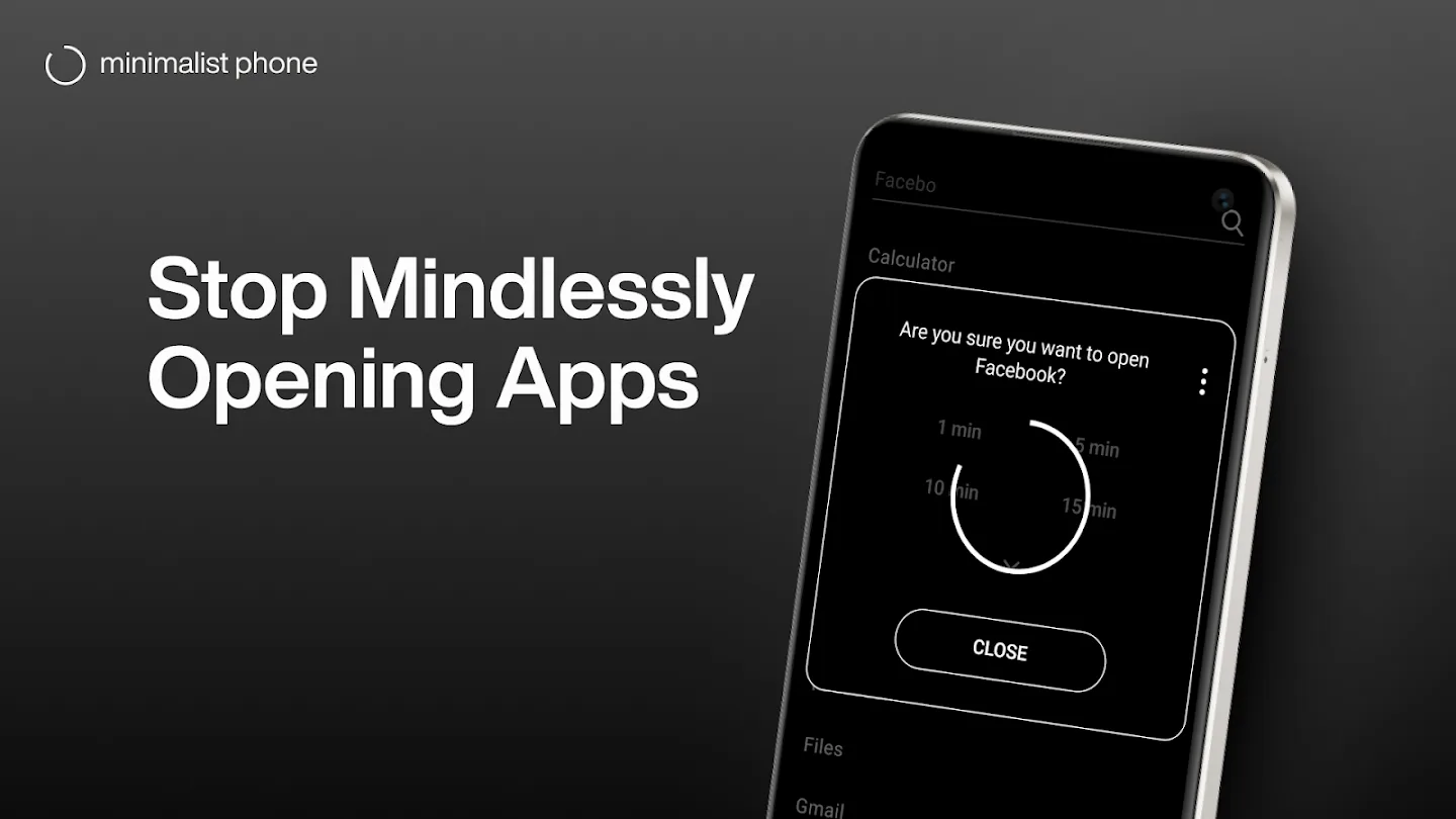
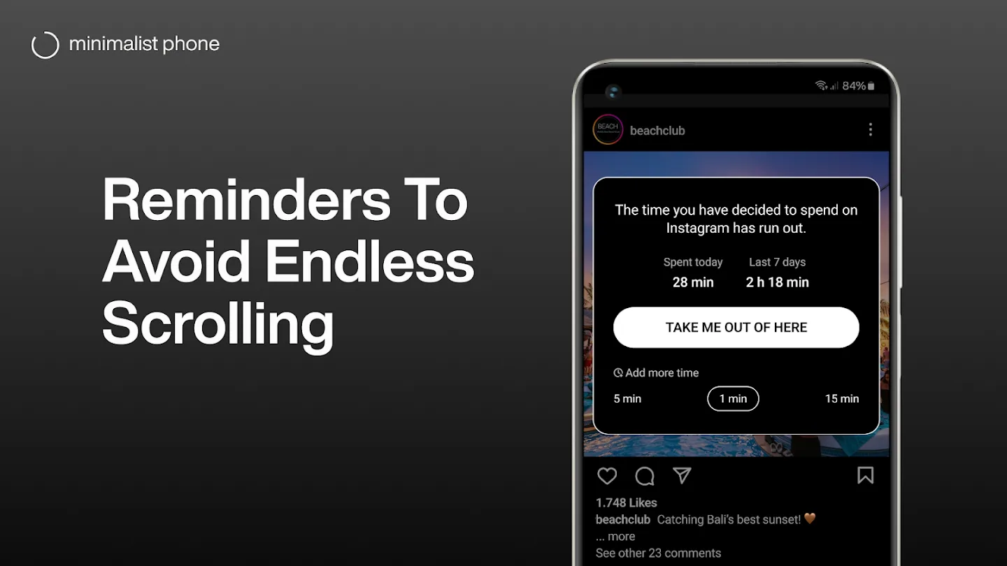
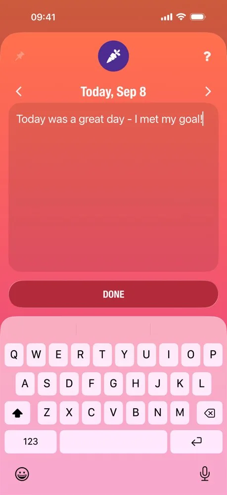
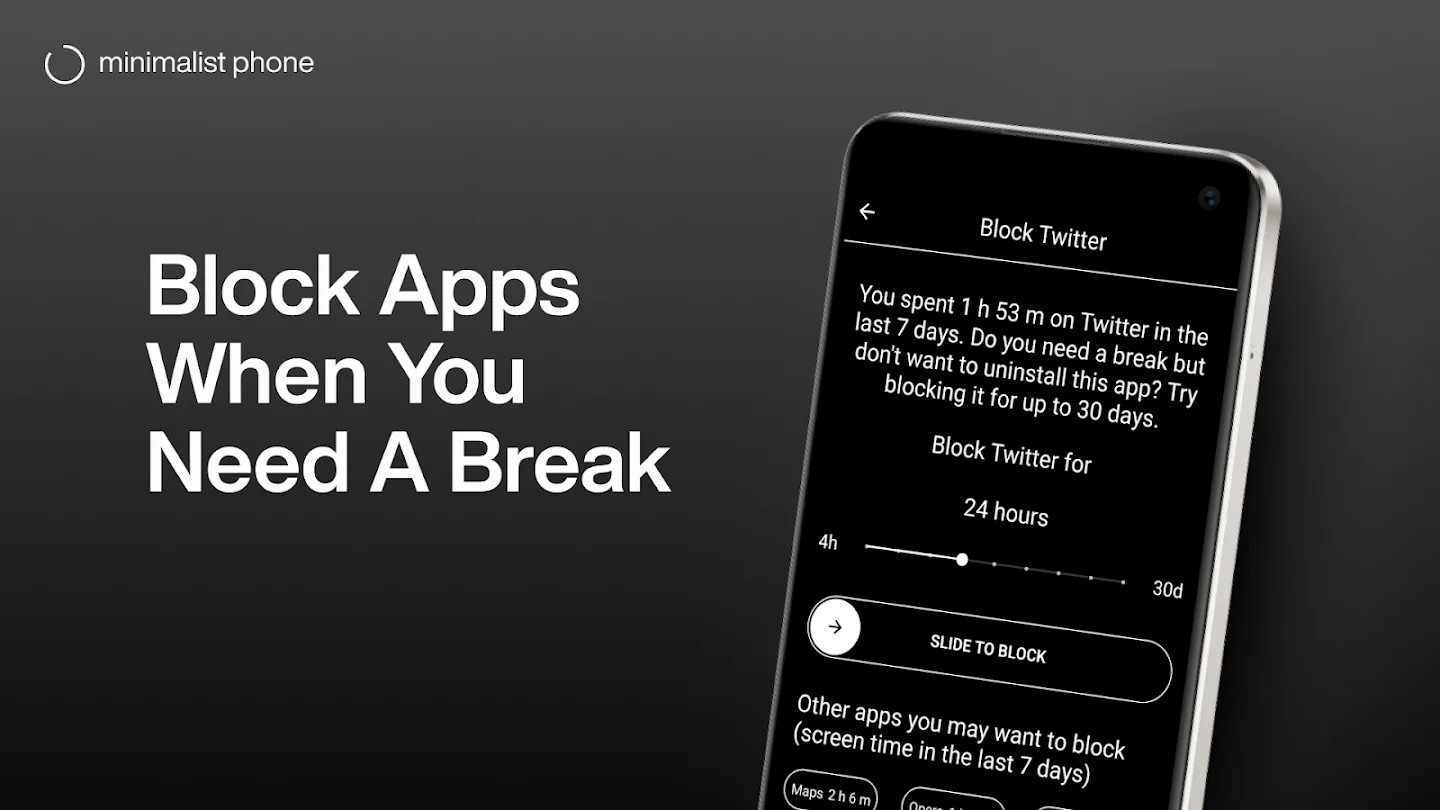
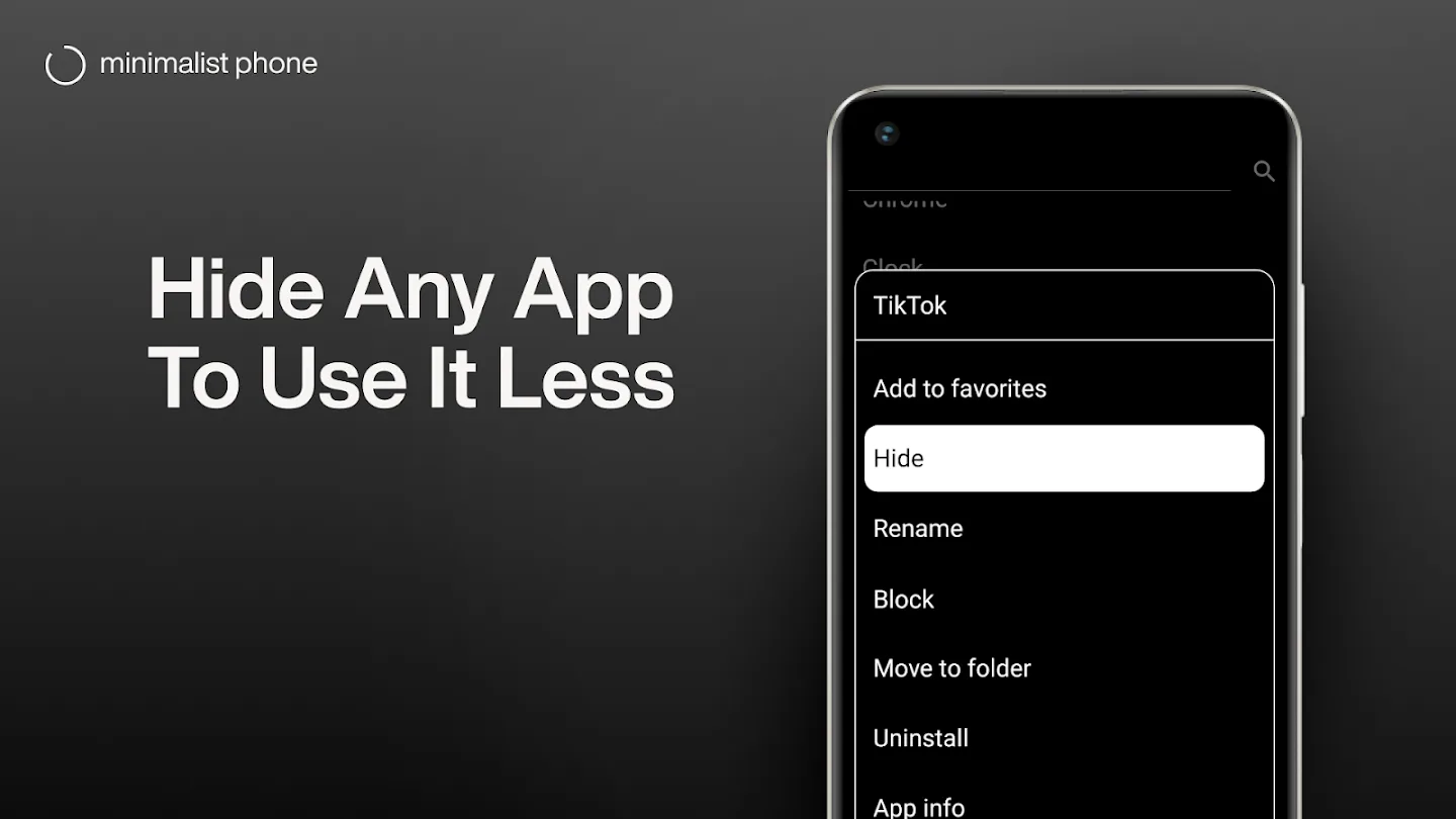
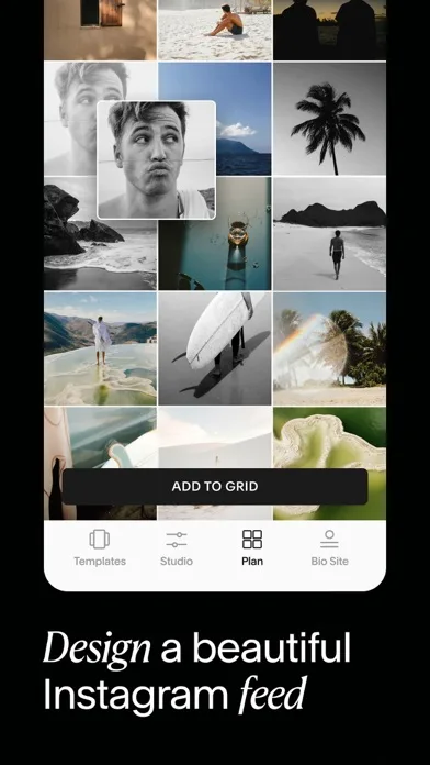
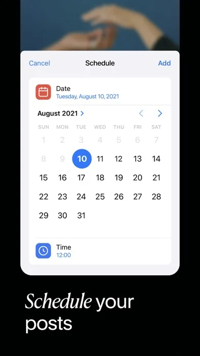
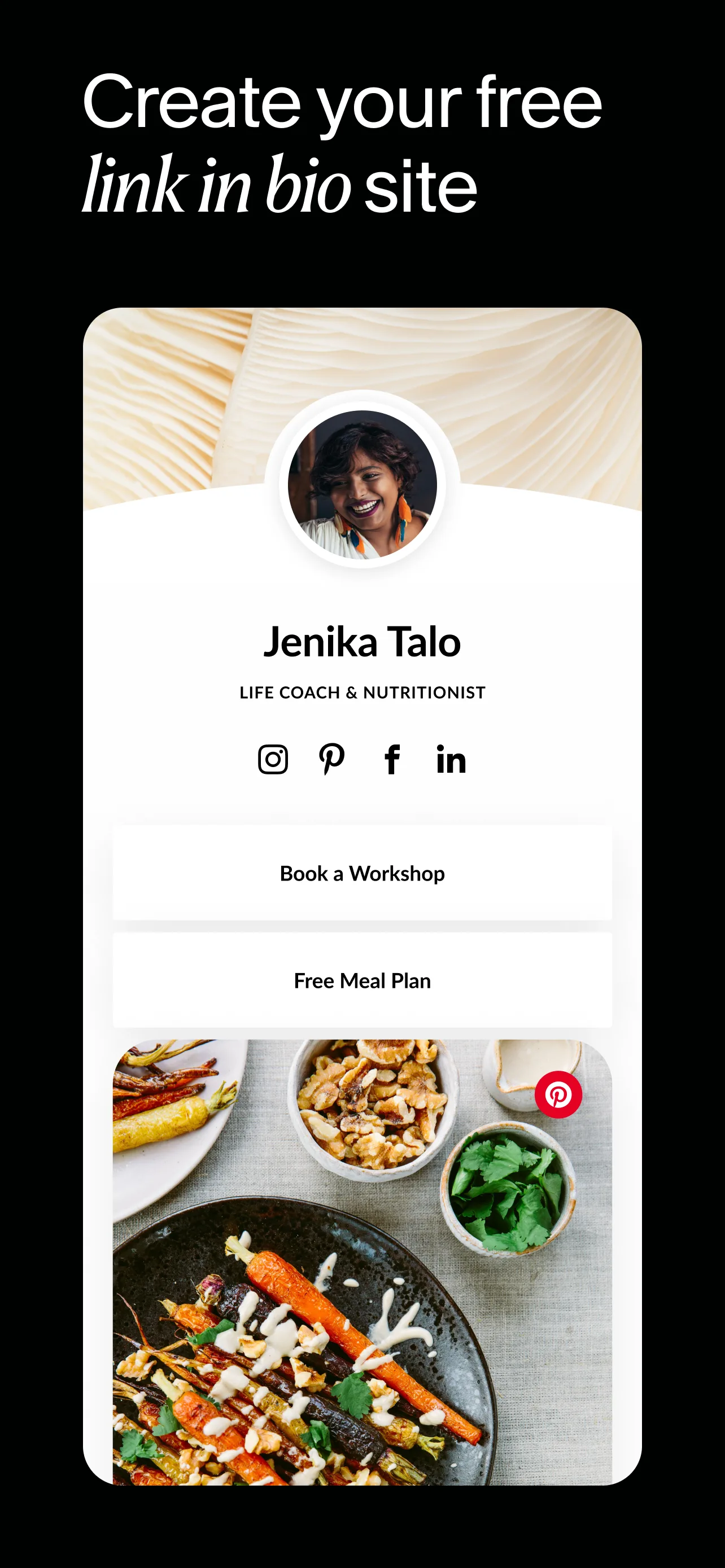
- Minimalist PhoneApp Store

 Play Store

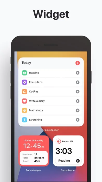
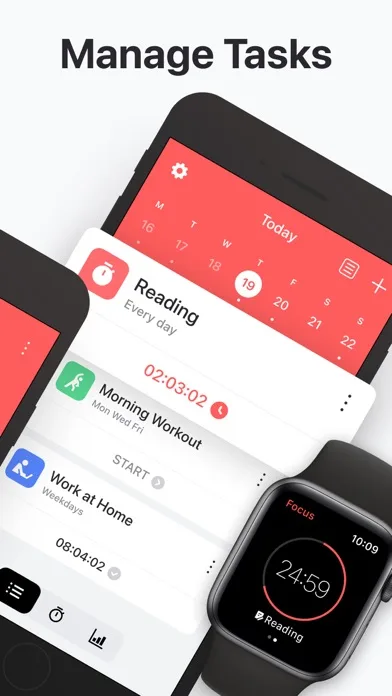
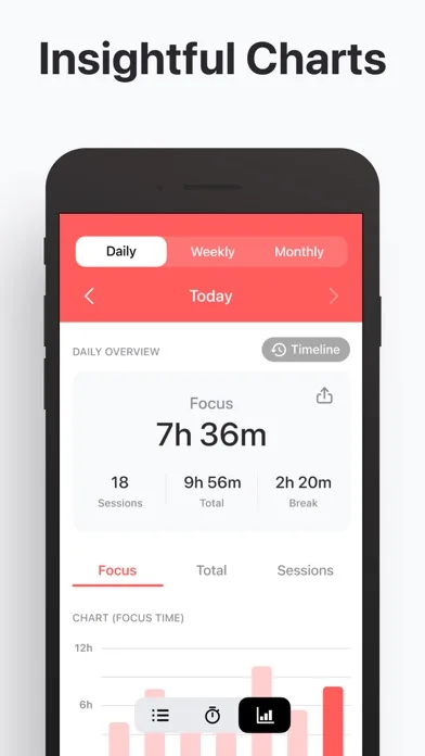
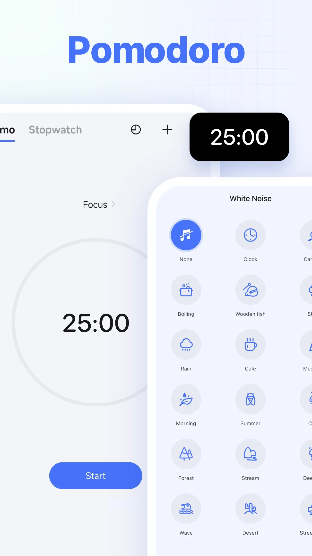
- Focus KeeperApp Store


 Play Store
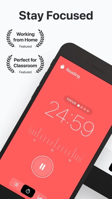


Dark themed
High contrast, controlled glow, and readable UI. Strong for “premium” + “focused” positioning.
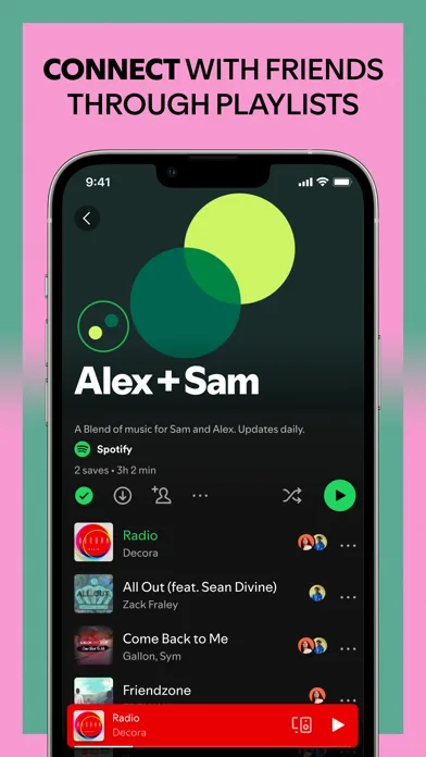
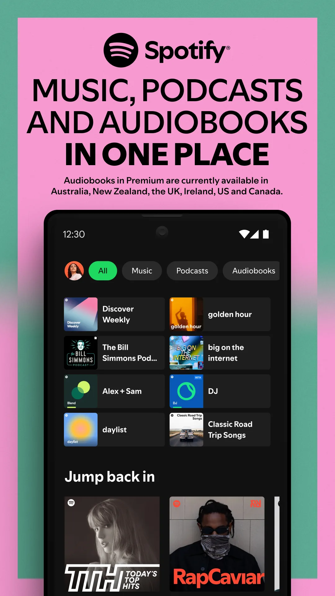
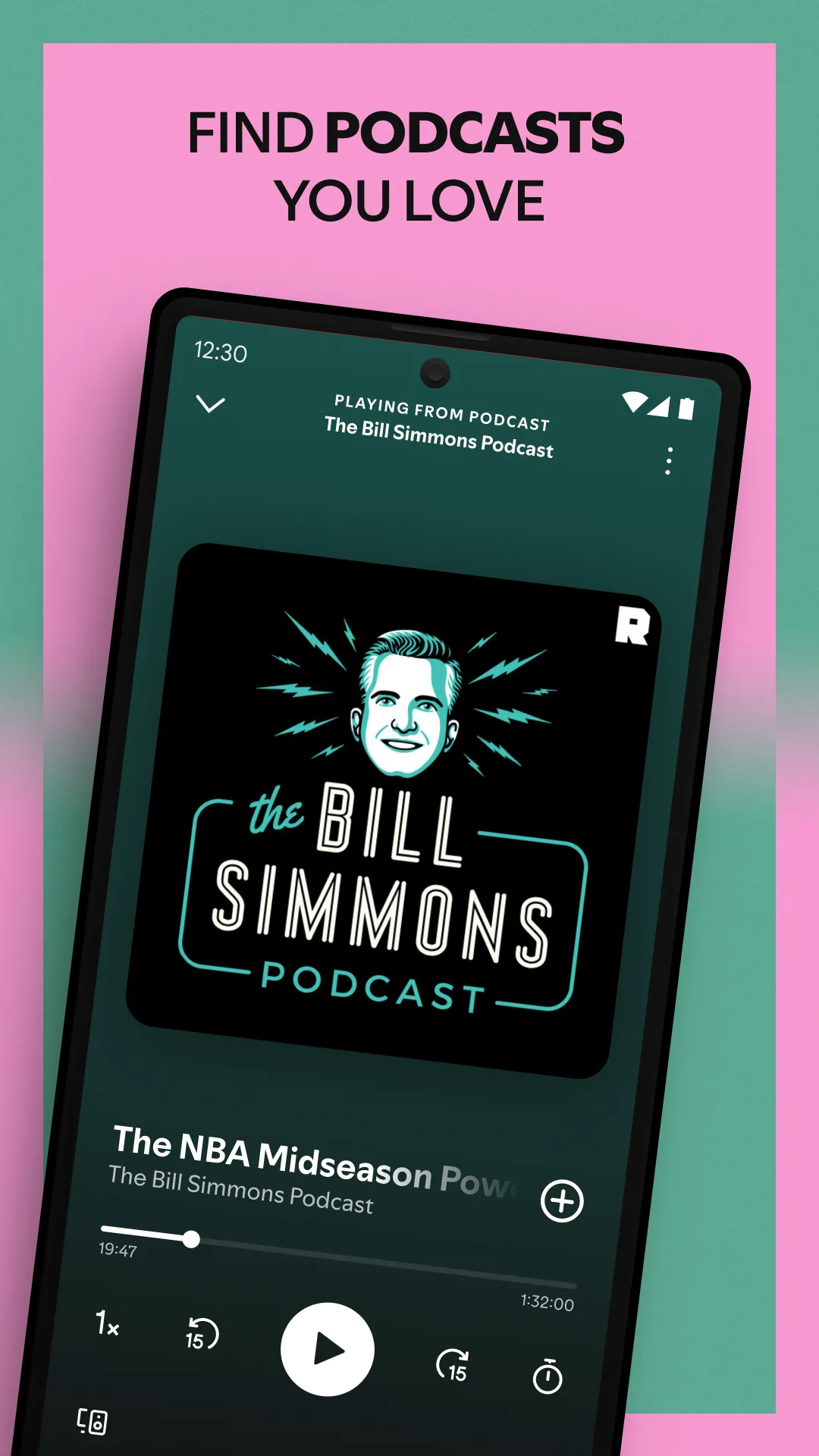
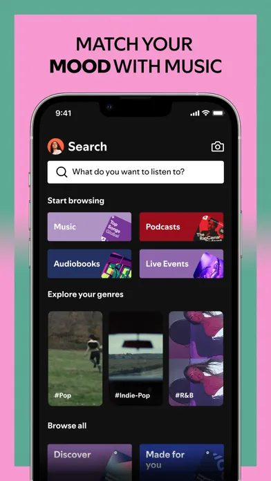
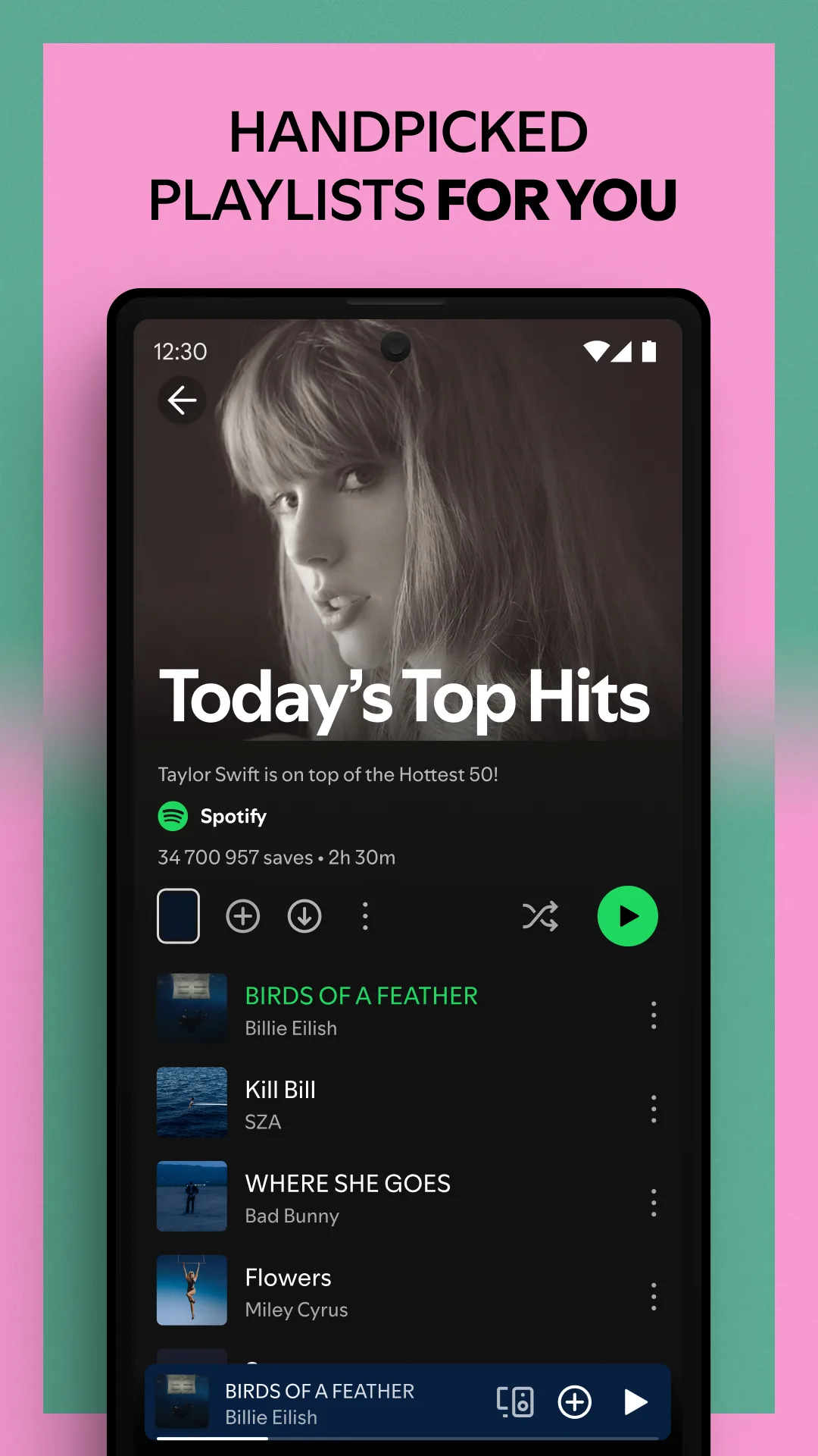
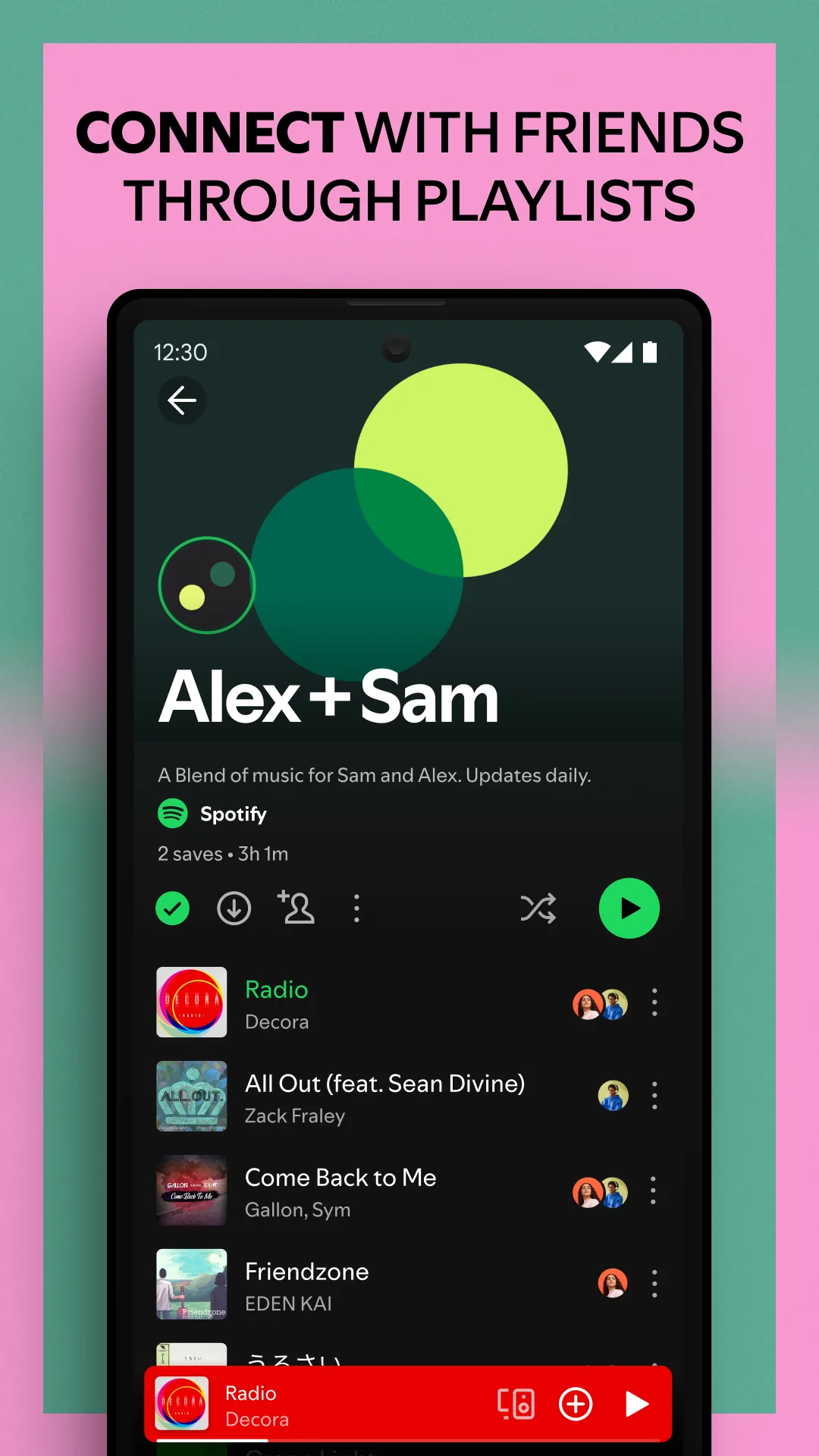
- SpotifyApp Store
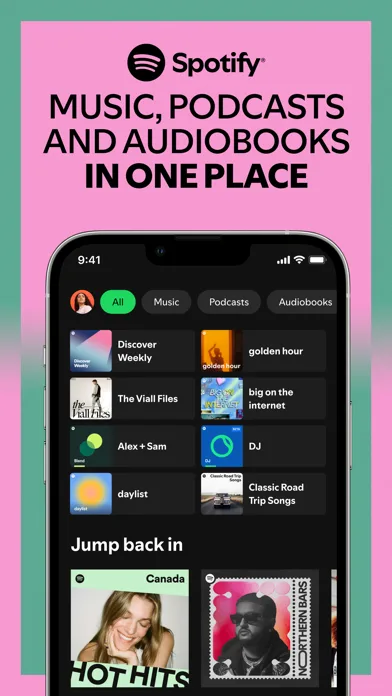
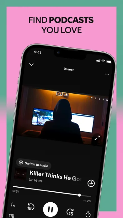
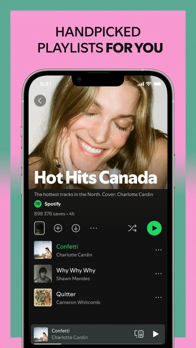
 Play Store
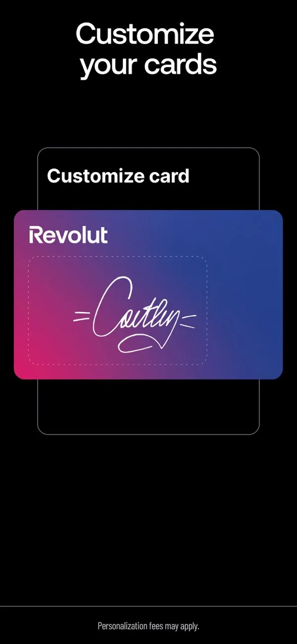
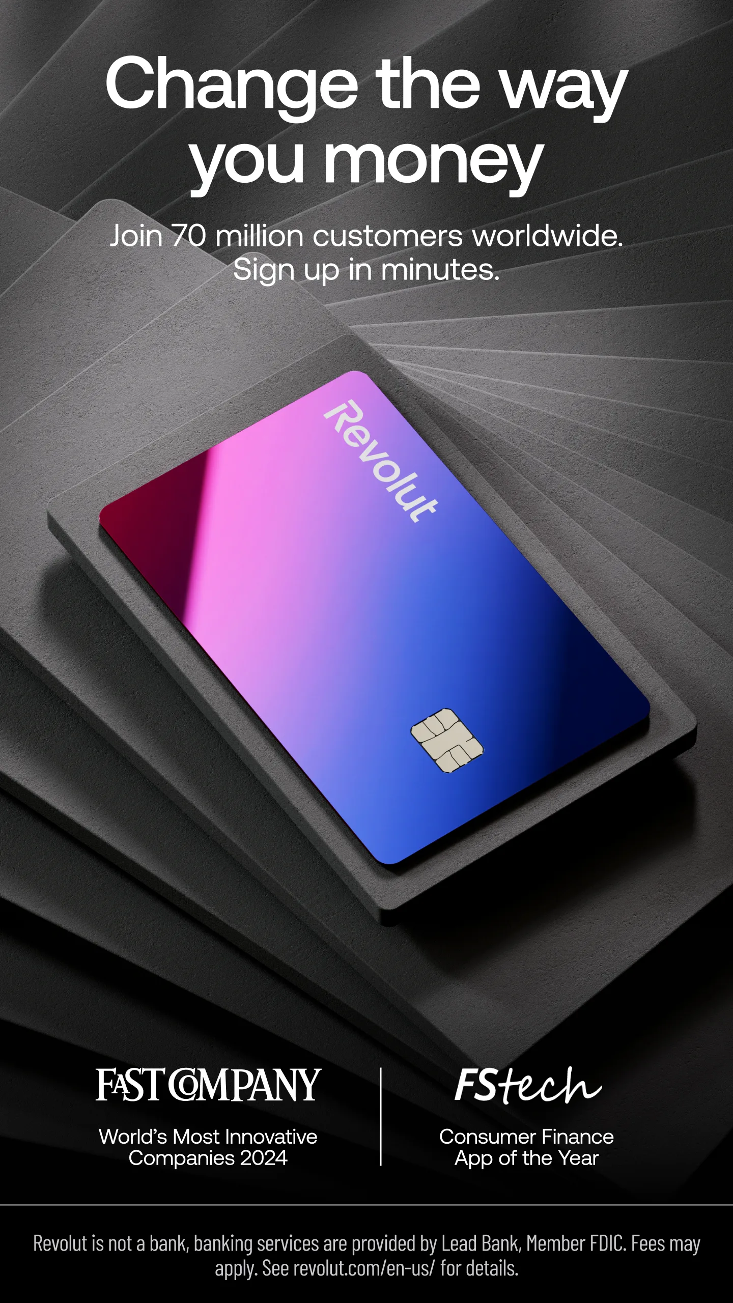
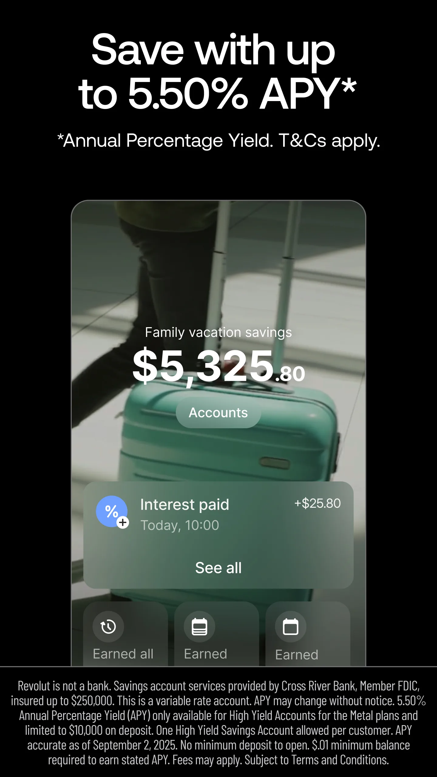
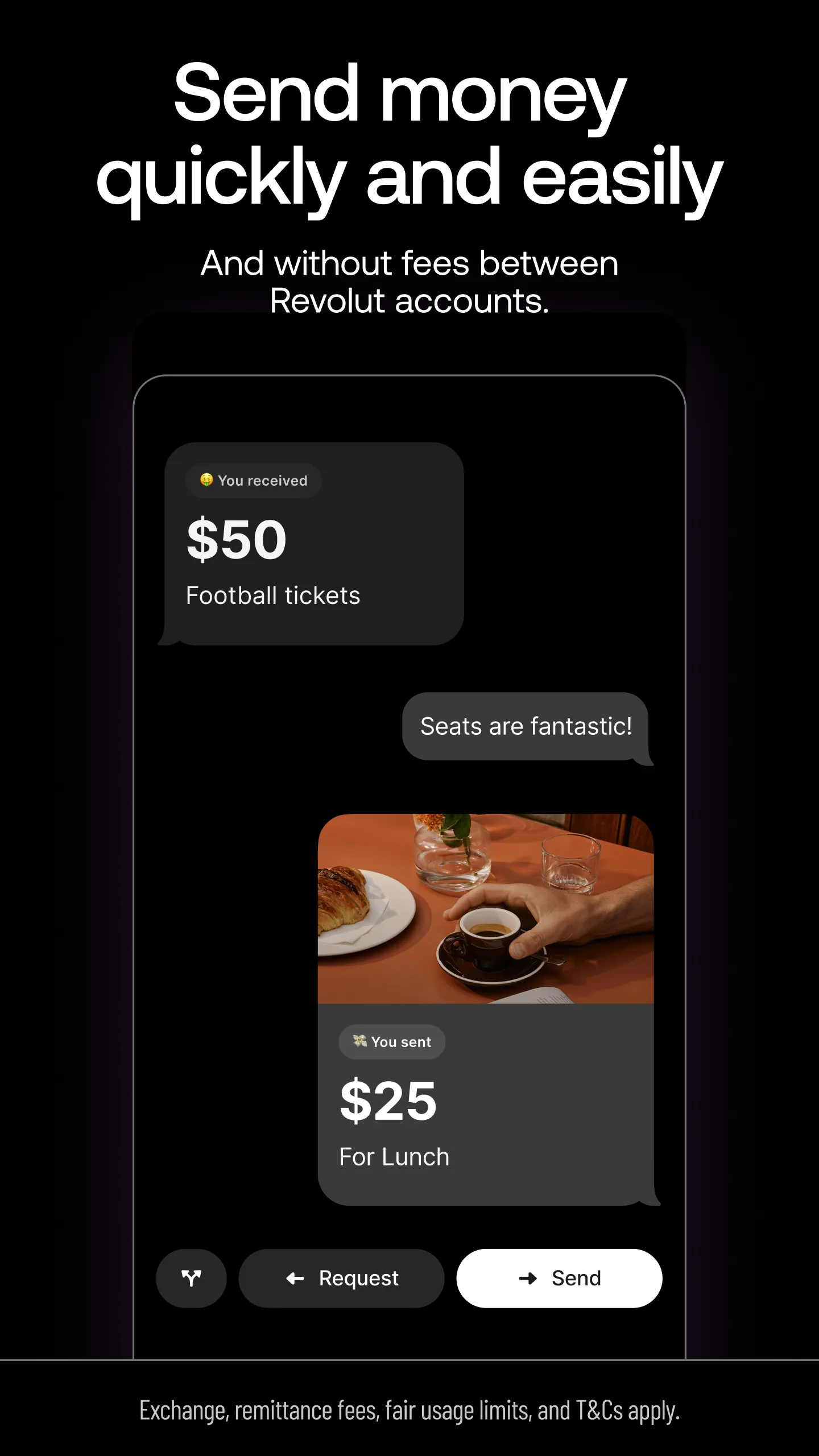
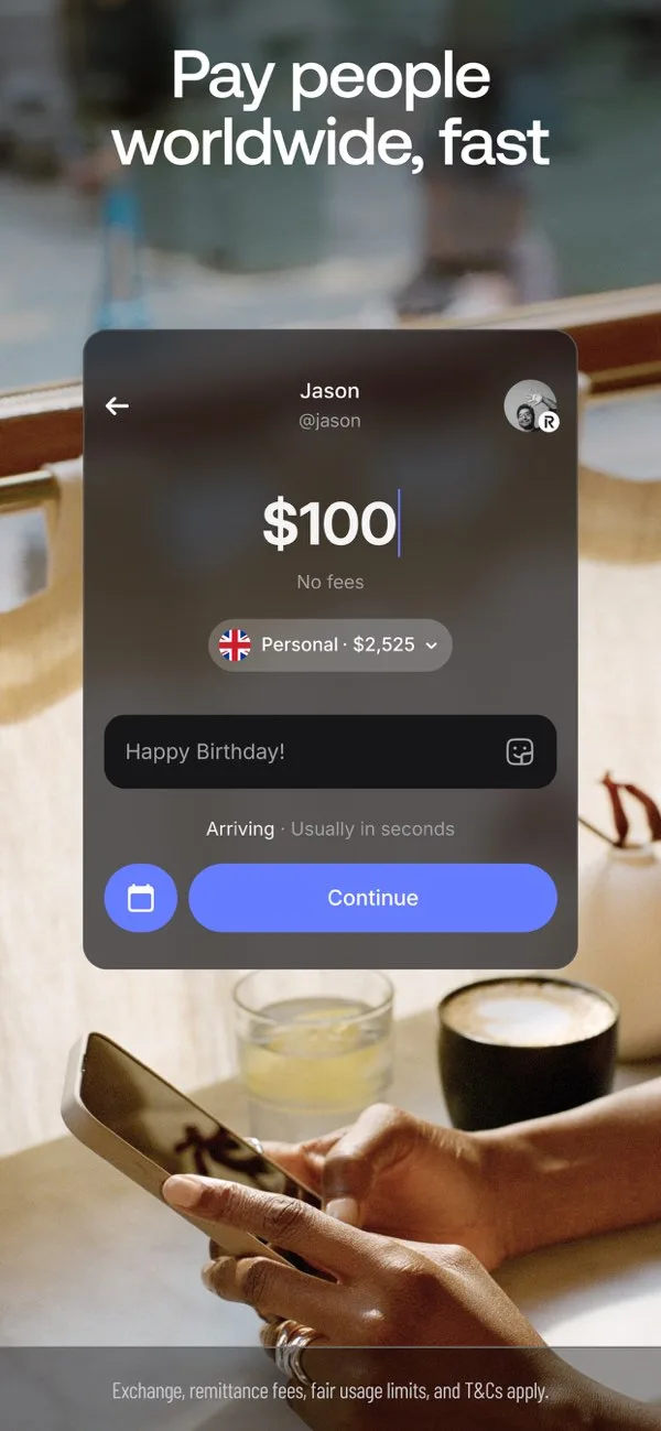
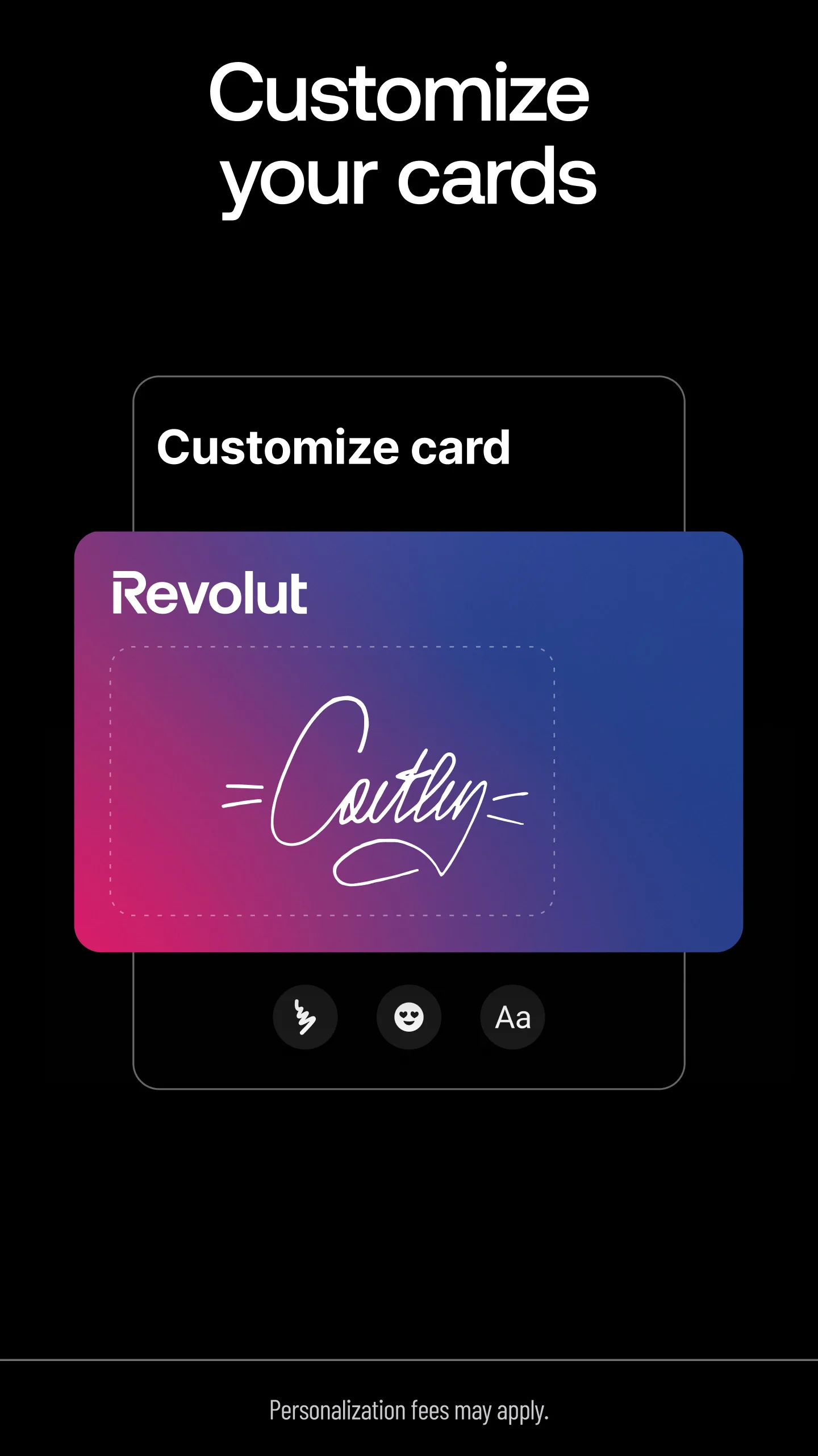
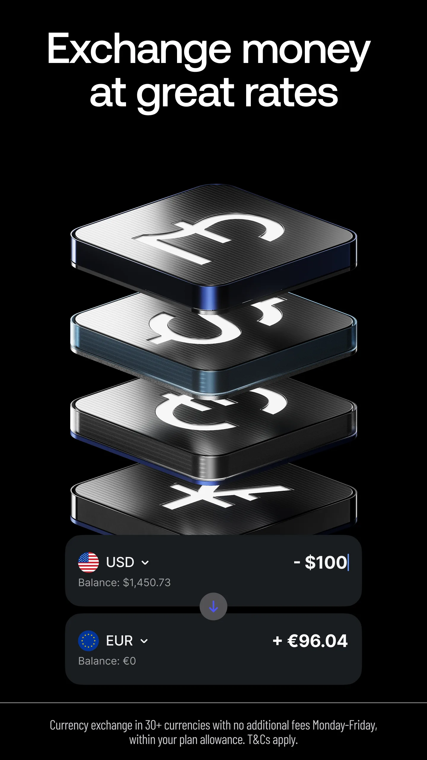
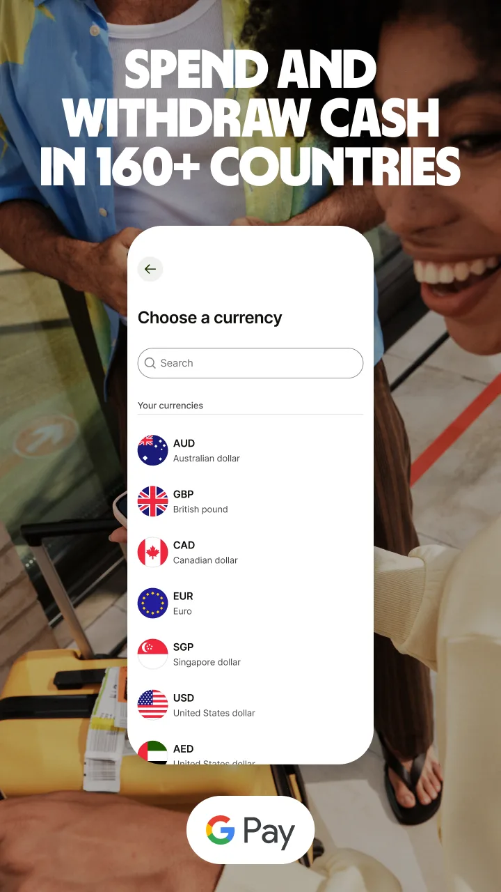
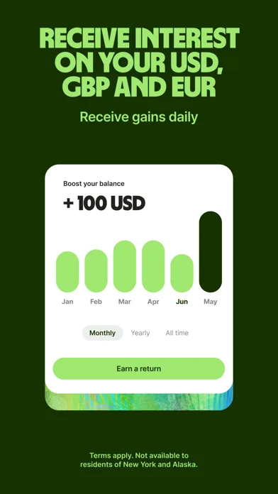
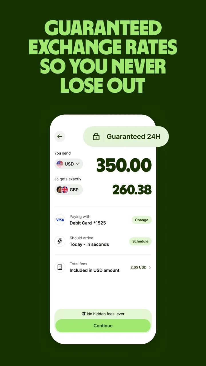
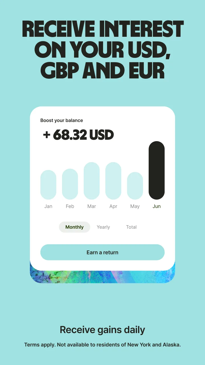
- RevolutApp Store
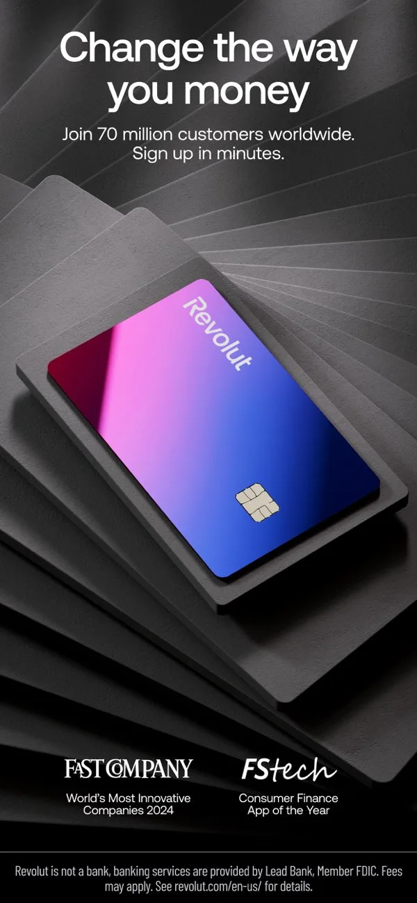
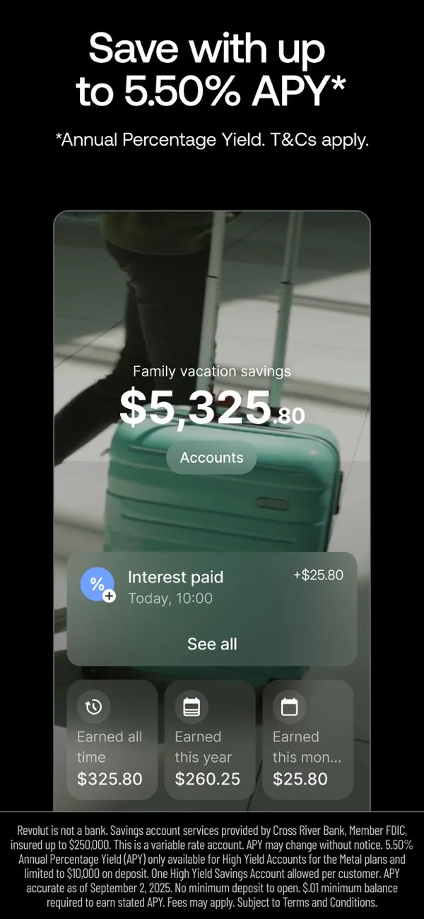
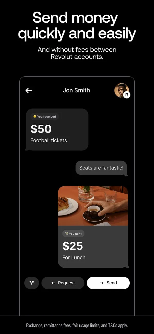
 Play Store
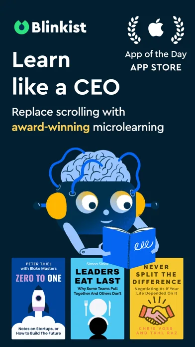
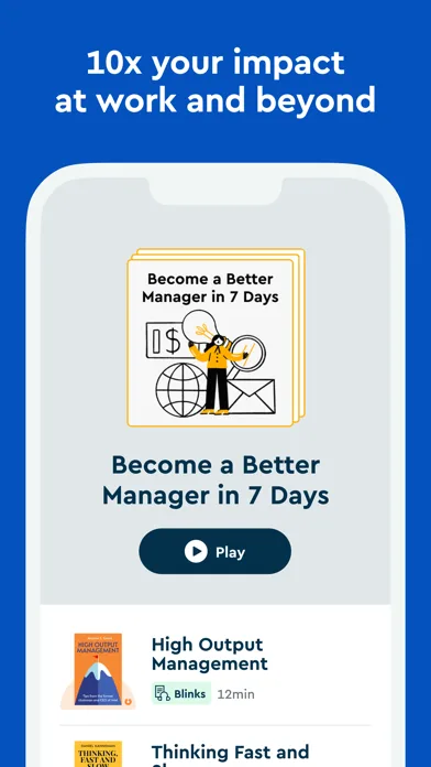
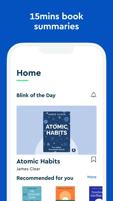
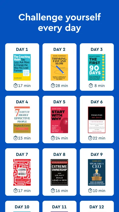
- BlinkistApp Store


 Play Store

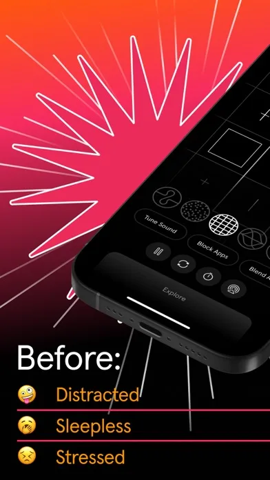
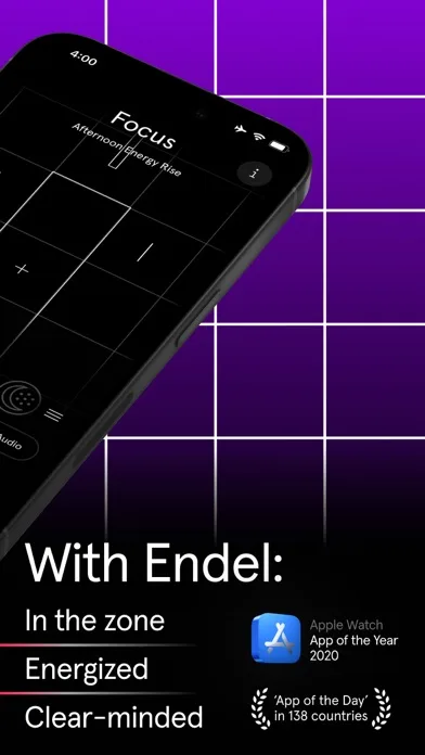
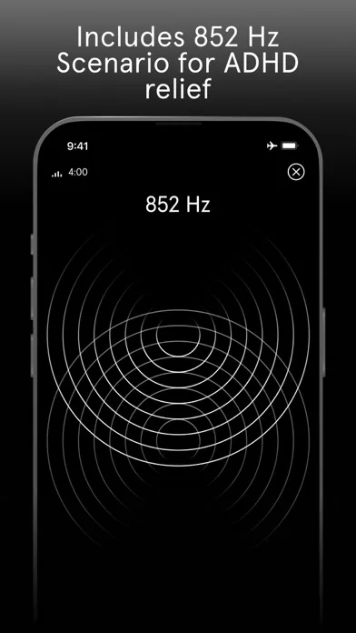
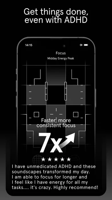
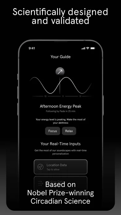
- EndelApp Store

 Play Store

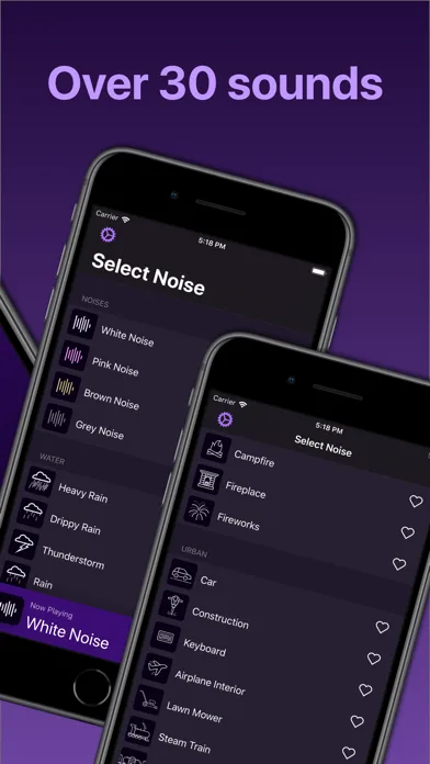
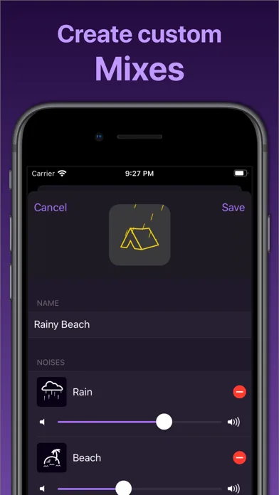
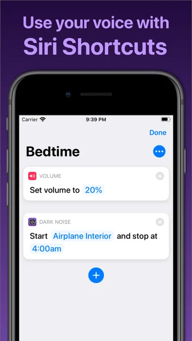
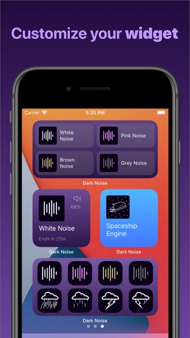
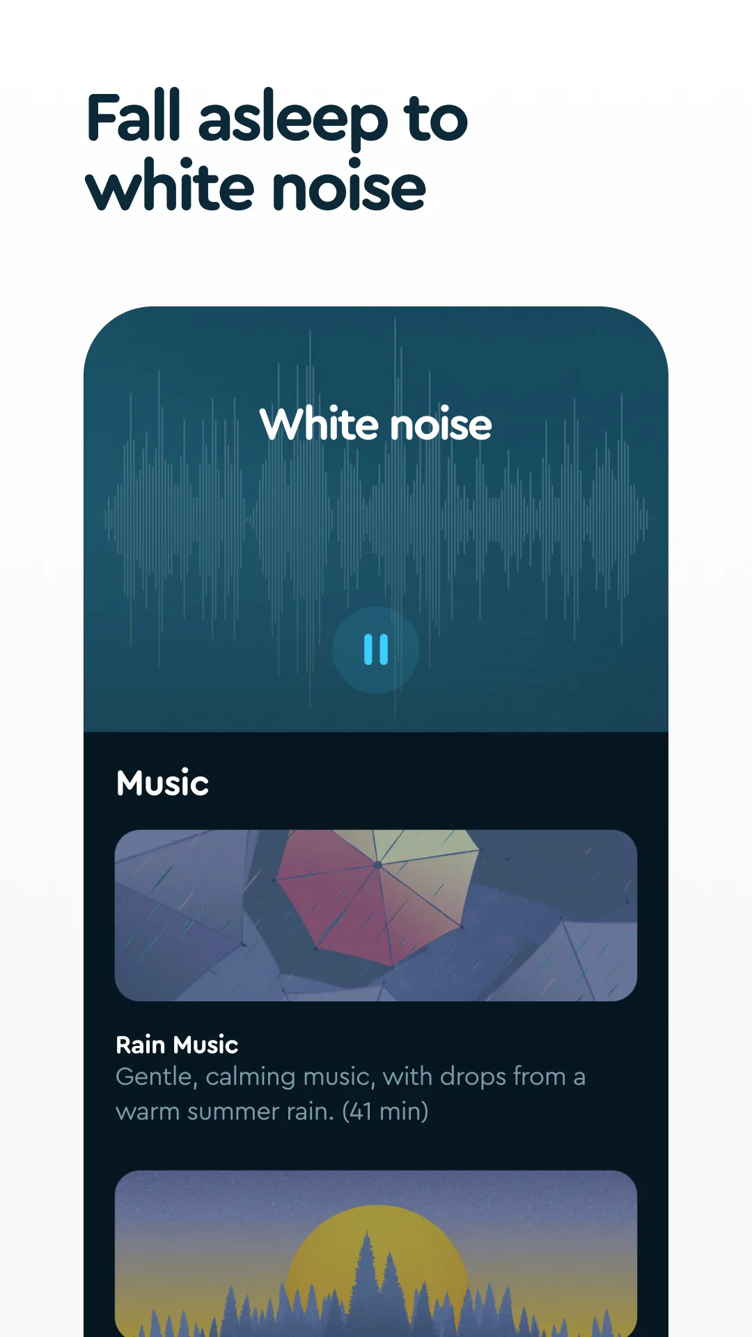
- Dark NoiseApp Store

 Play Store
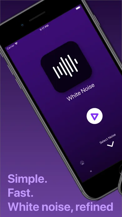


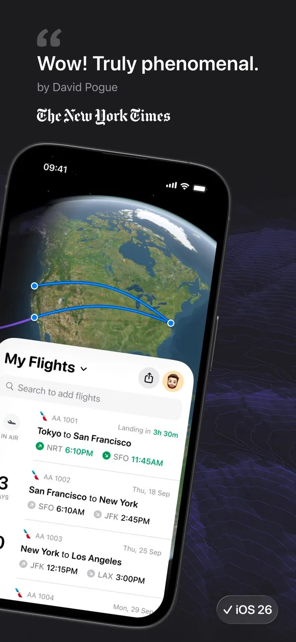
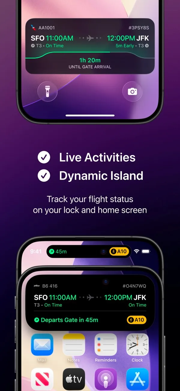
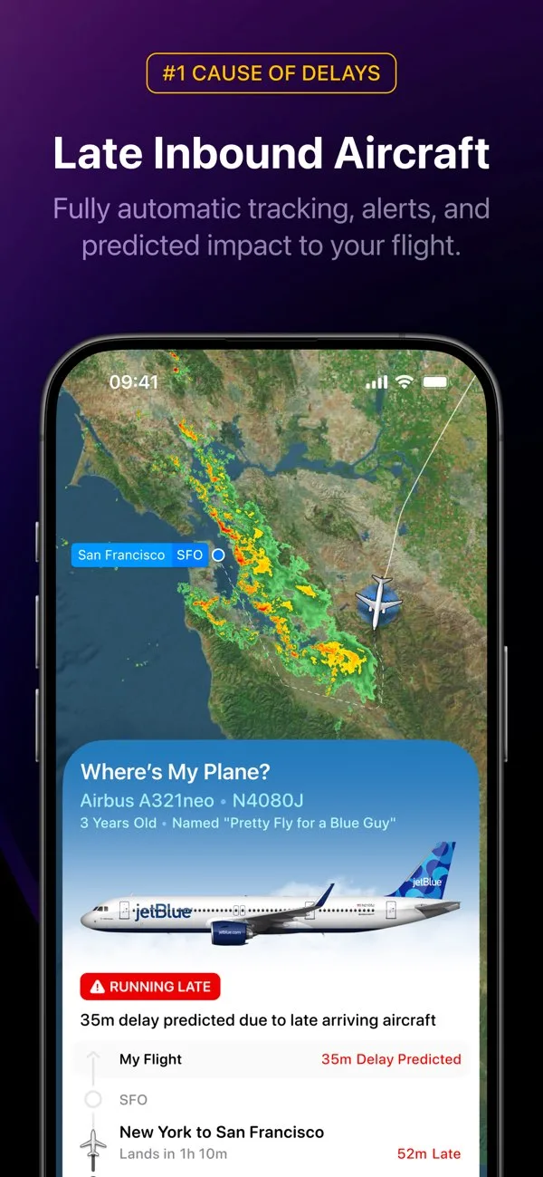
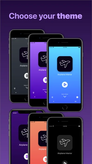
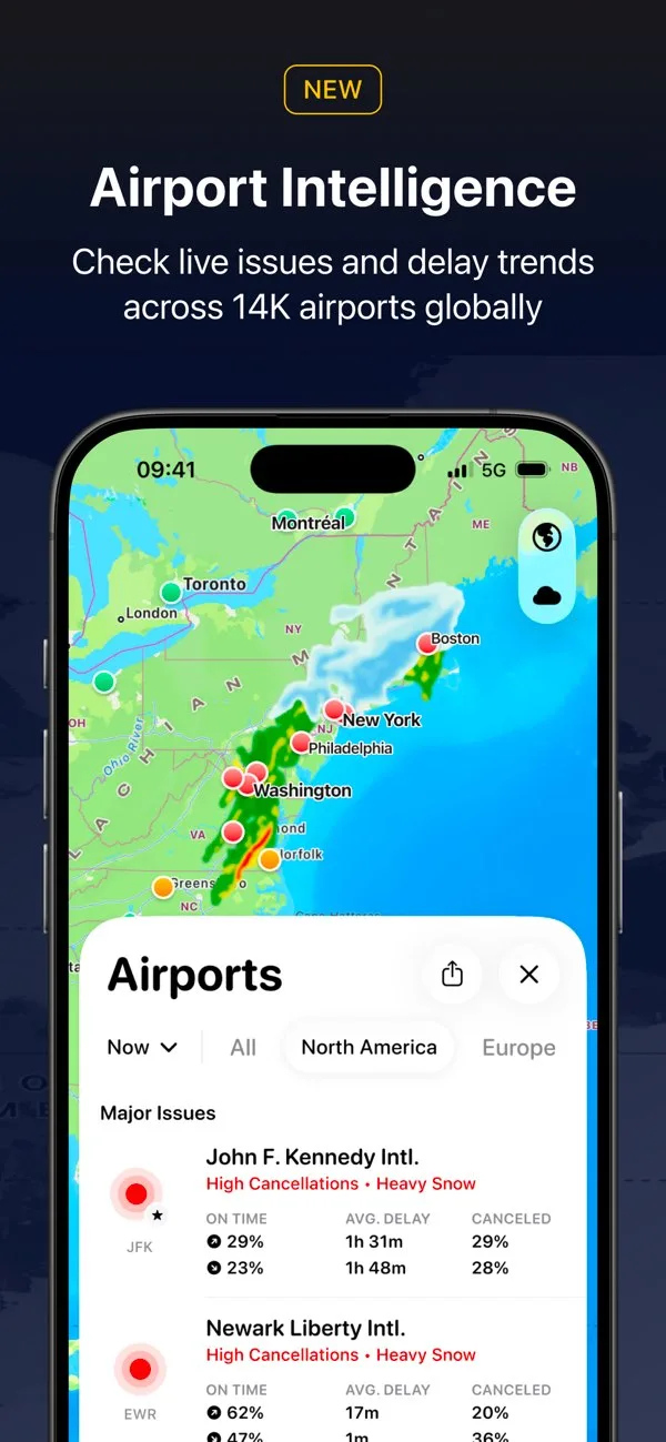
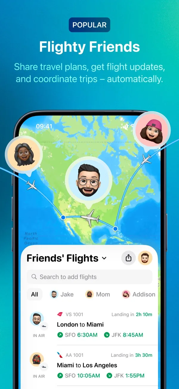
- FlightyApp Store

 Play Store
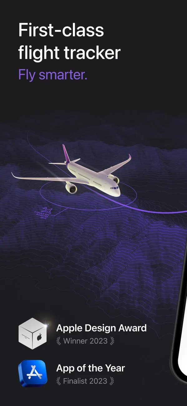


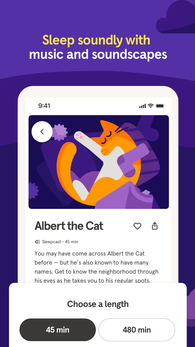
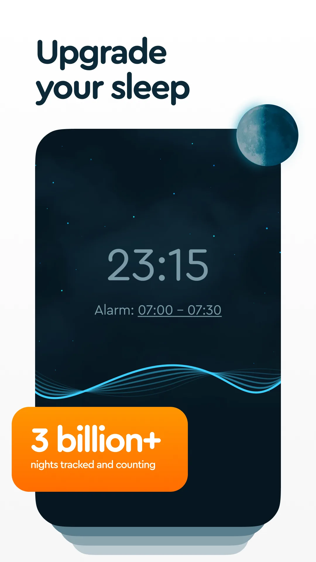
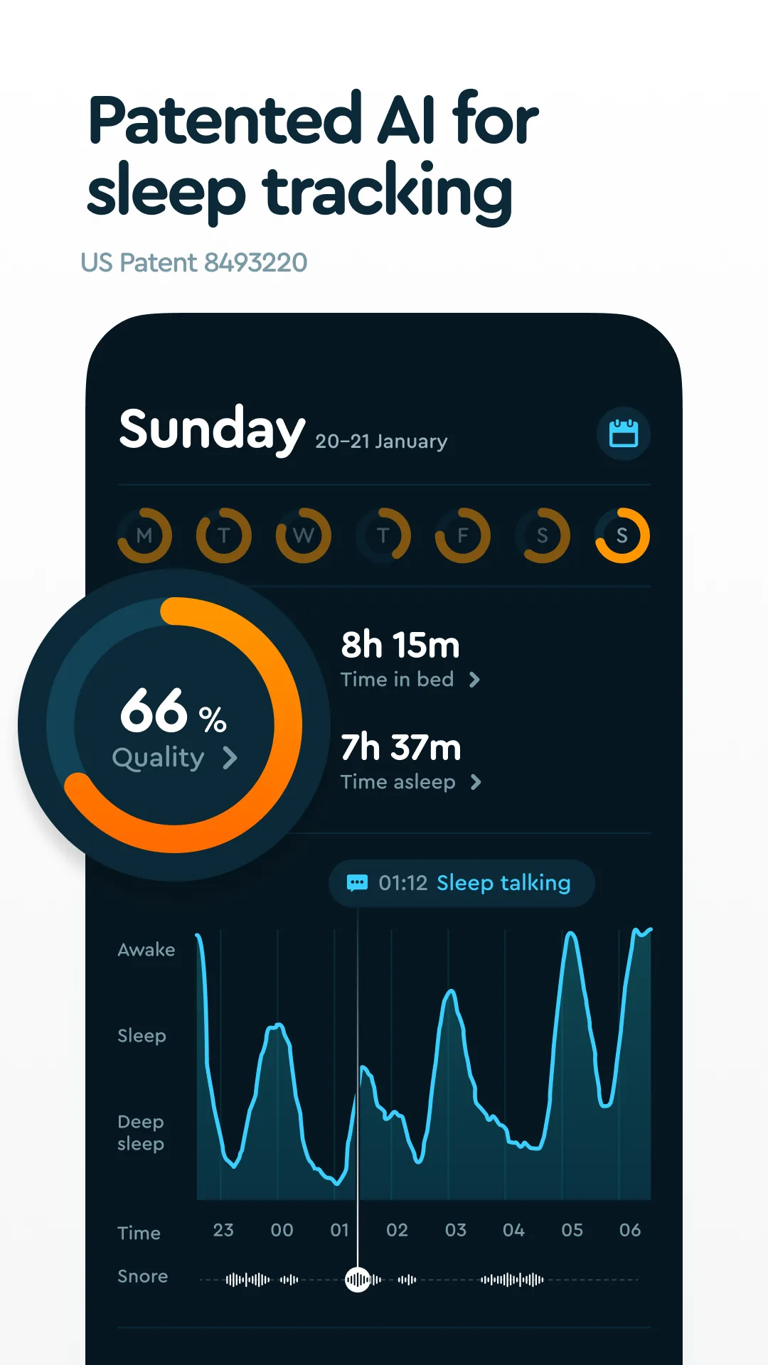
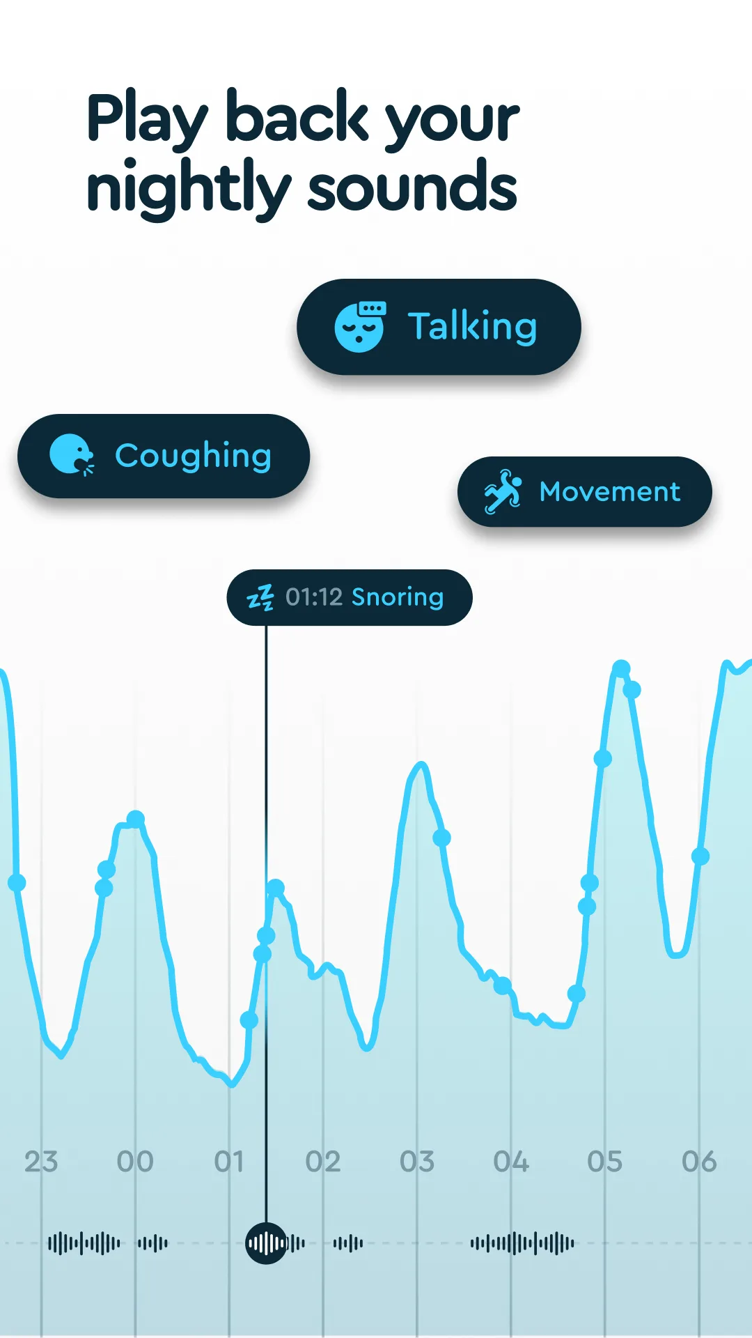
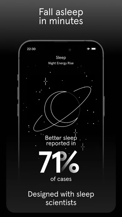
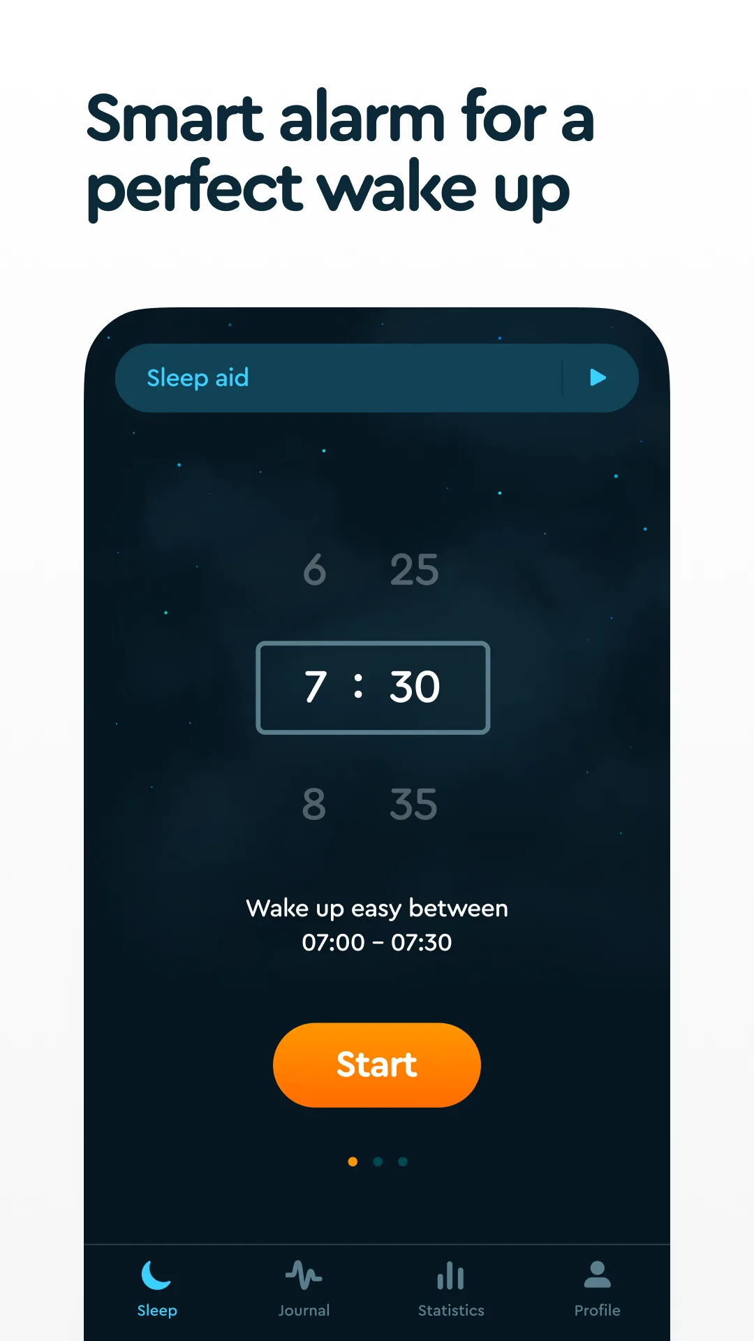
- Sleep CyclePlay Store


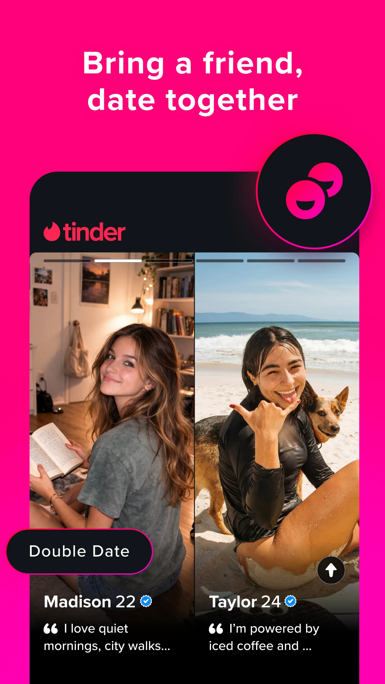
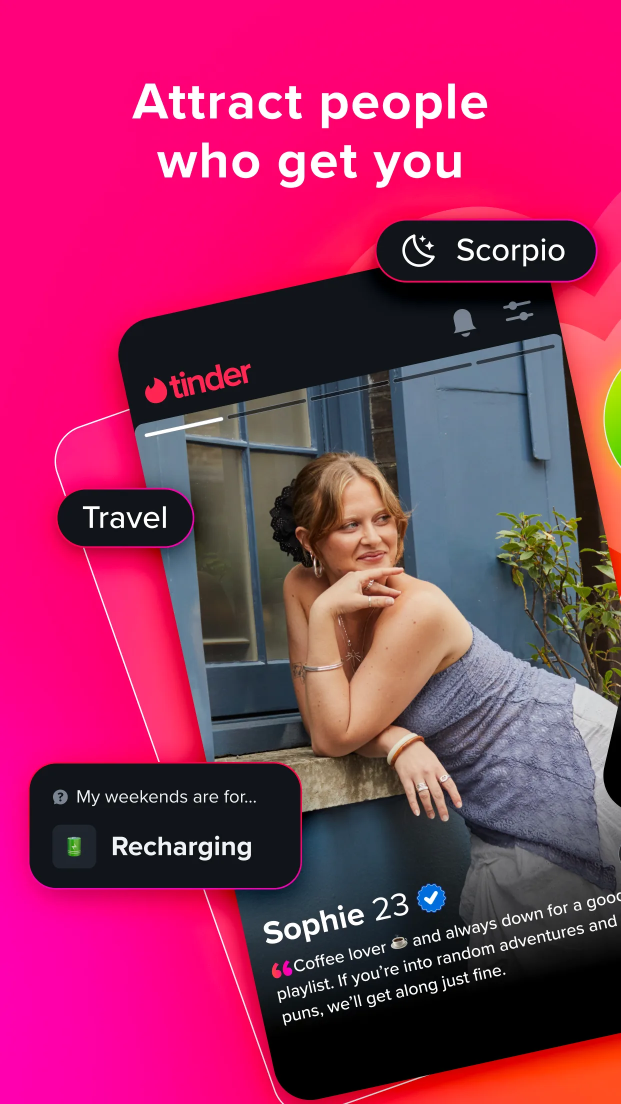
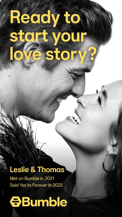
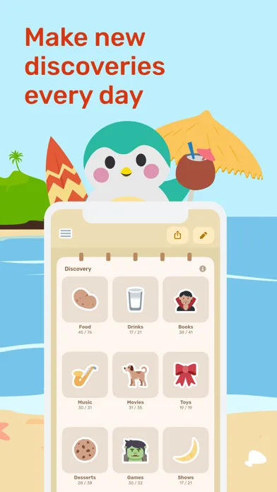
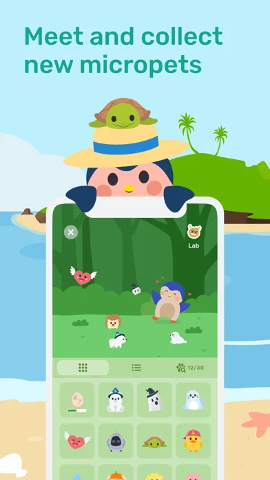
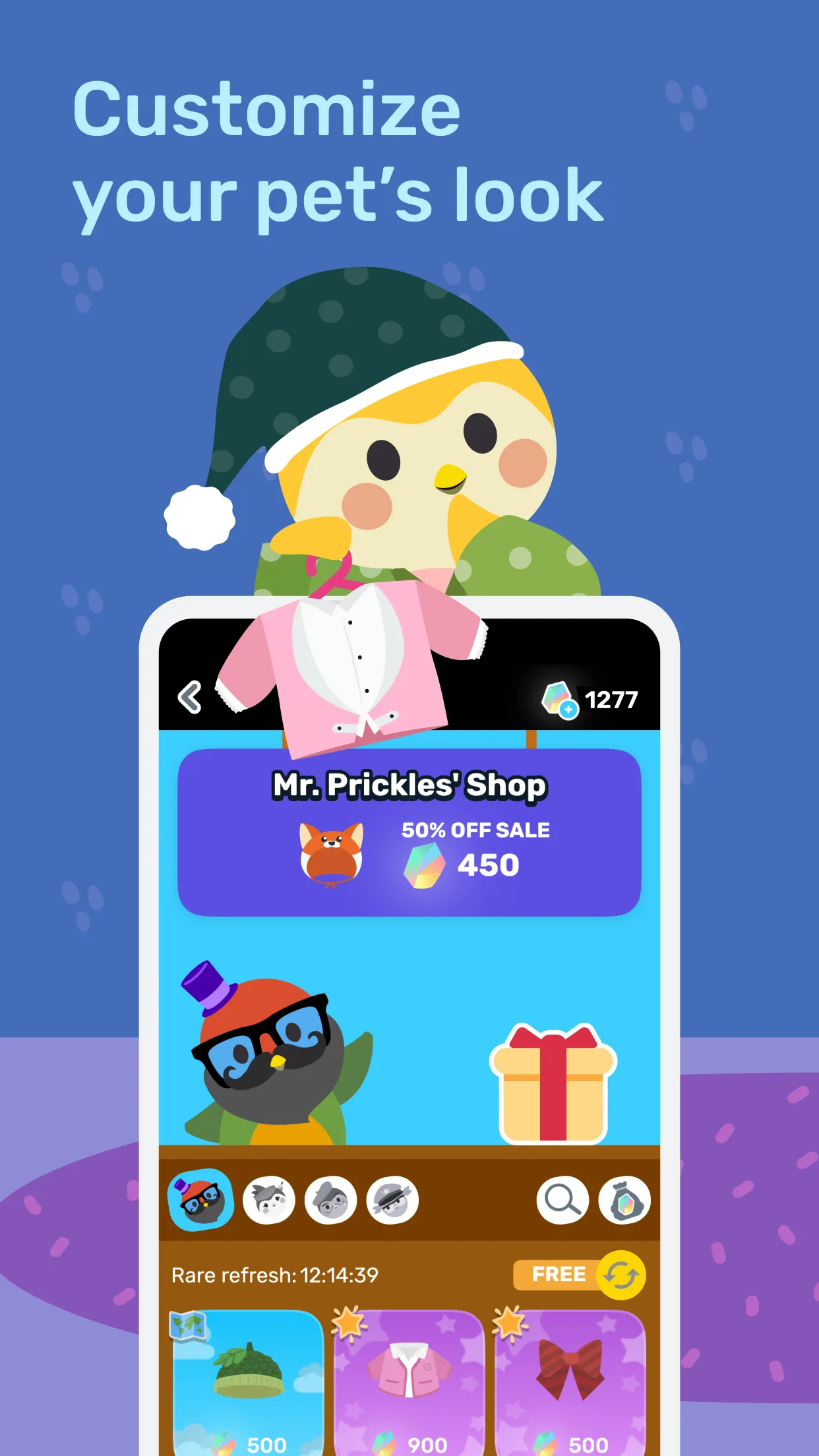
Colorful / playful
Big personality, bold color, and expressive characters—ideal for consumer apps and growth loops.
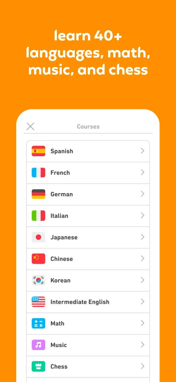
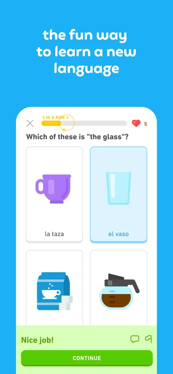
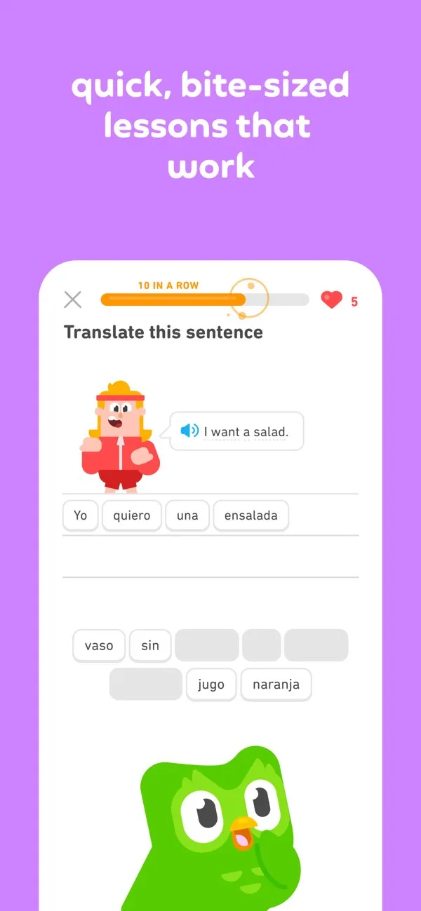
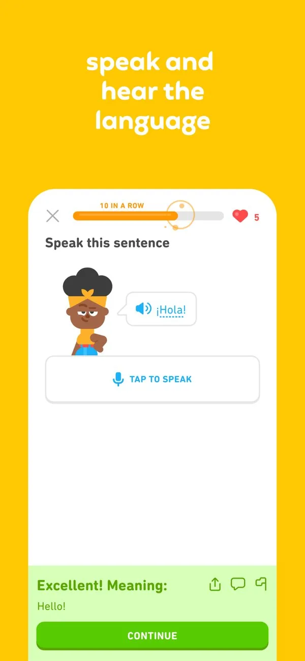
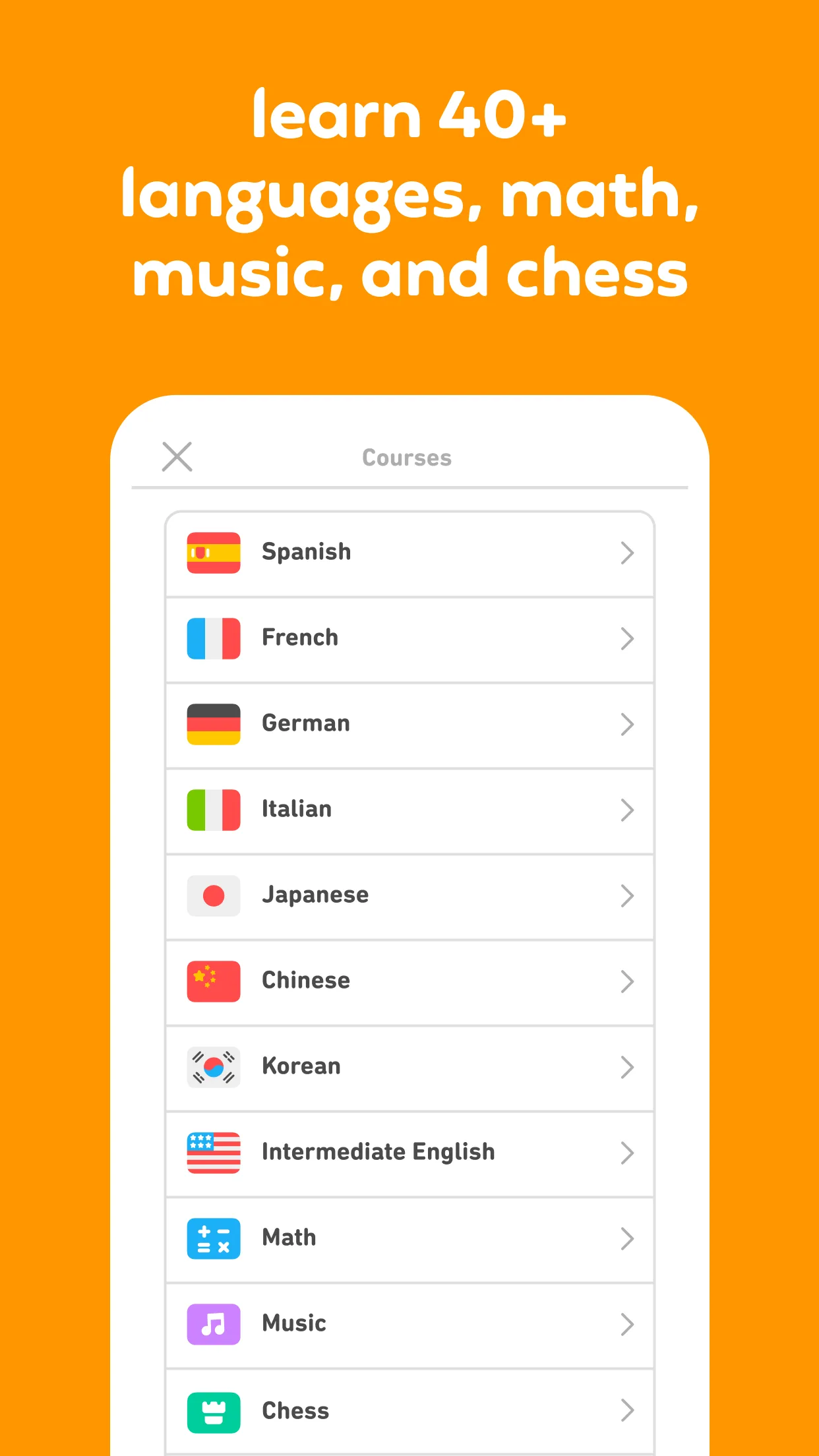
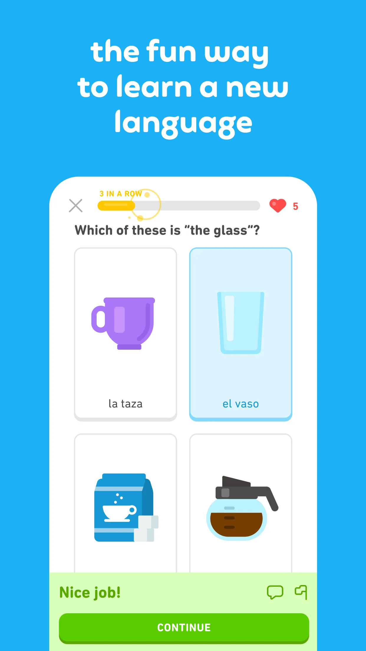
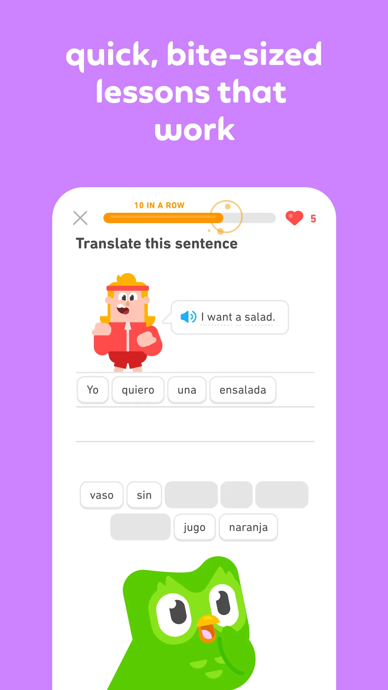
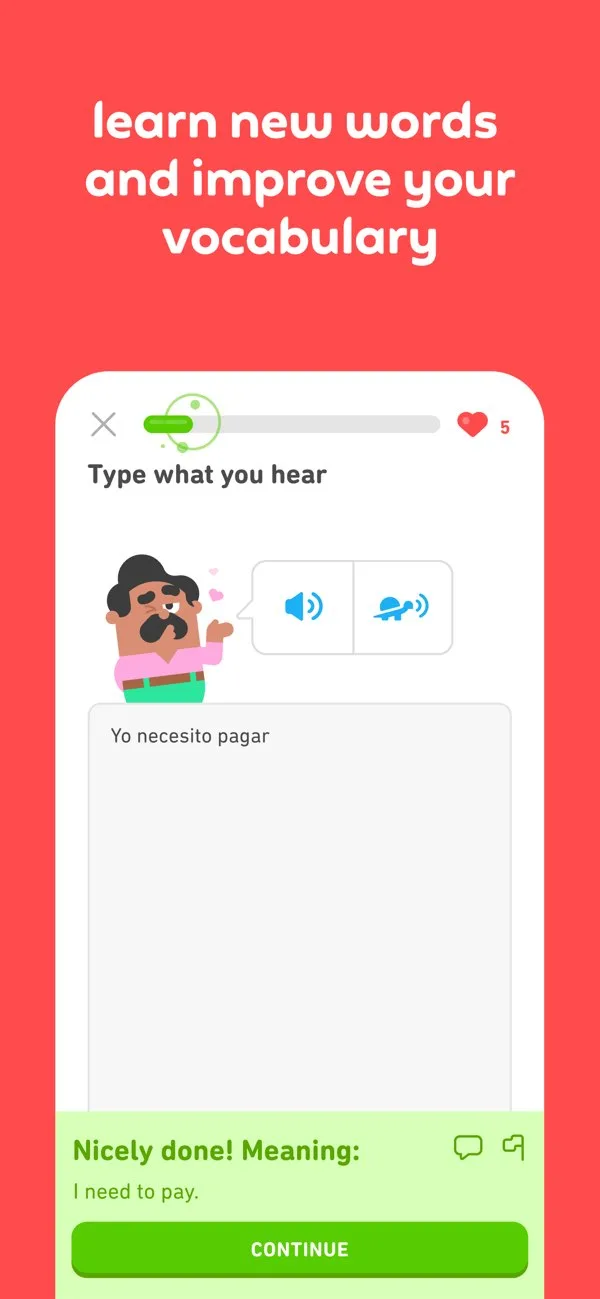
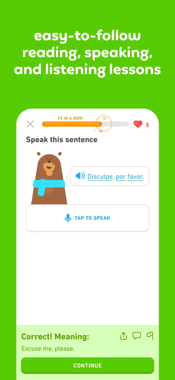
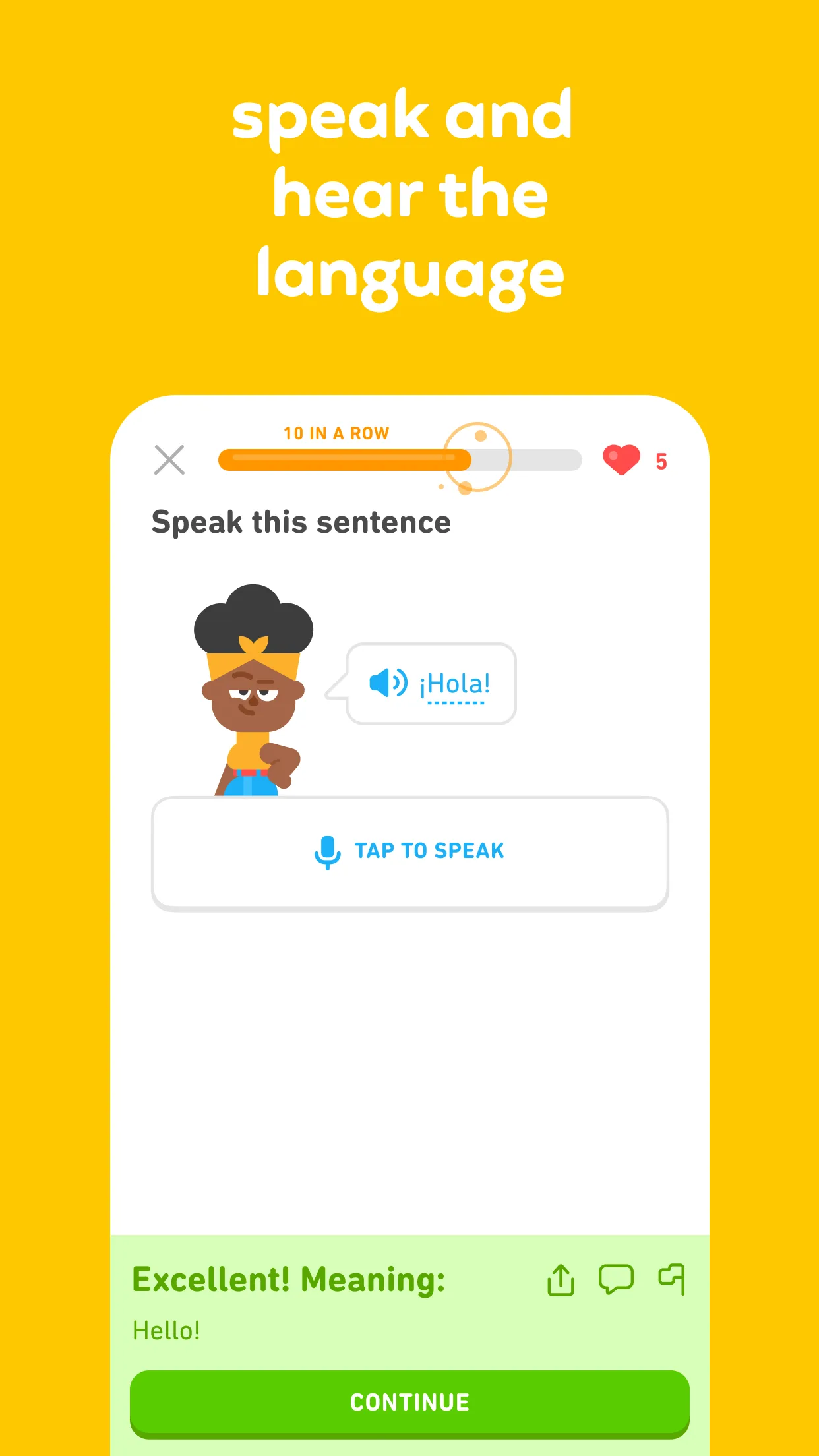
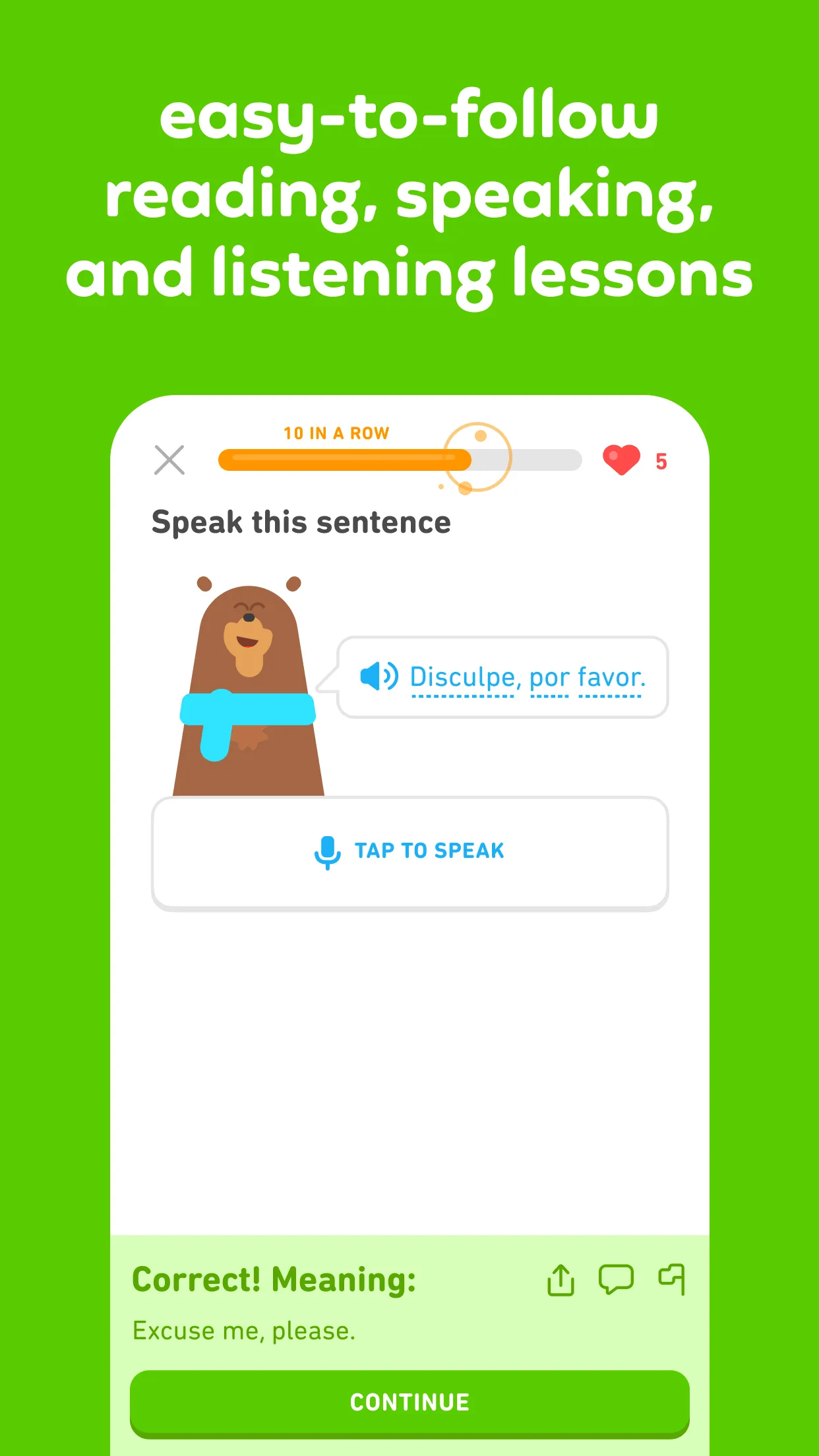
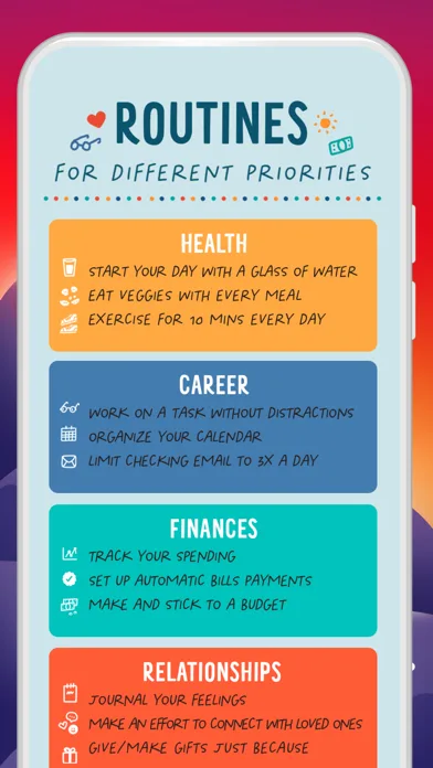
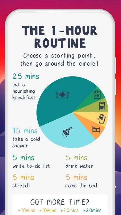
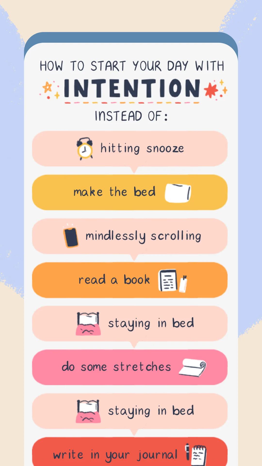
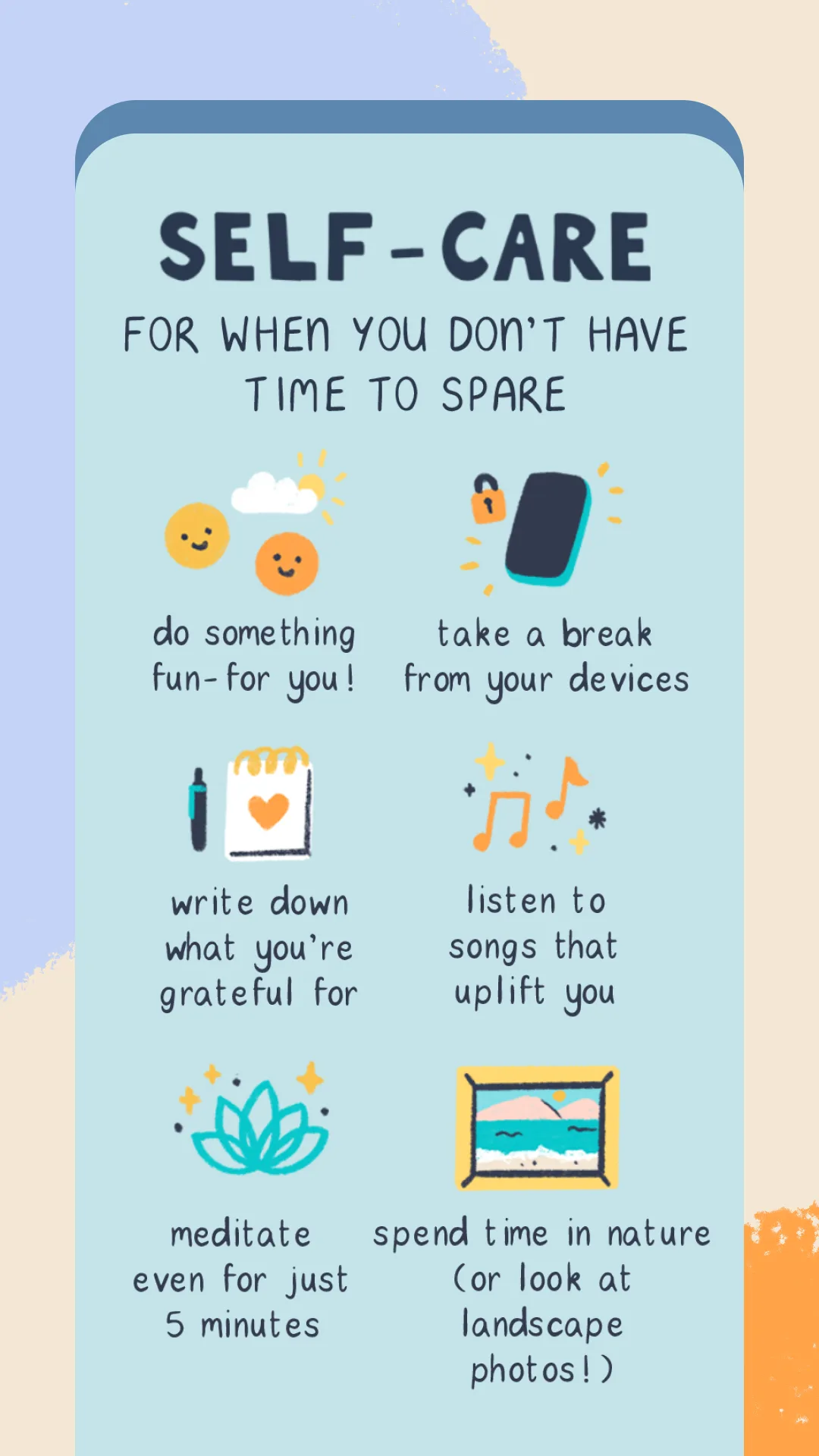
- DuolingoApp Store
 Play Store
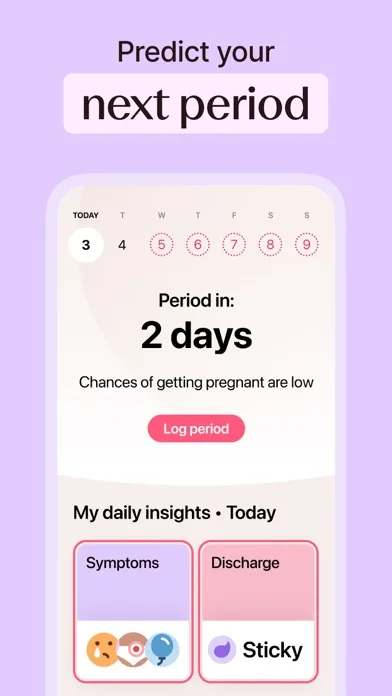
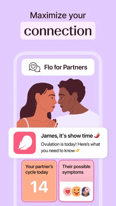
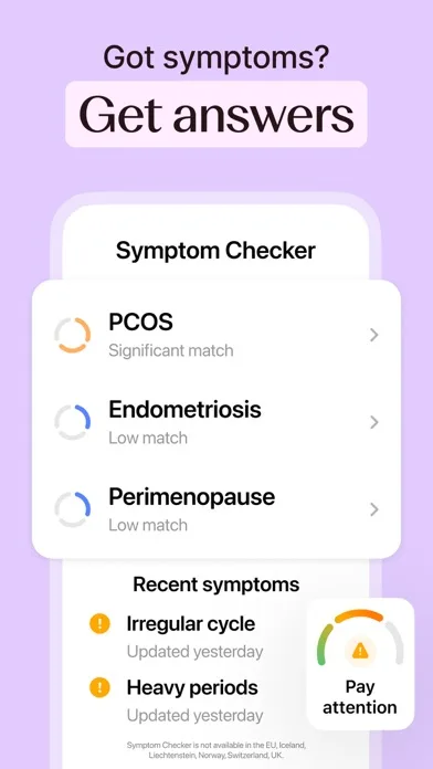
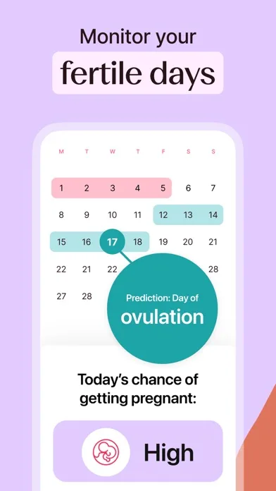
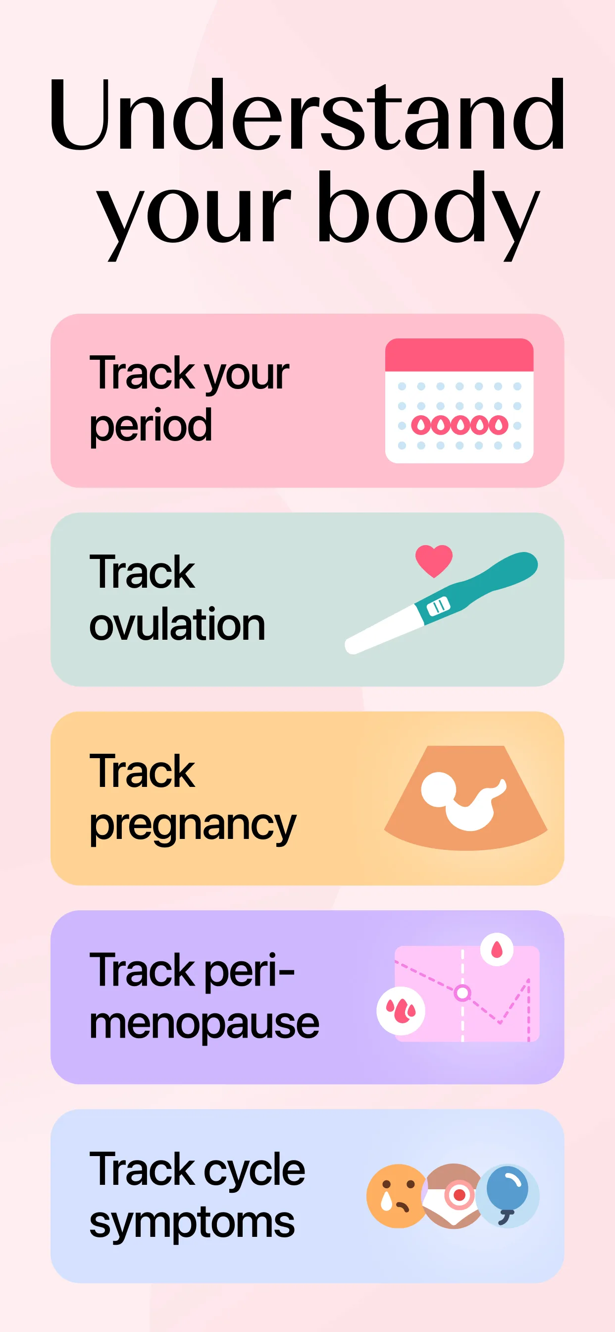
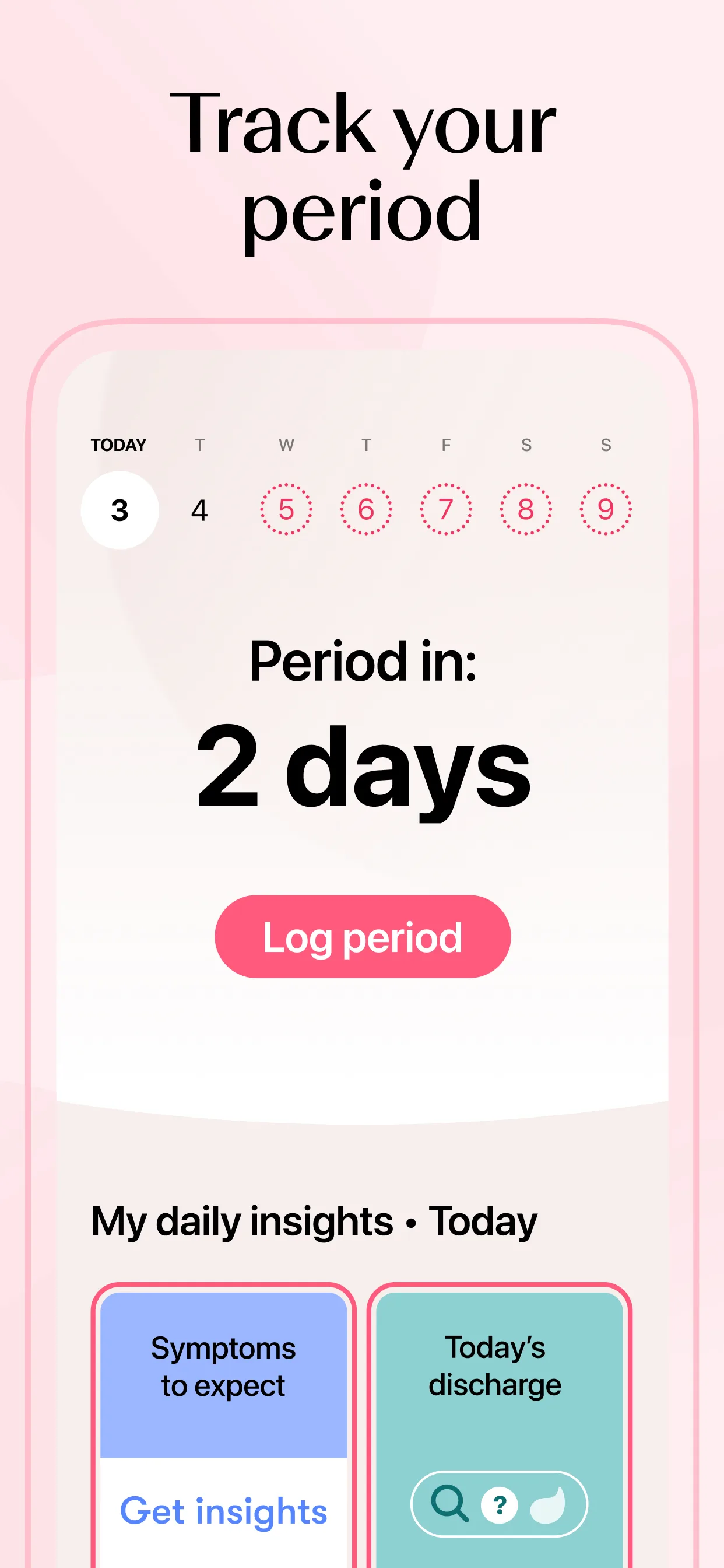
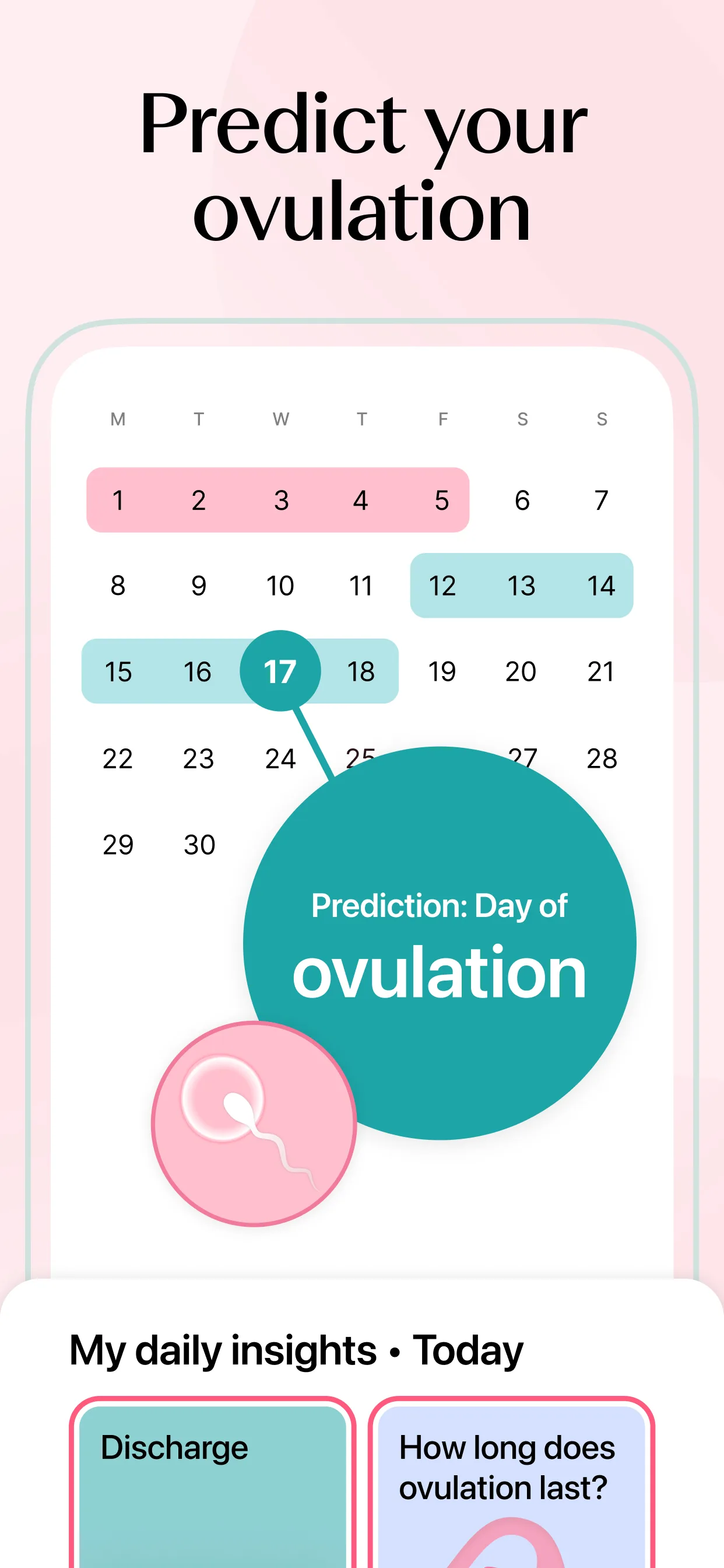
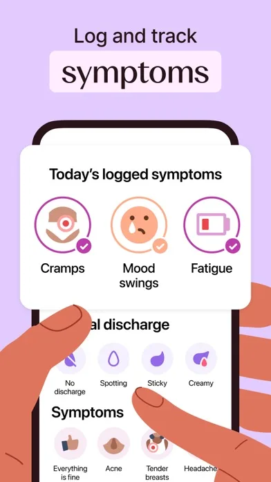
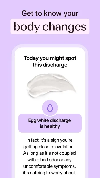
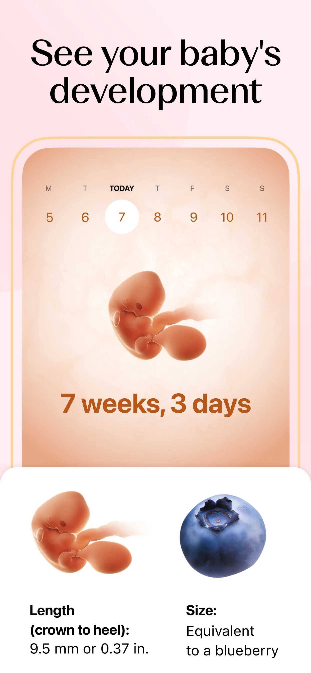
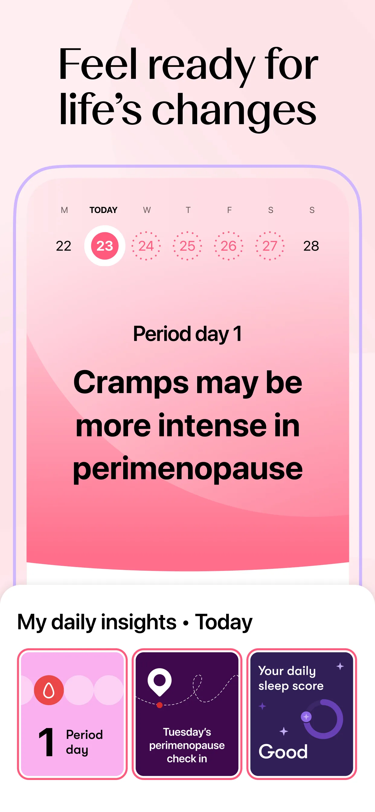
- FloApp Store
 Play Store
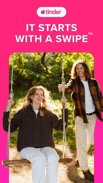
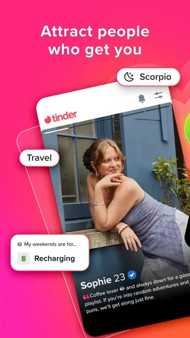
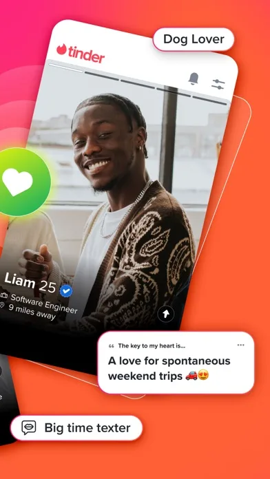
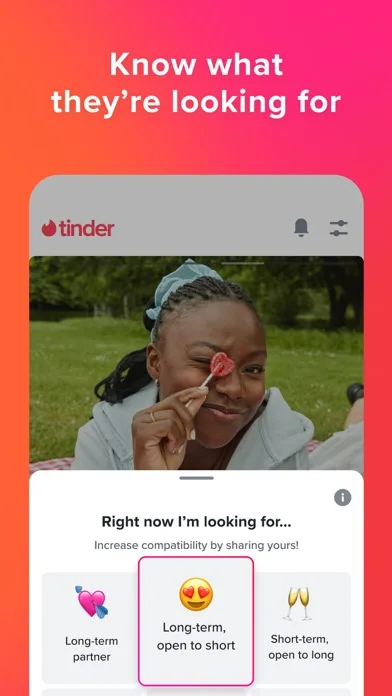
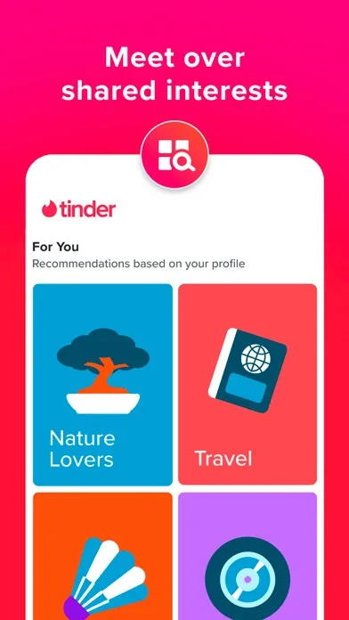
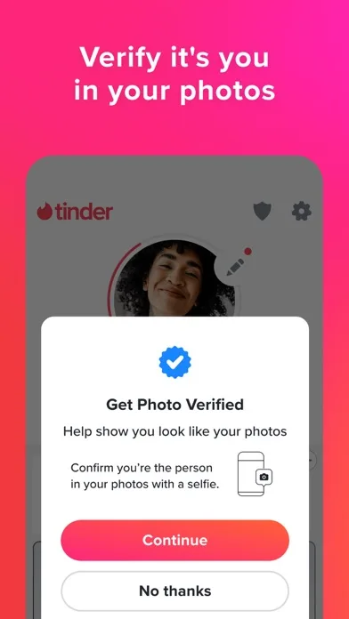
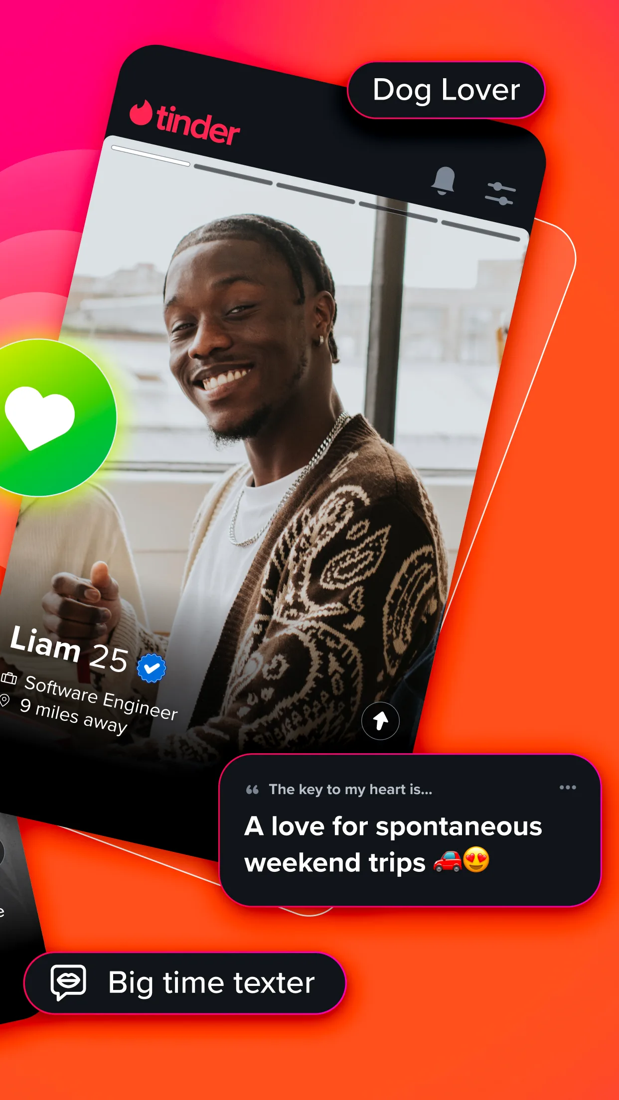
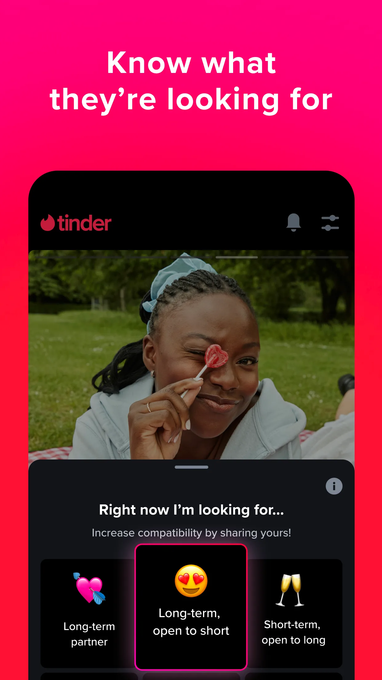
- TinderApp Store
 Play Store

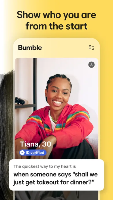
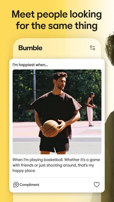
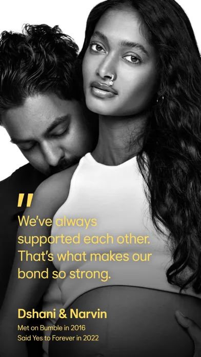
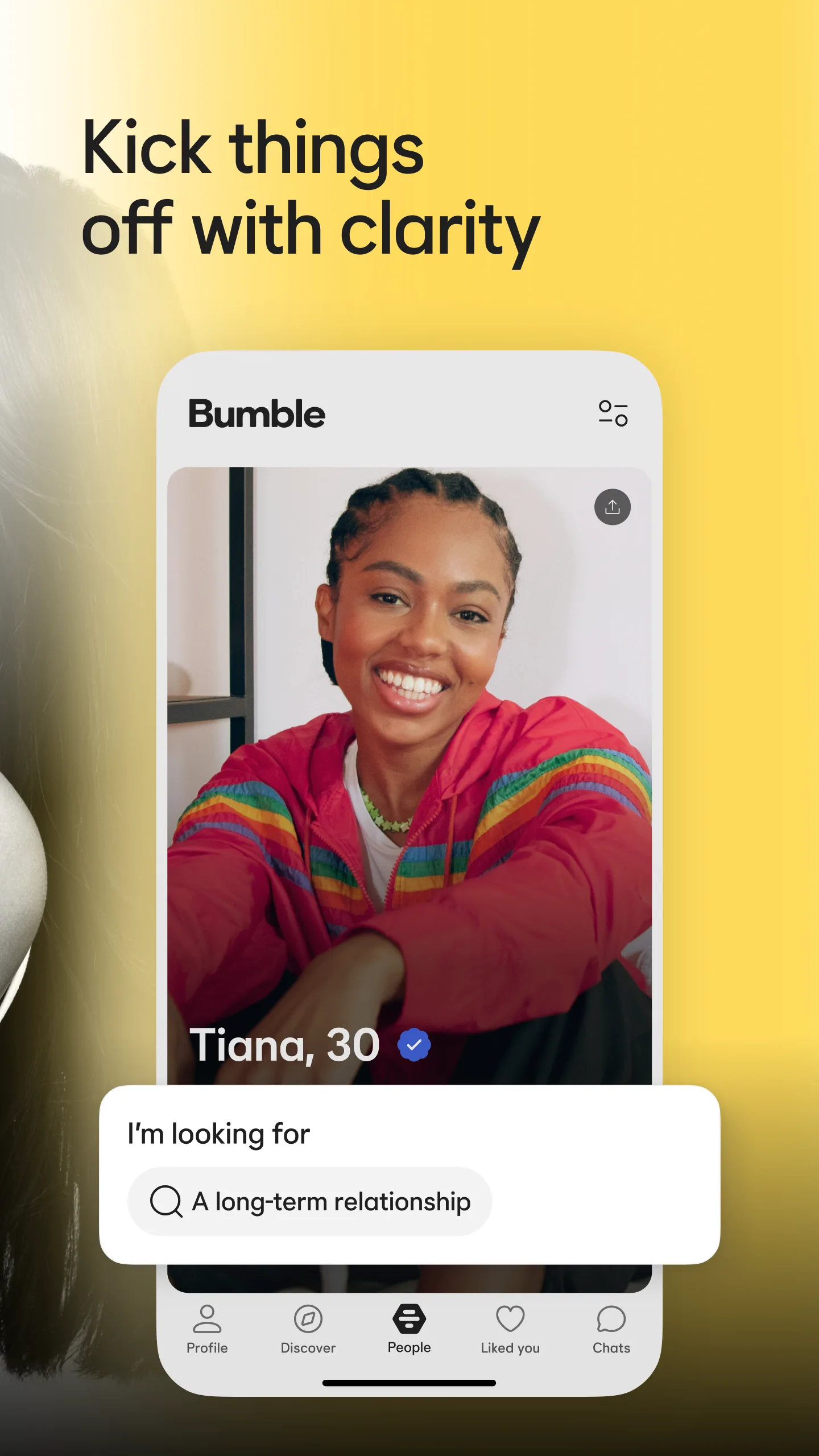
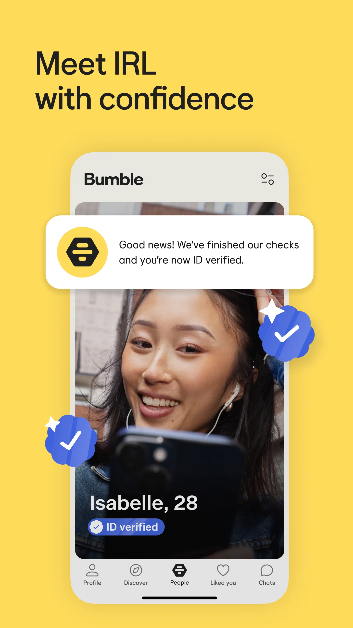
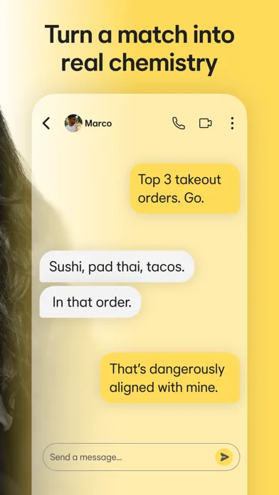
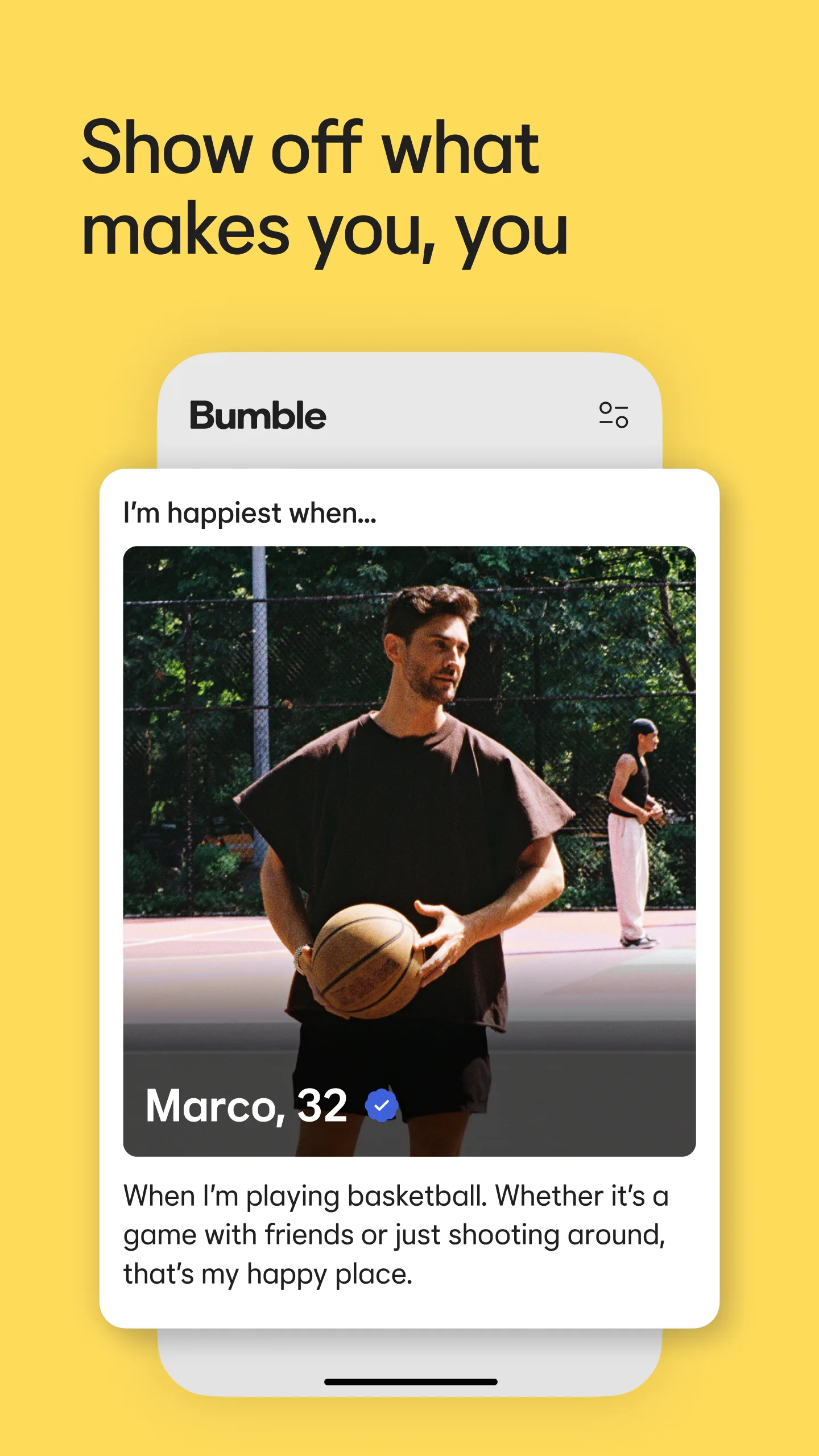
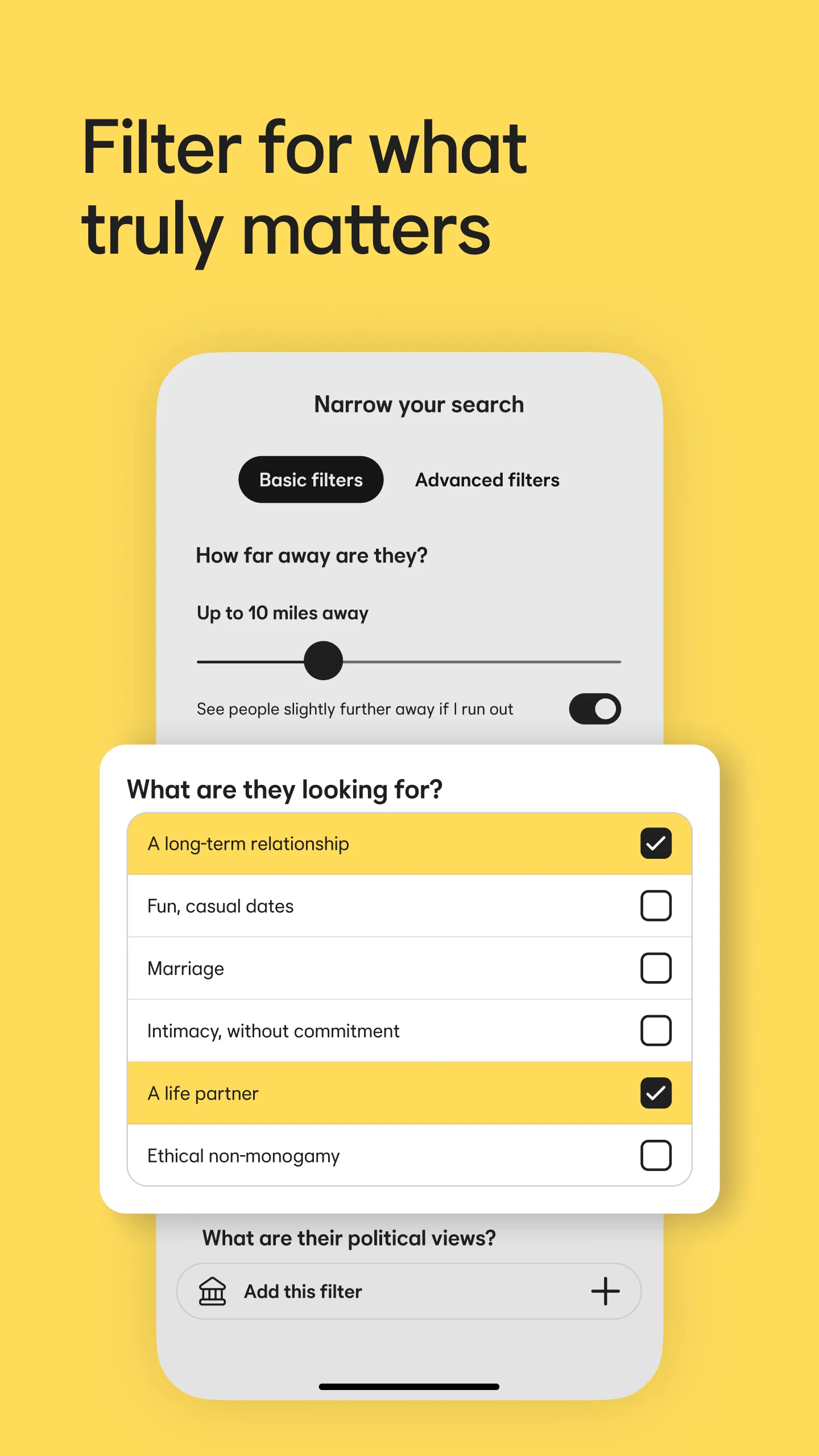
- BumbleApp Store
 Play Store

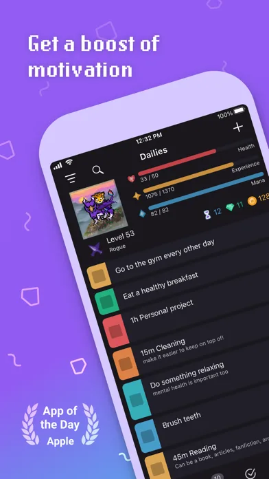
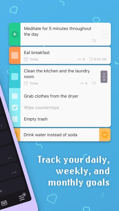
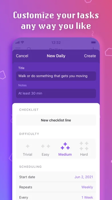
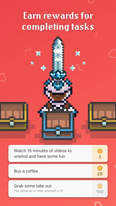
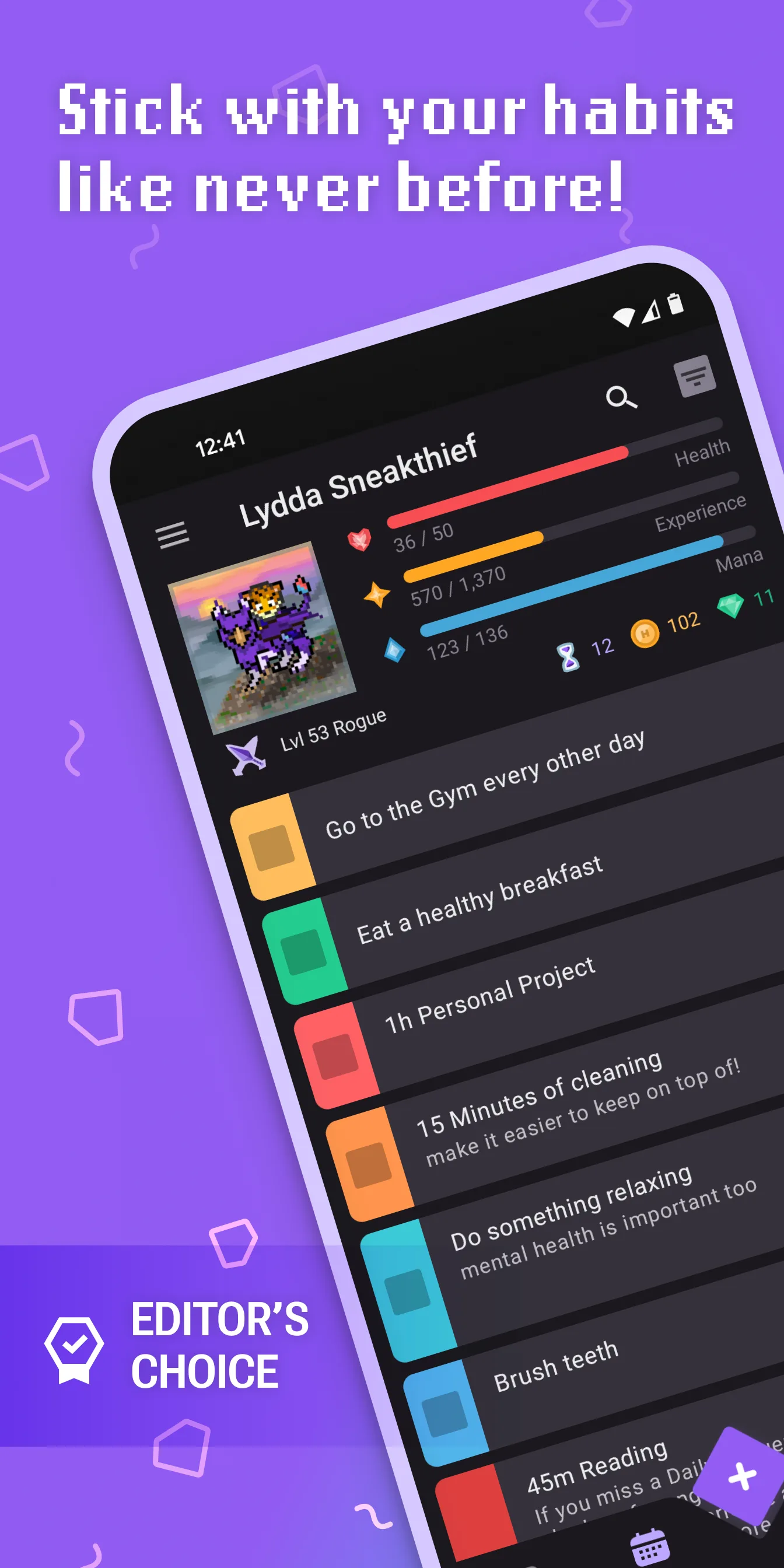
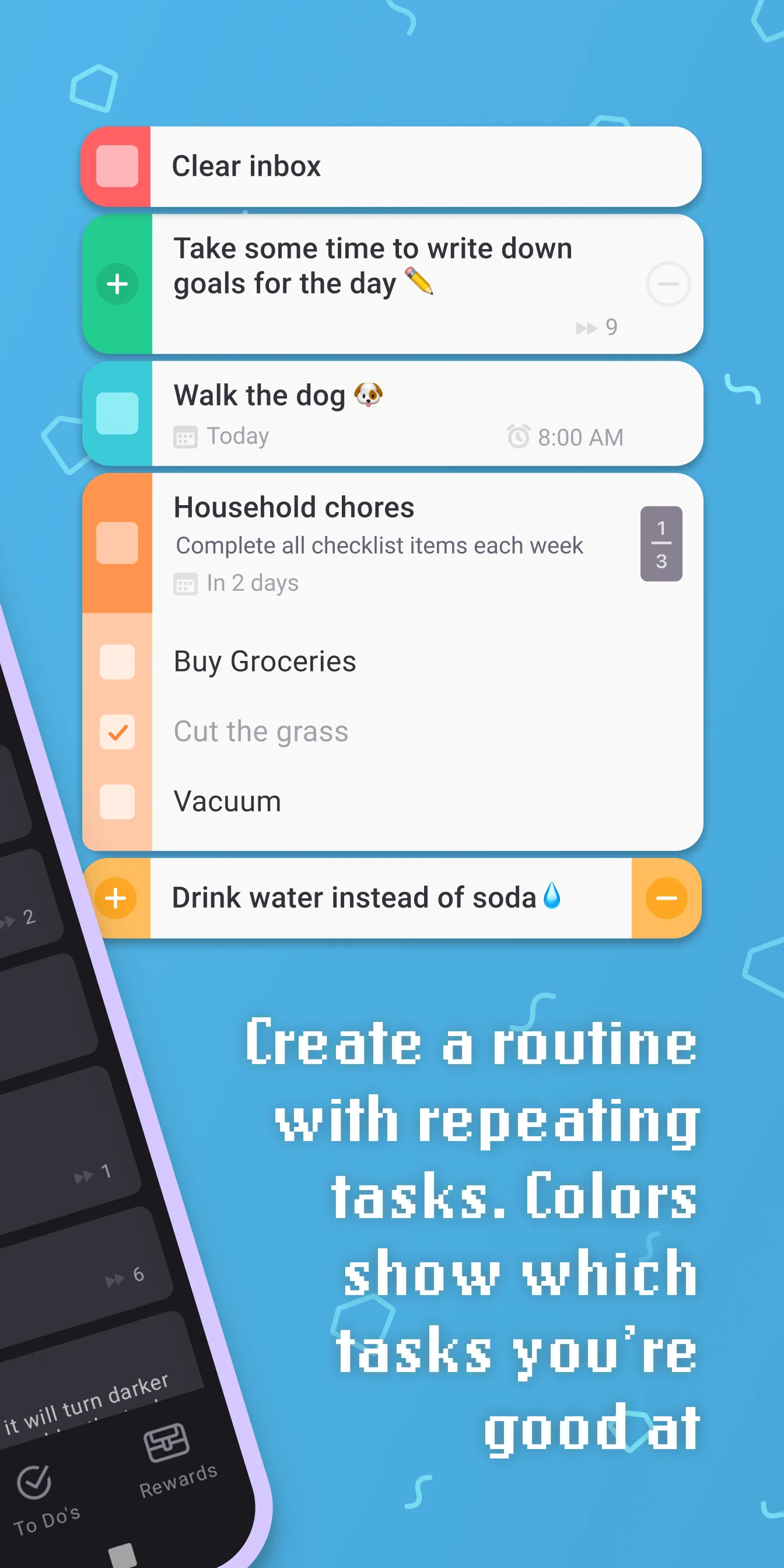
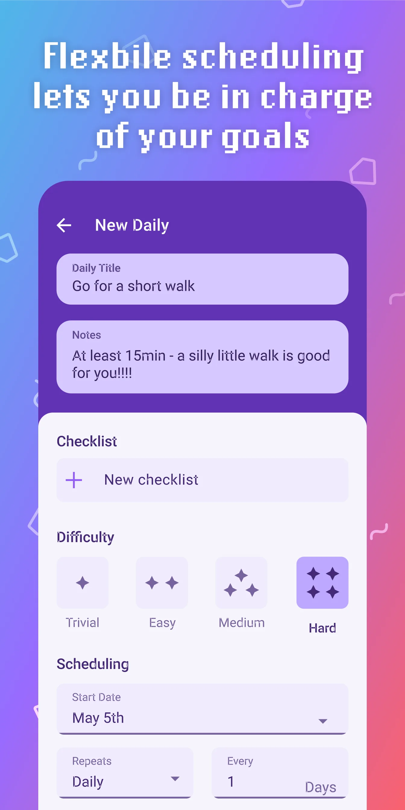
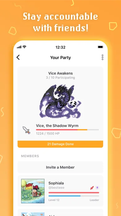
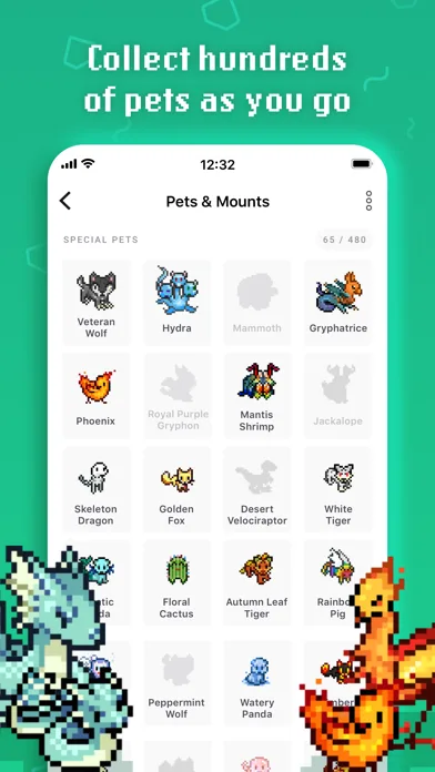
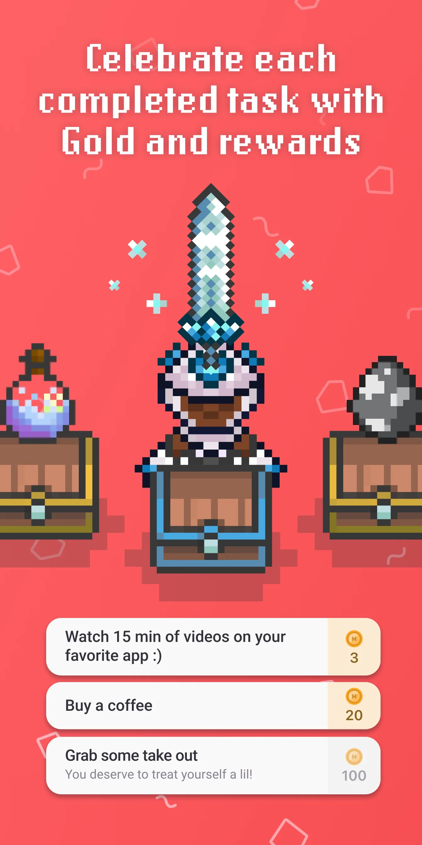
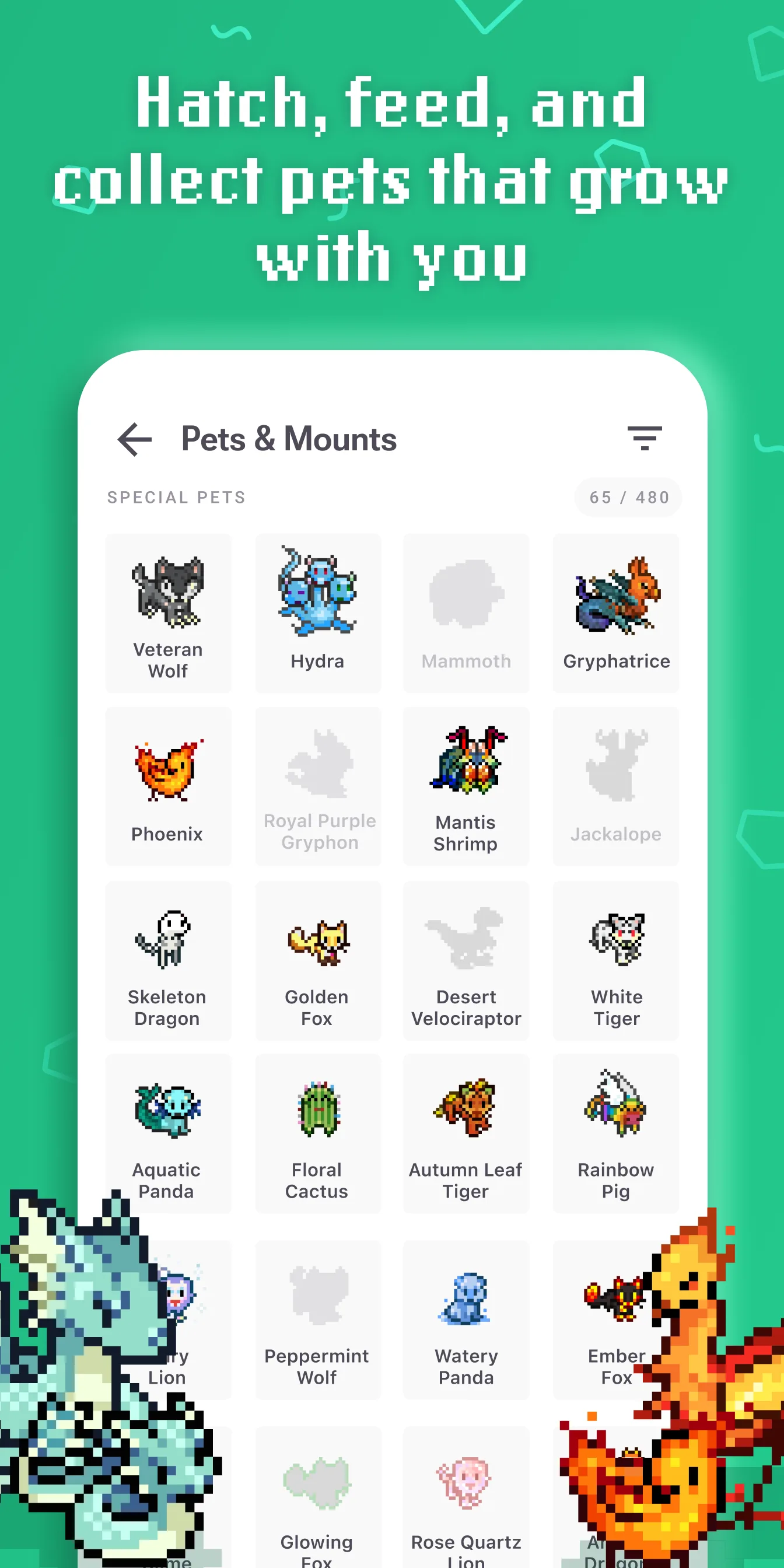
- HabiticaApp Store
 Play Store
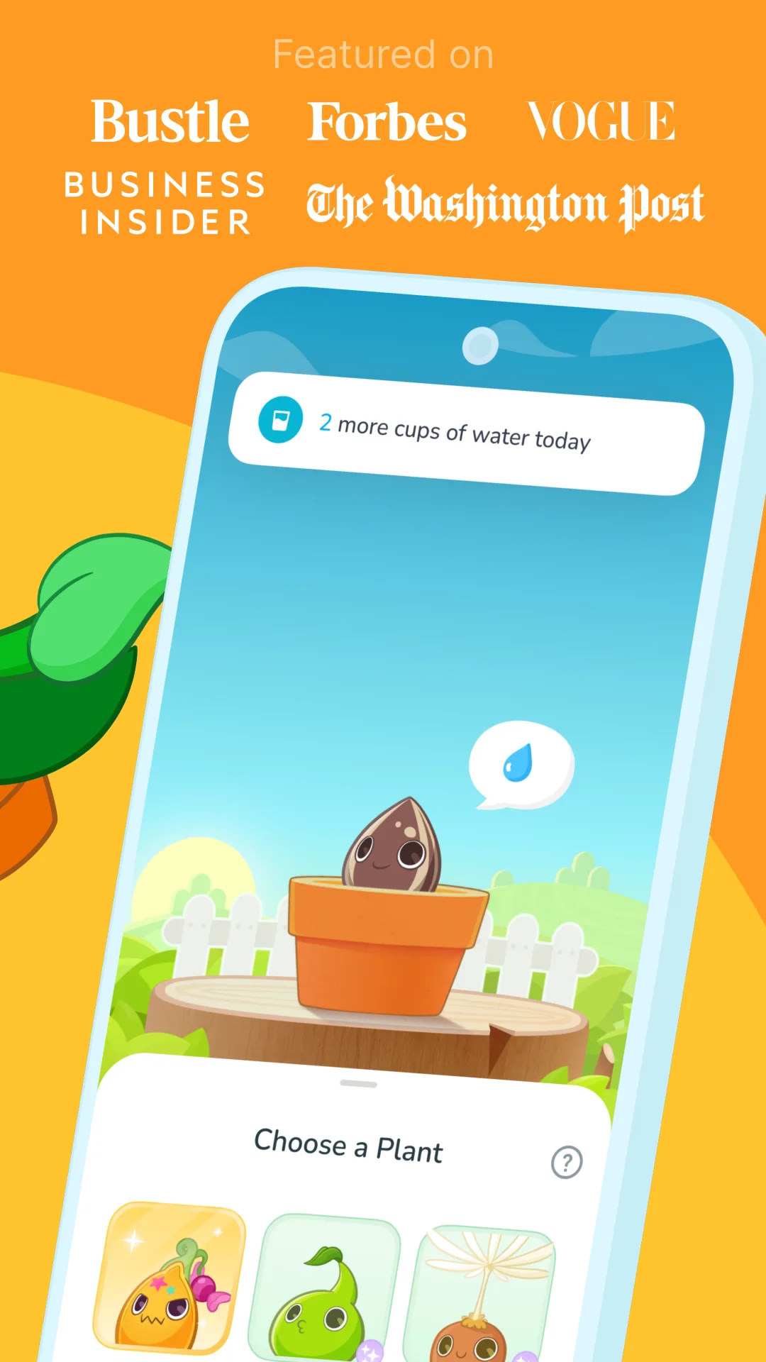
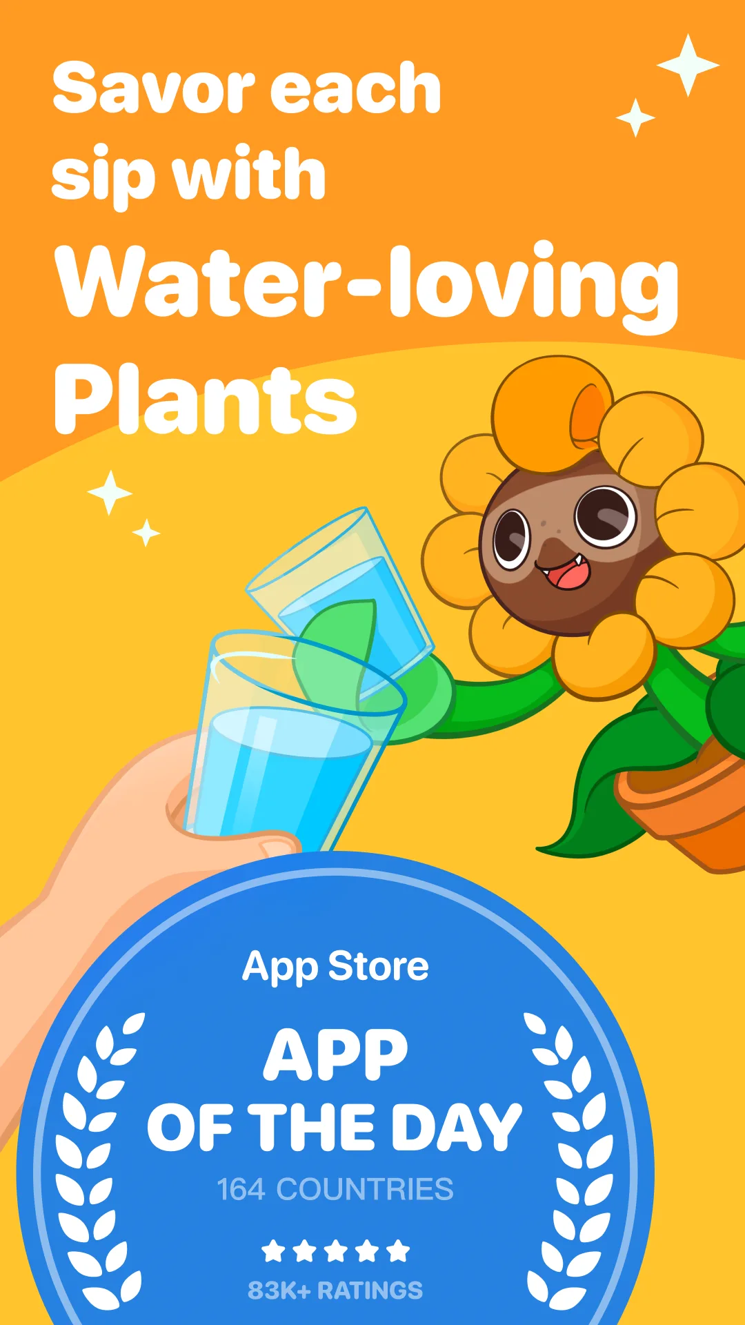
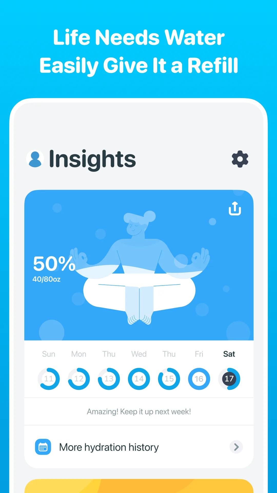
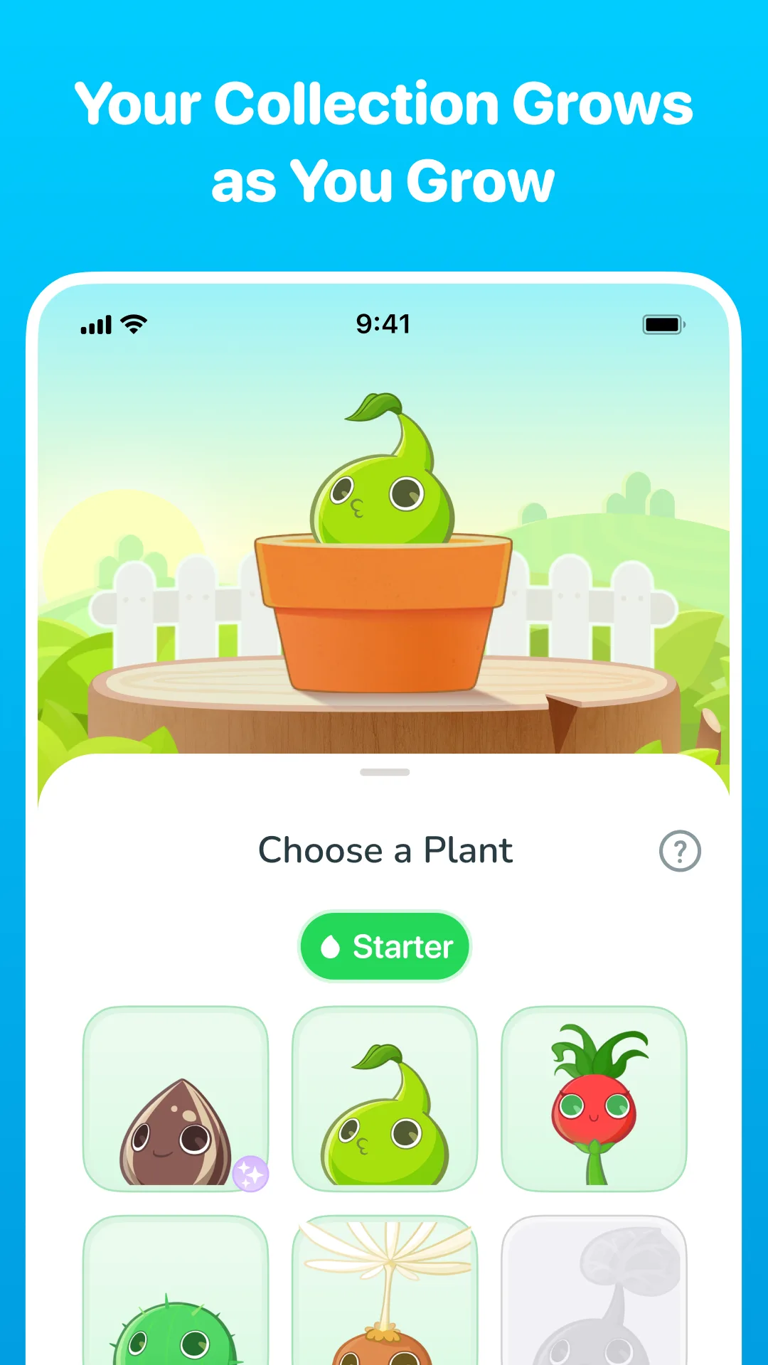
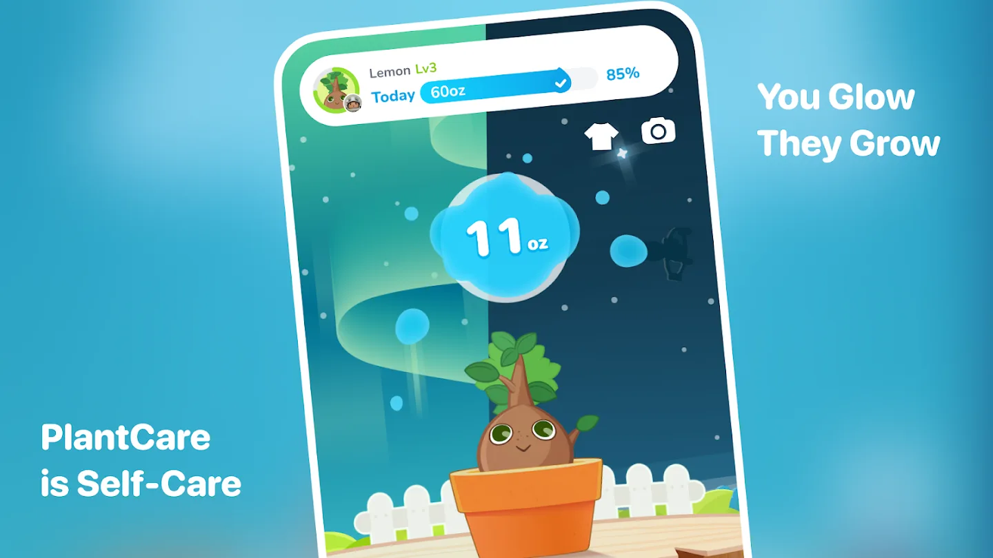
- Plant NannyApp Store


 Play Store
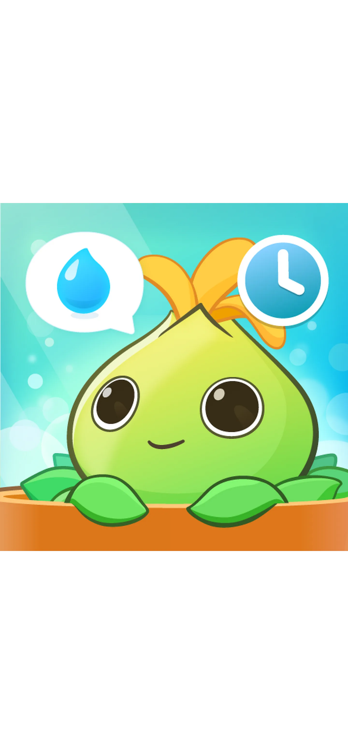

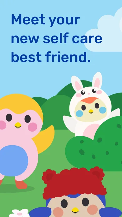
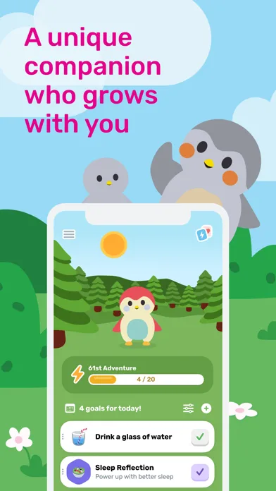
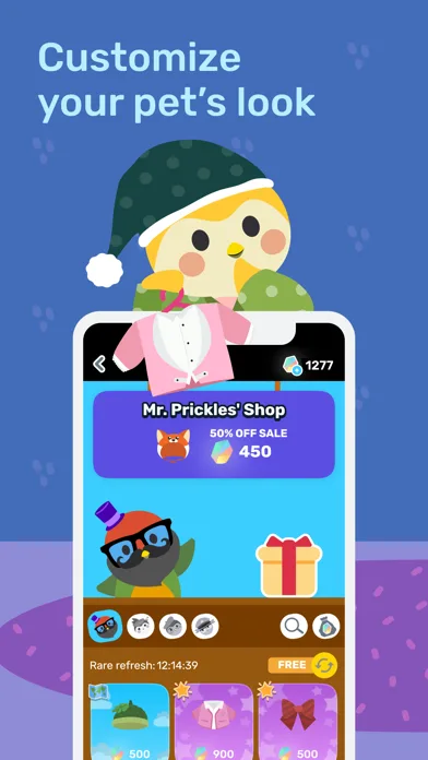
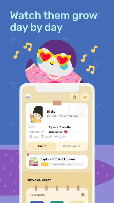
- FinchApp Store
 Play Store


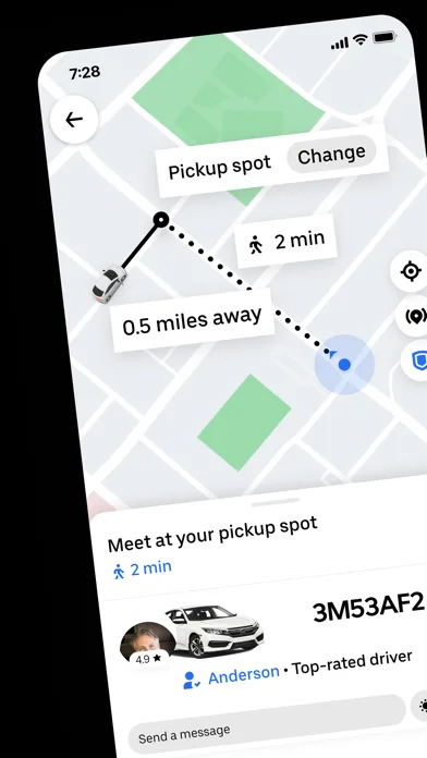
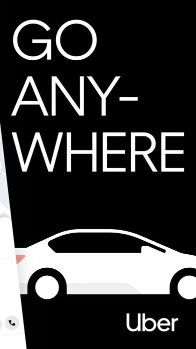
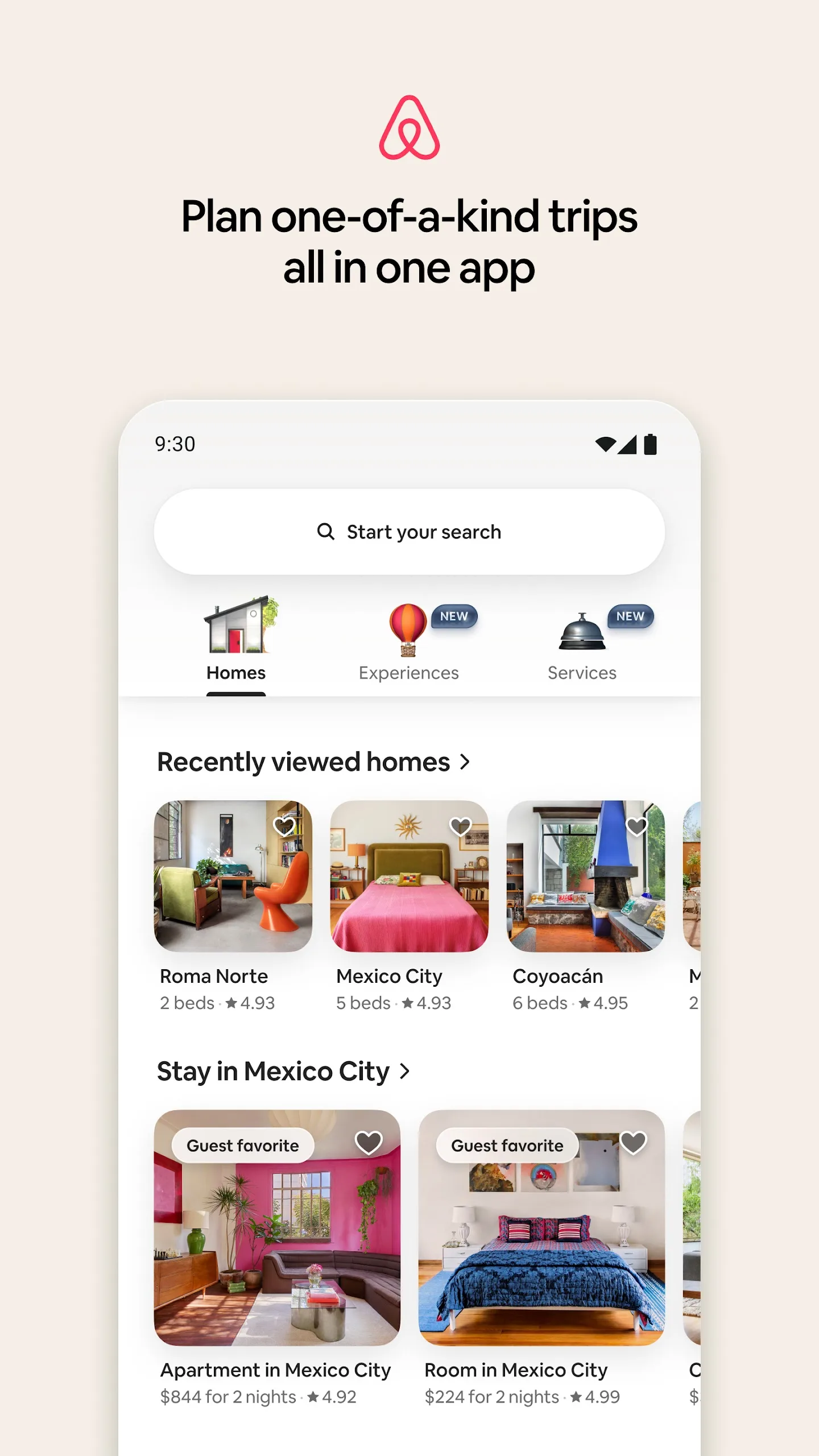
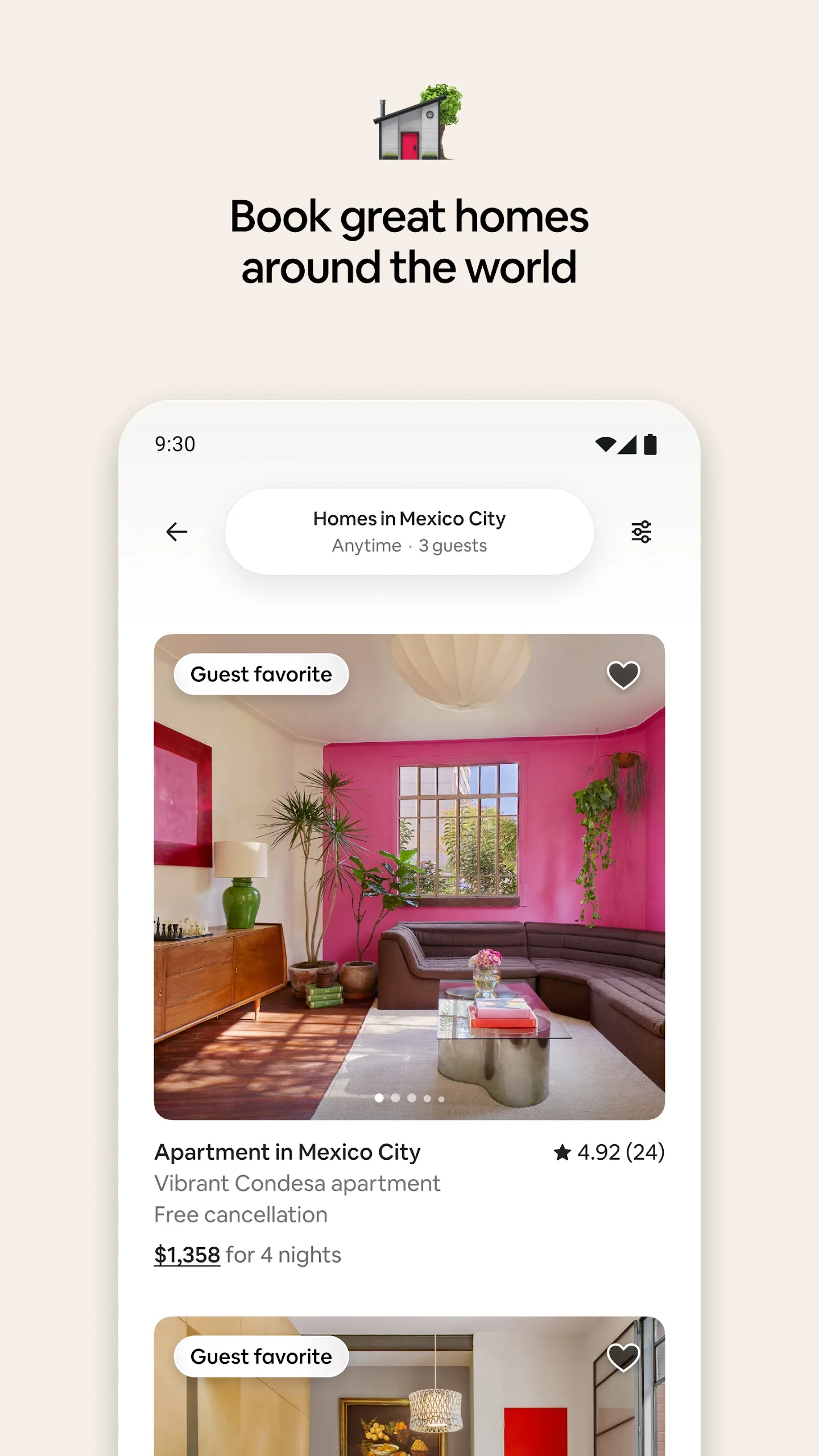
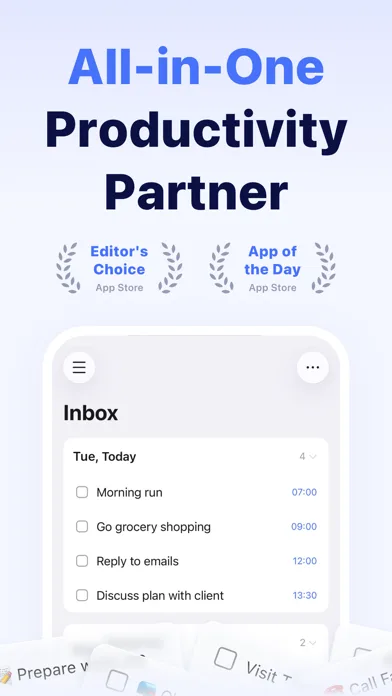
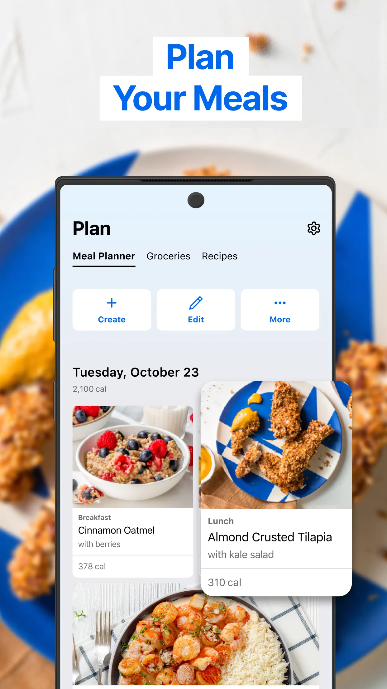
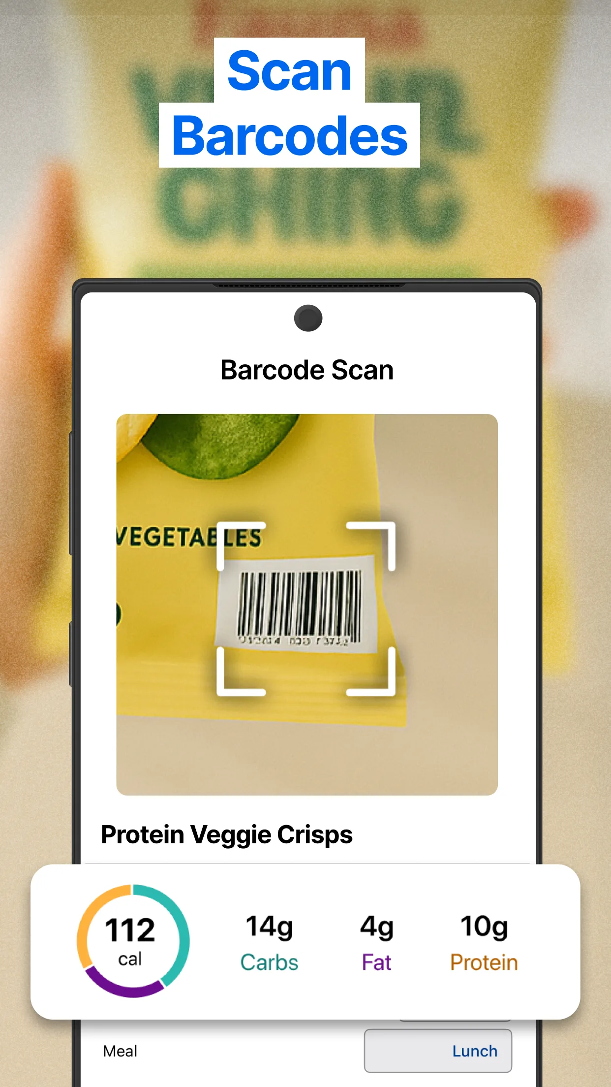
Feature-focused (ASO-heavy)
Clear benefits per slide, UI-first proof, and direct copy. Great references for conversion-oriented screenshot sets.
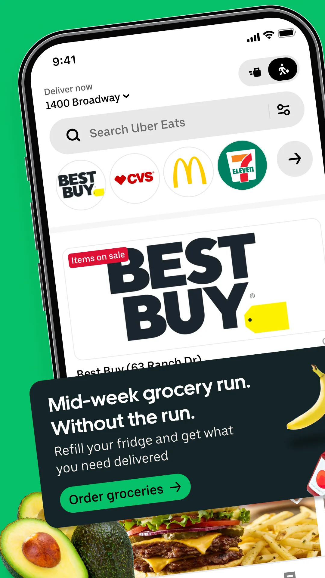
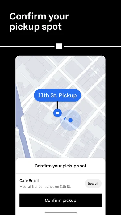
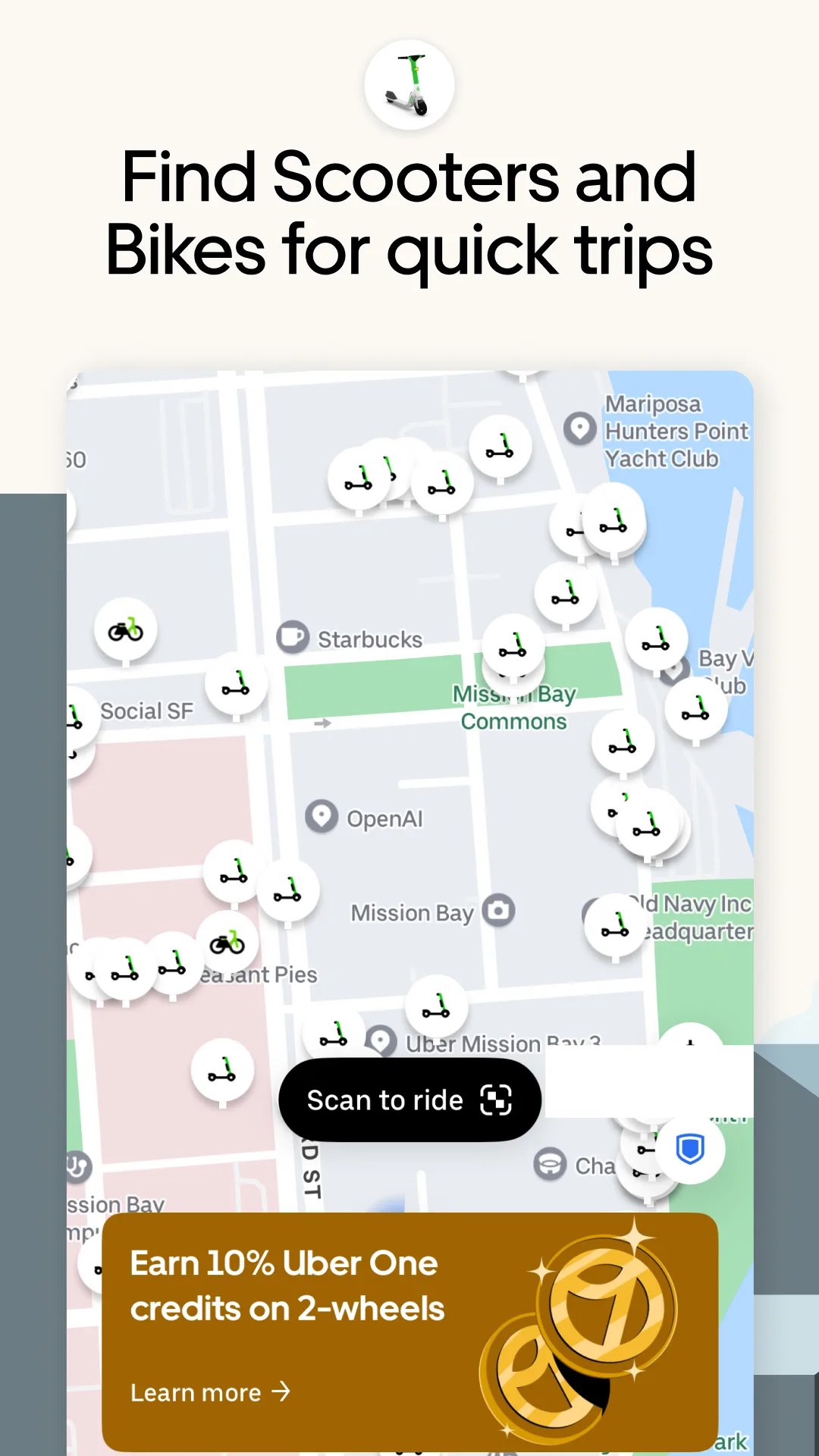
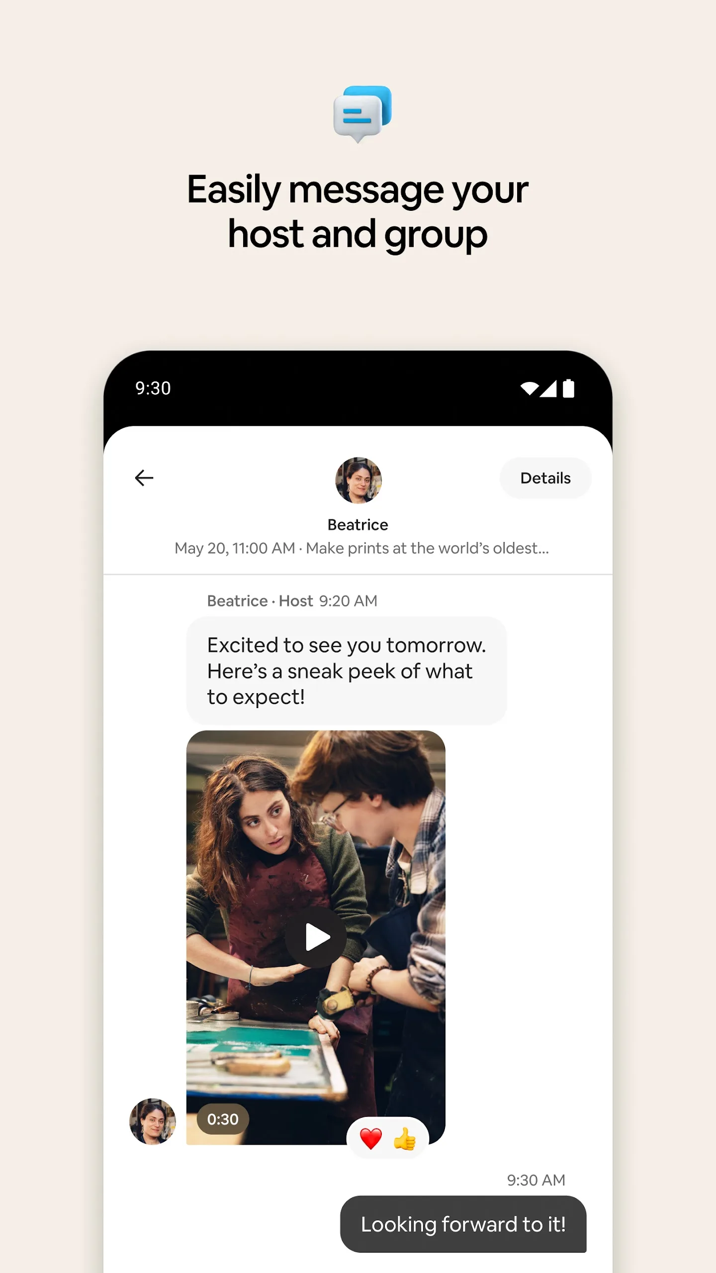
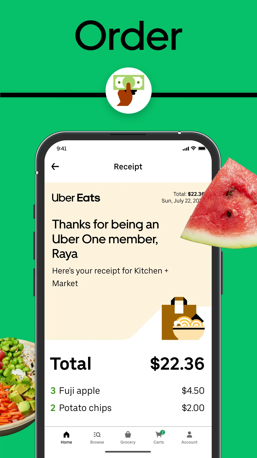
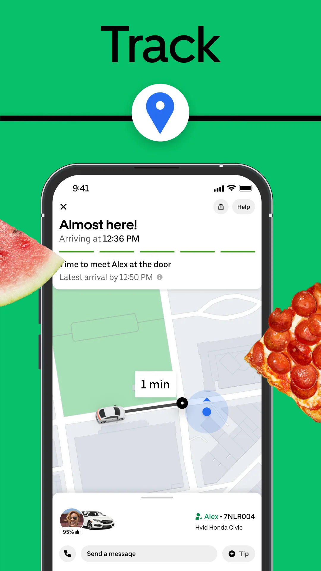
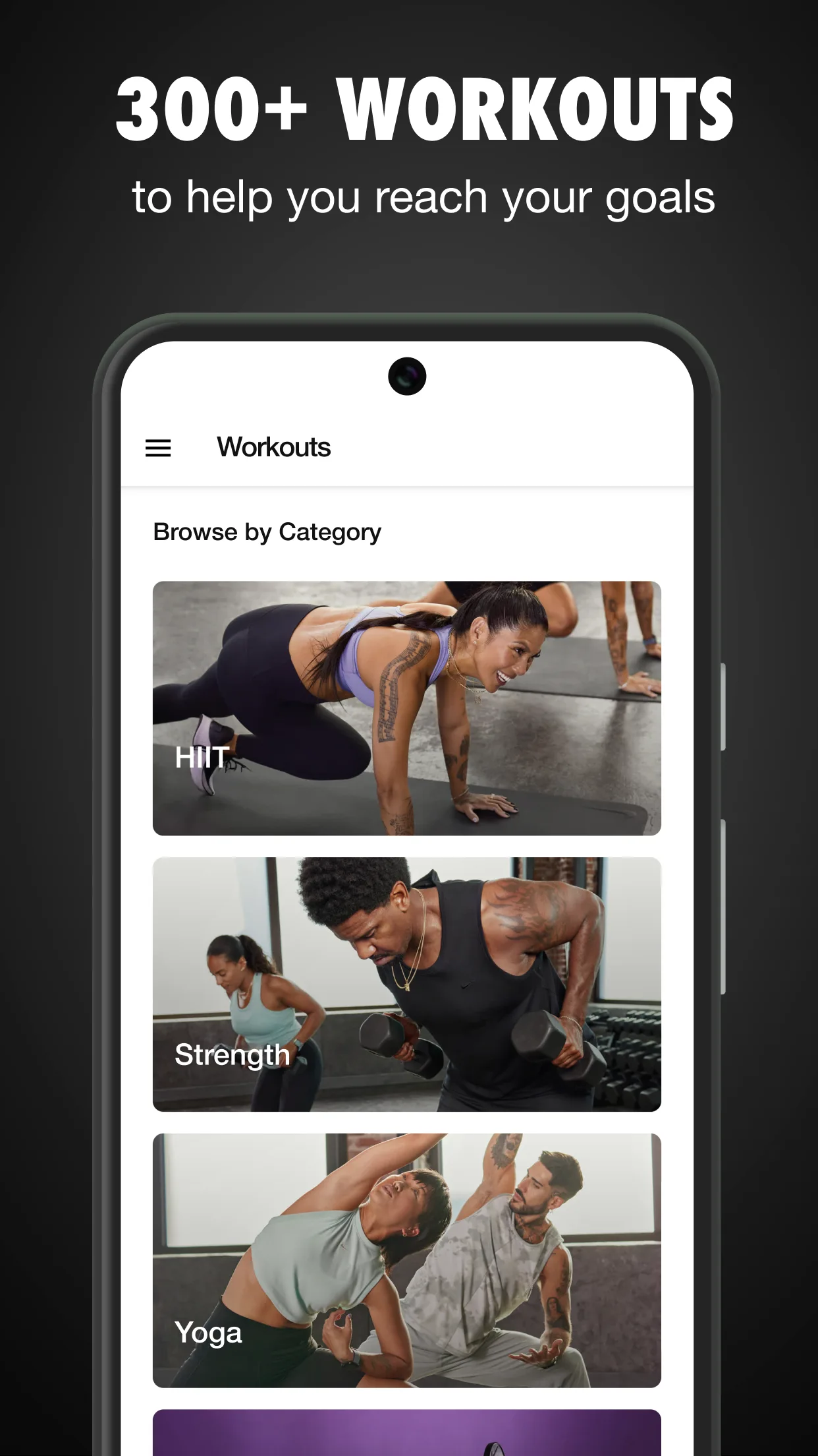
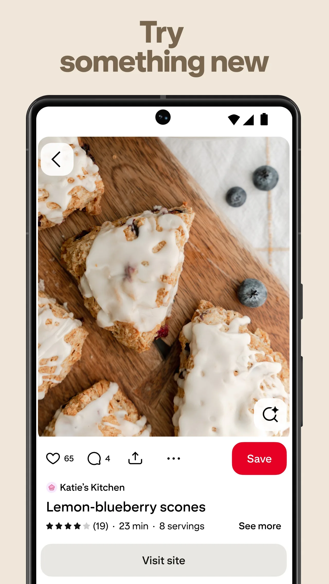
- UberApp Store
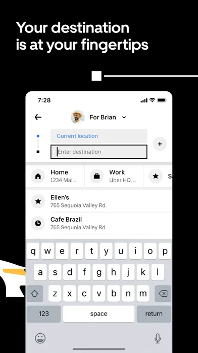
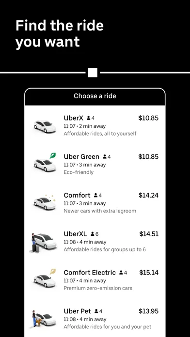 Play Store

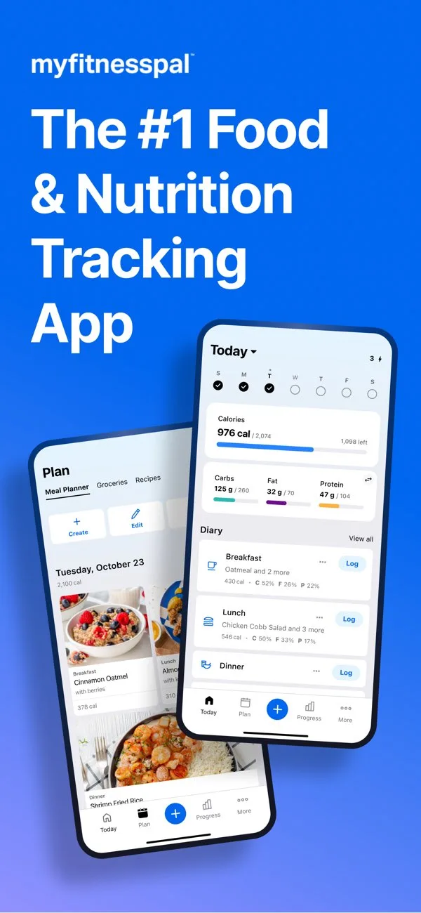
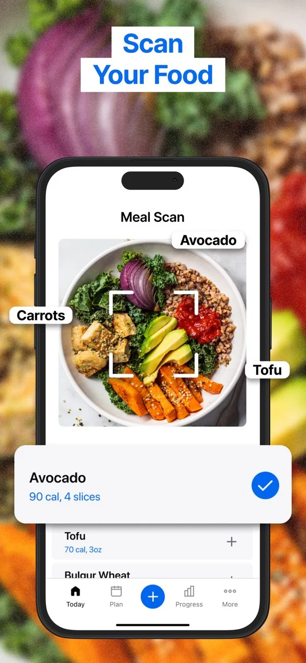
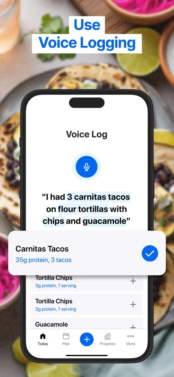
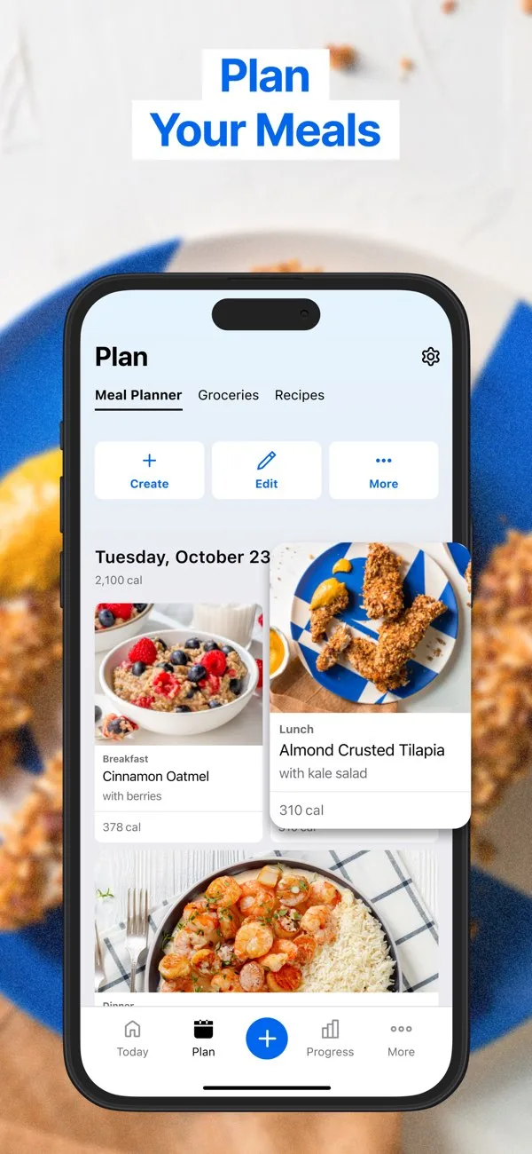
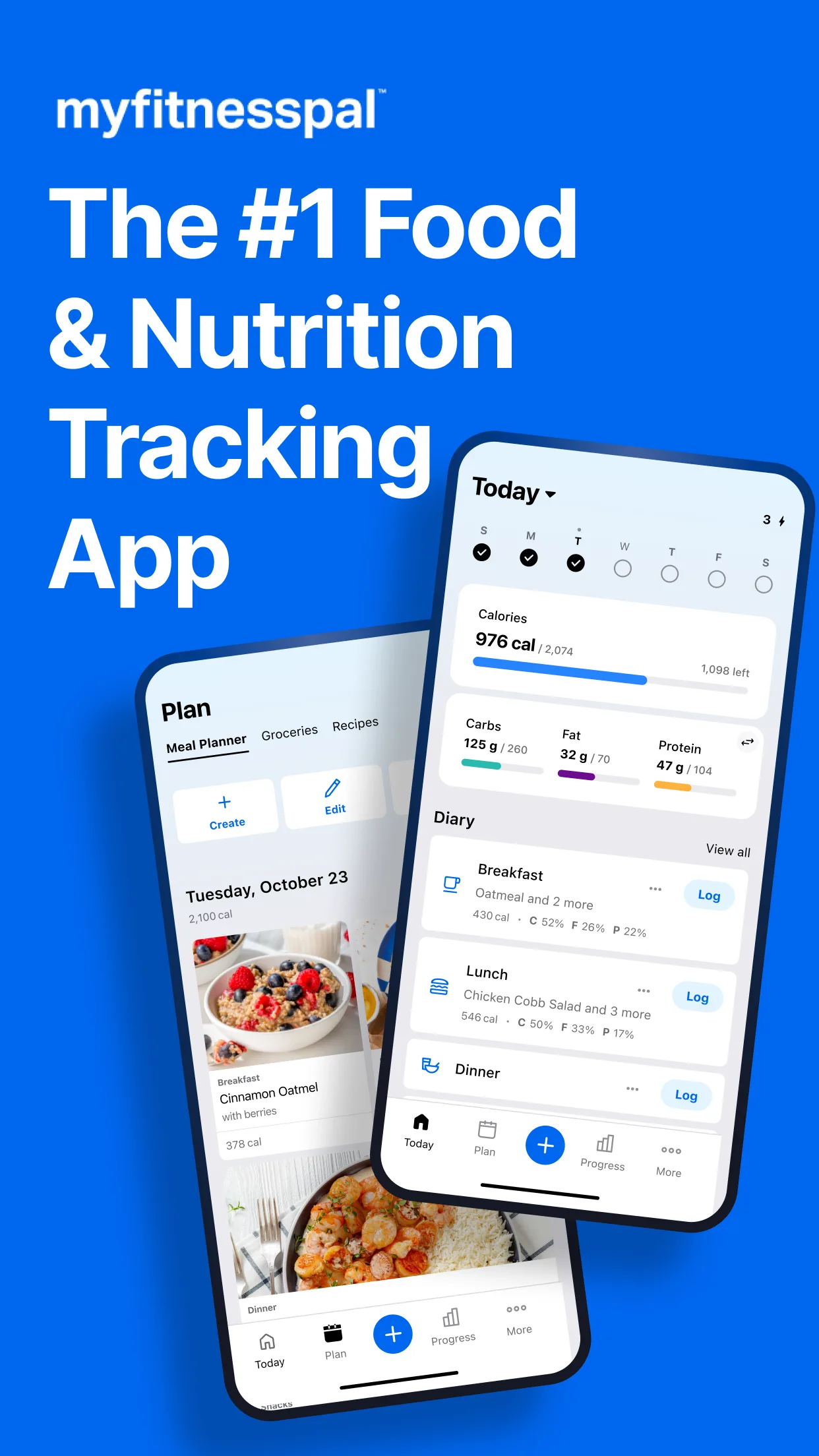
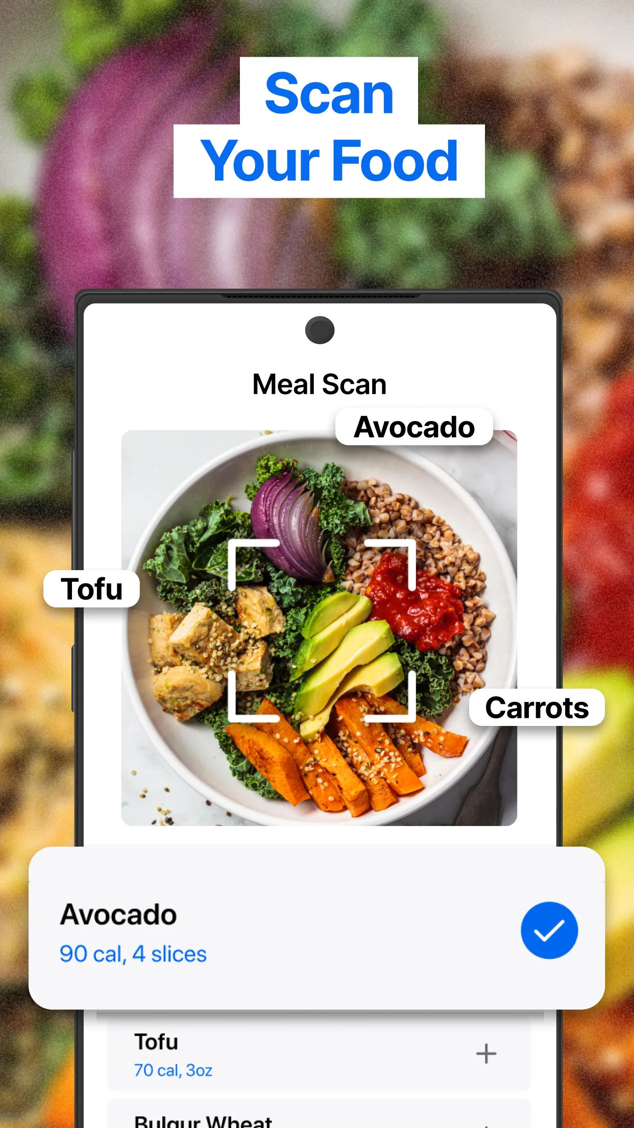
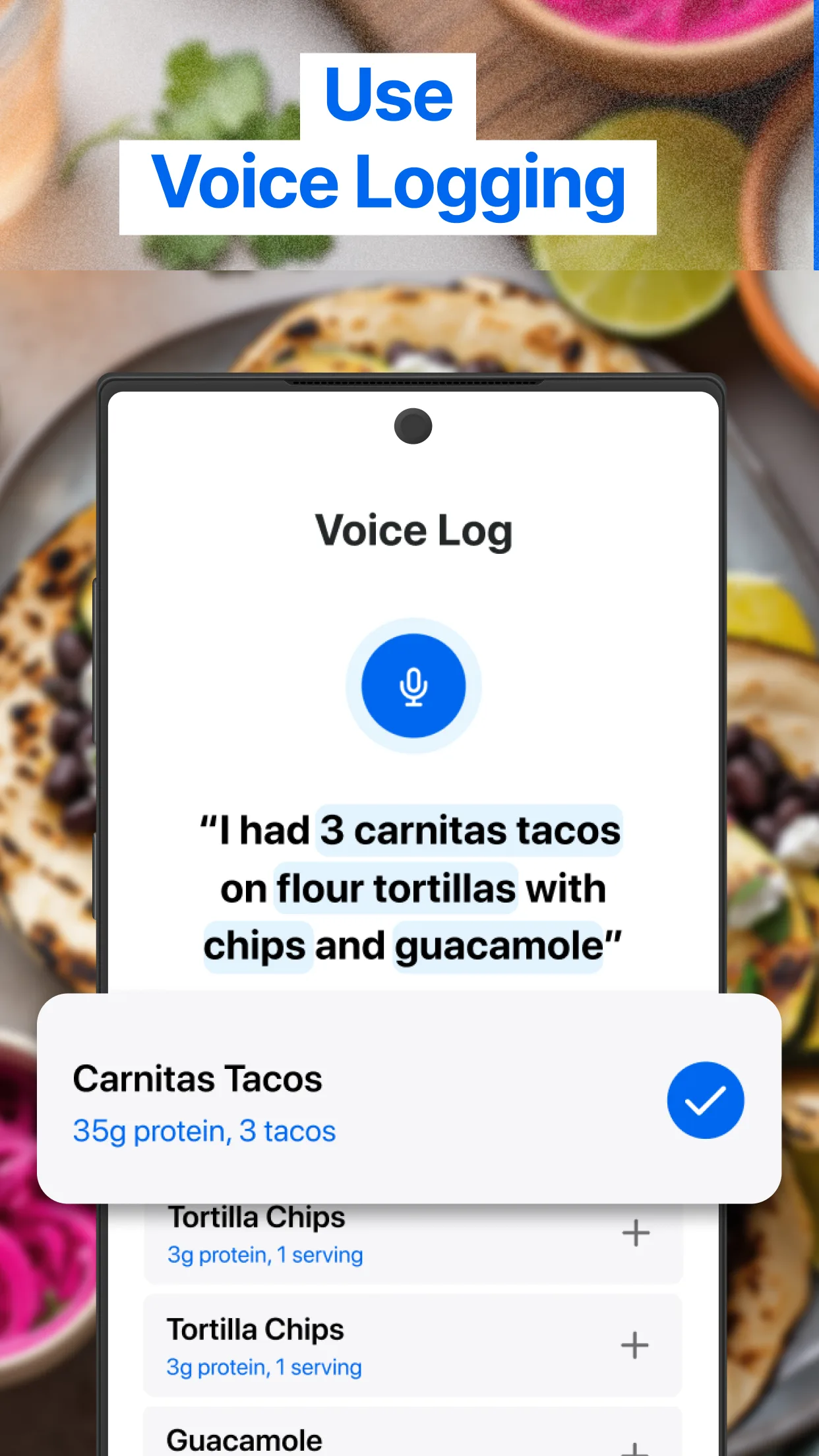
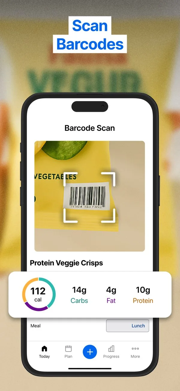
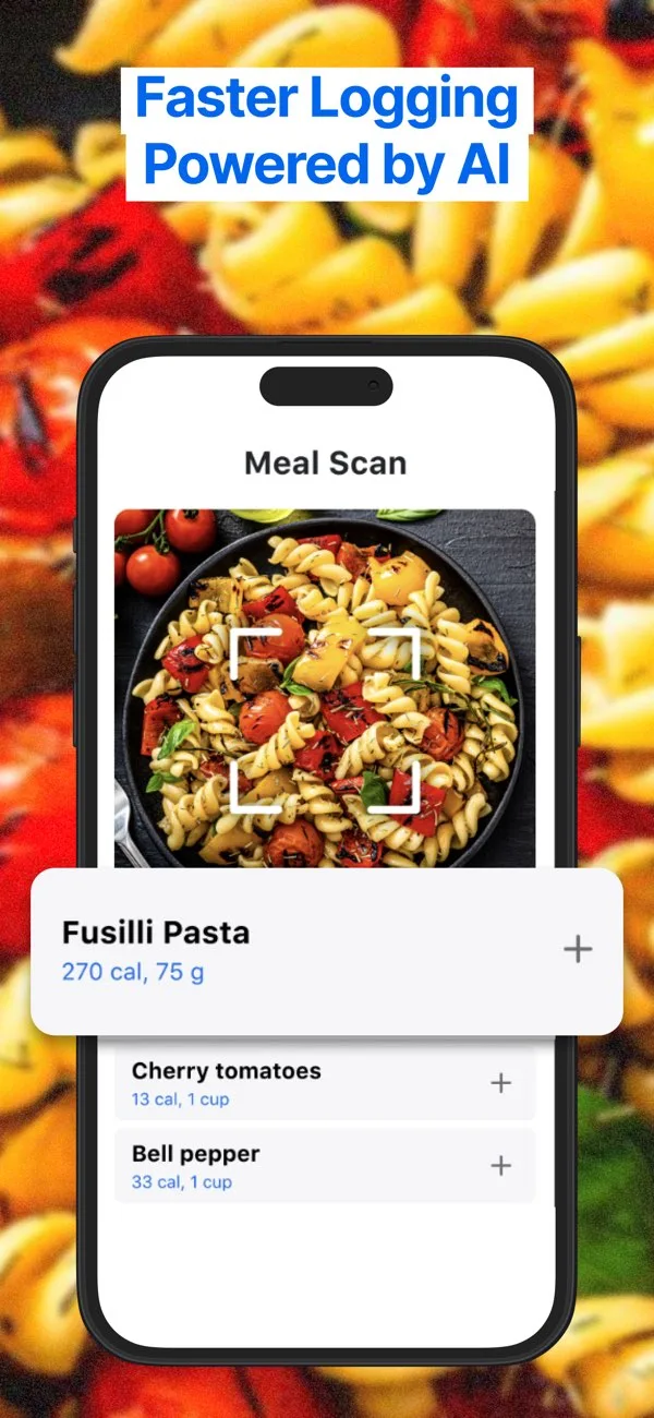
- MyFitnessPalApp Store
 Play Store
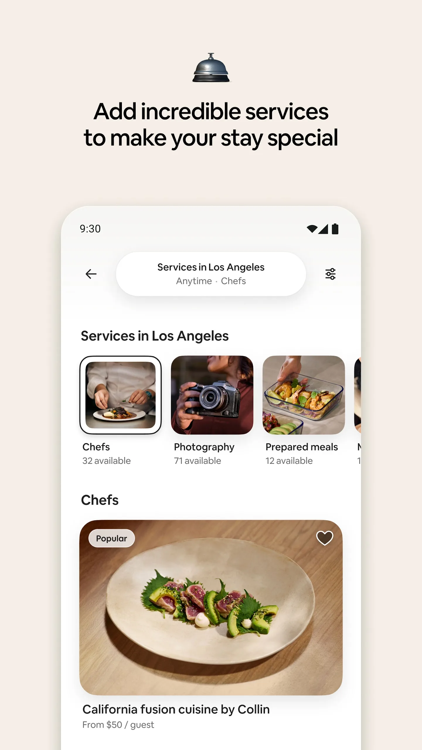
- AirbnbApp Store
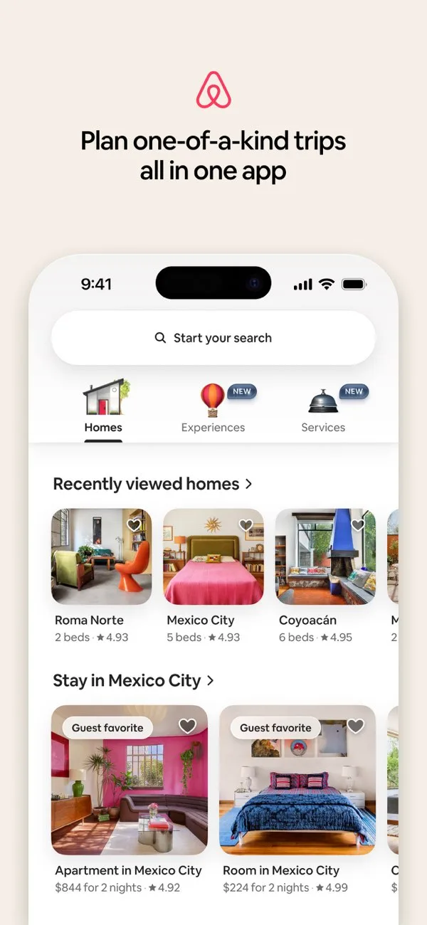
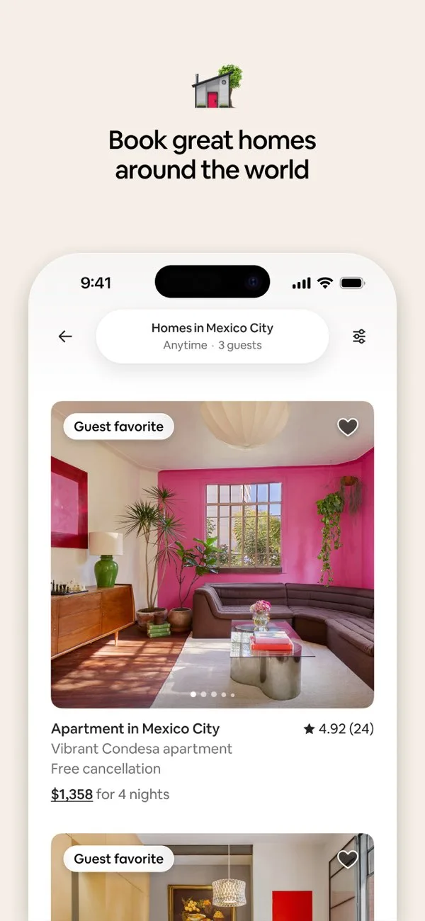
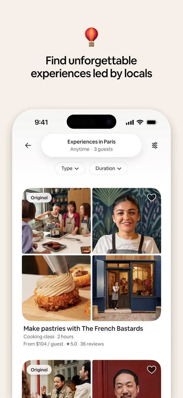
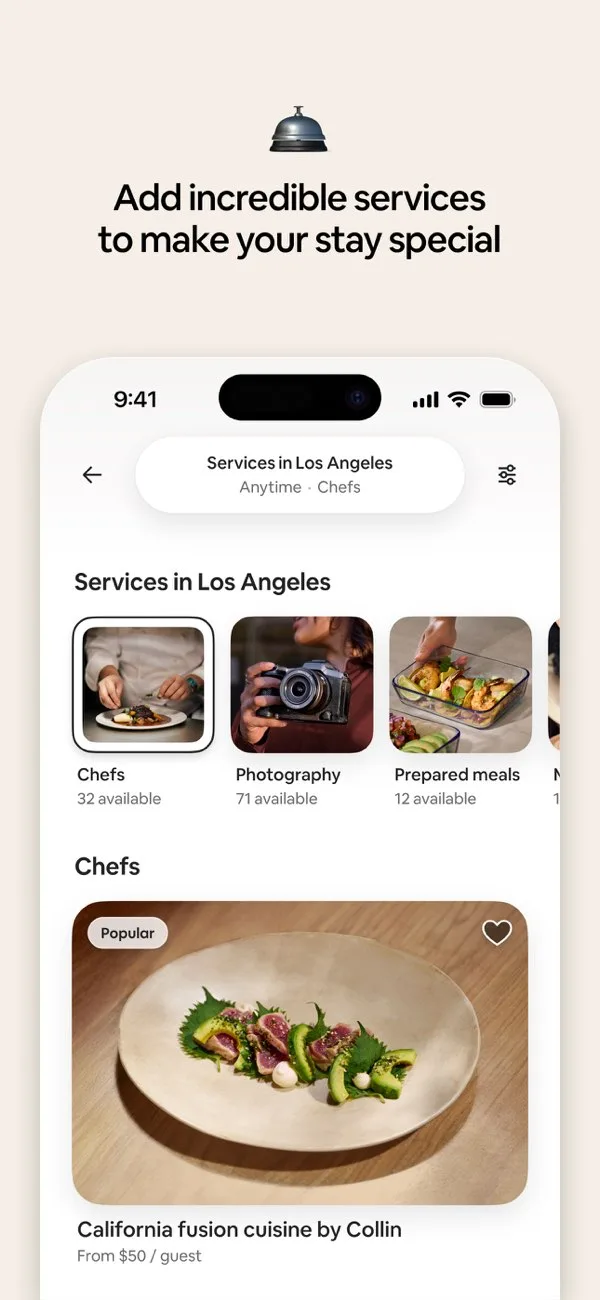 Play Store
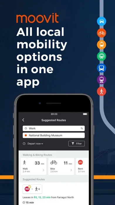
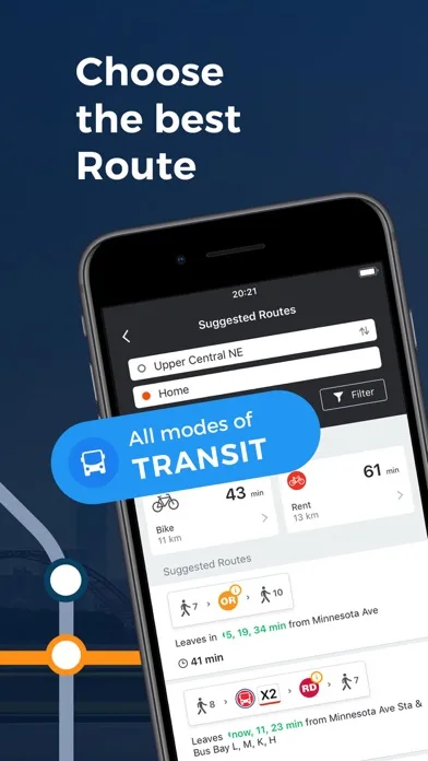
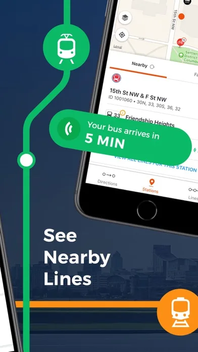
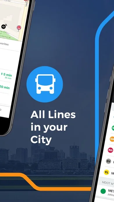
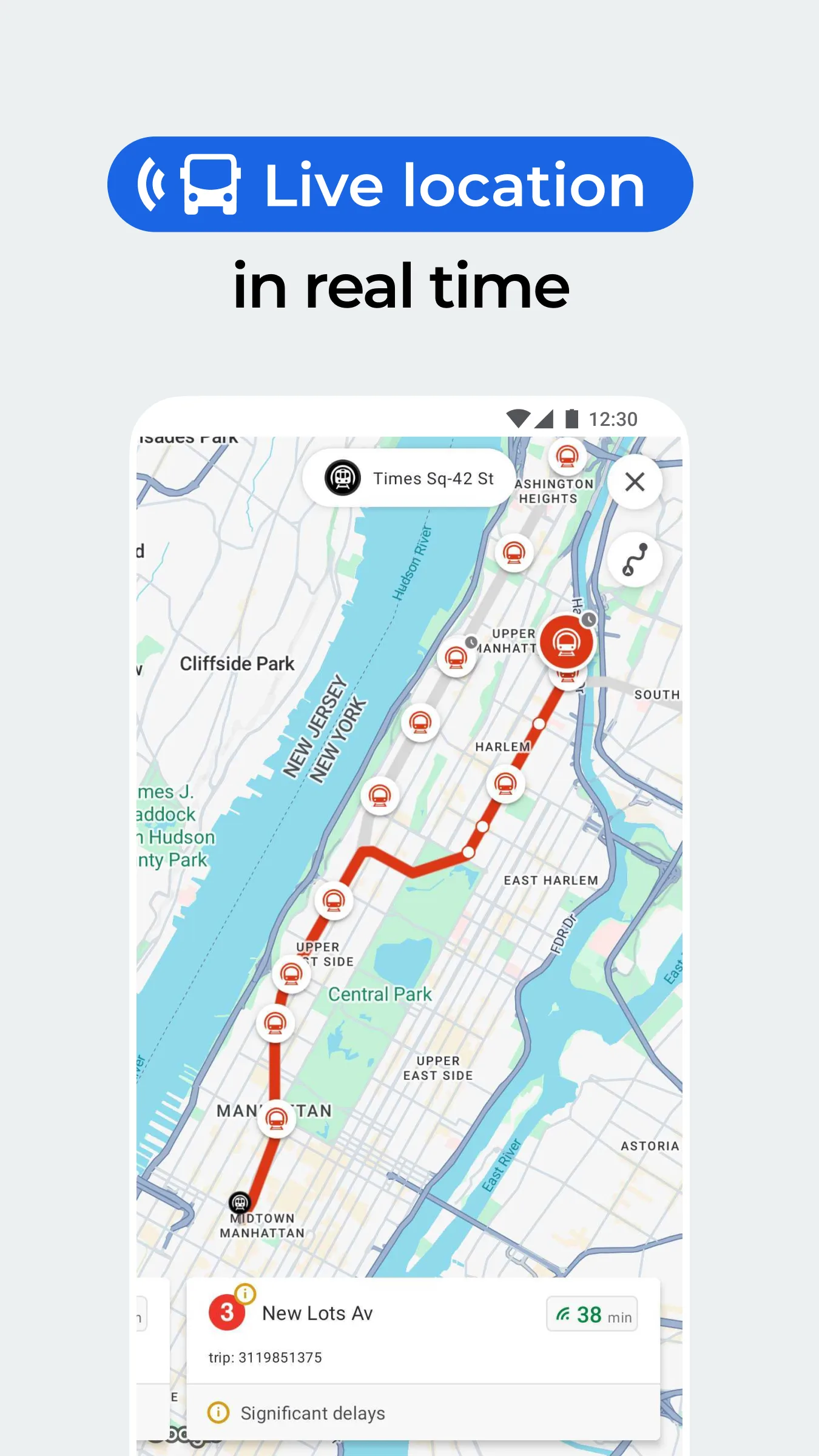
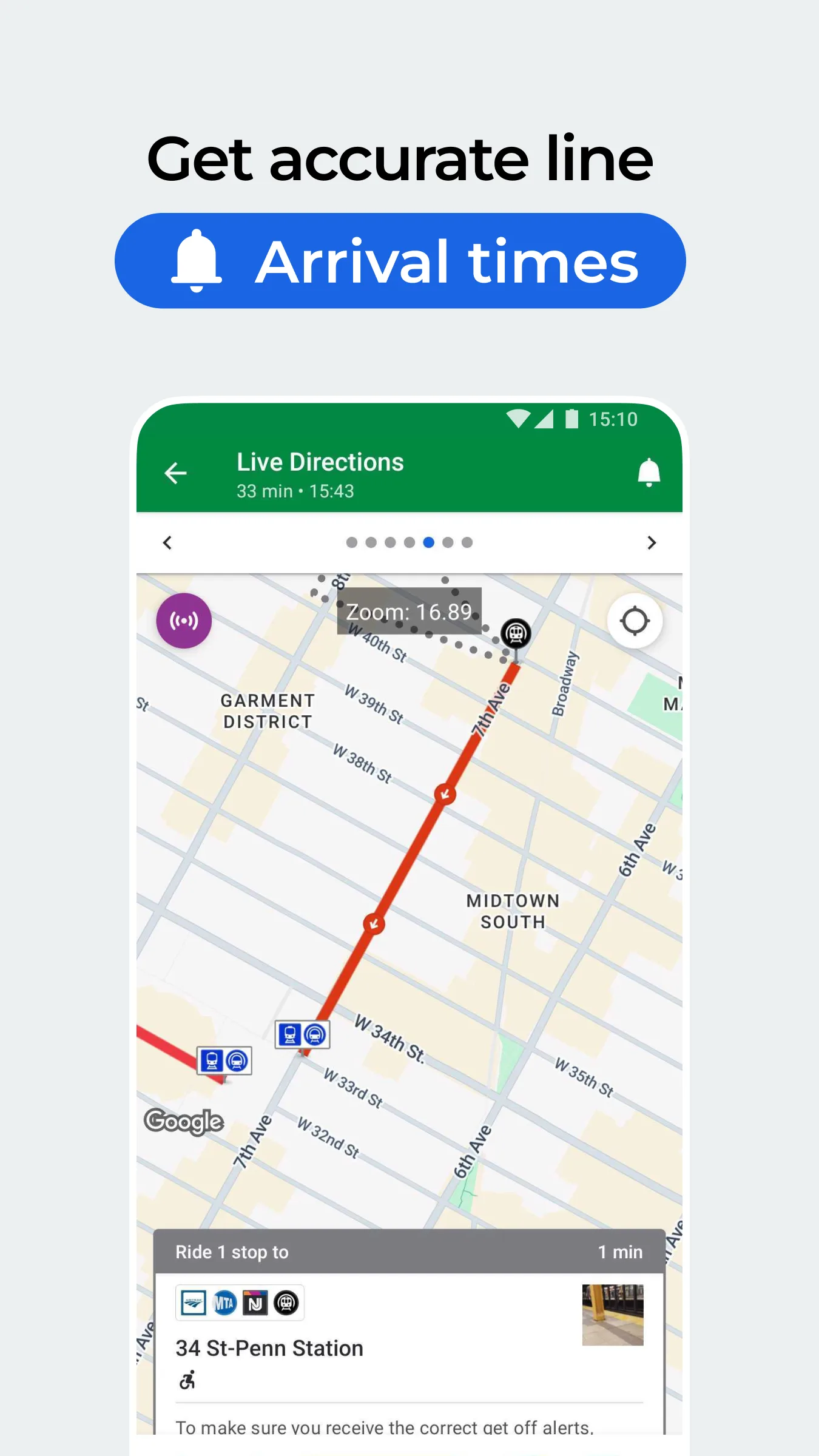
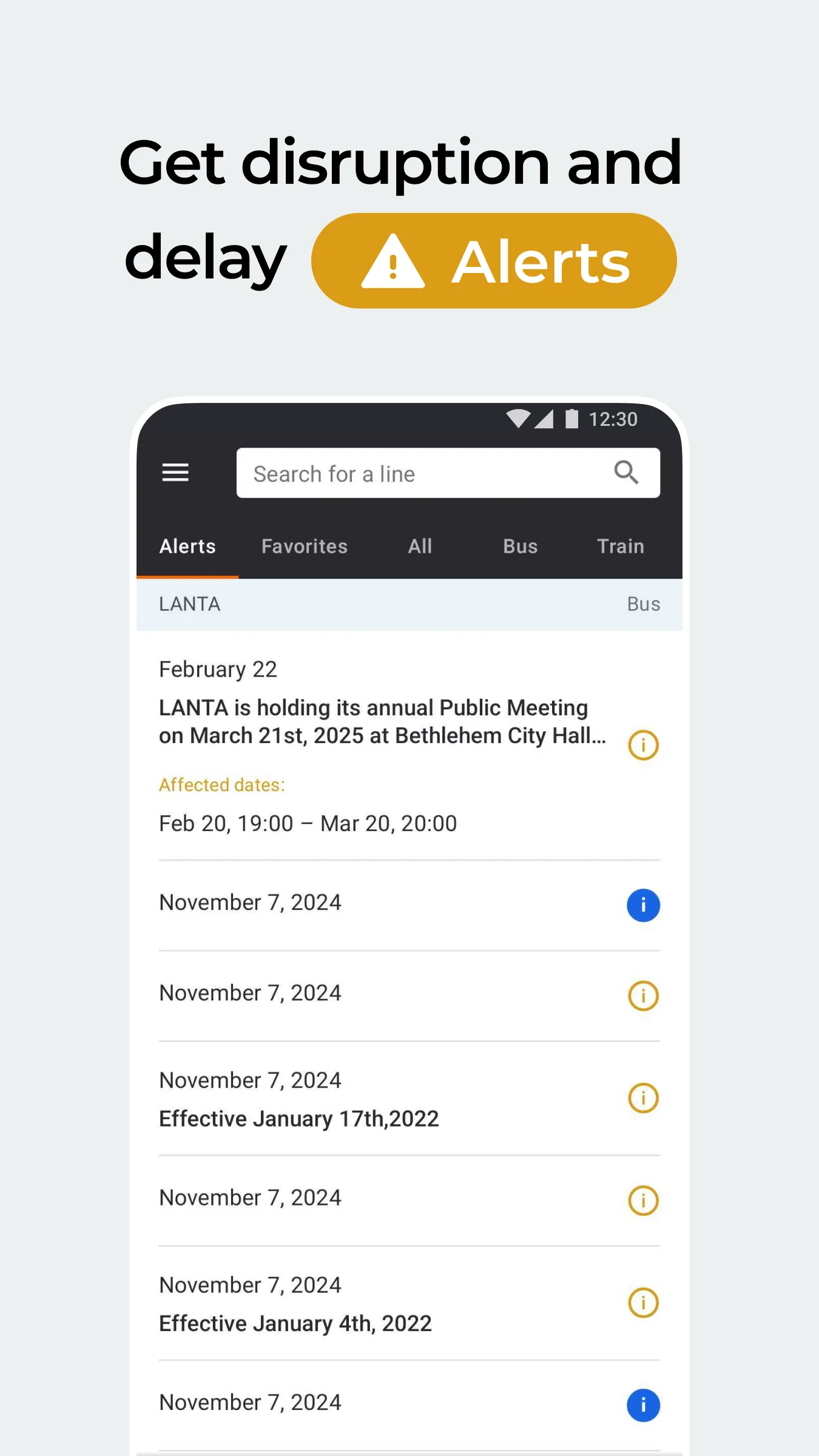
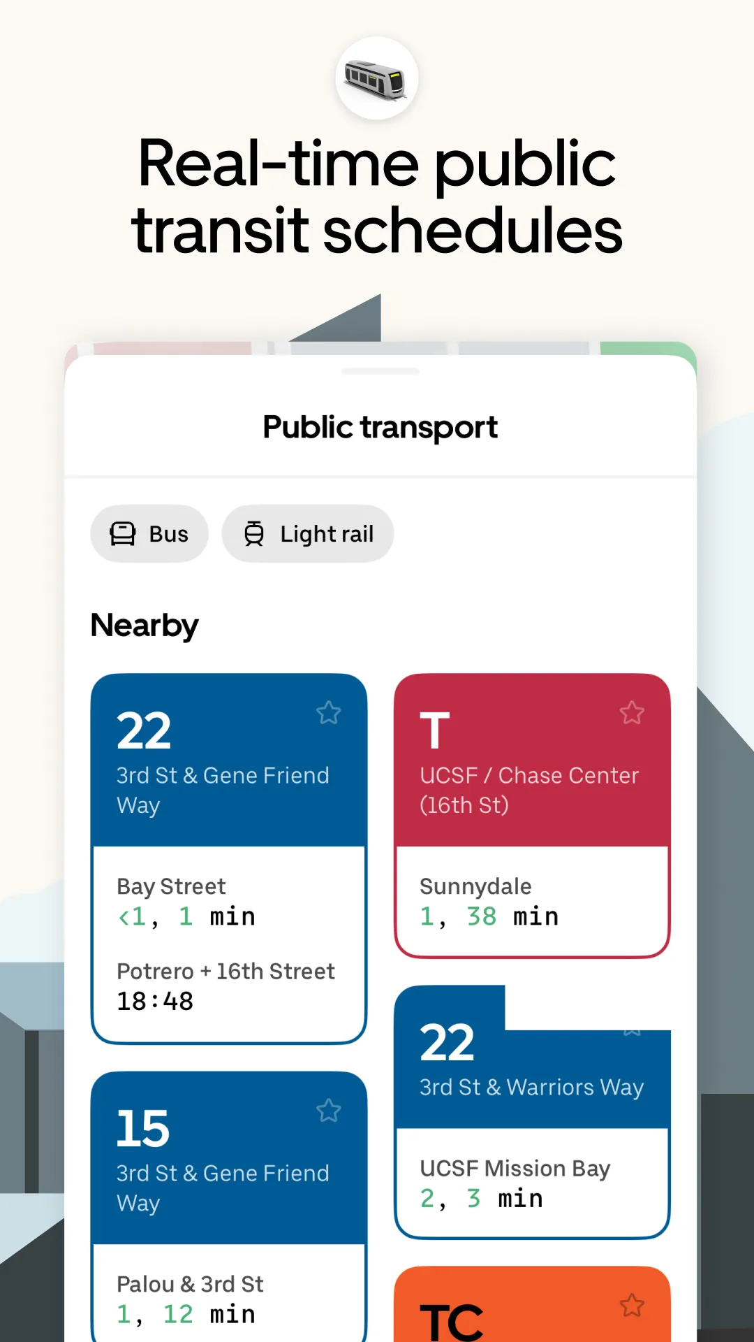
- MoovitApp Store
 Play Store
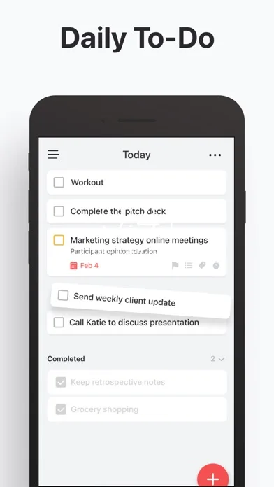
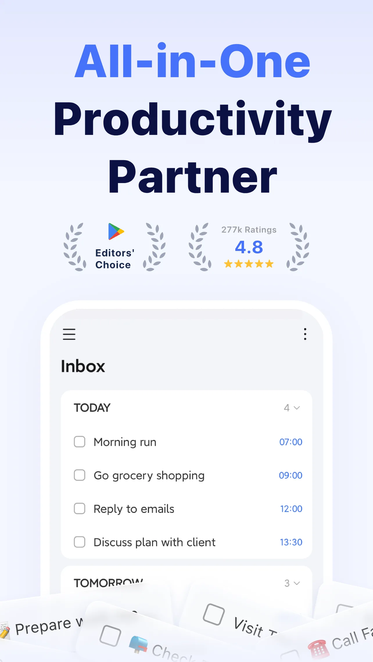
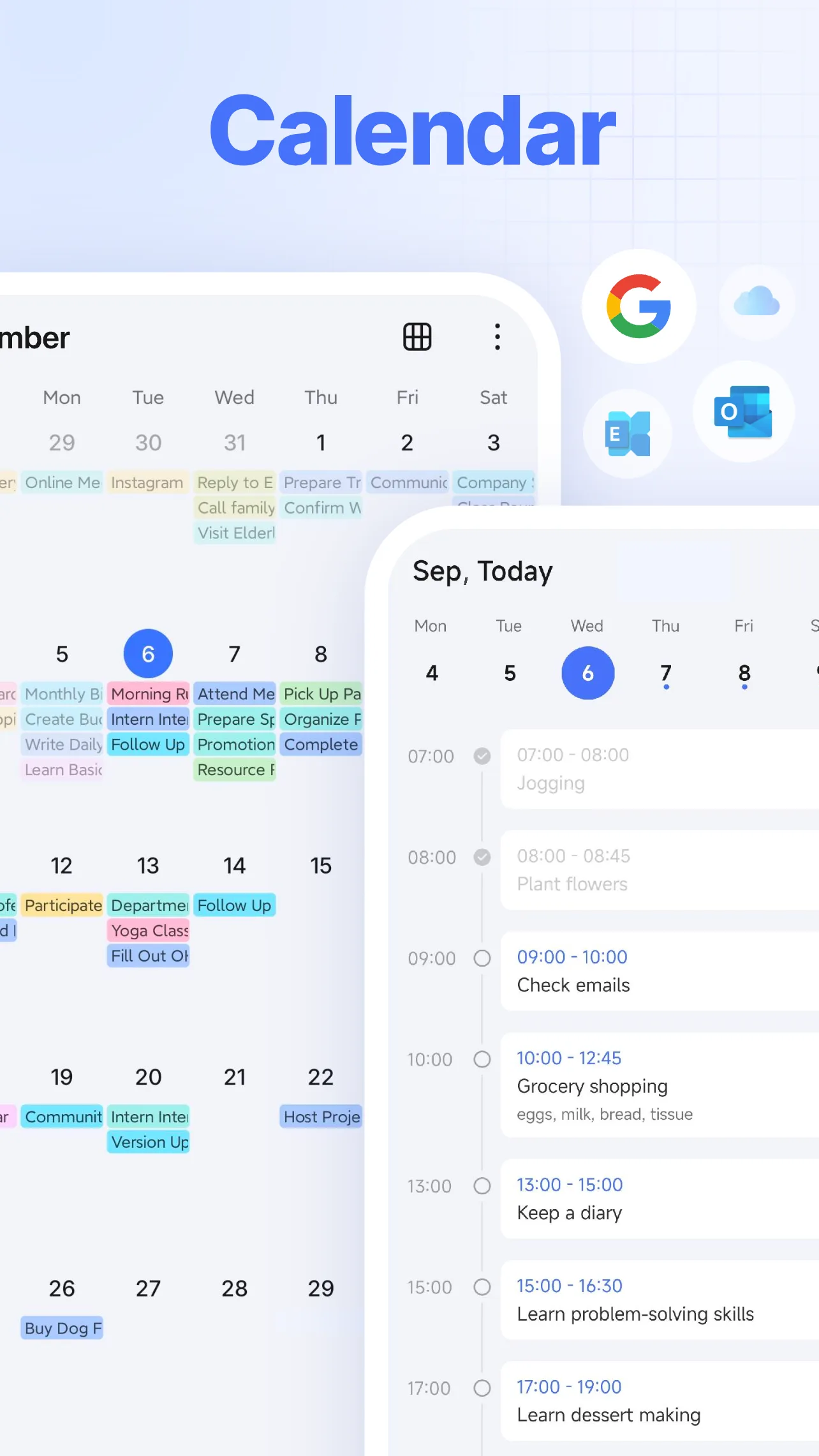
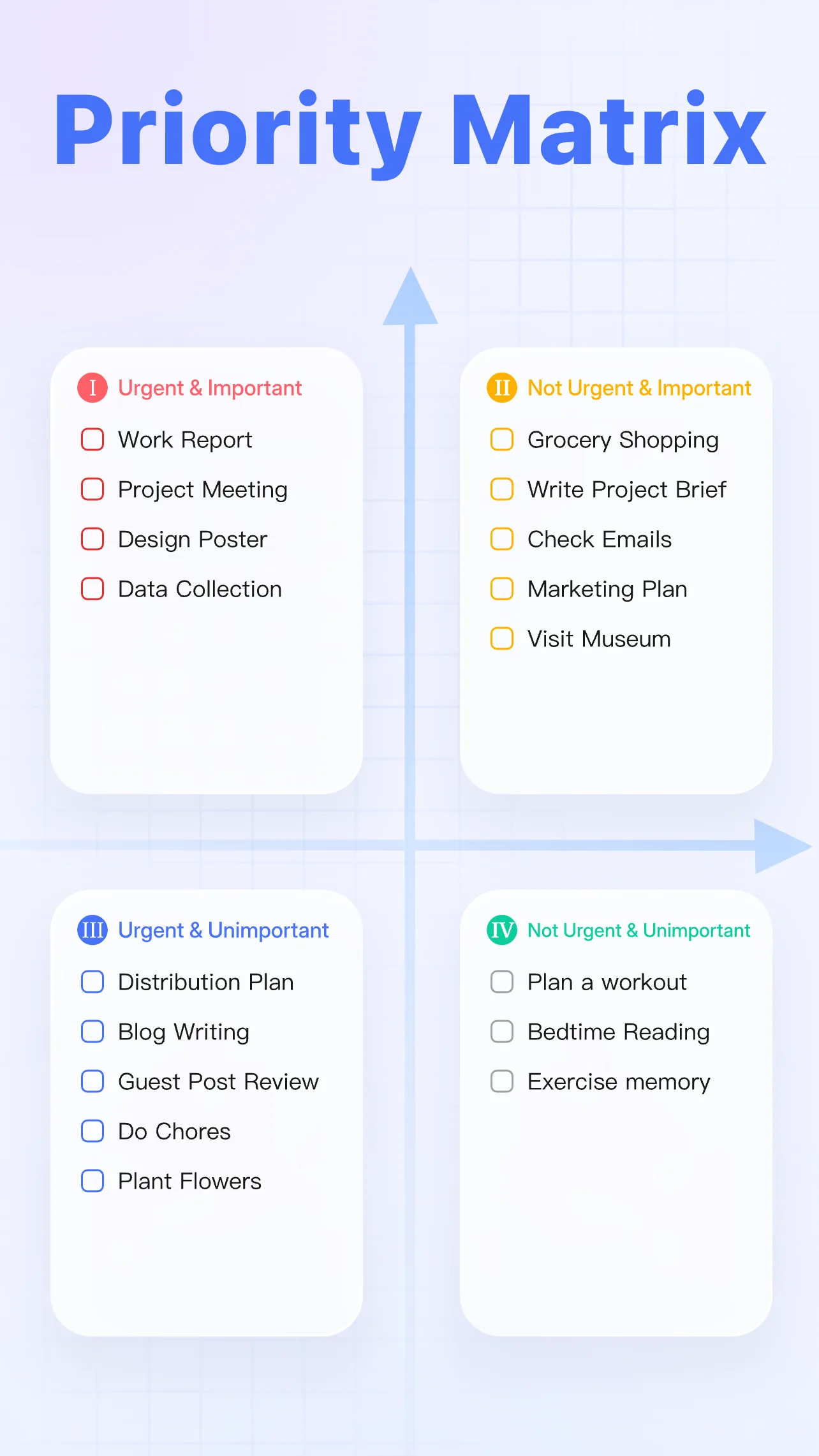
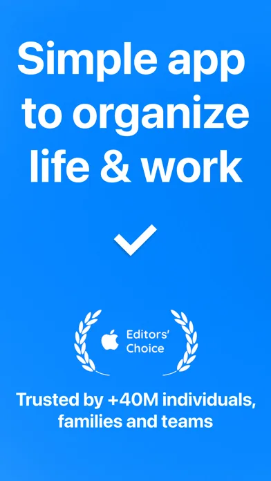
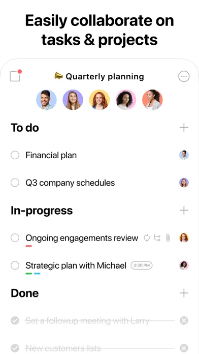
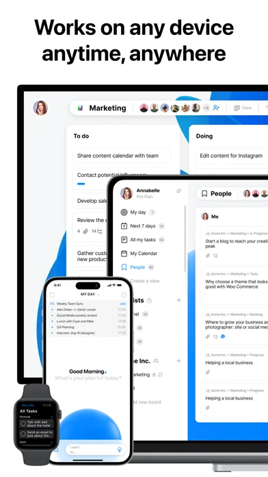
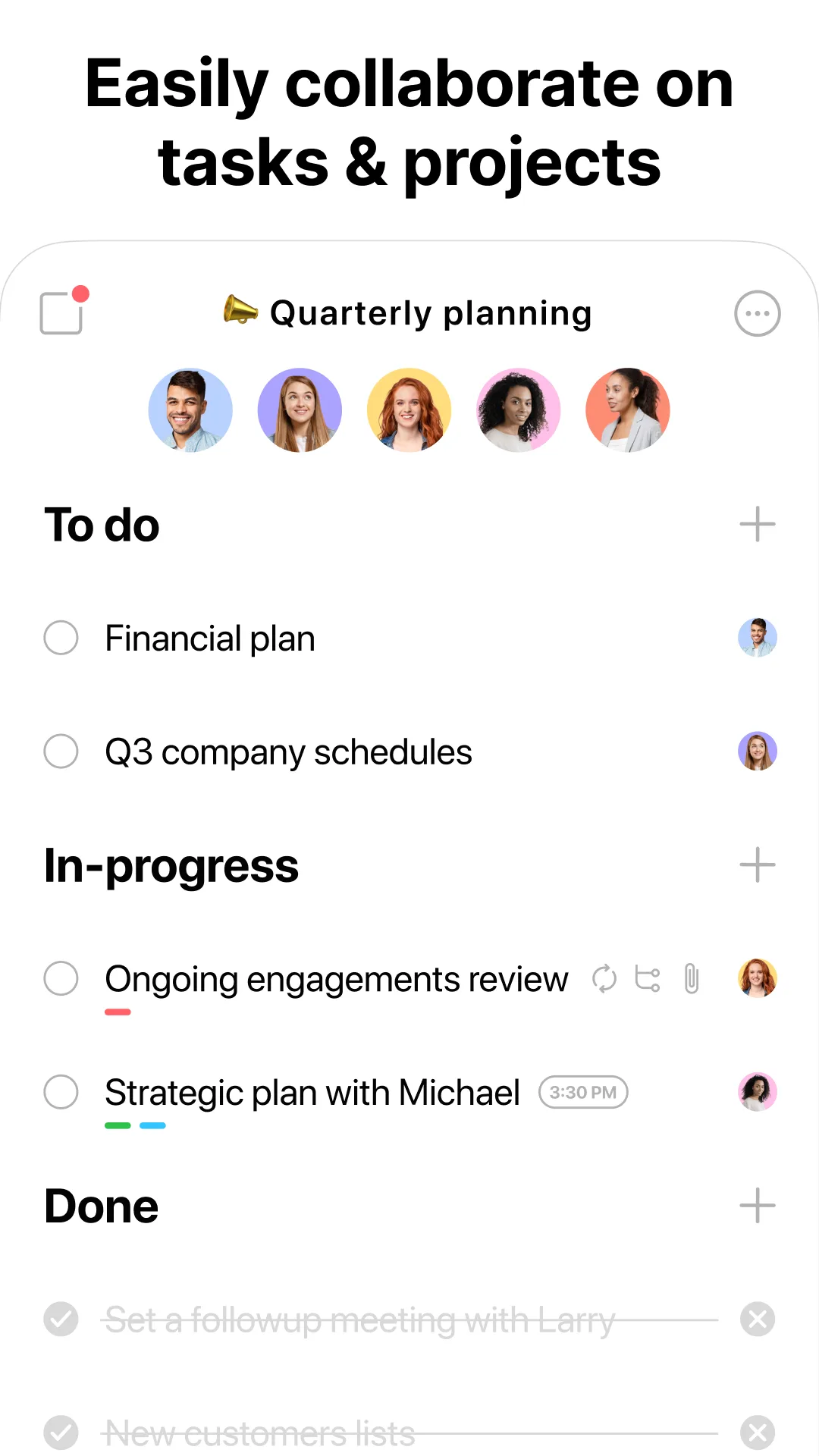
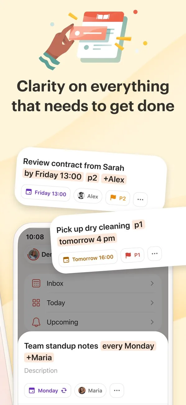
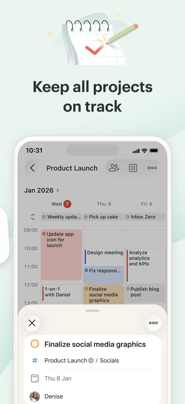
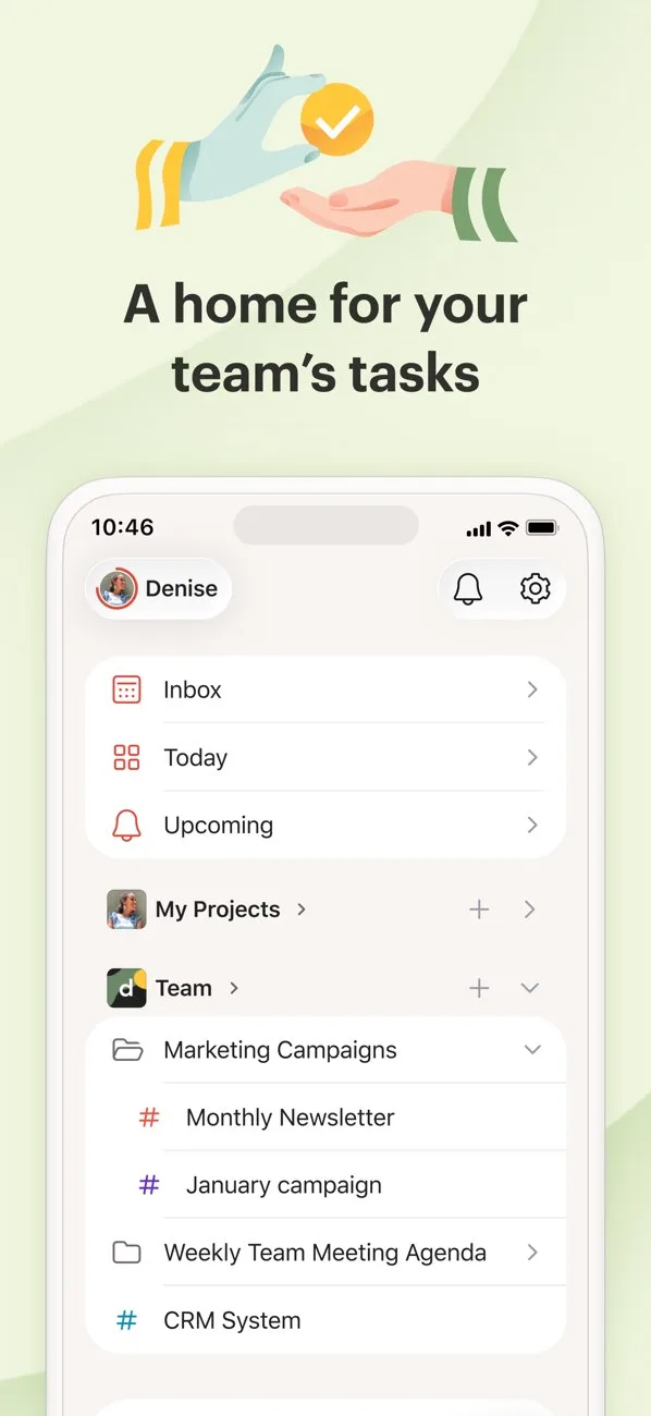
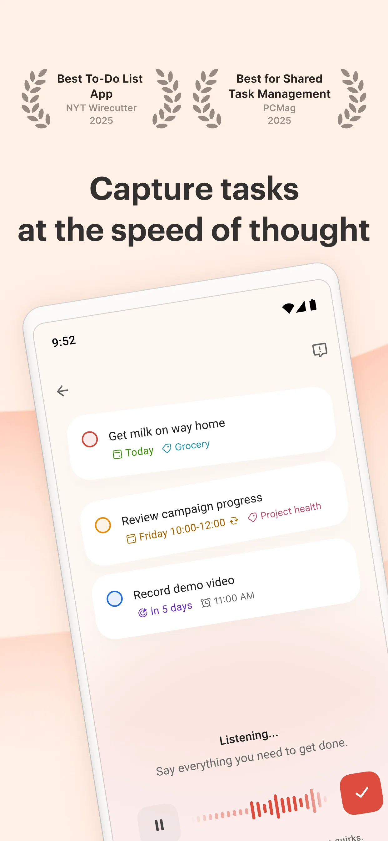
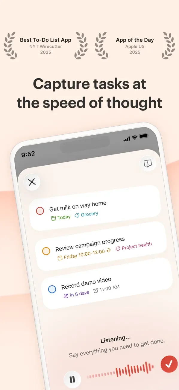
- TickTickApp Store

 Play Store
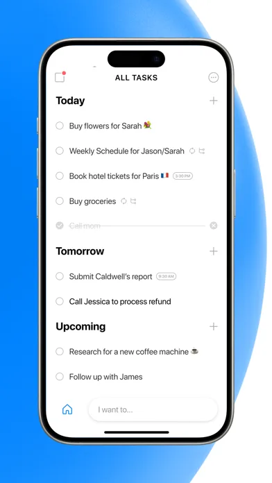
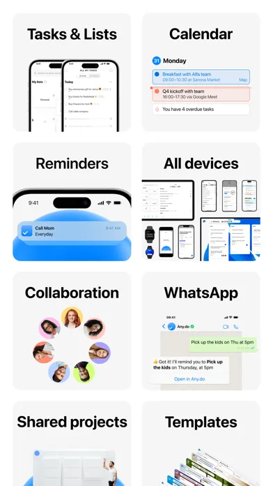
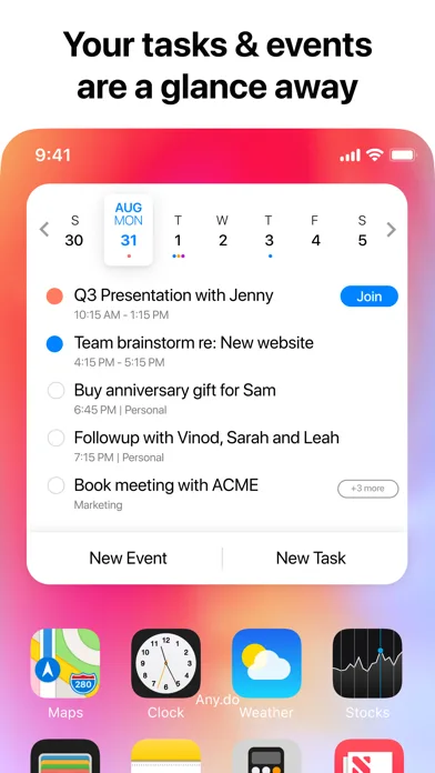
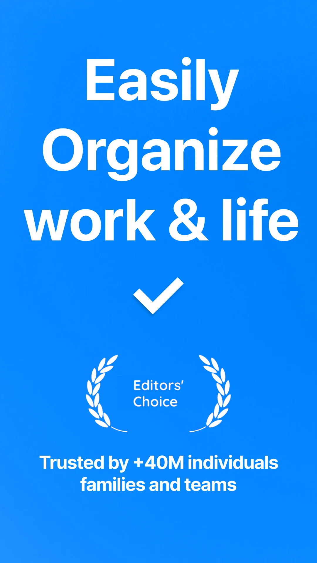
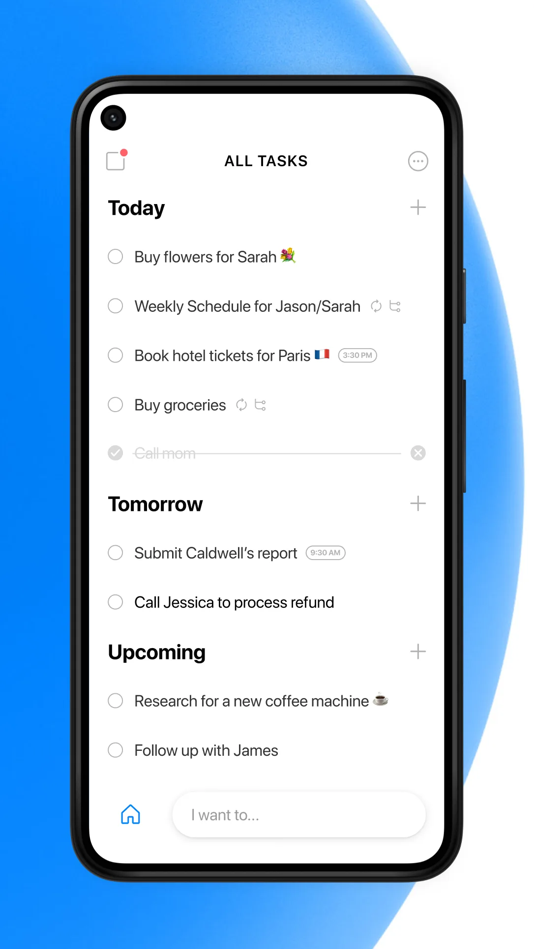
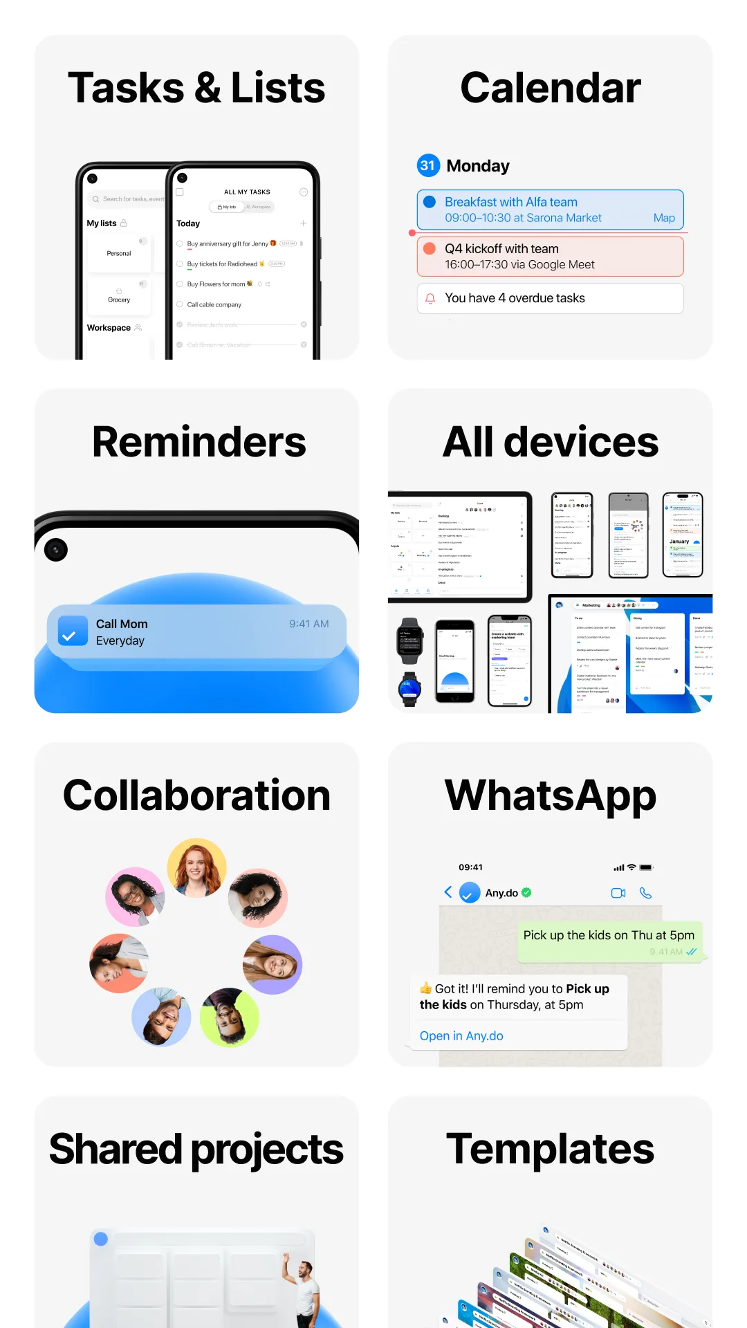
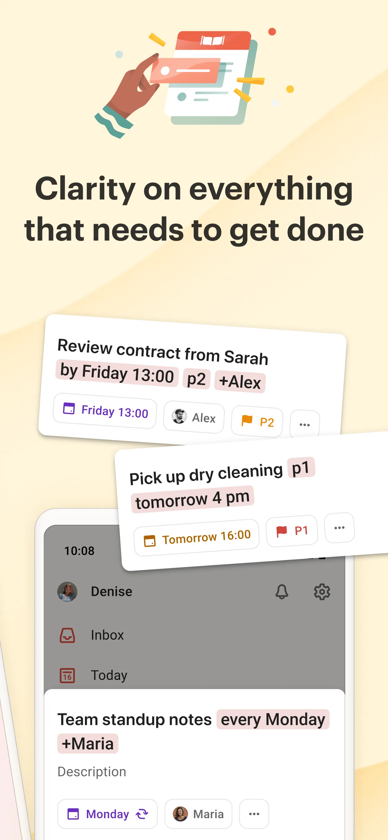
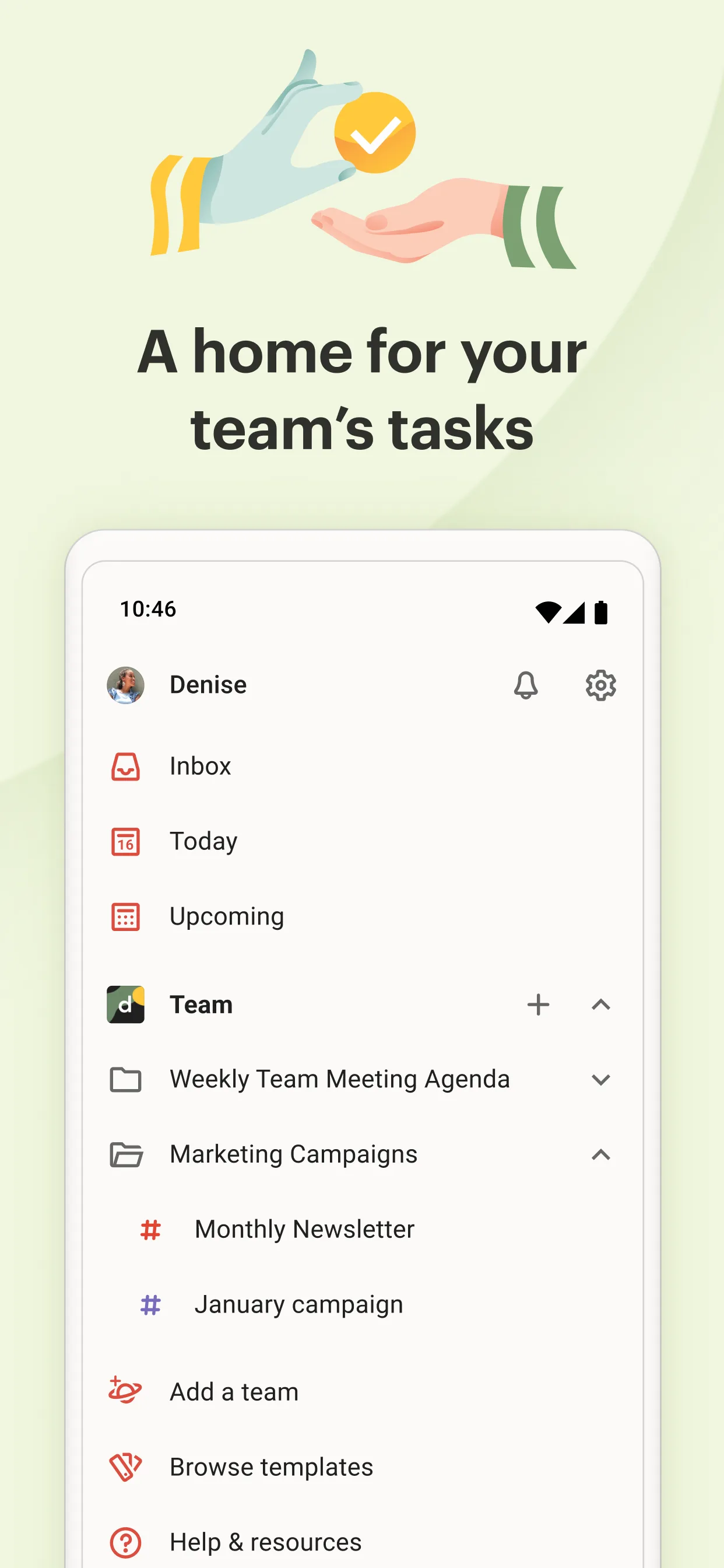
- Any.doApp Store
 Play Store
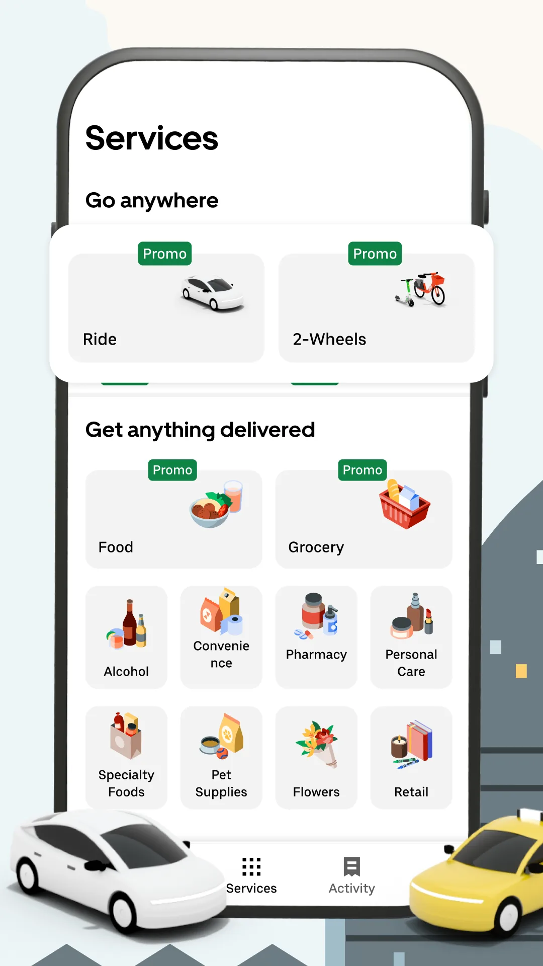
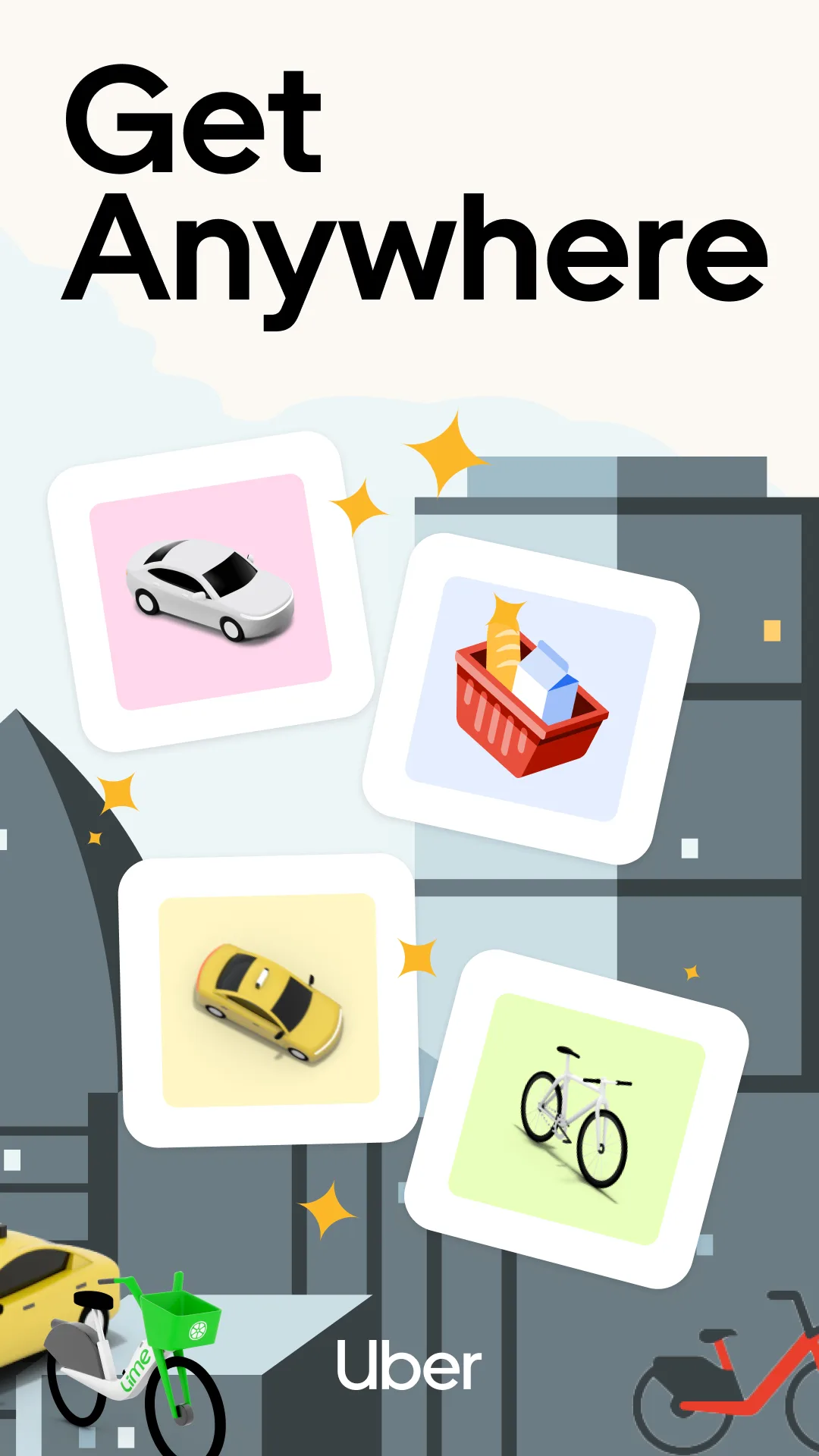
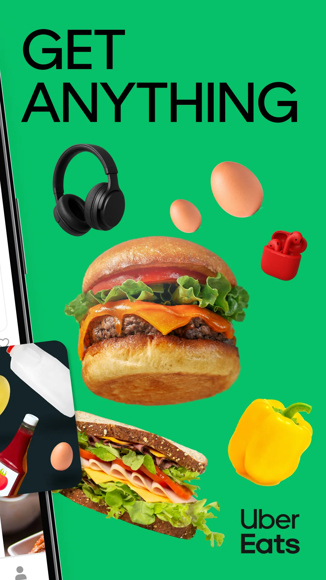
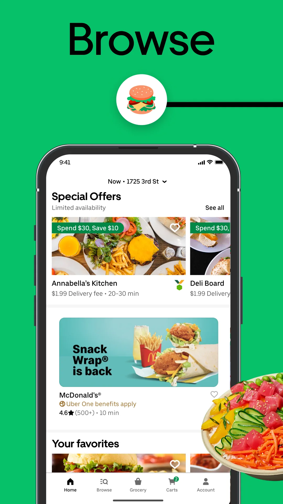
- Uber EatsPlay Store

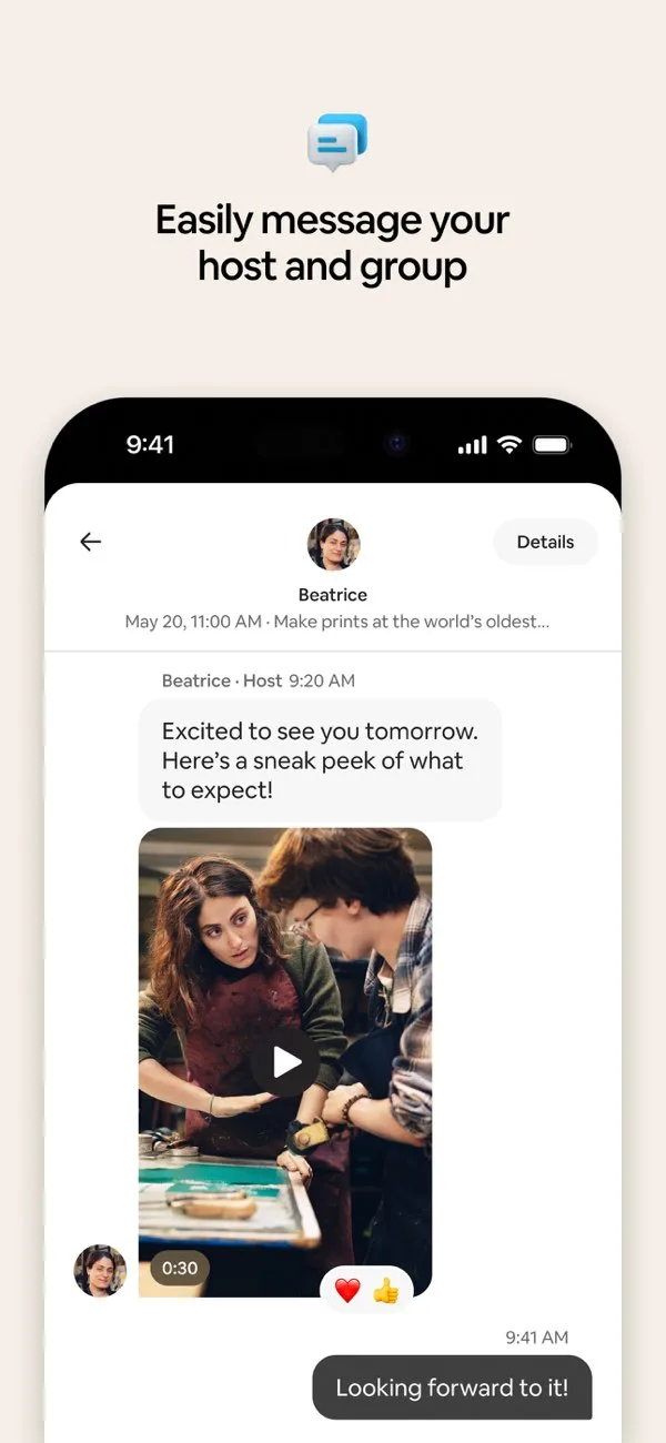
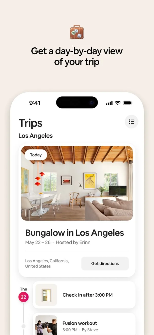
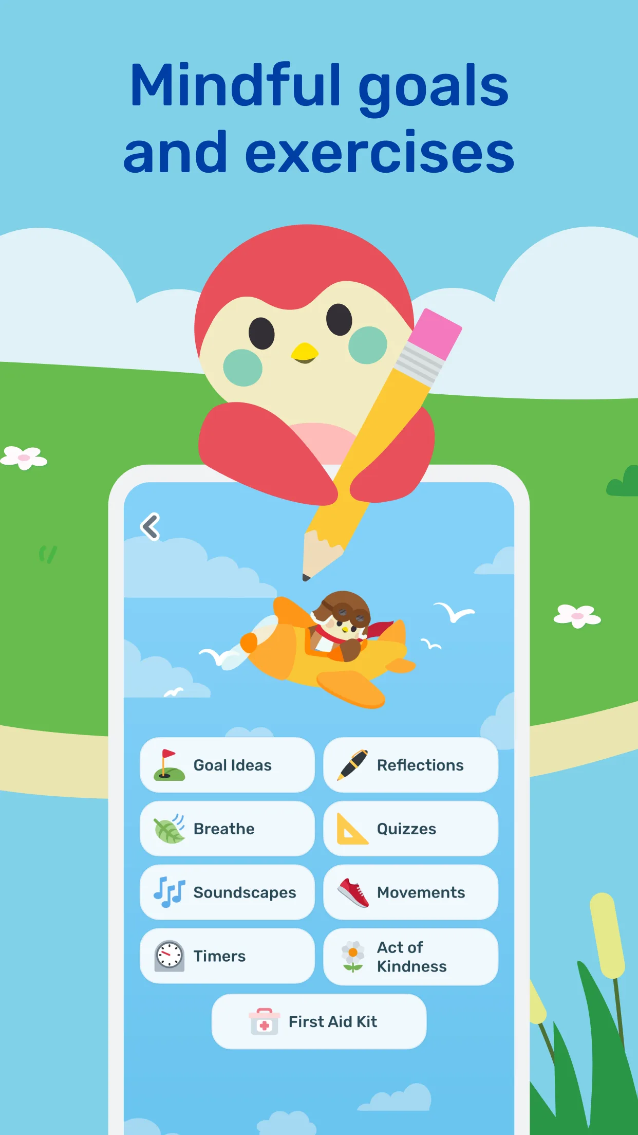
Storytelling / flow-based
Onboarding-like narrative, emotional framing, and paced progression—excellent for habit, wellness, and learning apps.
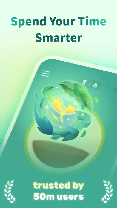
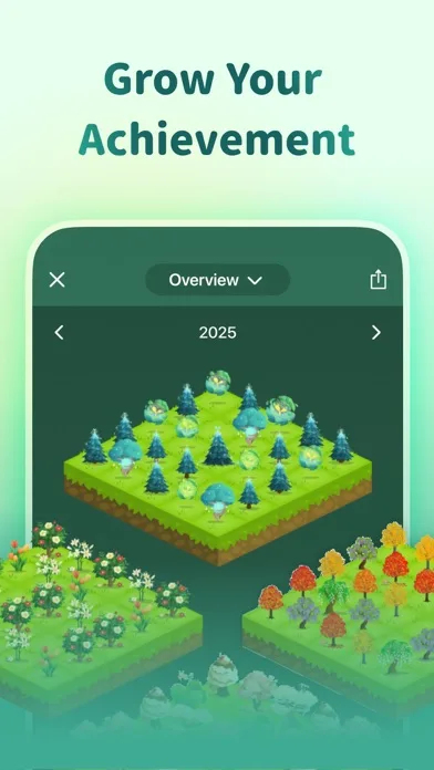
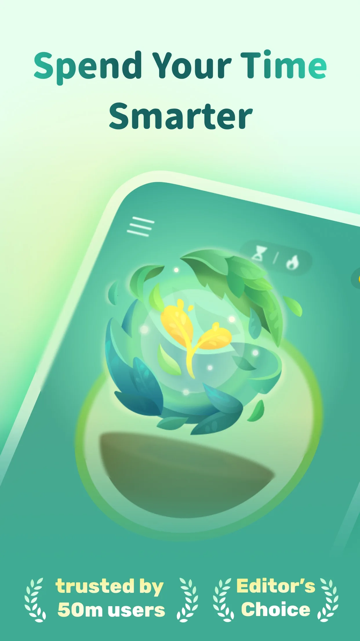
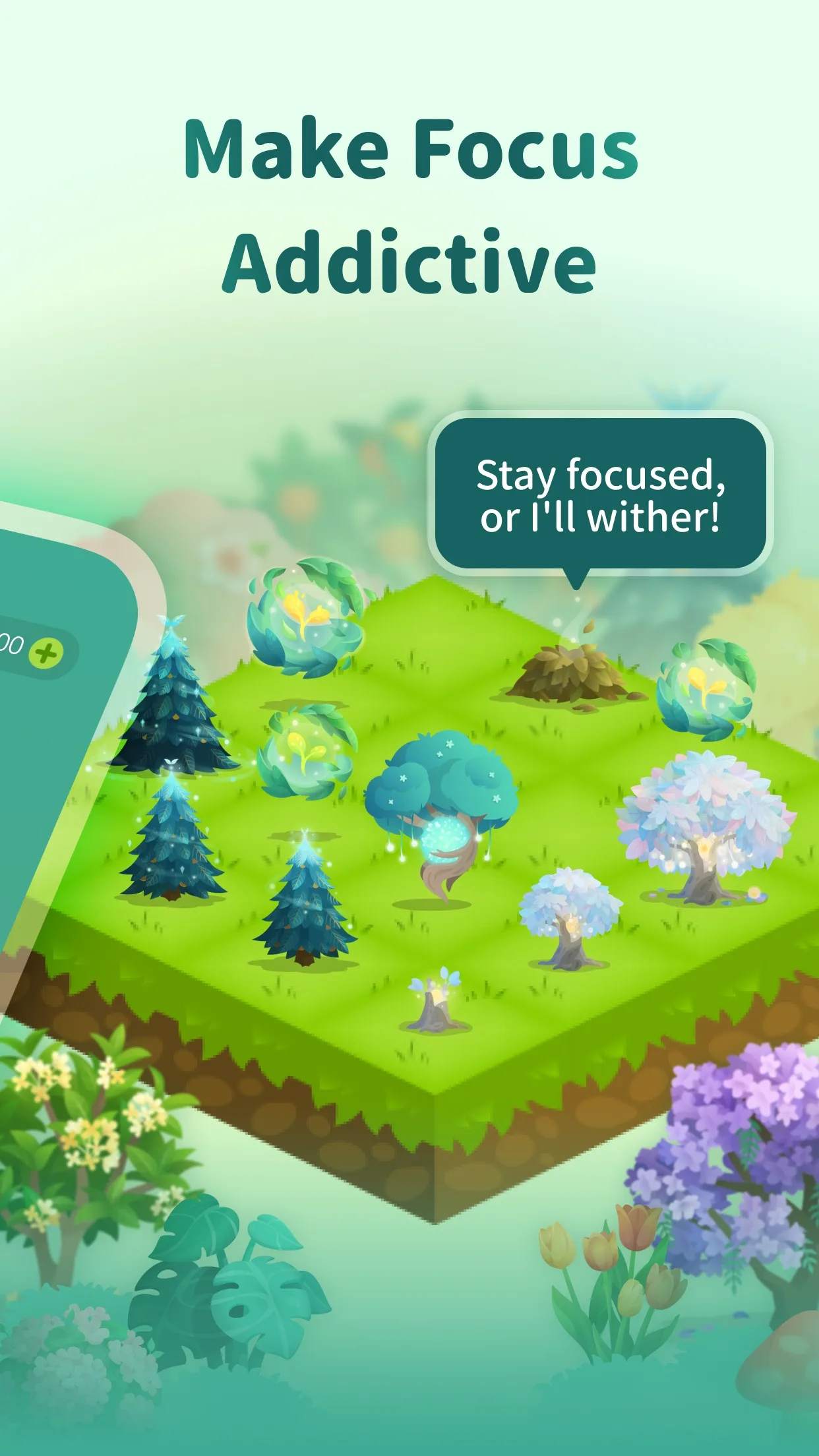
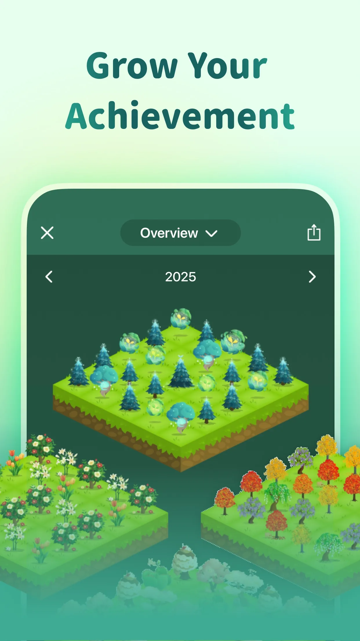
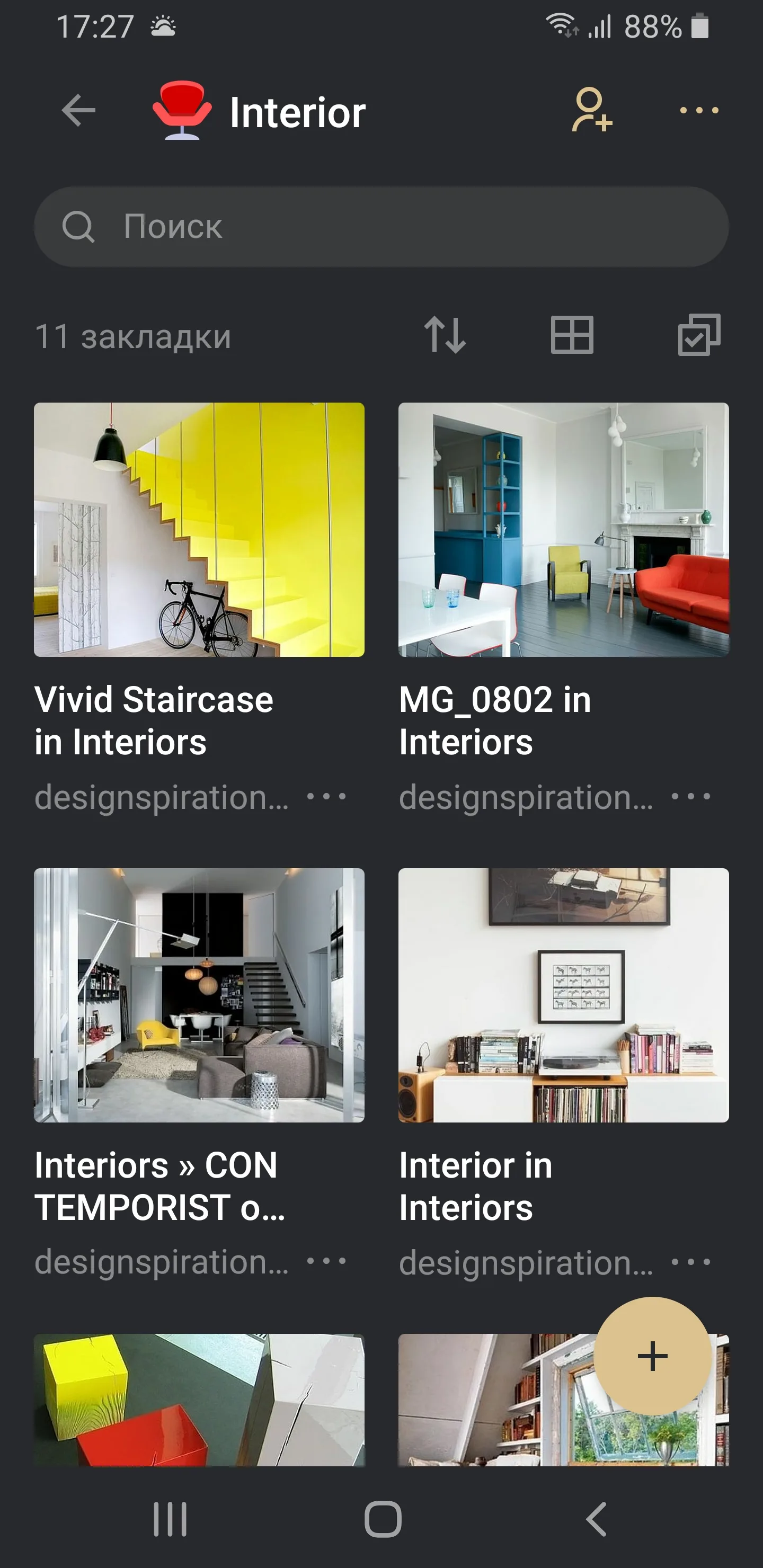
- ForestApp Store


 Play Store
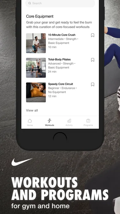
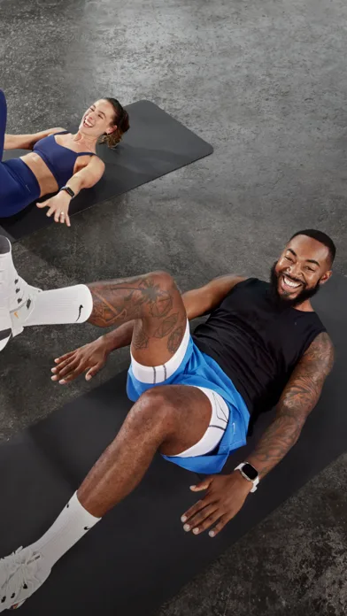
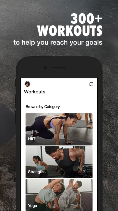
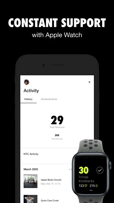
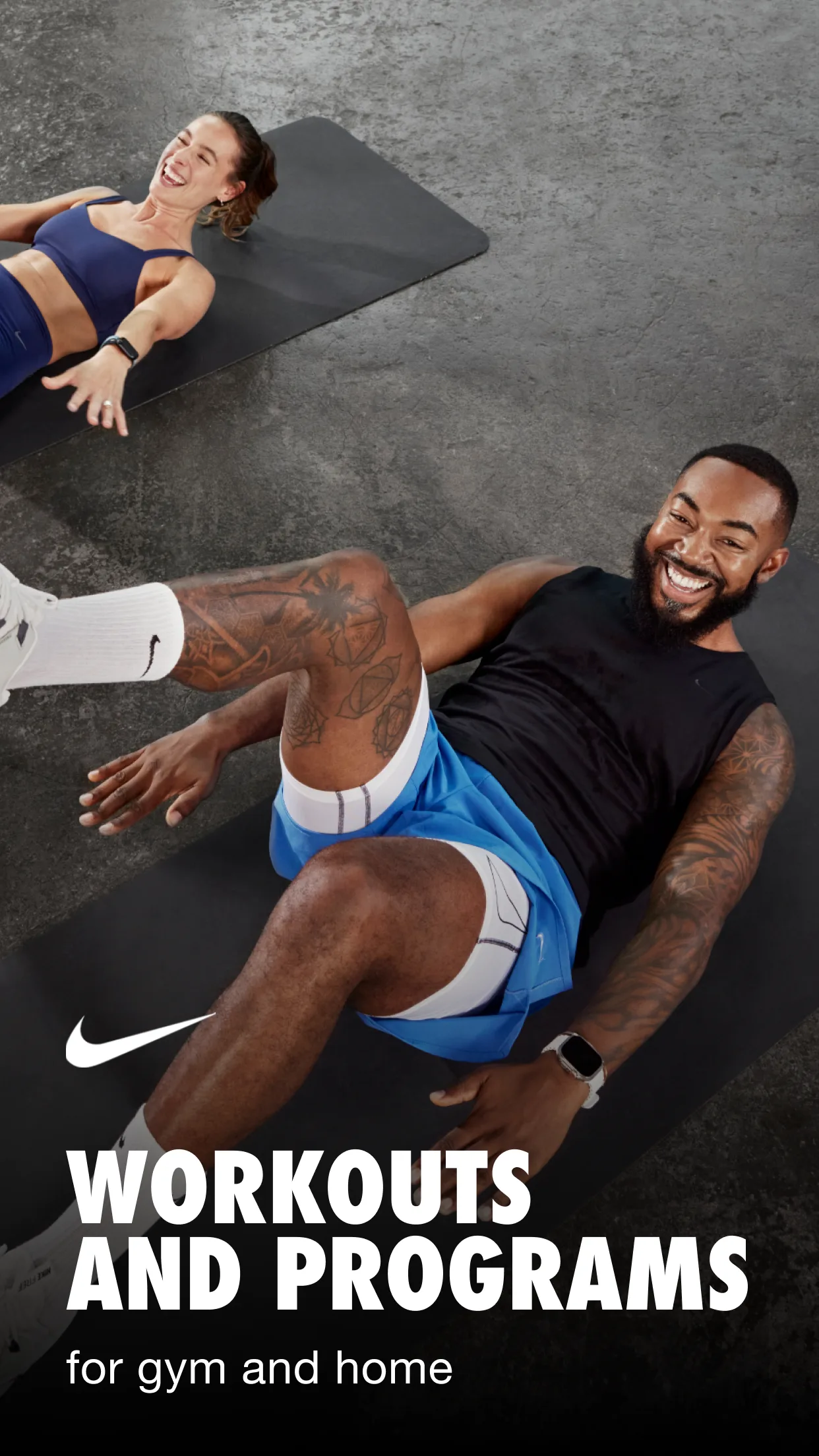
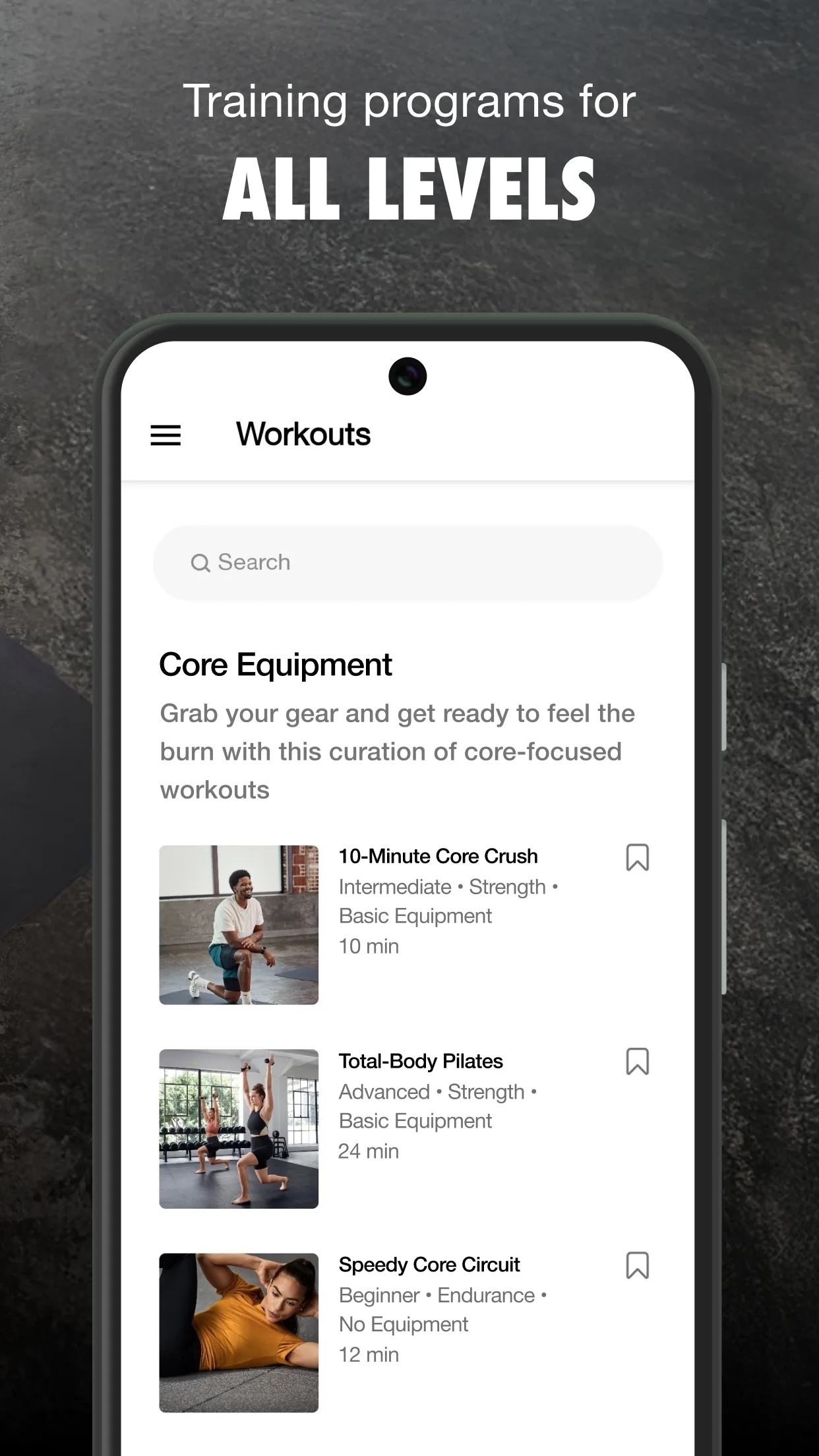
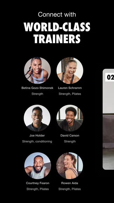
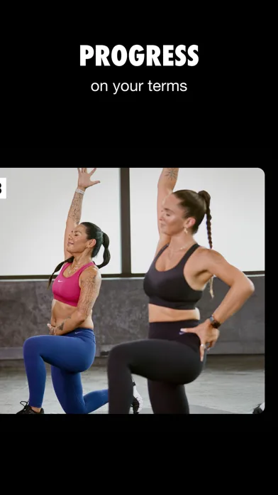
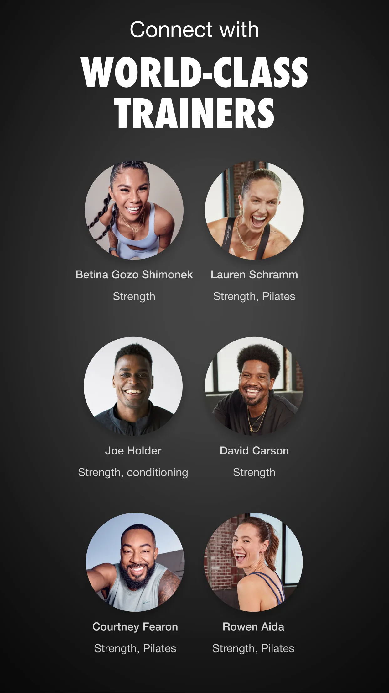
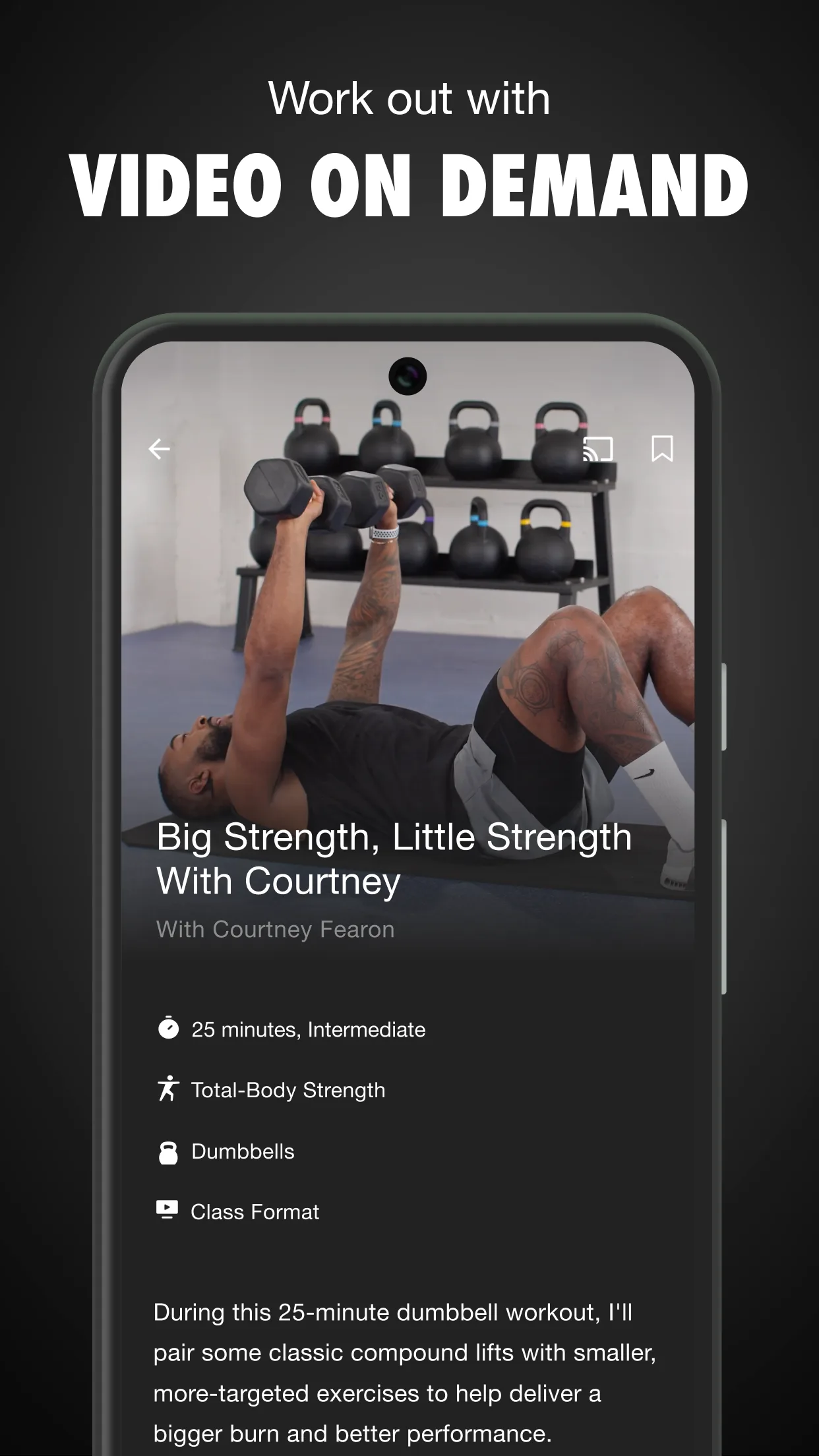
- Nike Training ClubApp Store
 Play Store
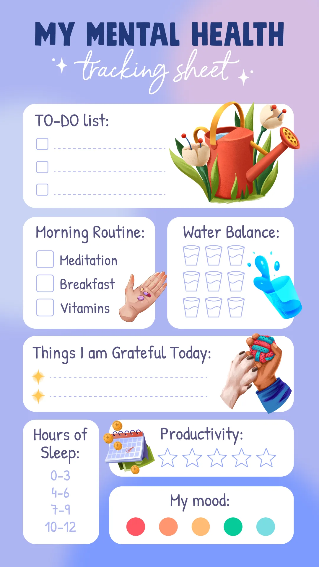
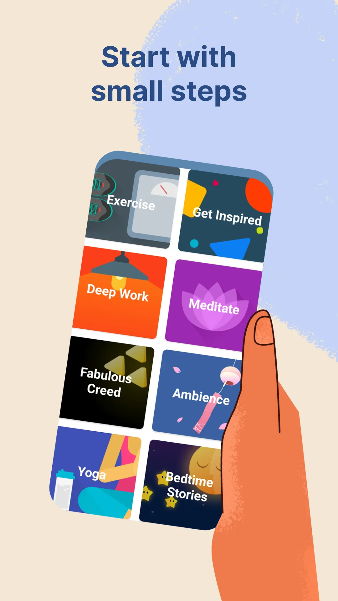
- FabulousApp Store
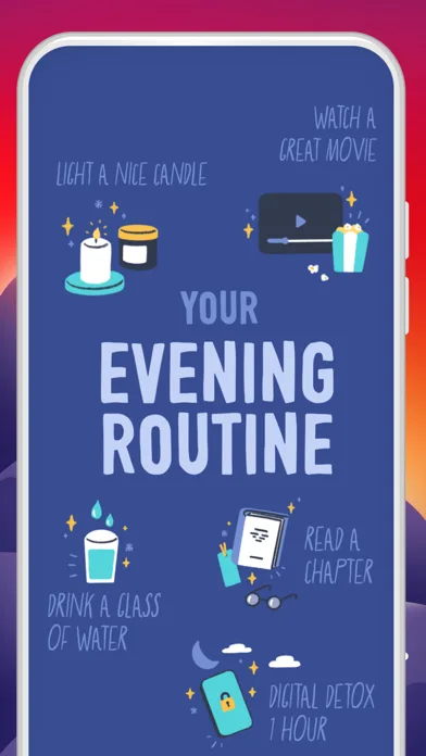 Play Store
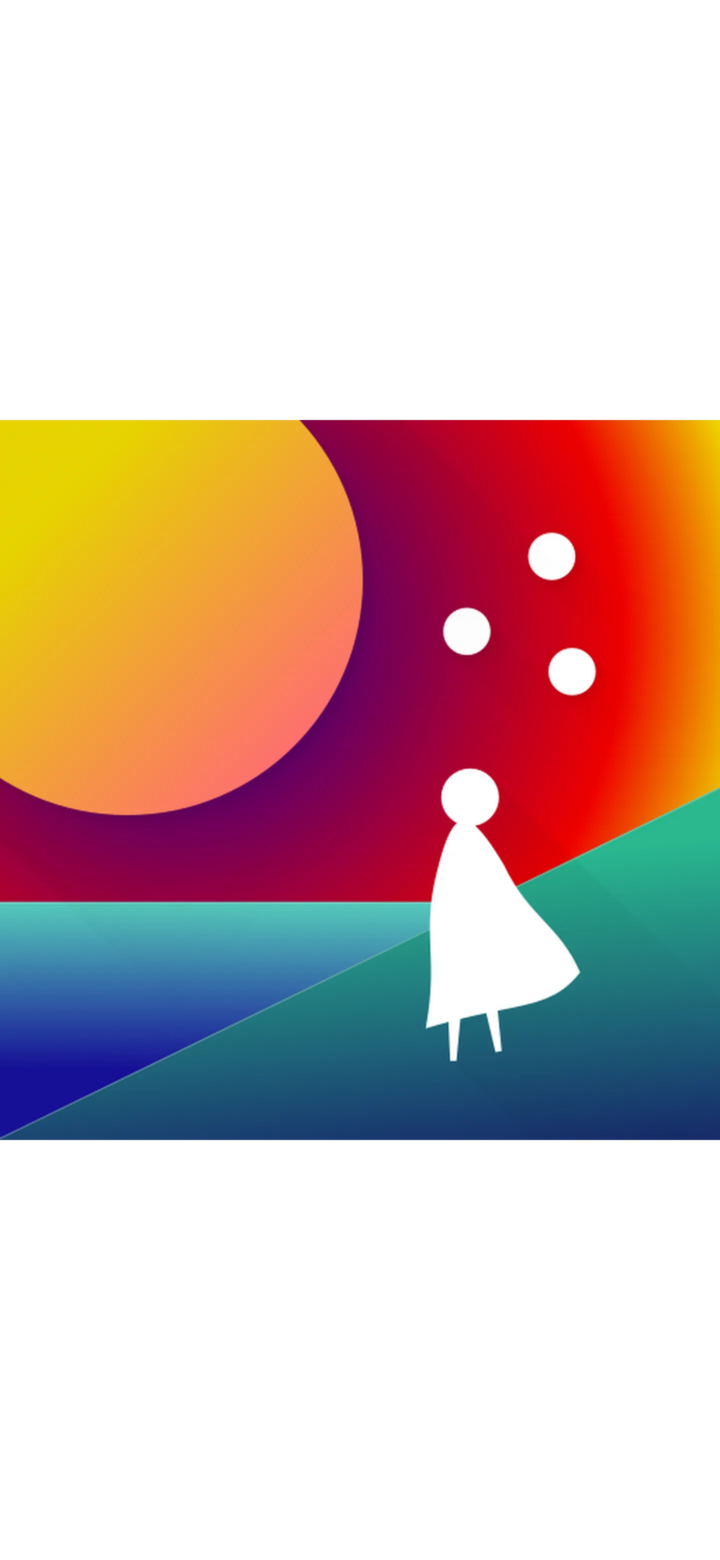
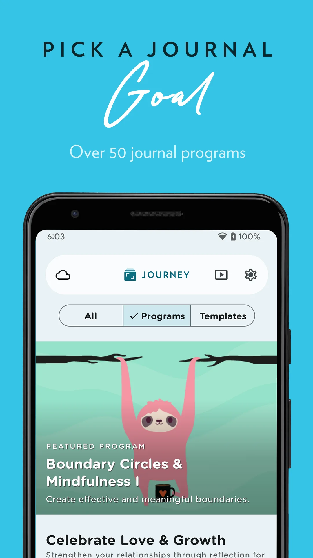
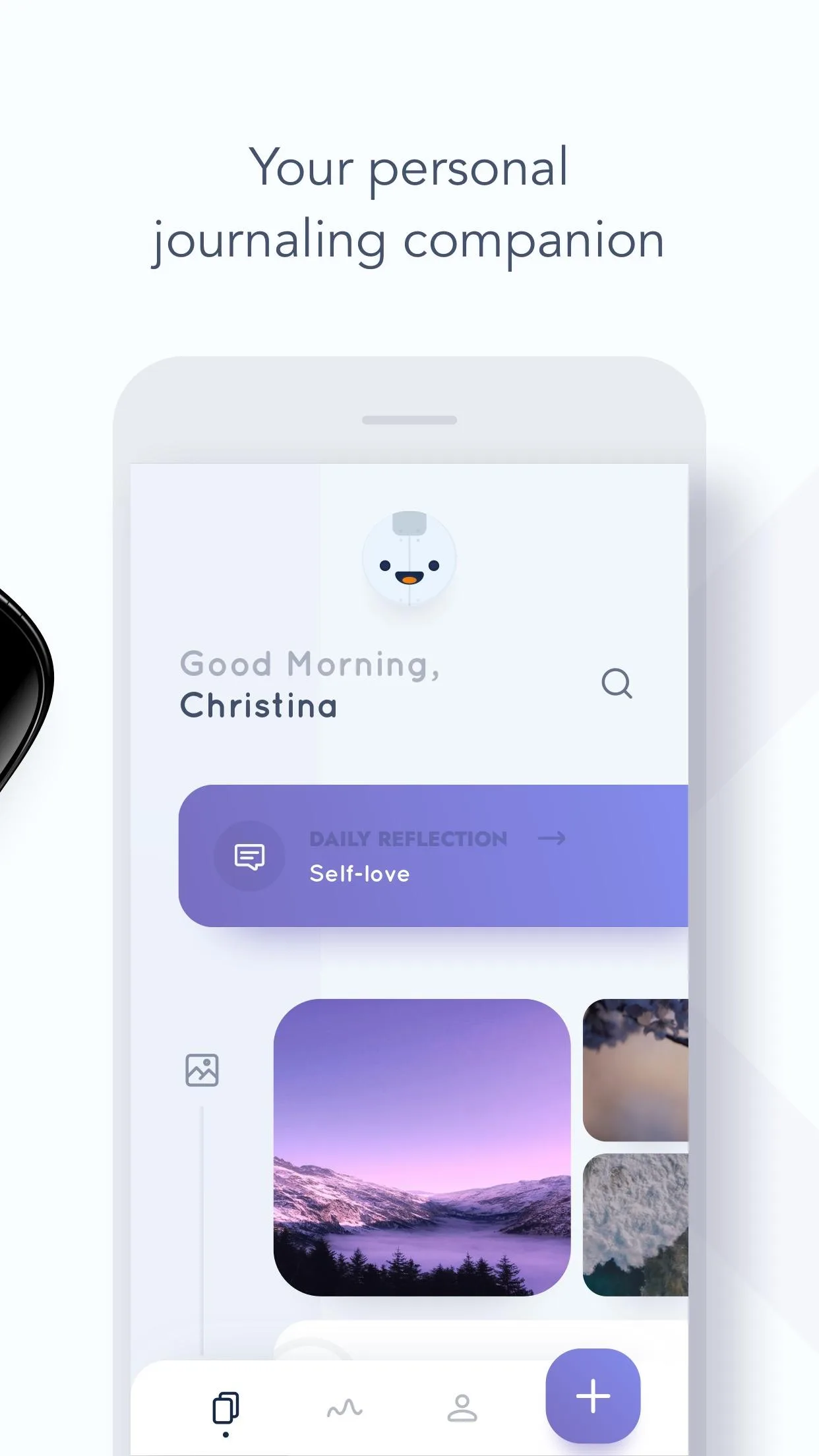
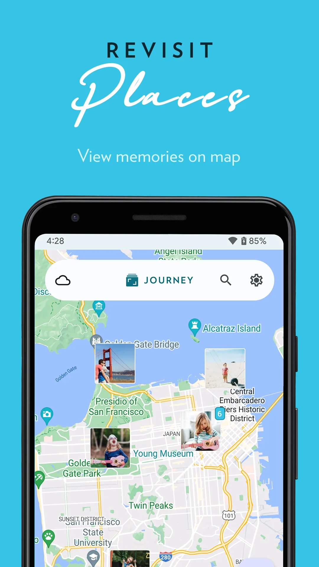
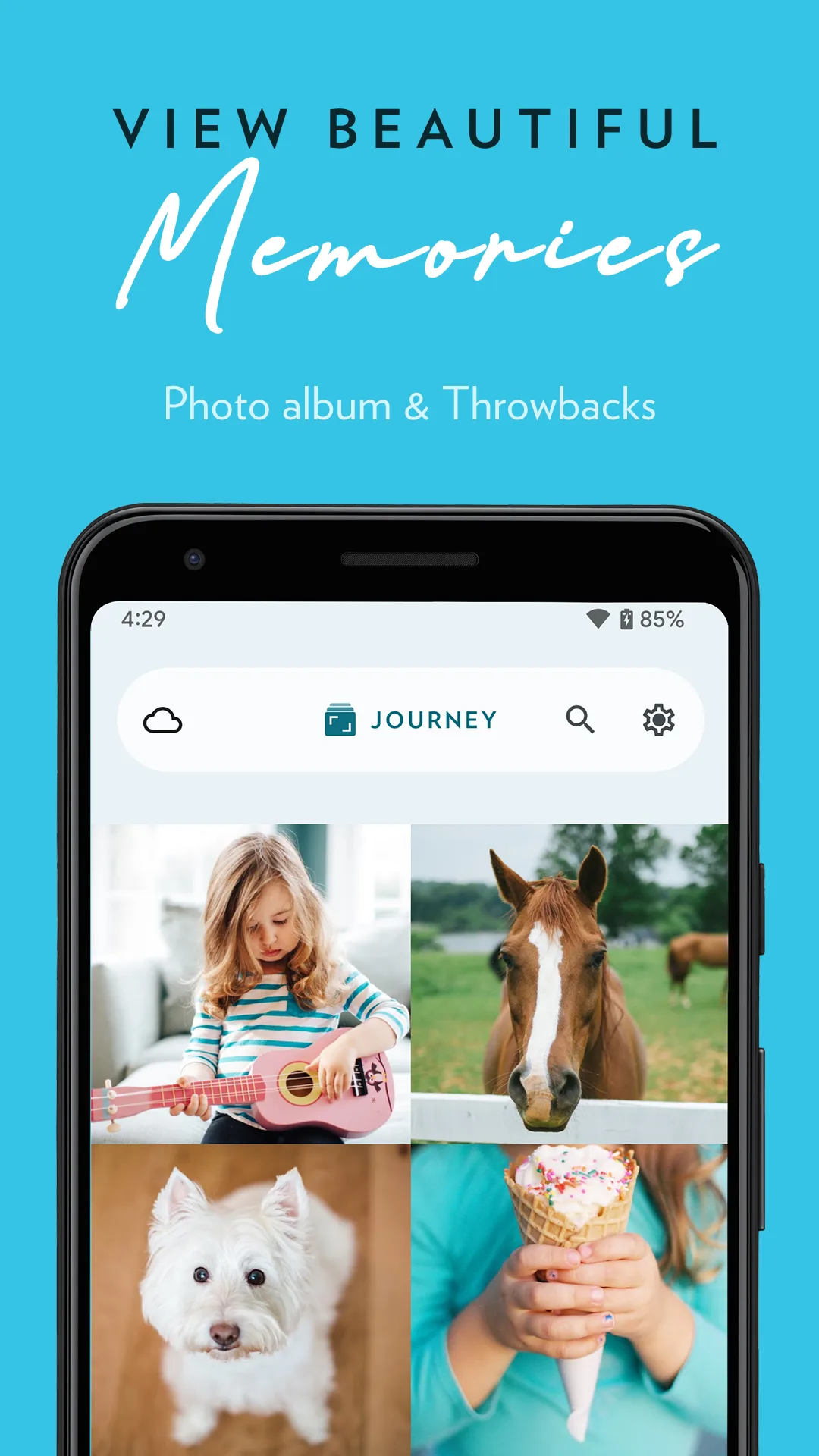
- JourneyApp Store

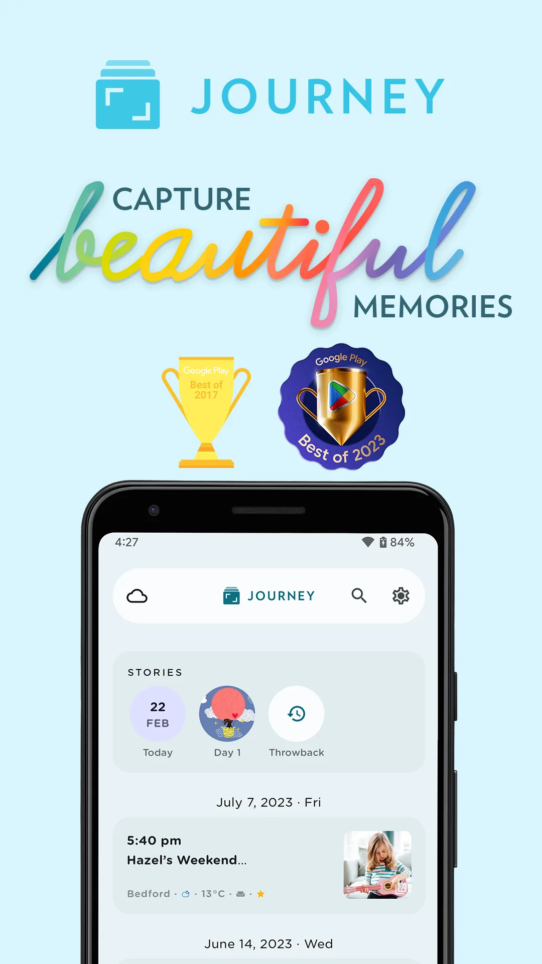

 Play Store

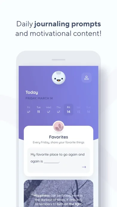
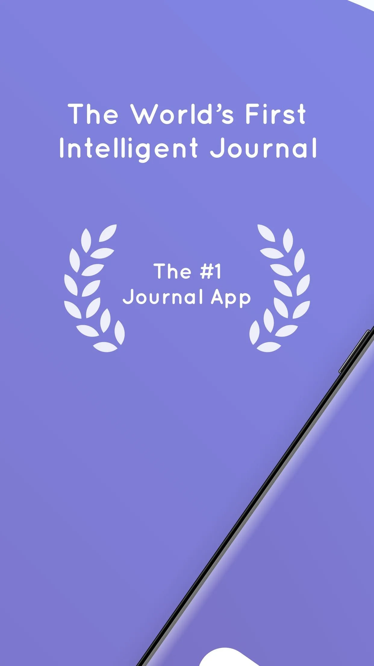
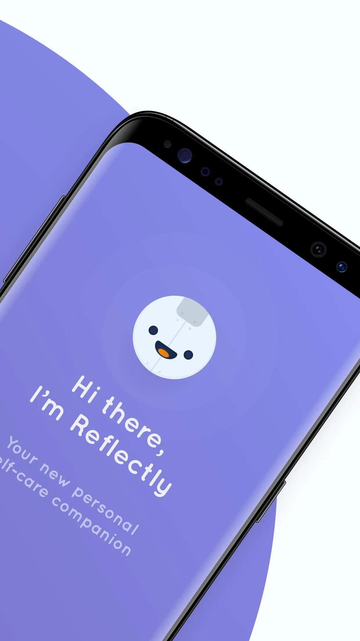
- ReflectlyApp Store
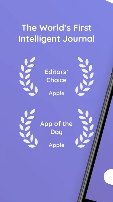
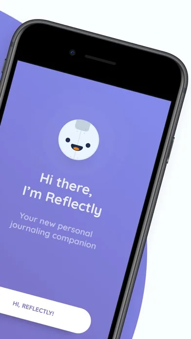
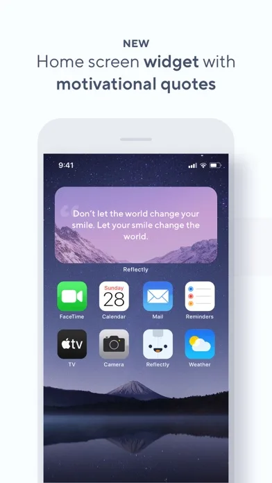
 Play Store


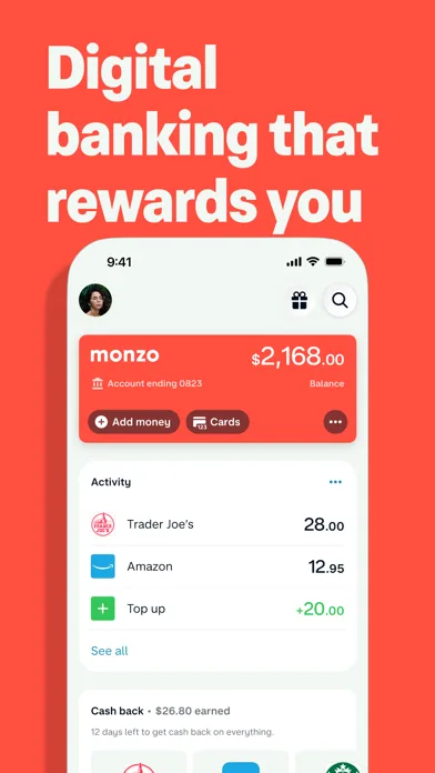
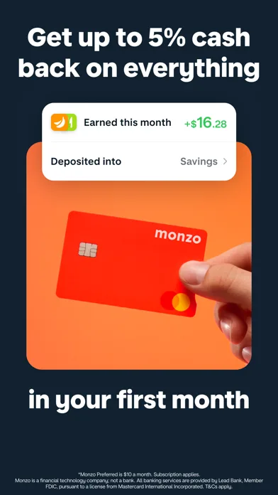
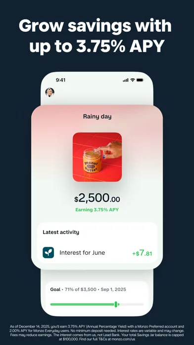
Premium / fintech style
Clean grids, confident spacing, and subtle depth. Great references for “trust + polish” screenshot systems.
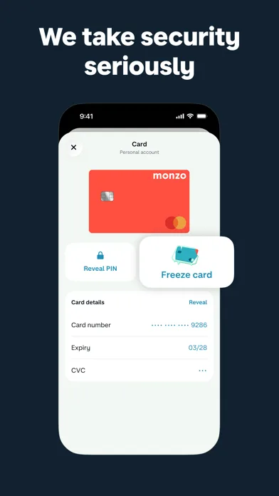
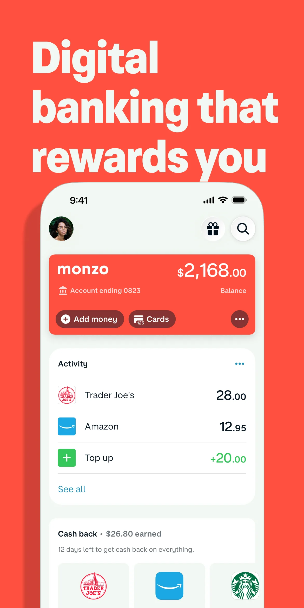
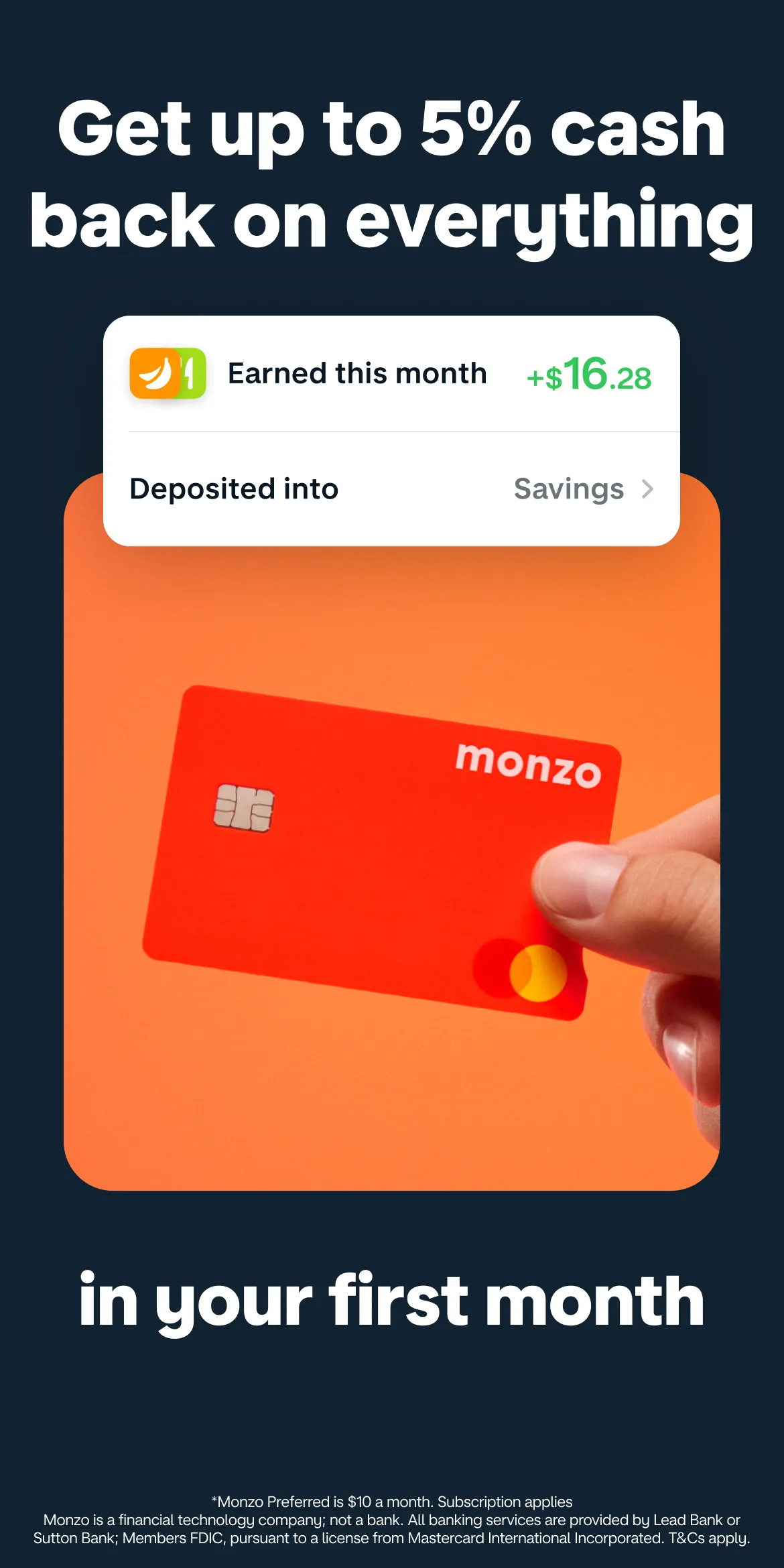
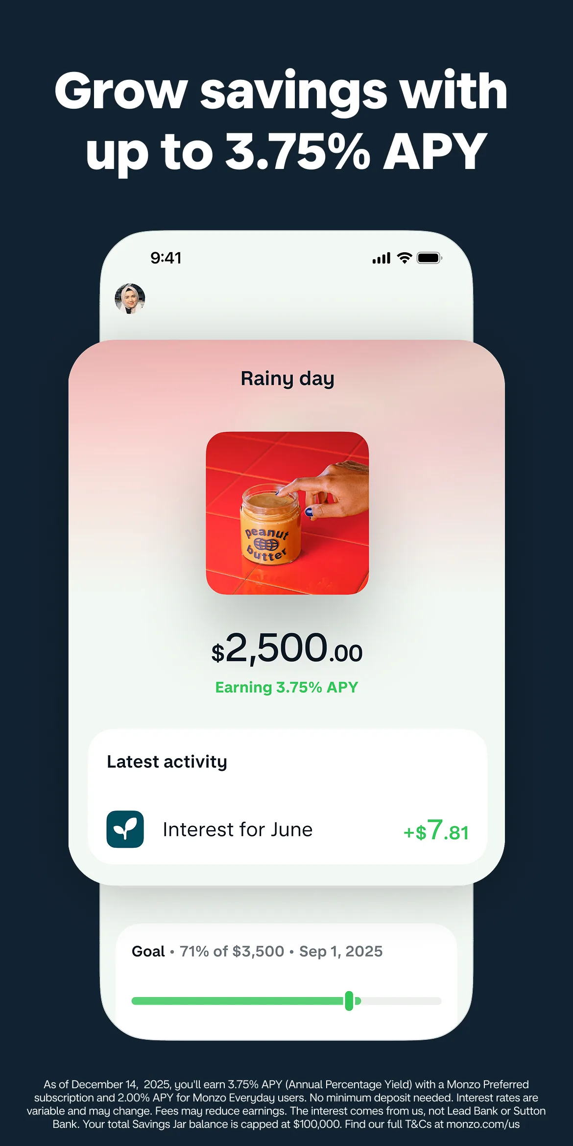
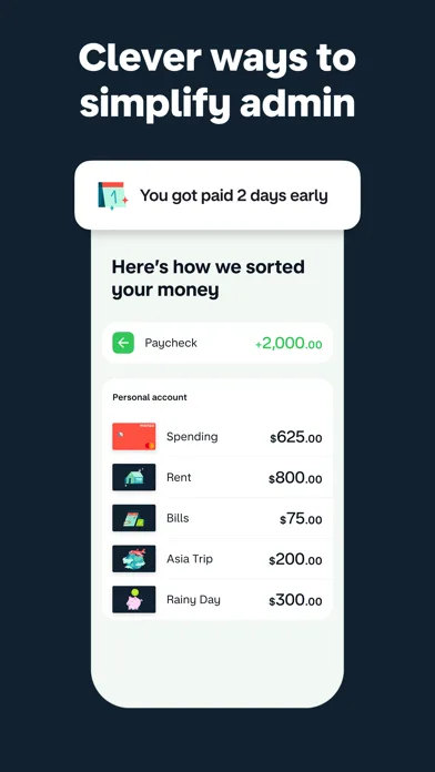
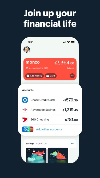
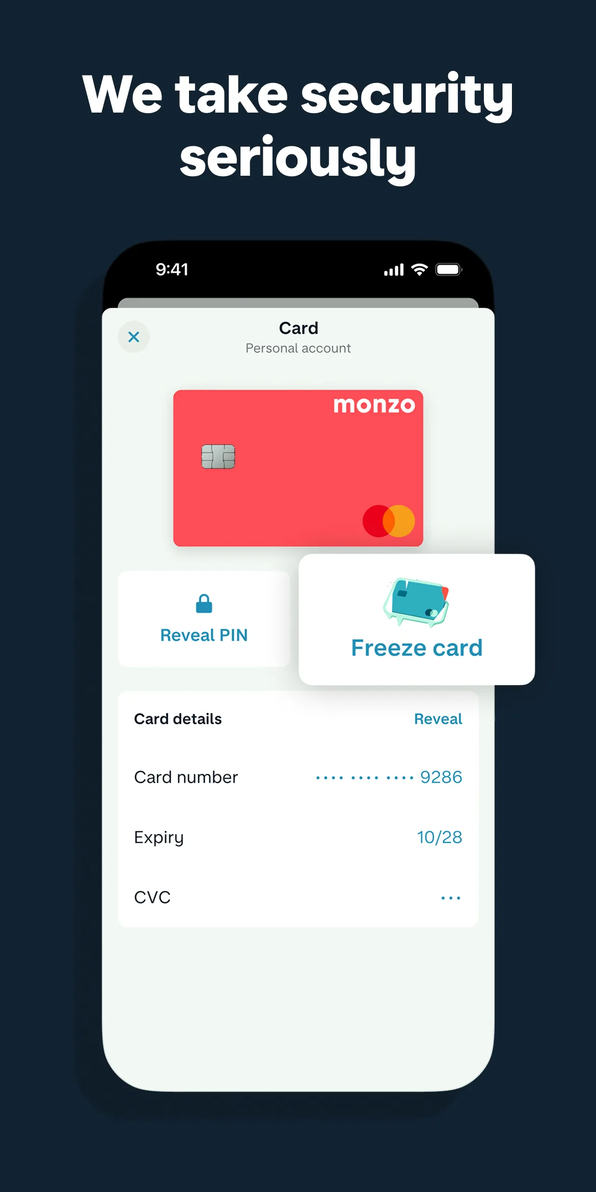
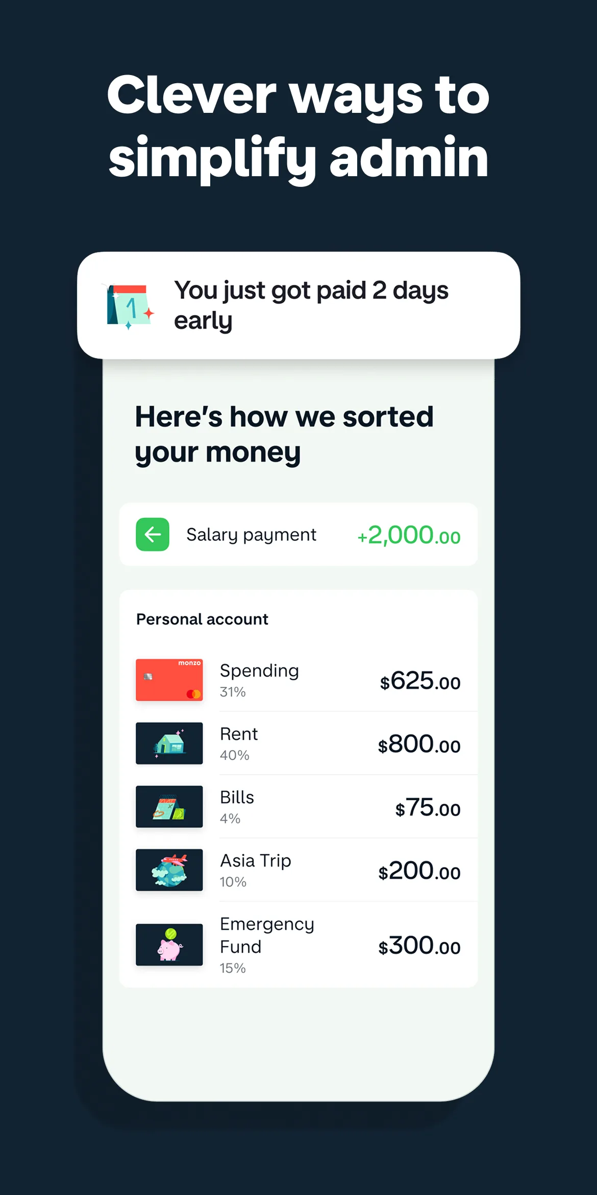
- MonzoApp Store
 Play Store
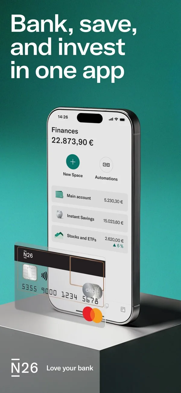
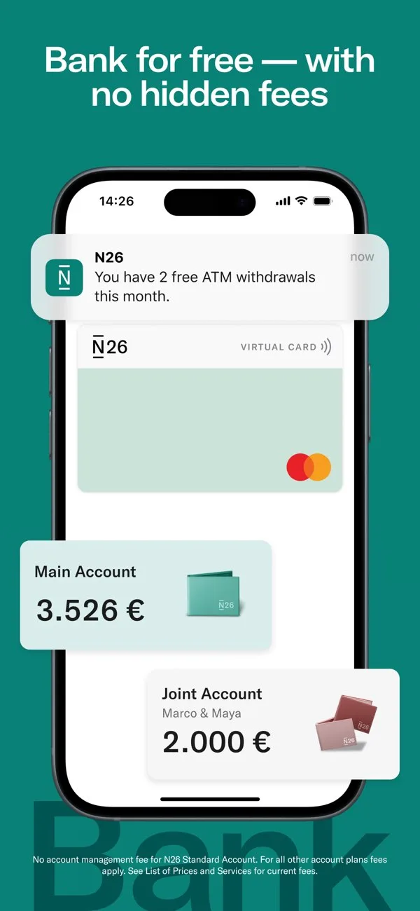
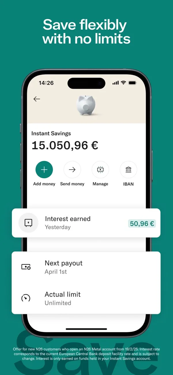
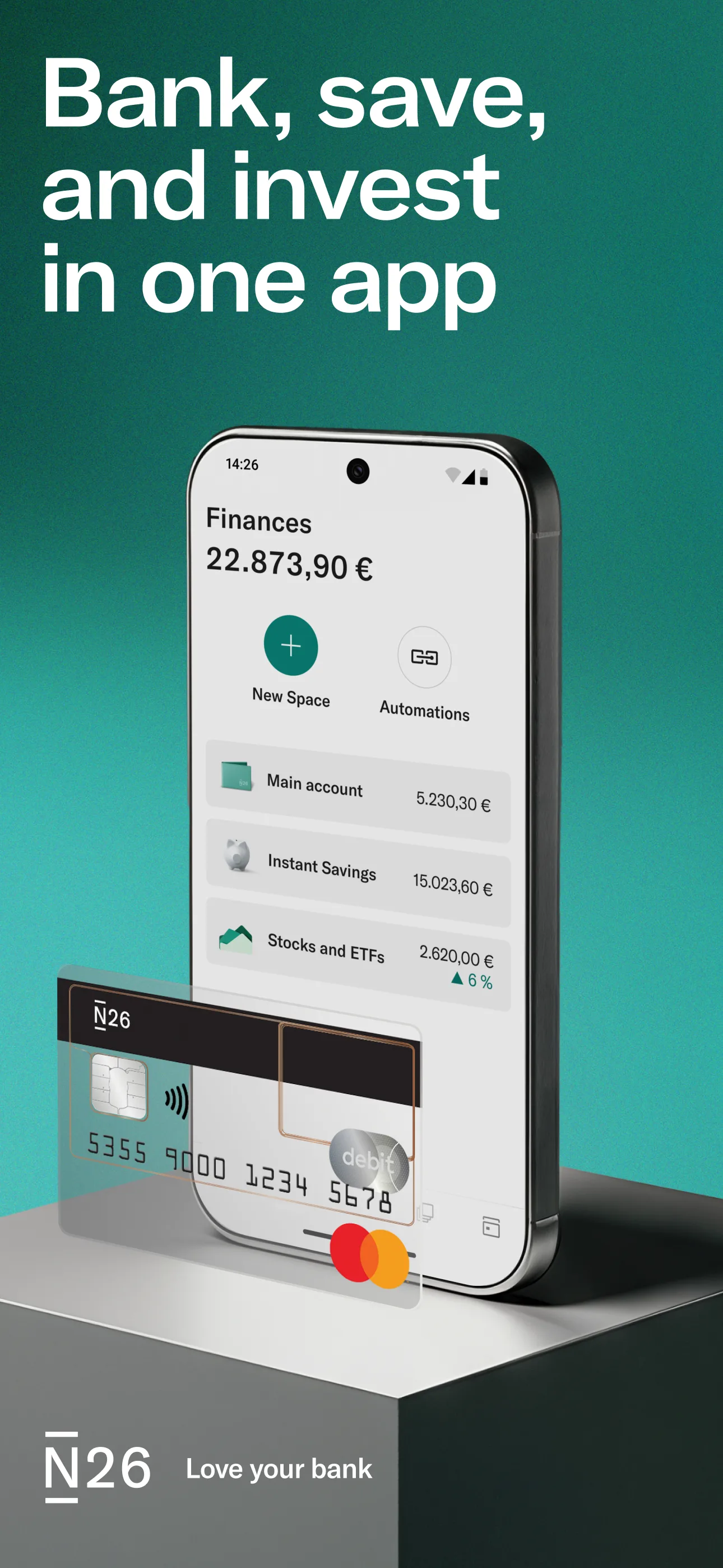
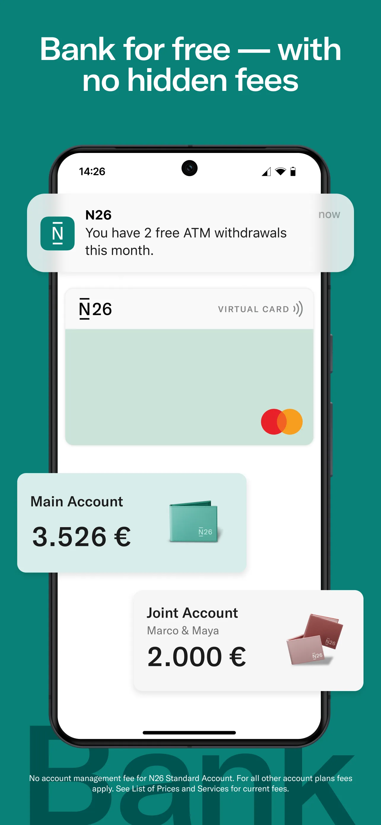
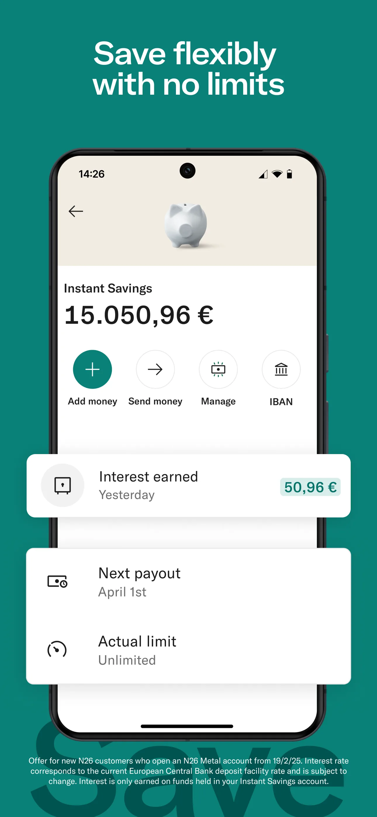
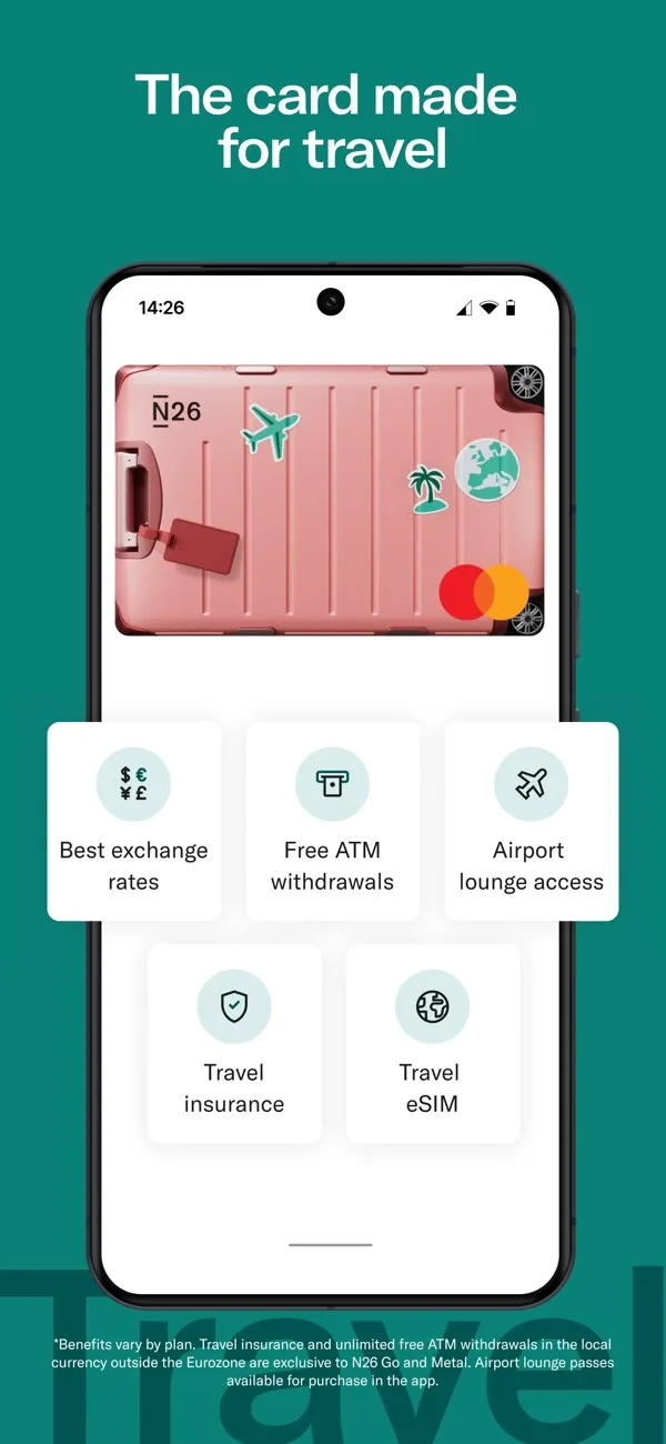
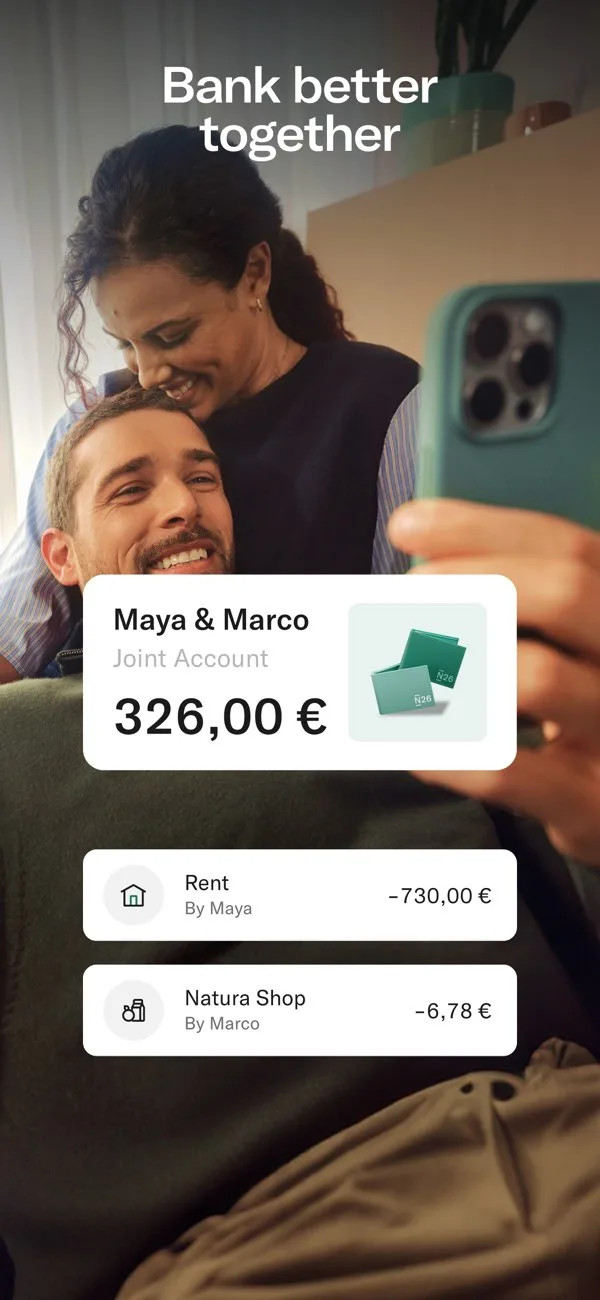
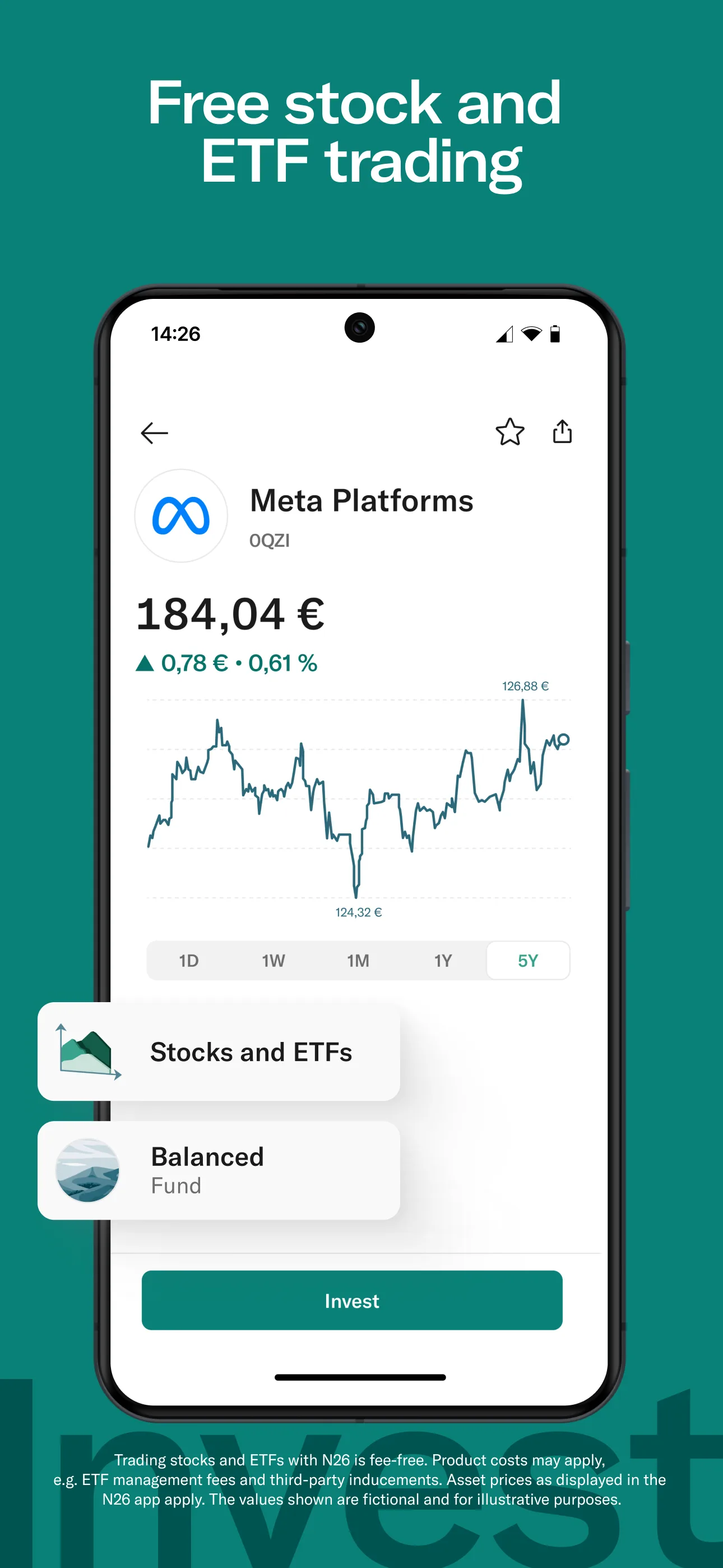
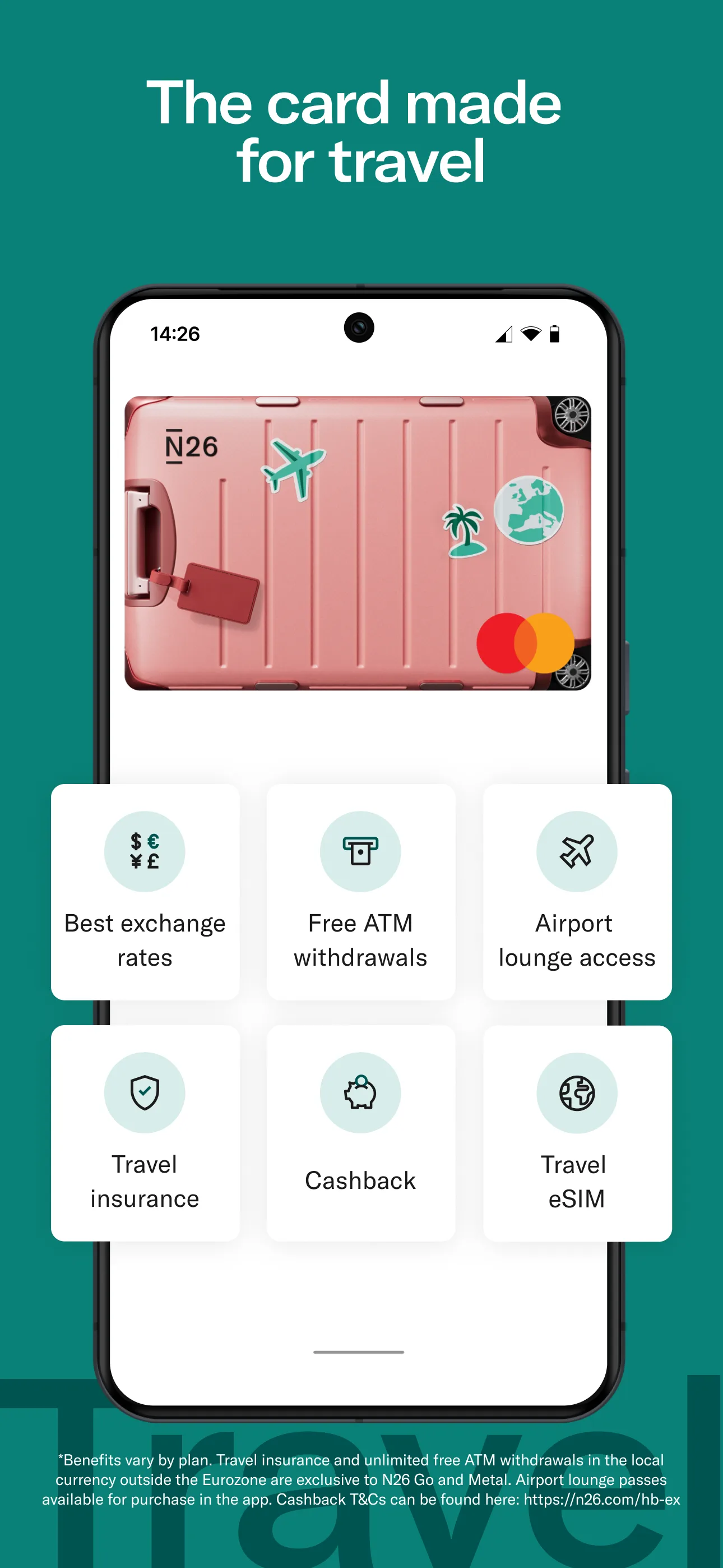
- N26App Store
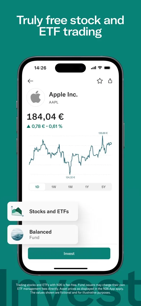 Play Store
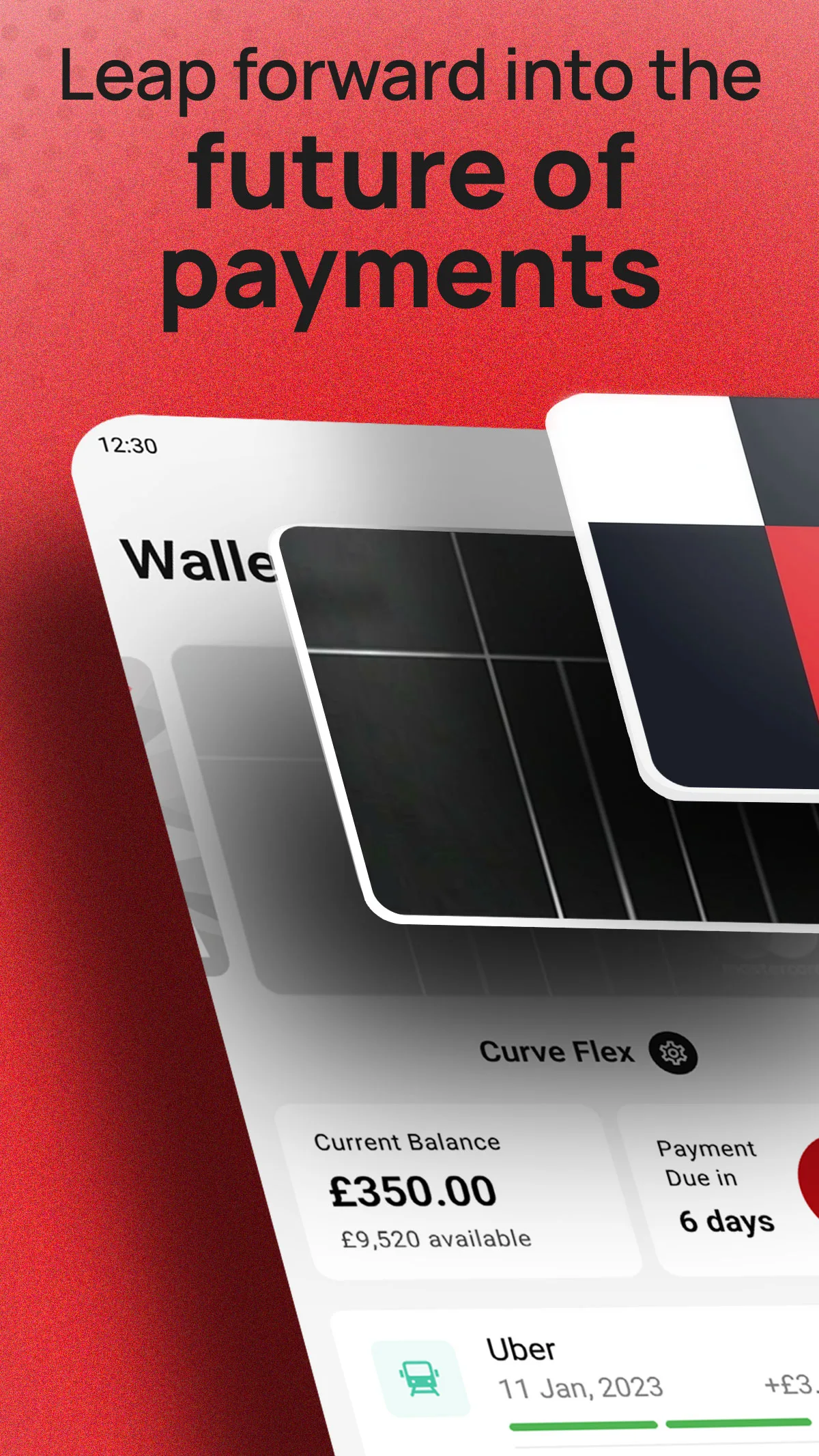
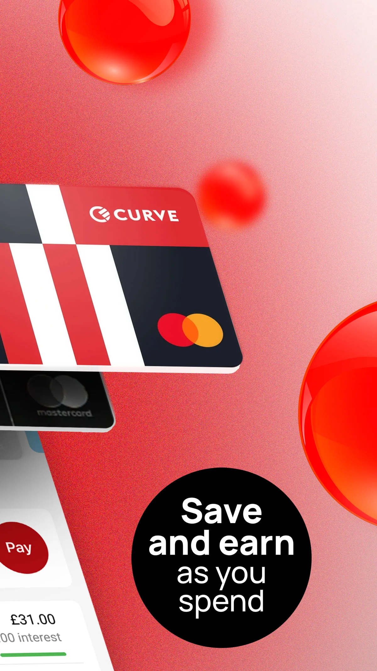
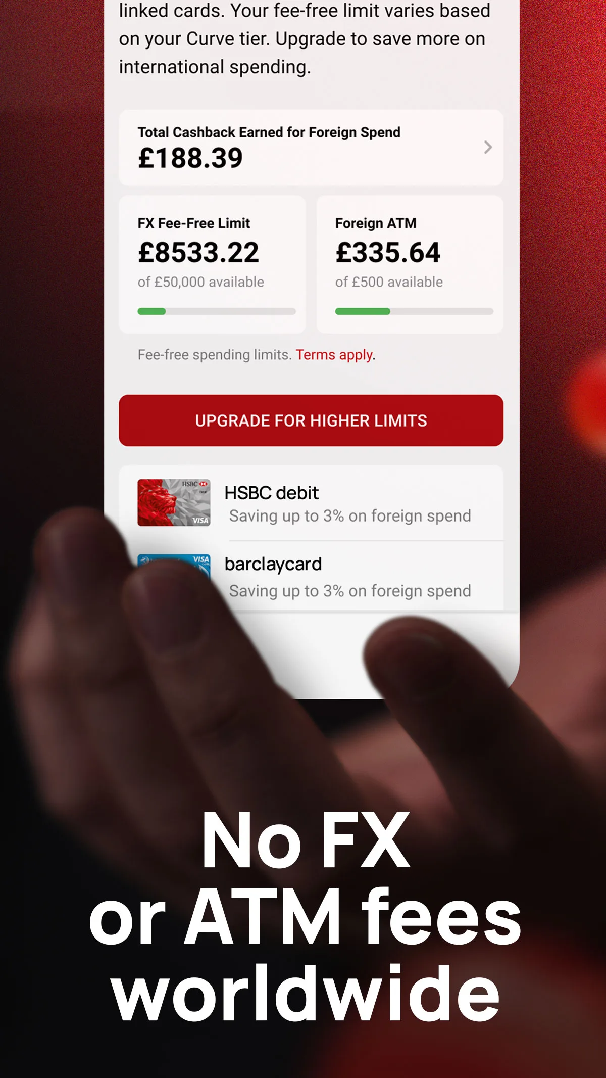
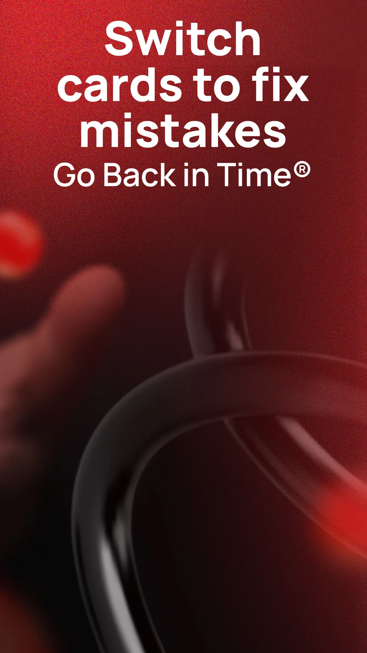
- CurveApp Store


 Play Store
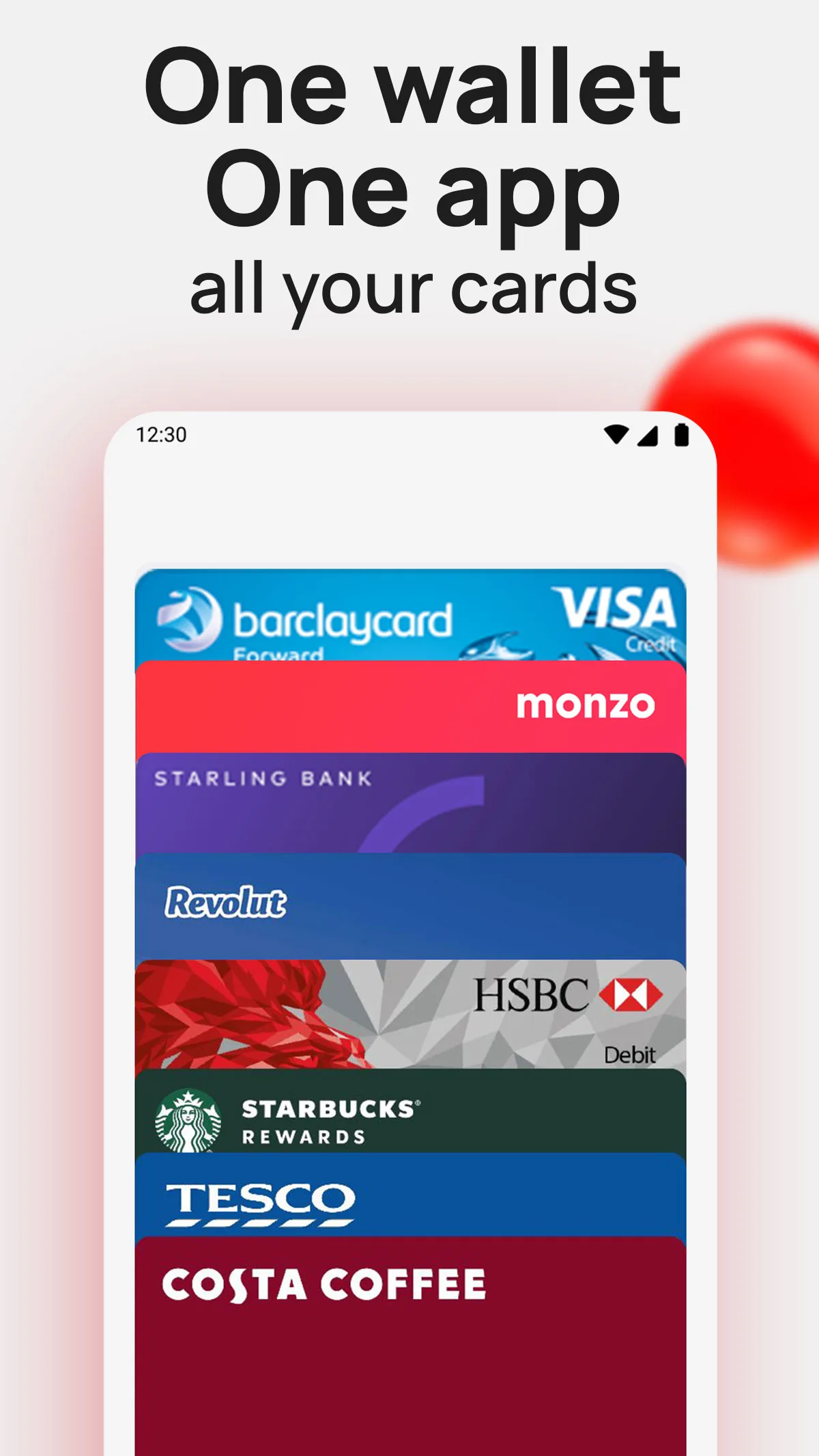
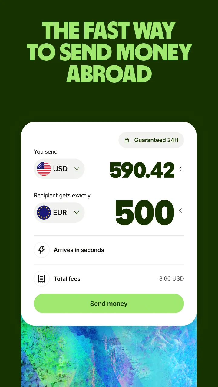
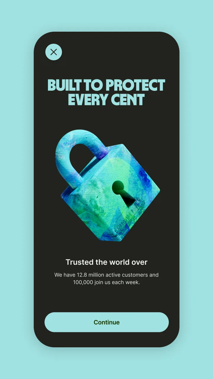
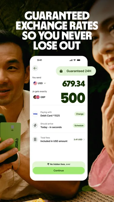
- WiseApp Store
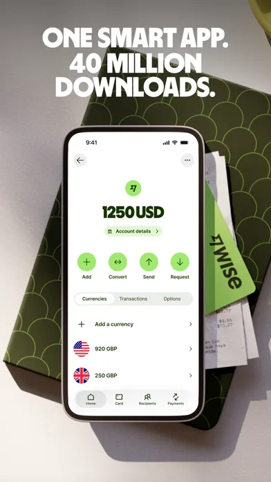
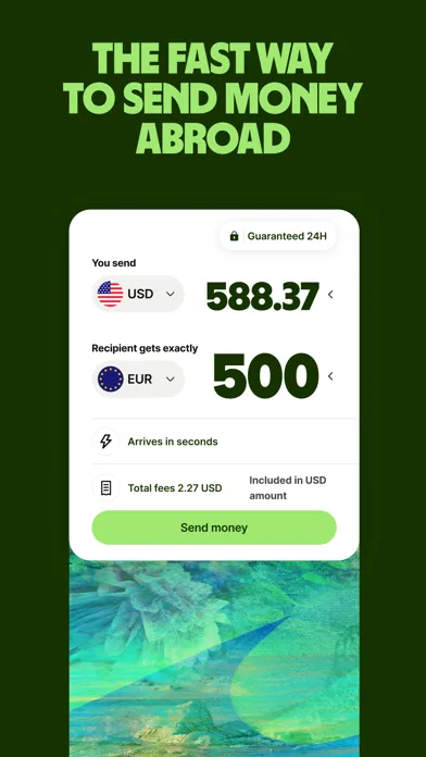
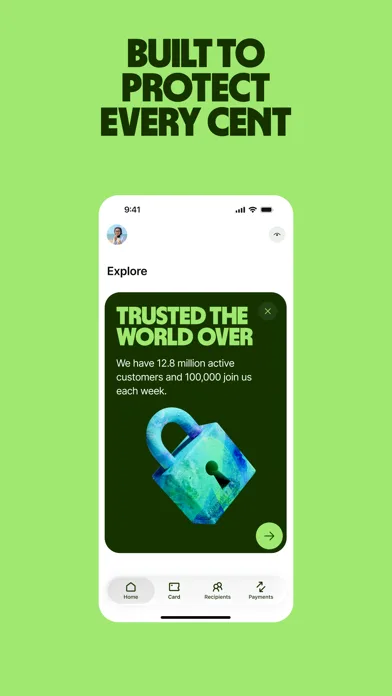
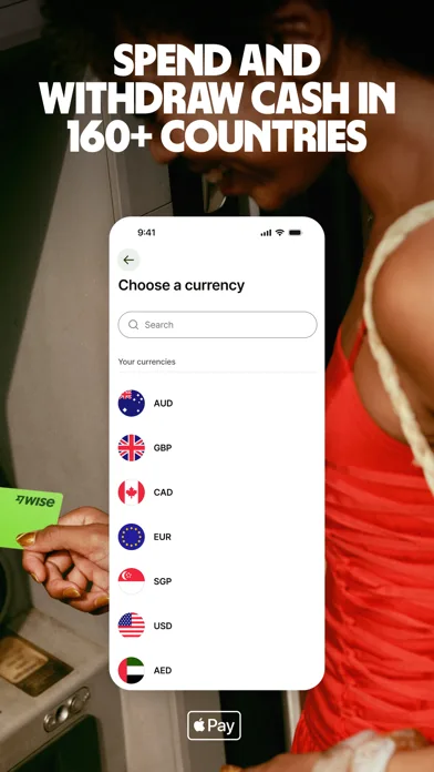 Play Store
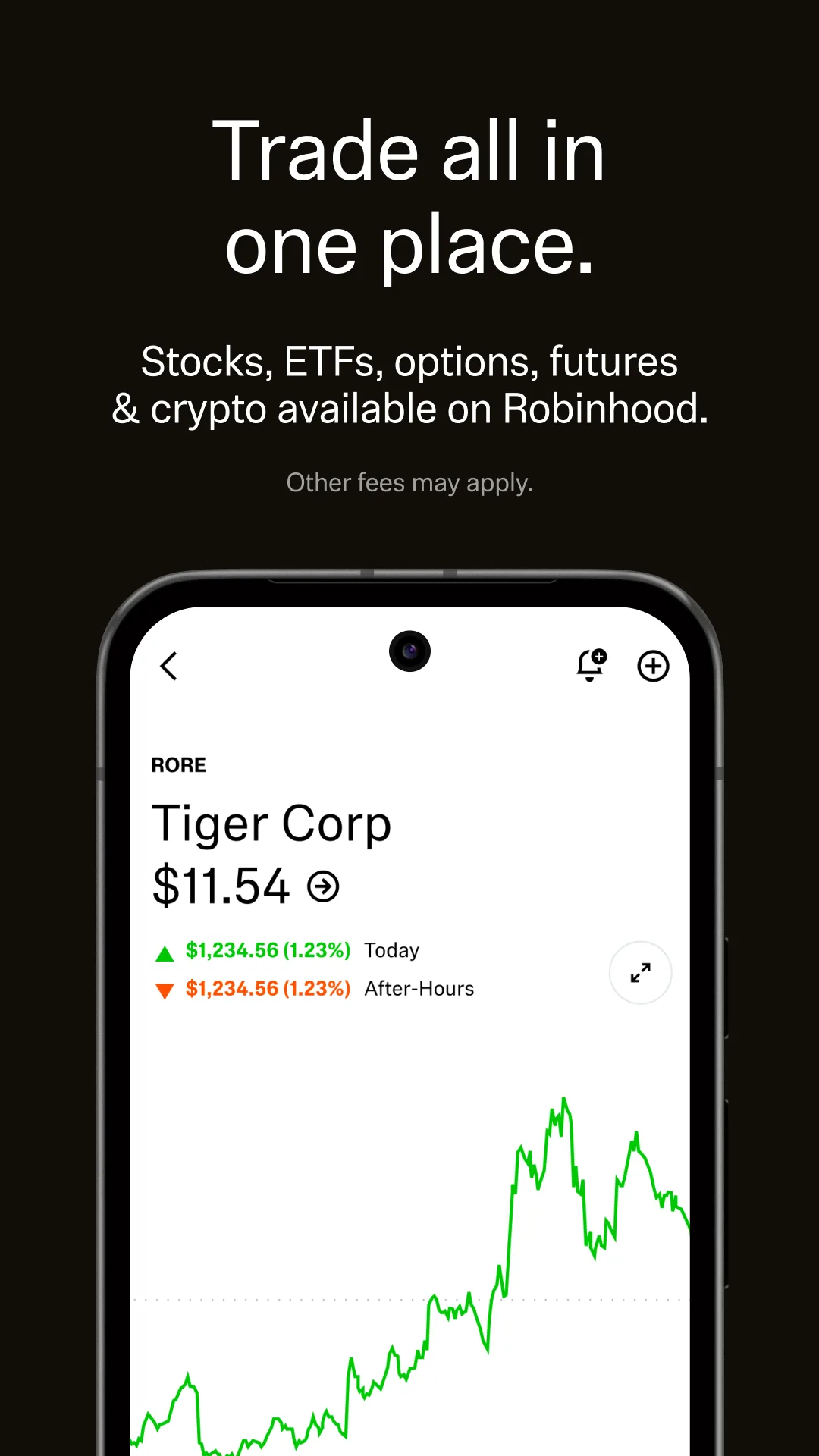
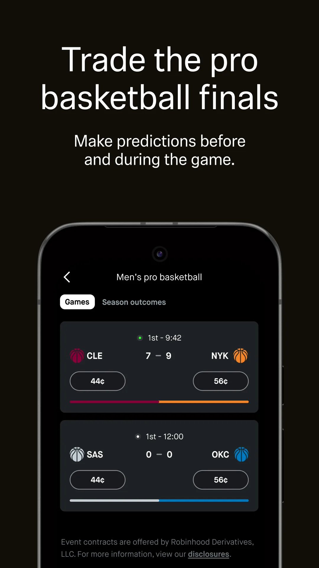
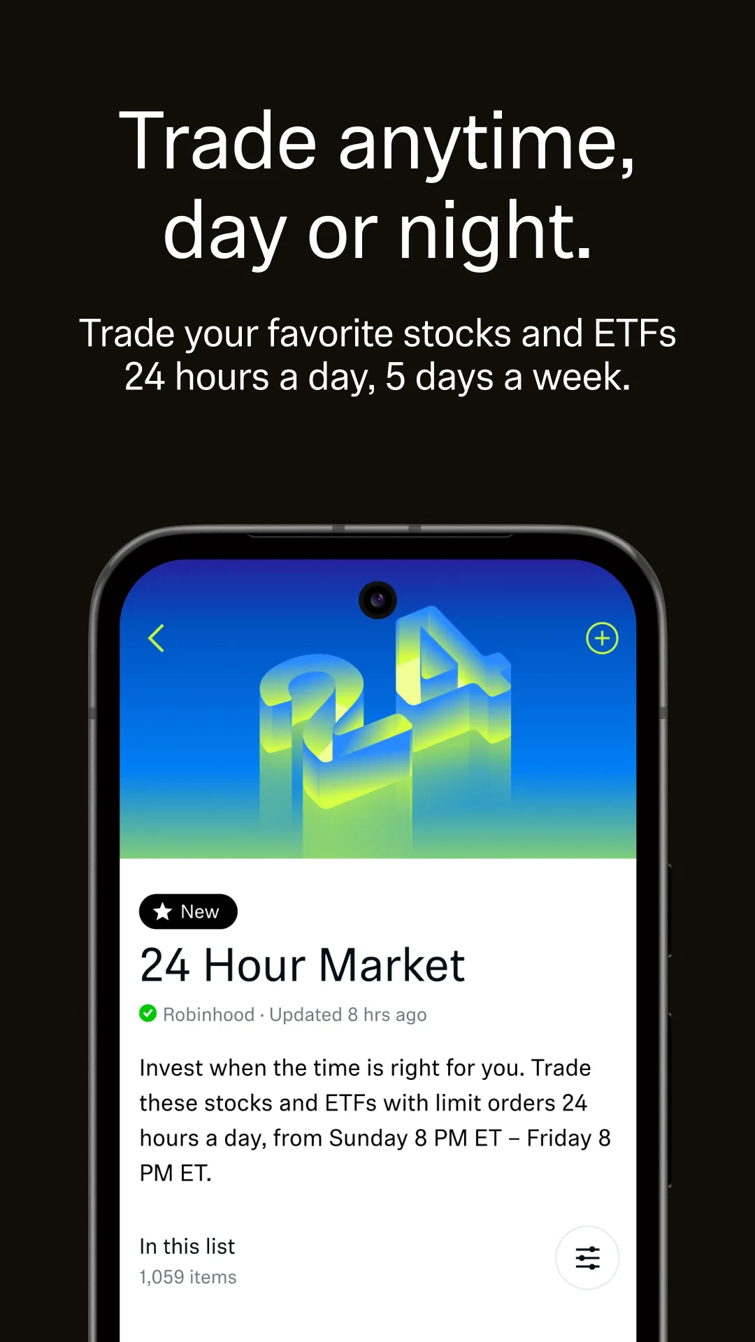
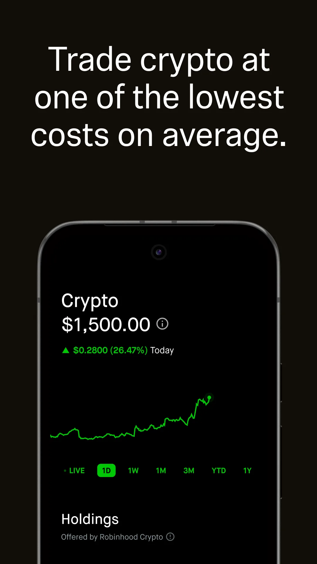
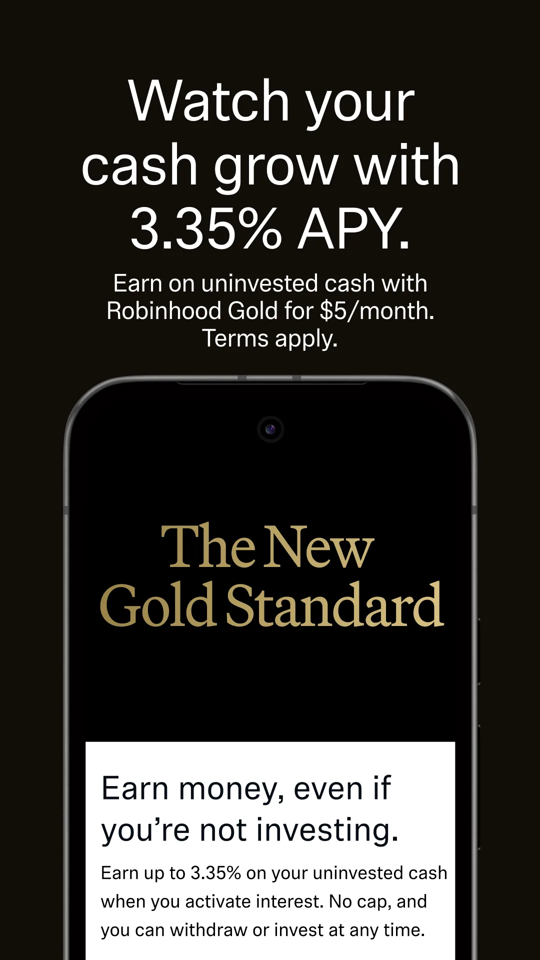
- RobinhoodPlay Store


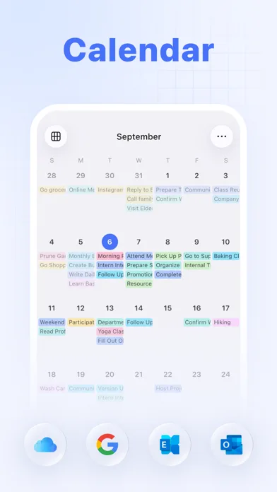
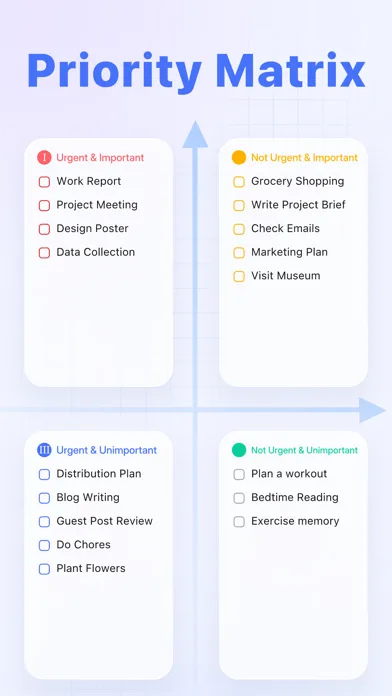
Real UI focused (no distraction)
Less illustration, more product proof. Best when your UI is the selling point.
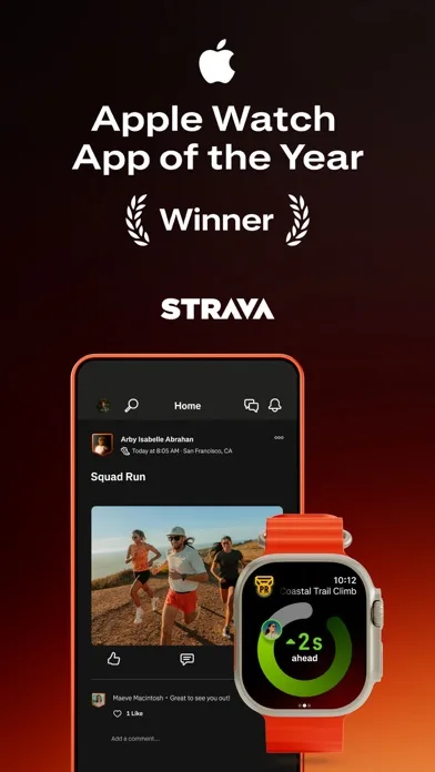
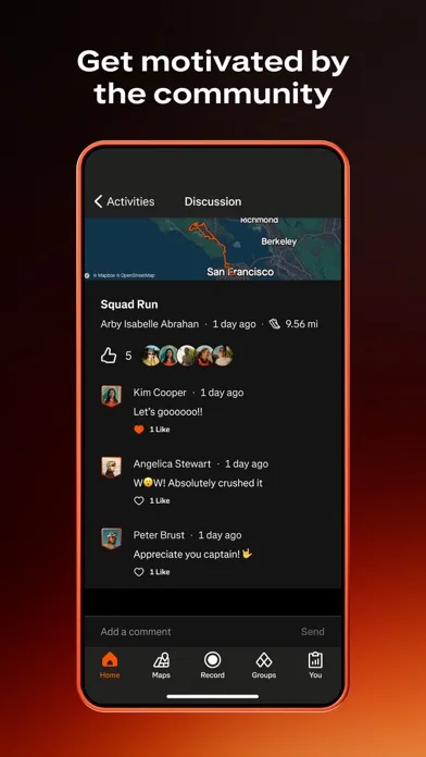
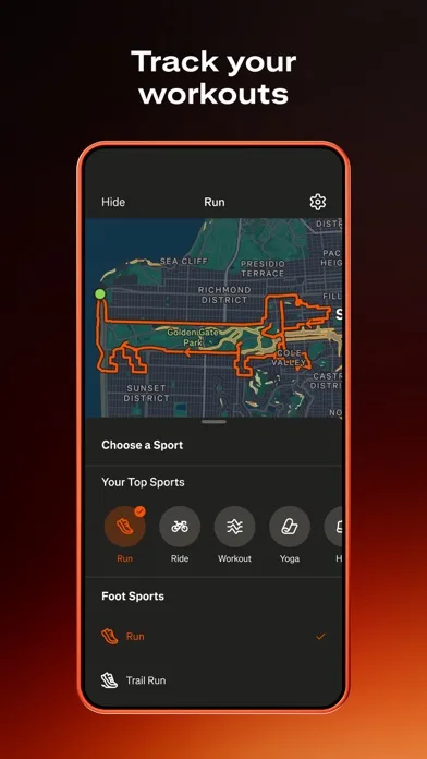
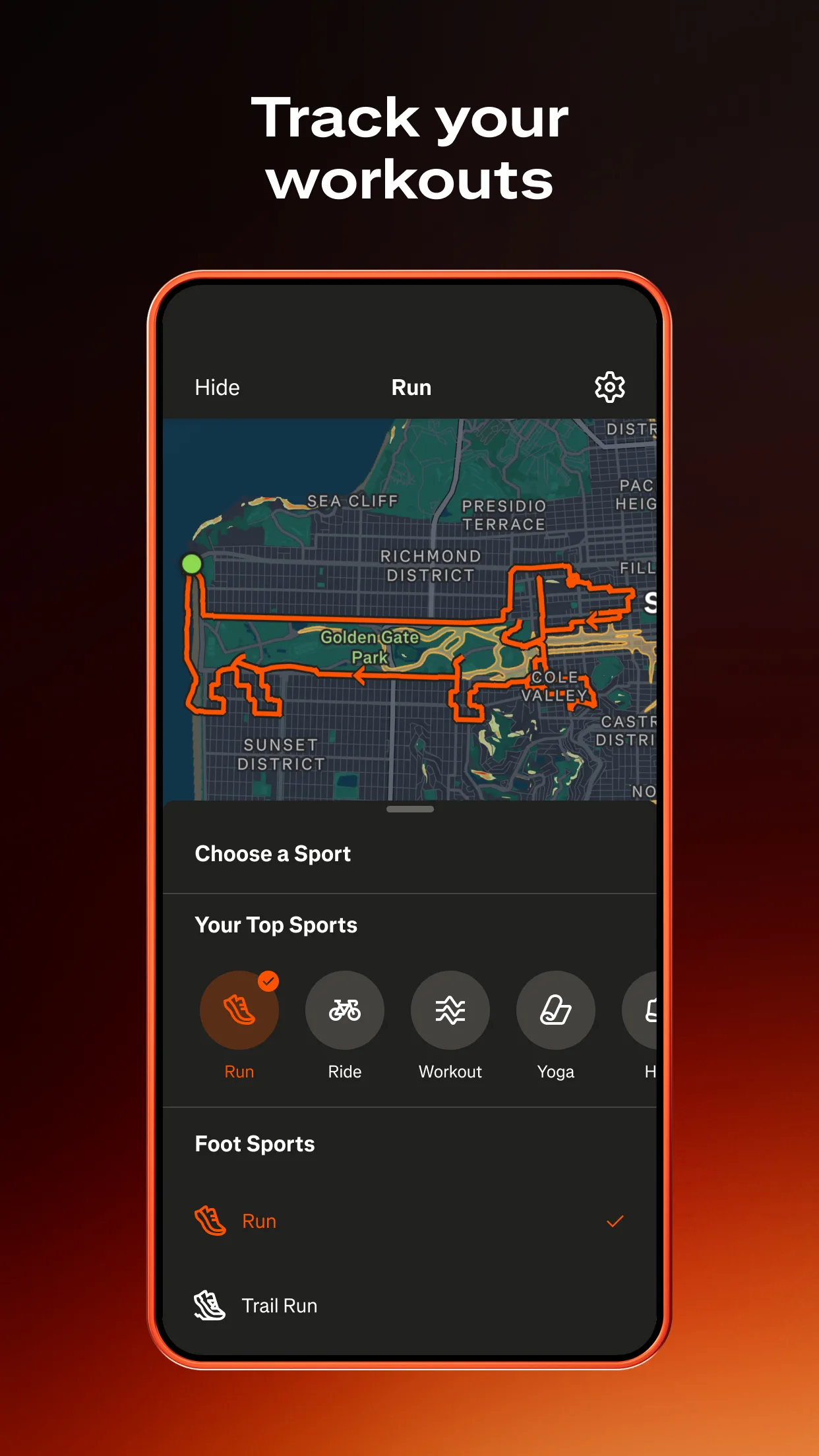
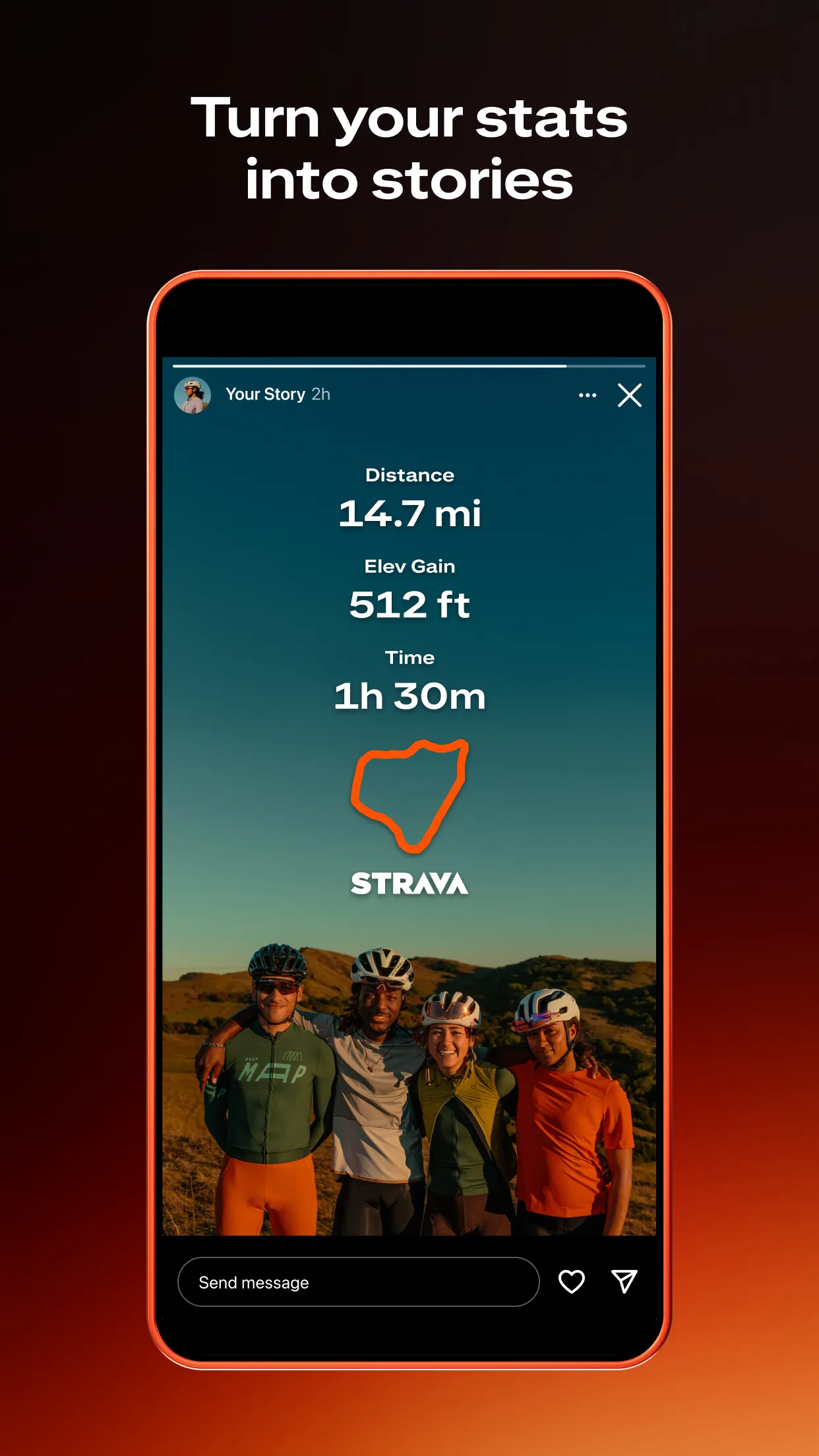
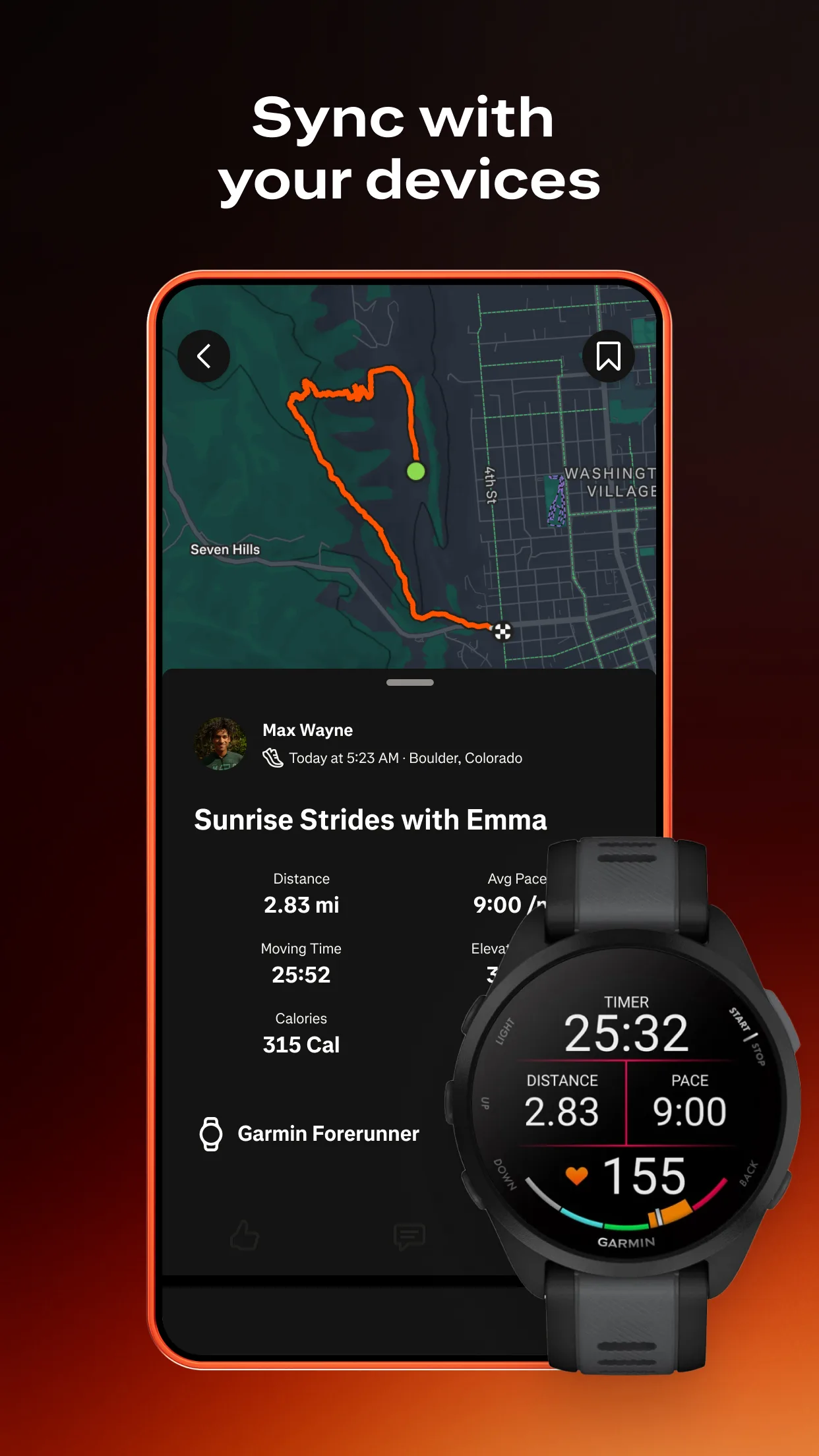
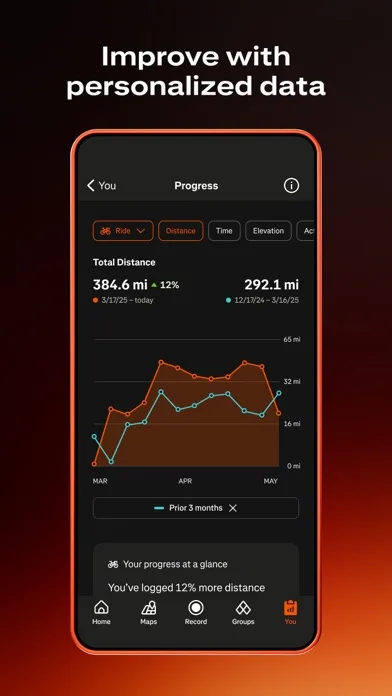
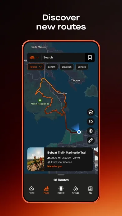
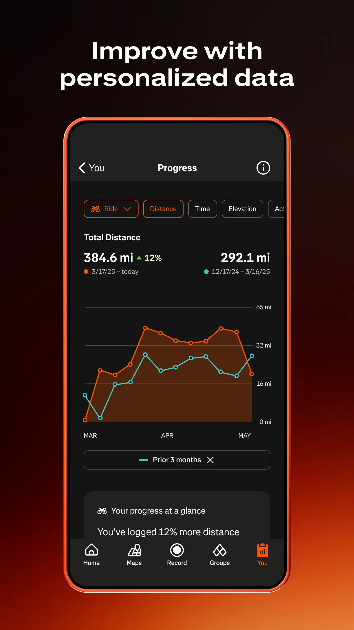
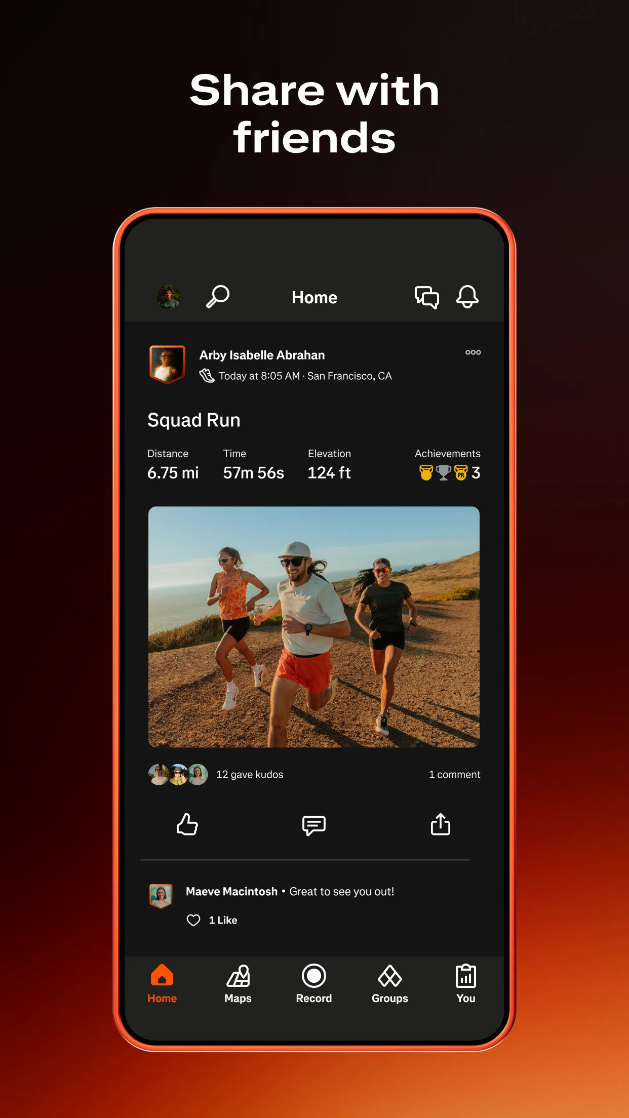
- StravaApp Store
 Play Store
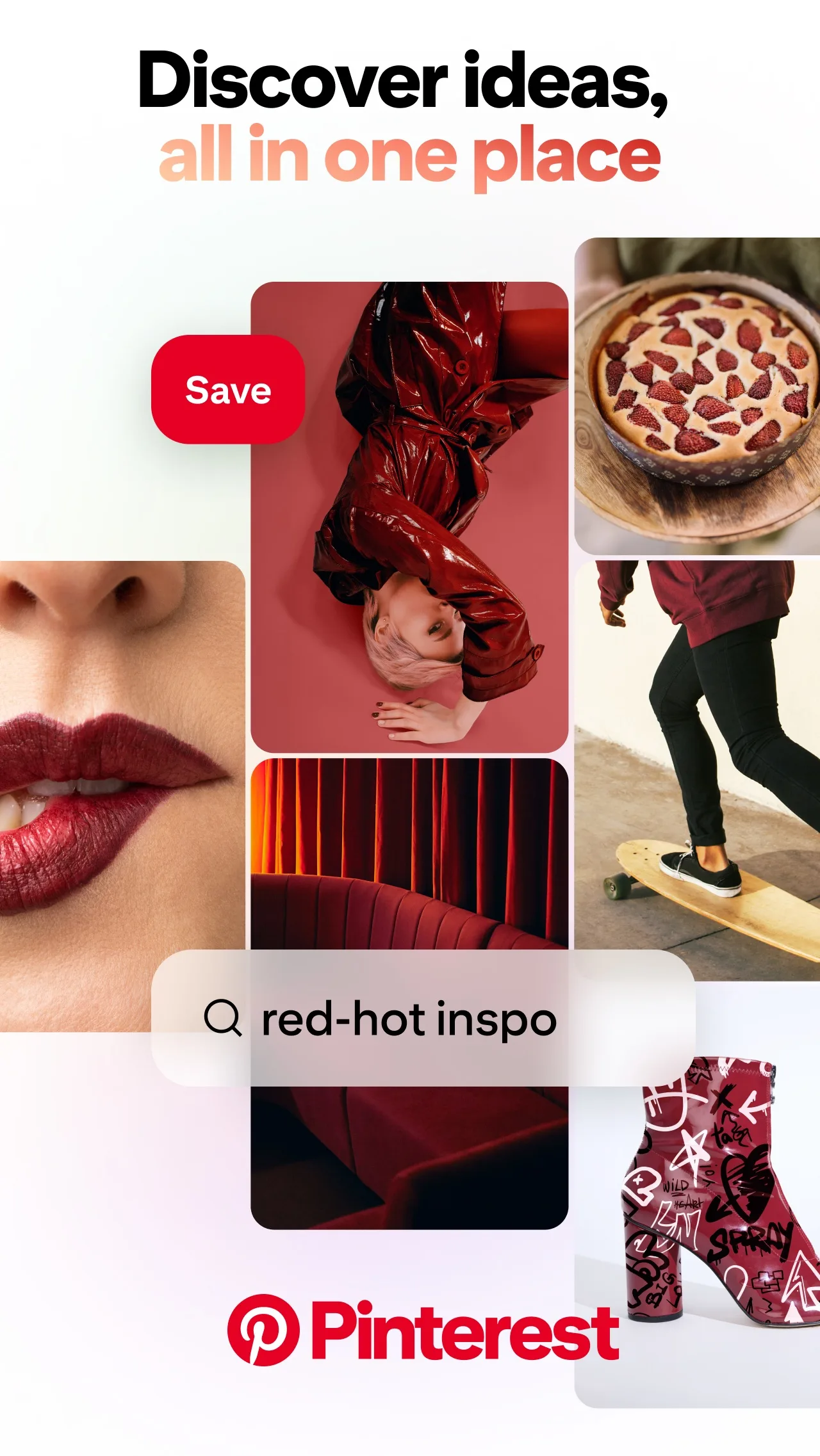
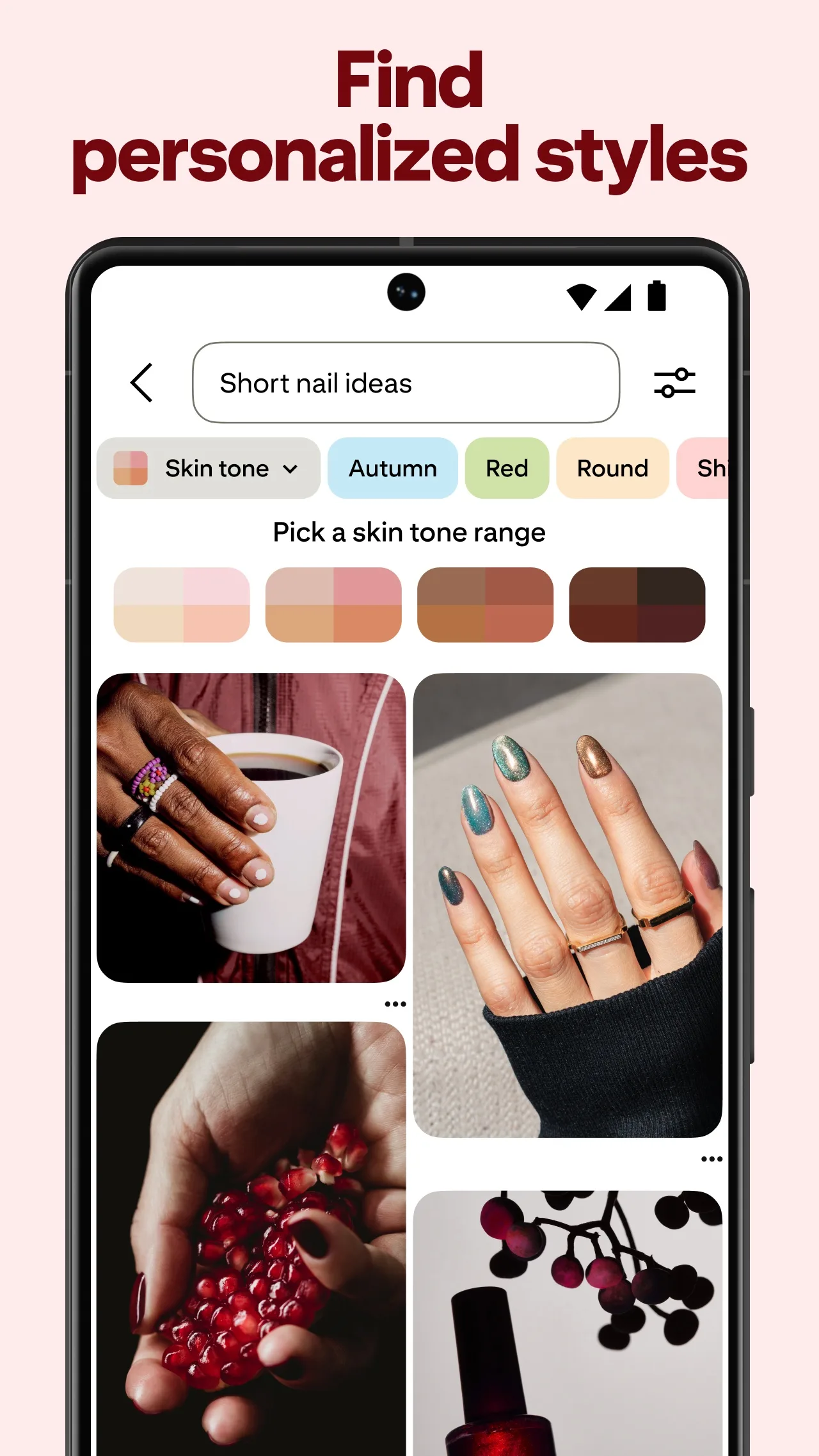
- PinterestApp Store
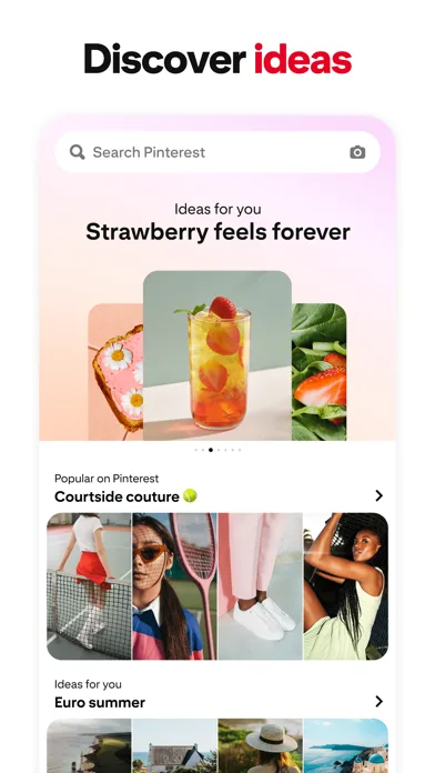
 Play Store
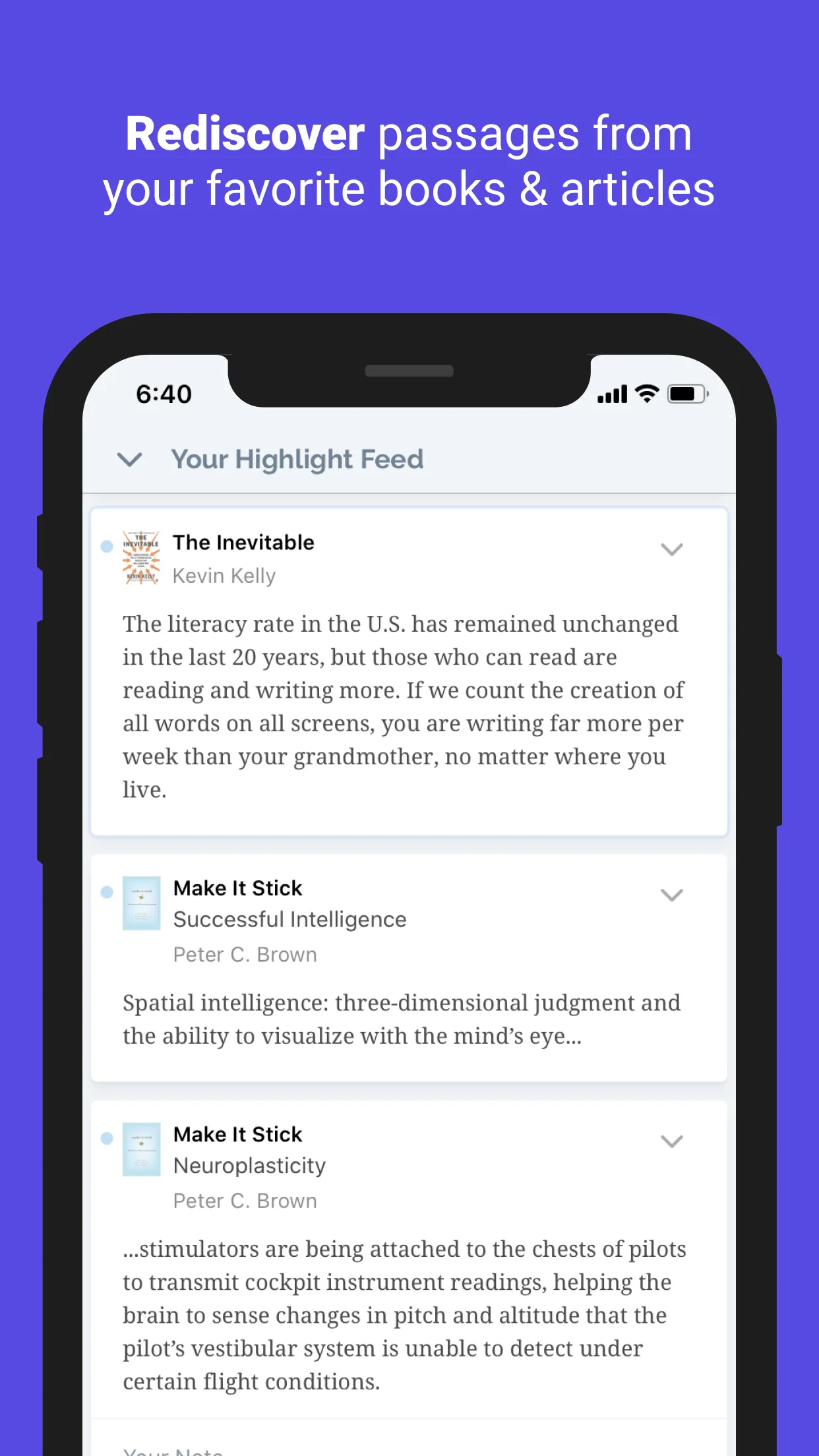
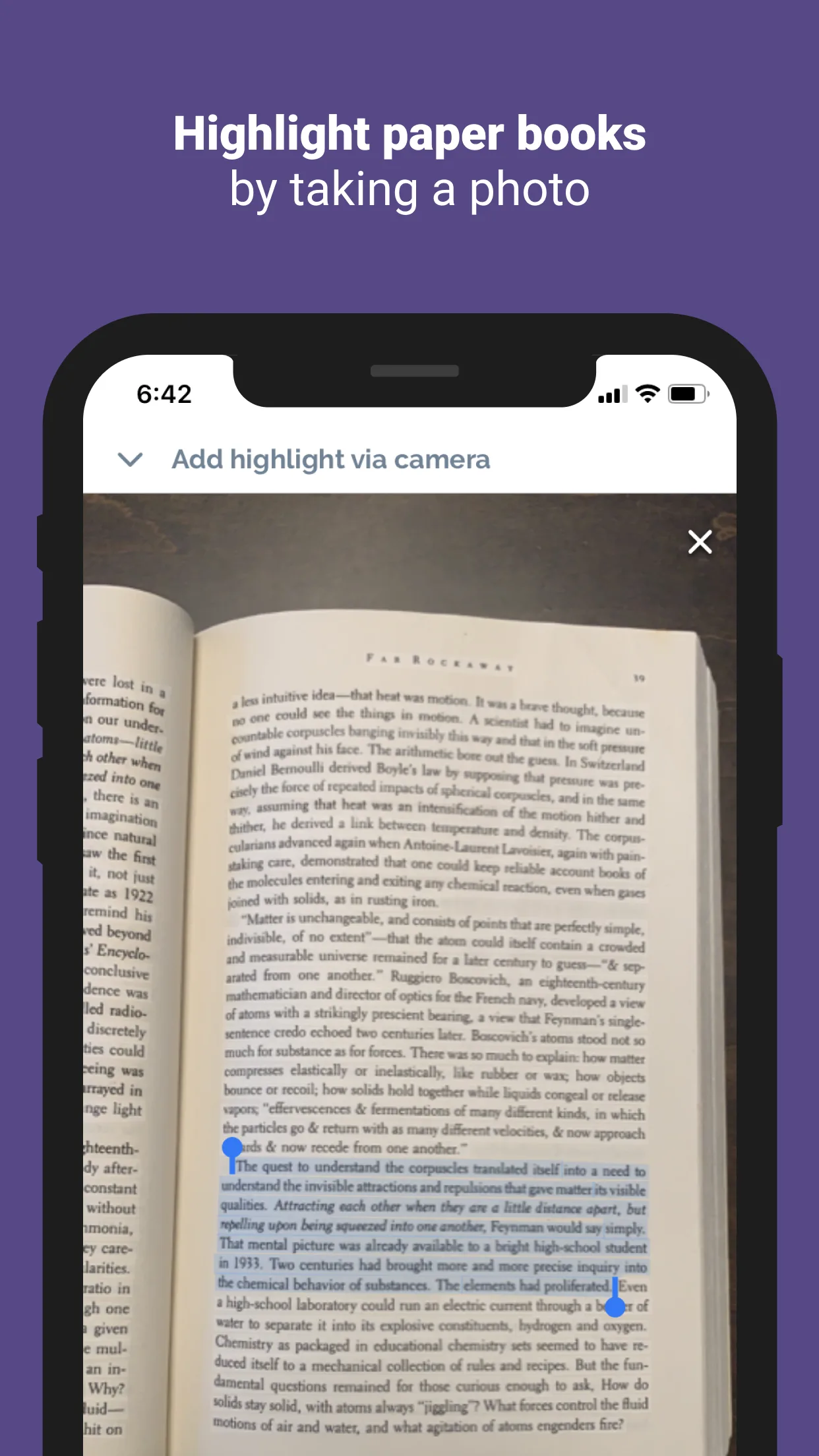
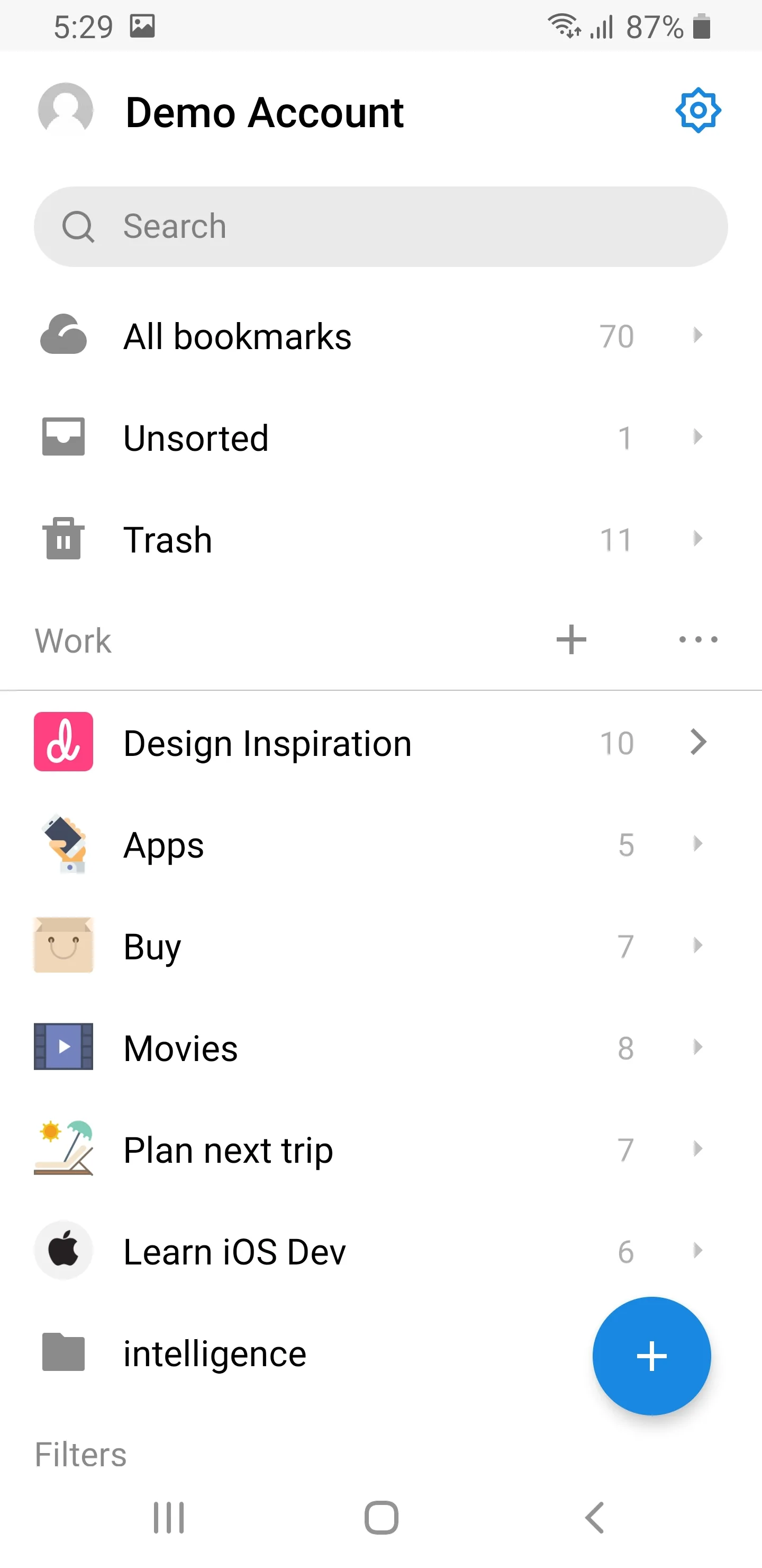
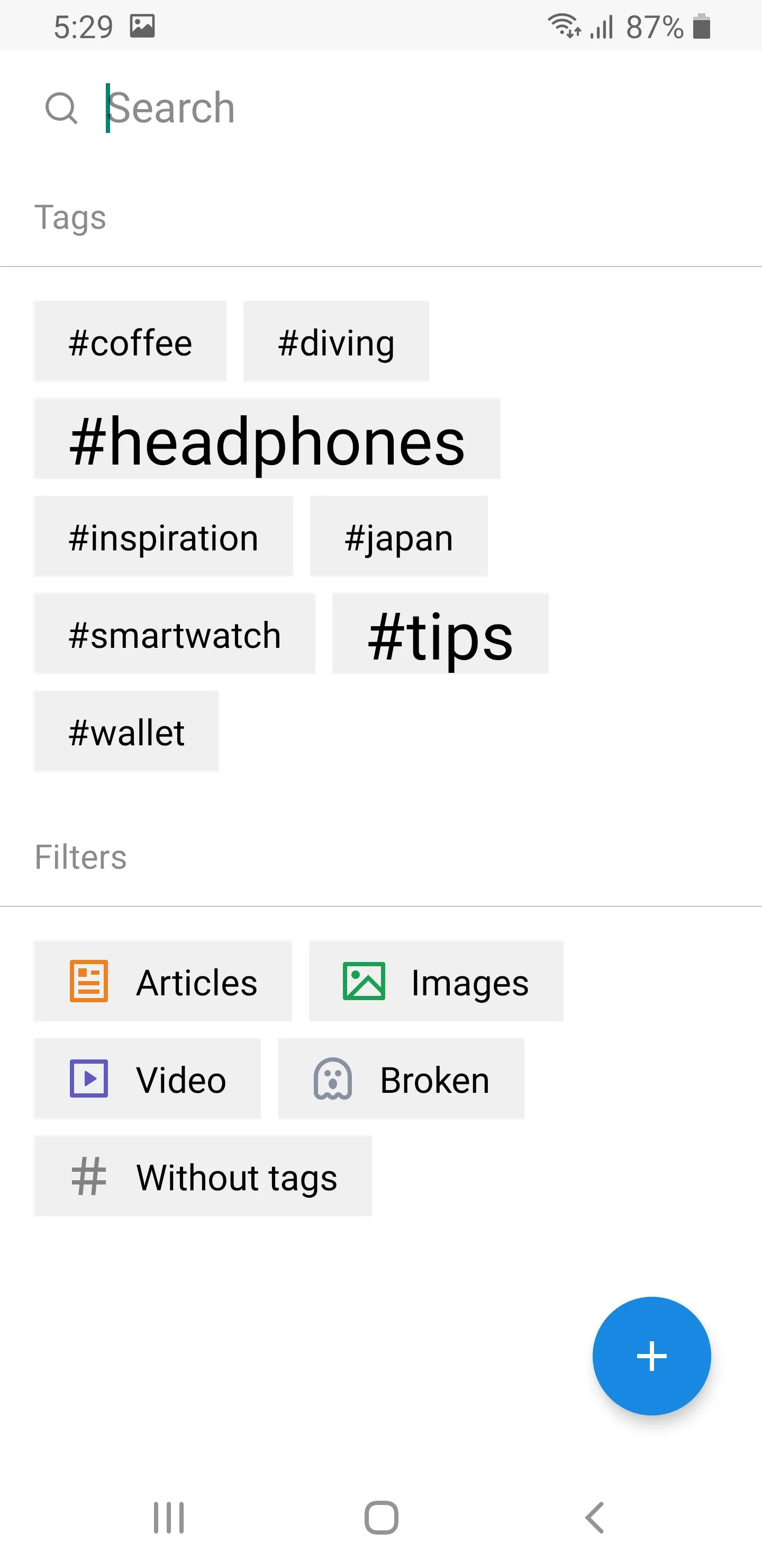
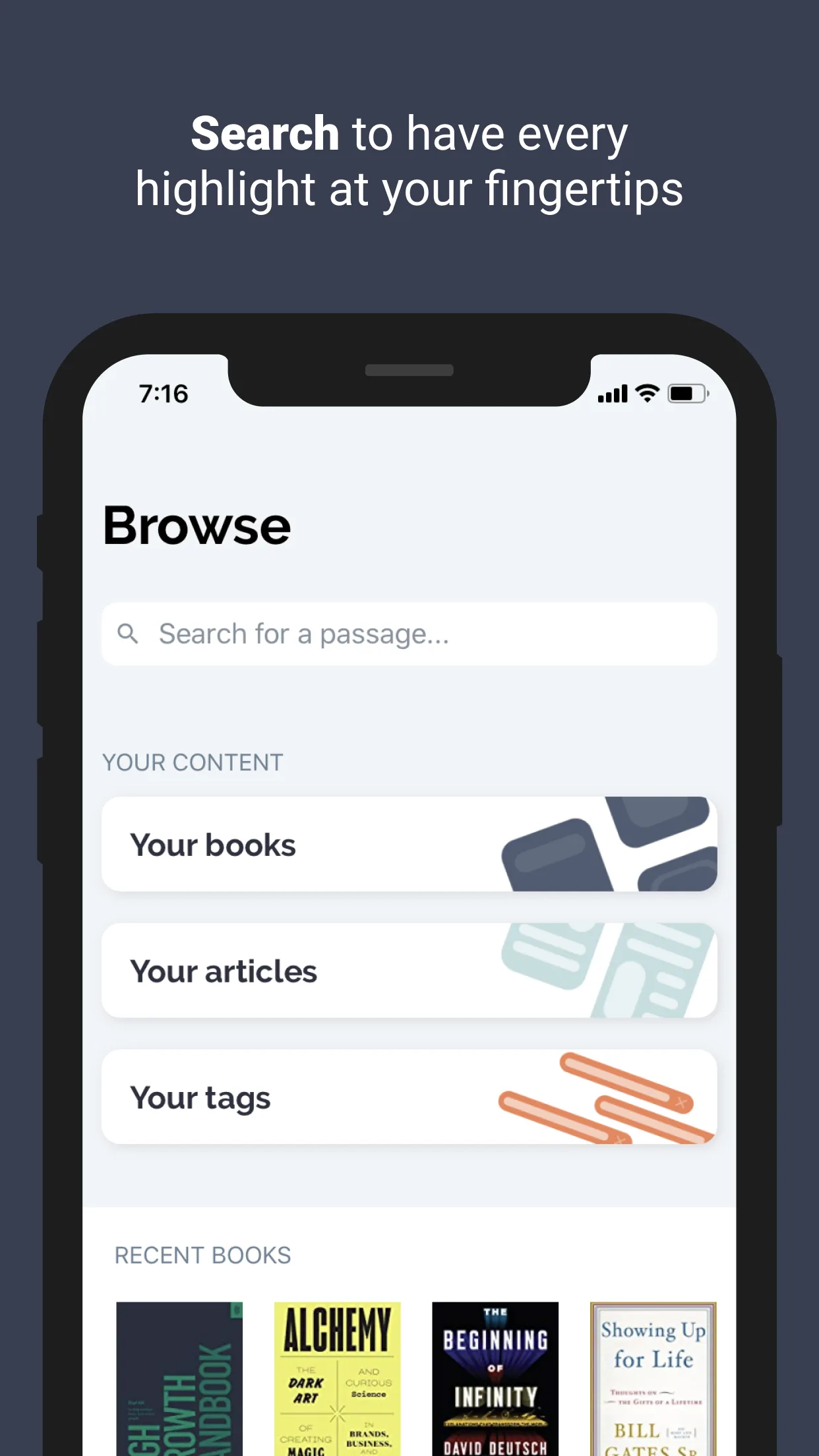
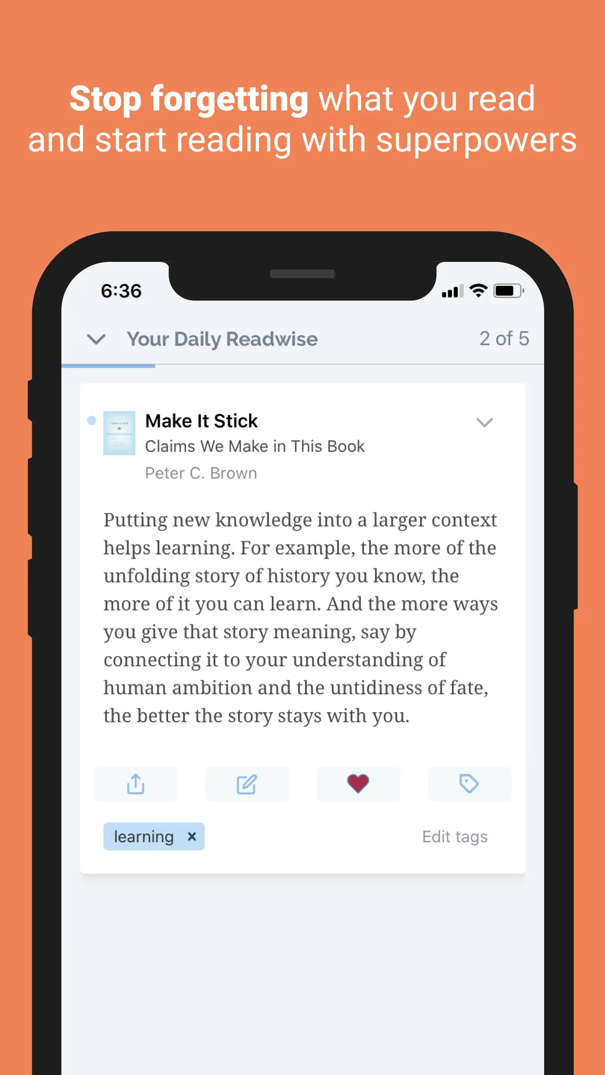
- ReadwiseApp Store


 Play Store

- Raindrop.ioApp Store
 Play Store
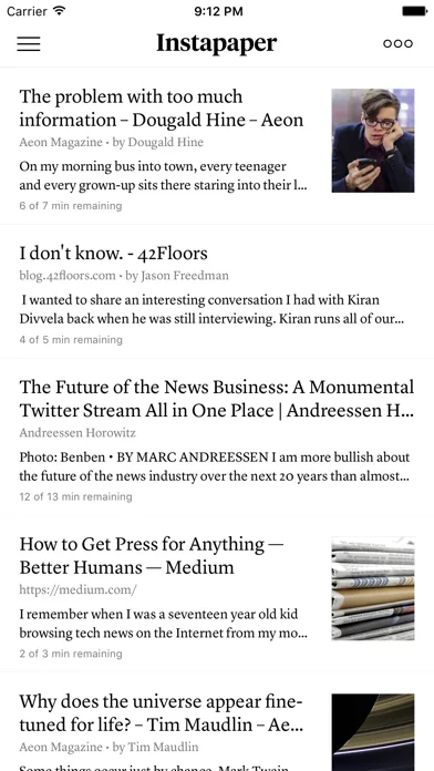
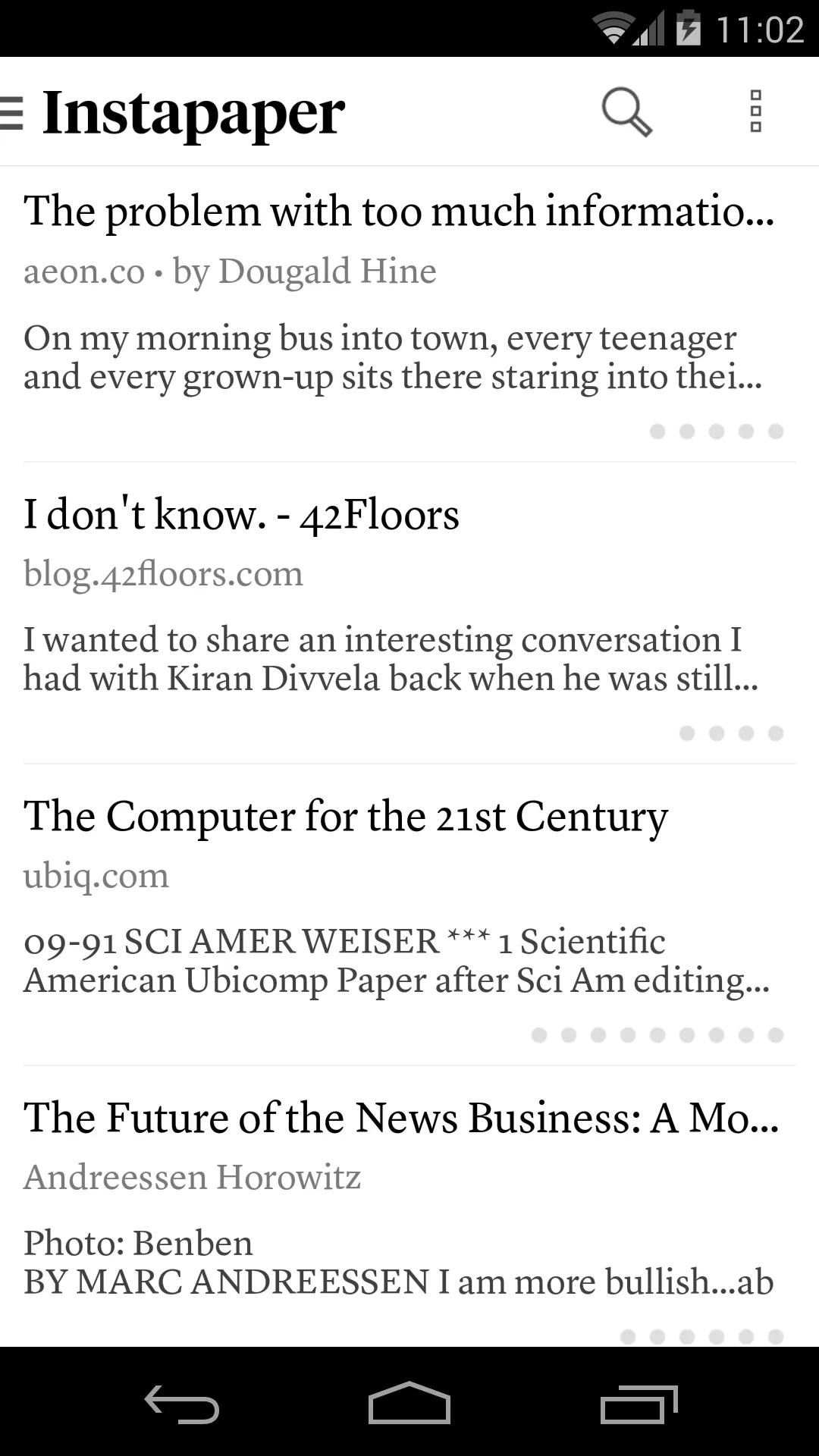
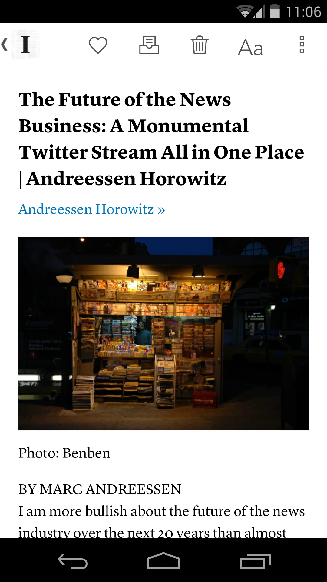
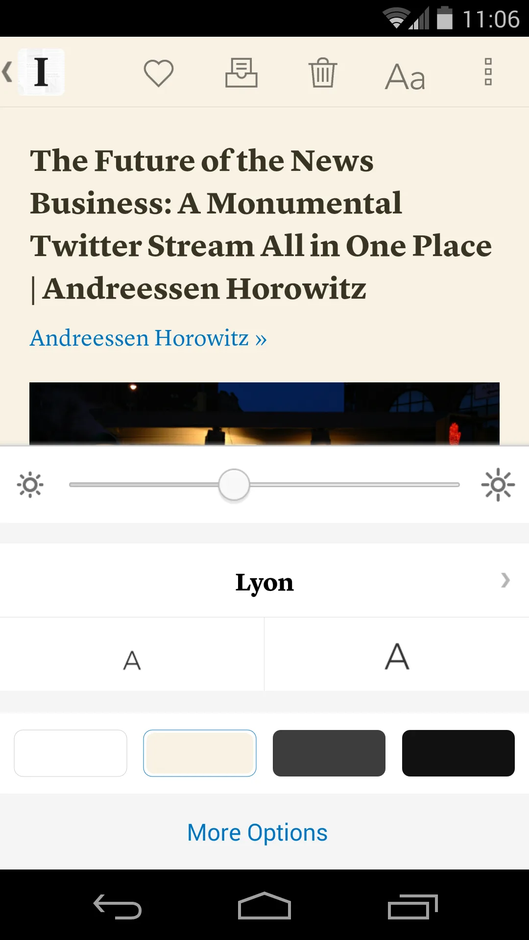
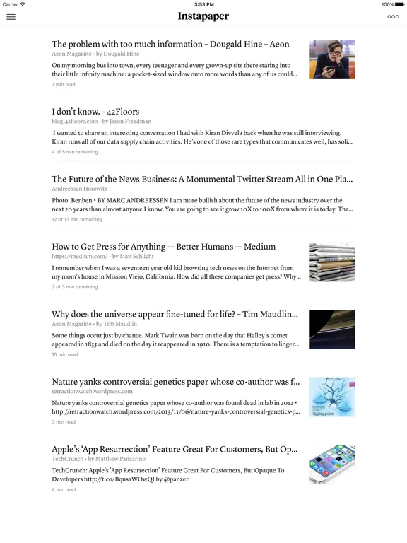
- InstapaperApp Store
 Play Store
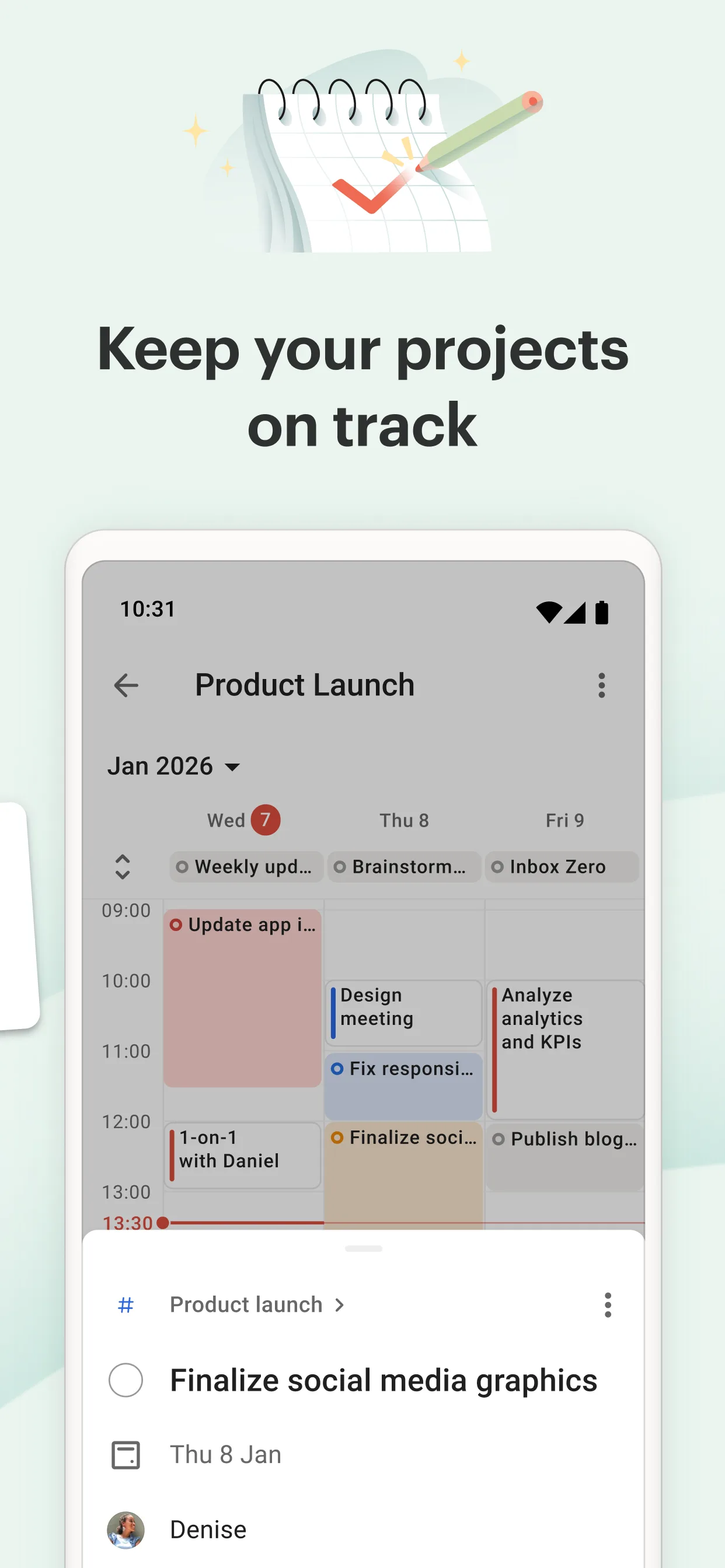
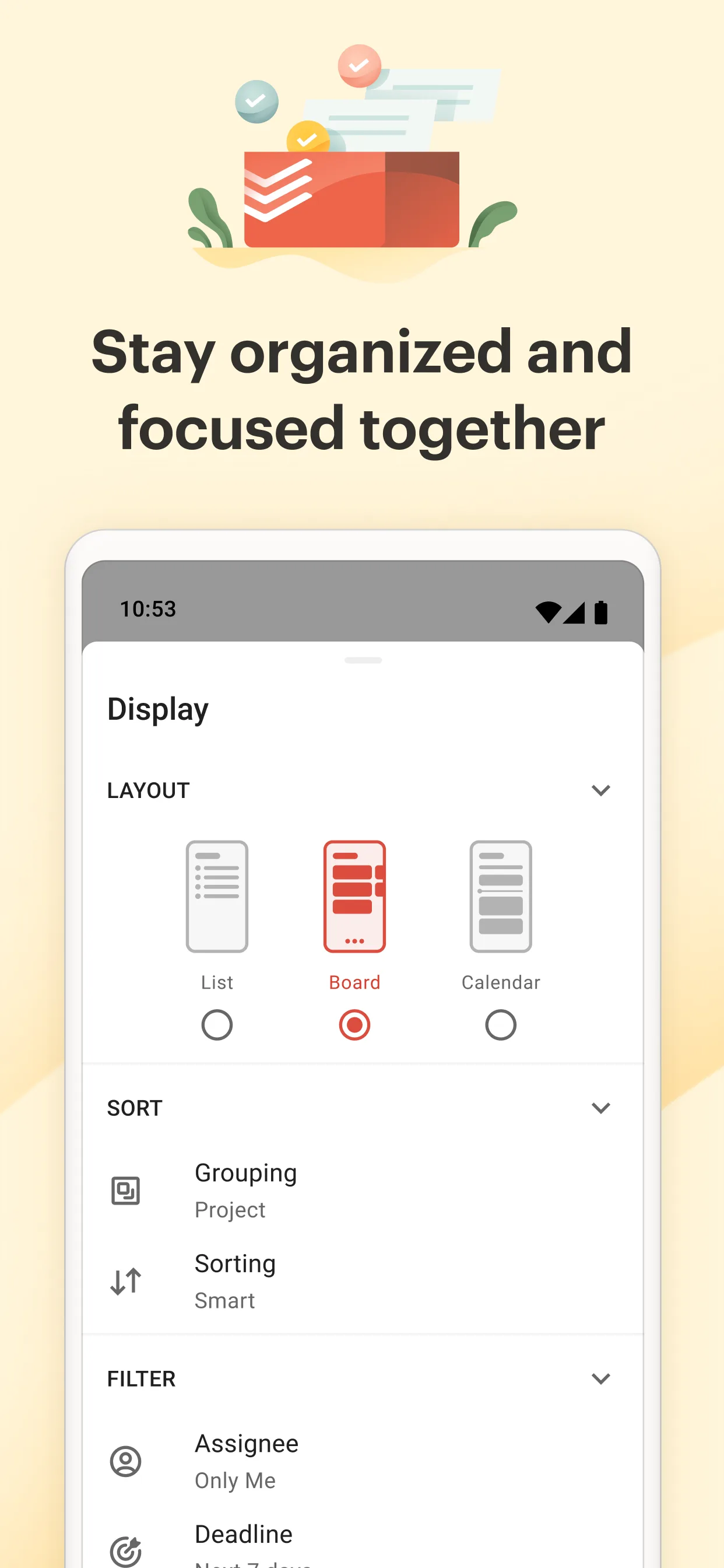
- TodoistApp Store
 Play Store
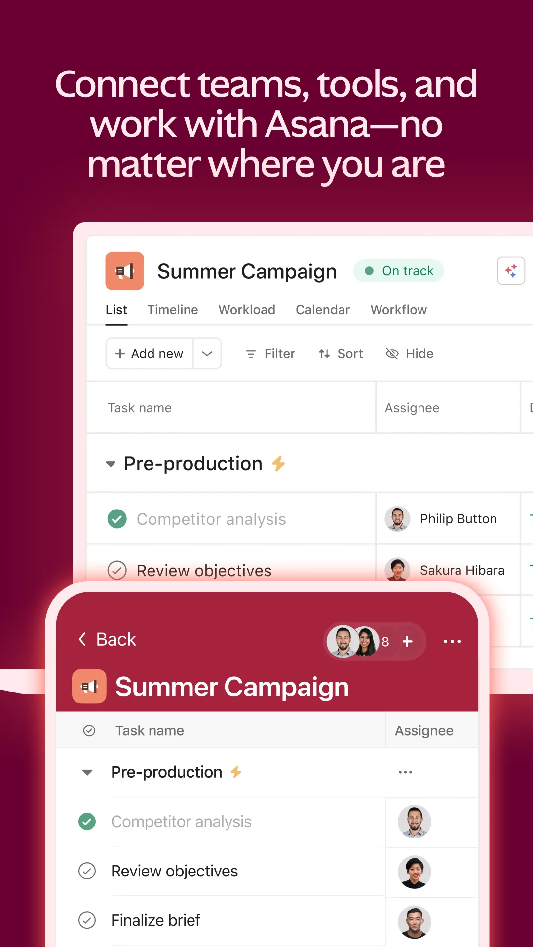
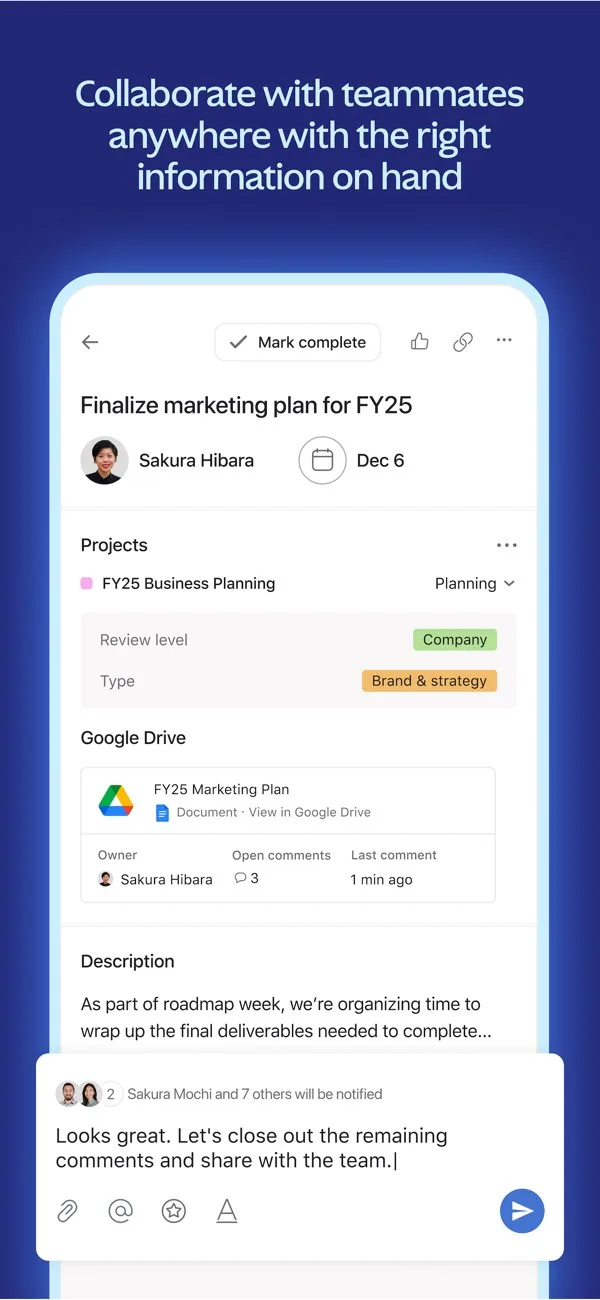
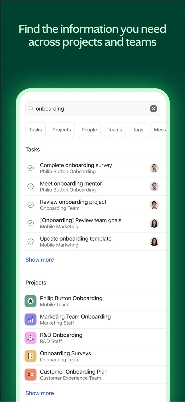
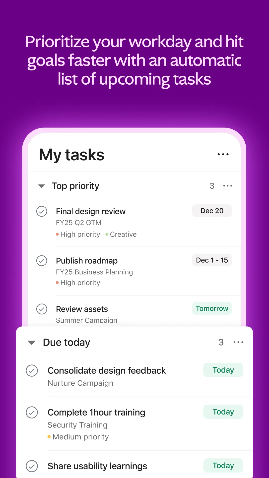
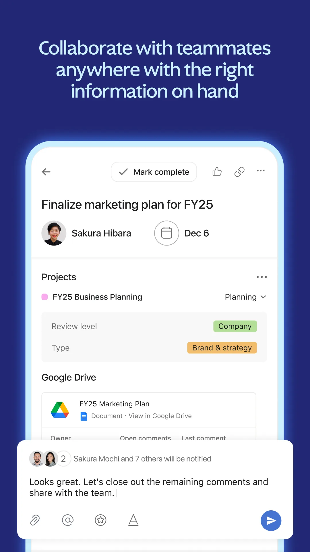
- AsanaApp Store
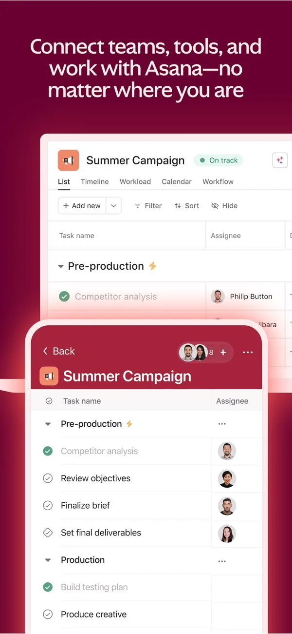
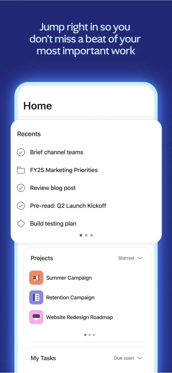
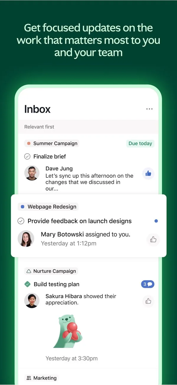
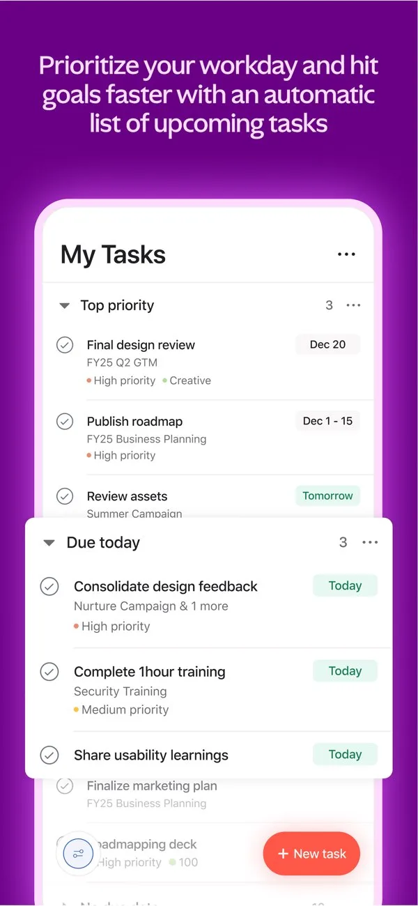 Play Store


Creative / breaking patterns
Bold art direction, editorial layouts, and unconventional screenshot storytelling for standout store presence.
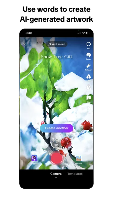
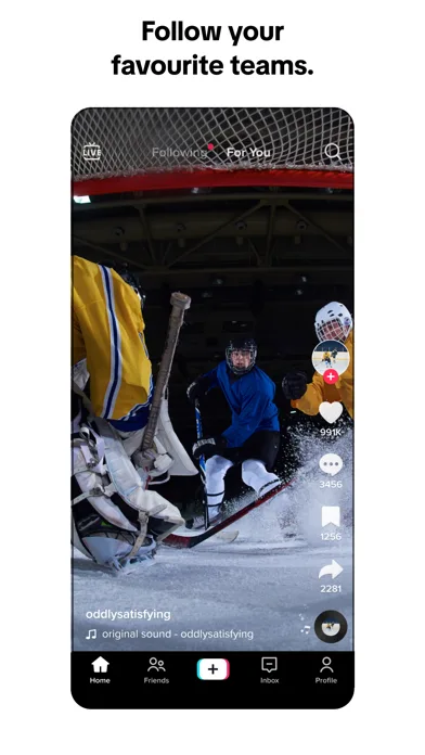
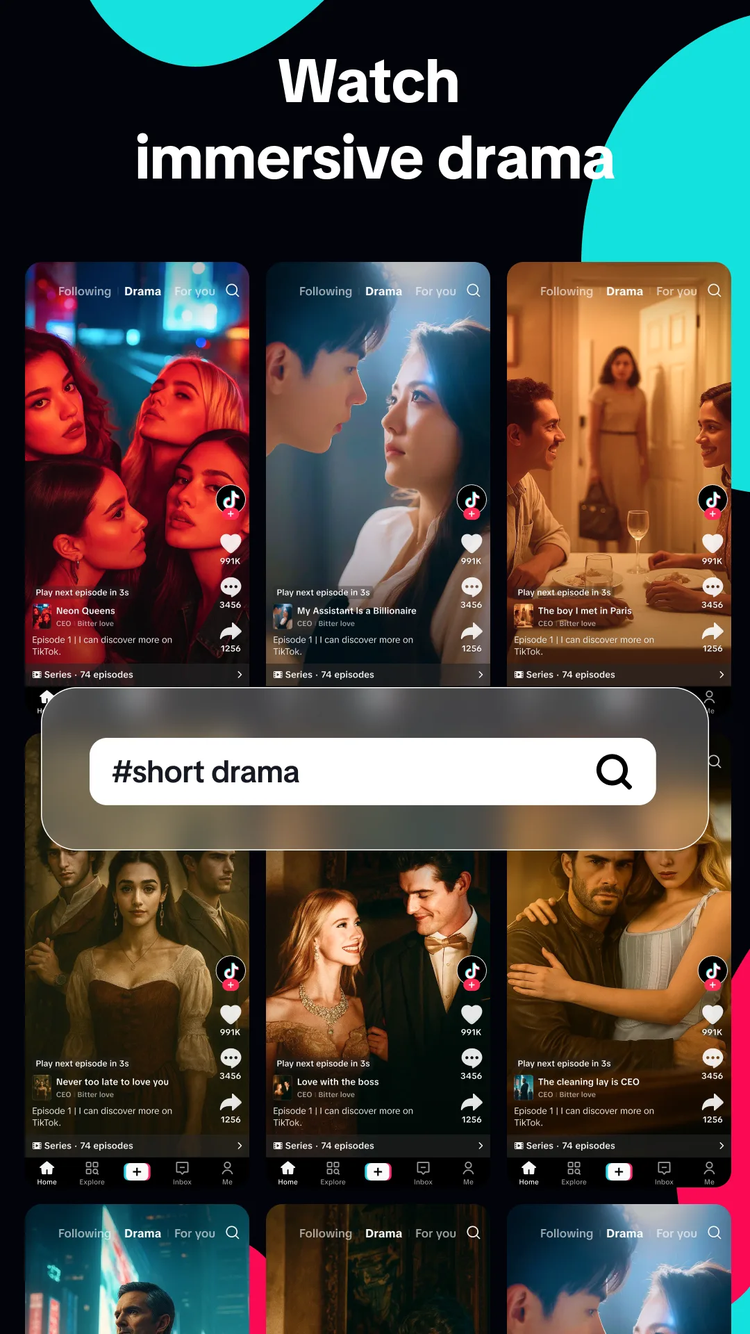
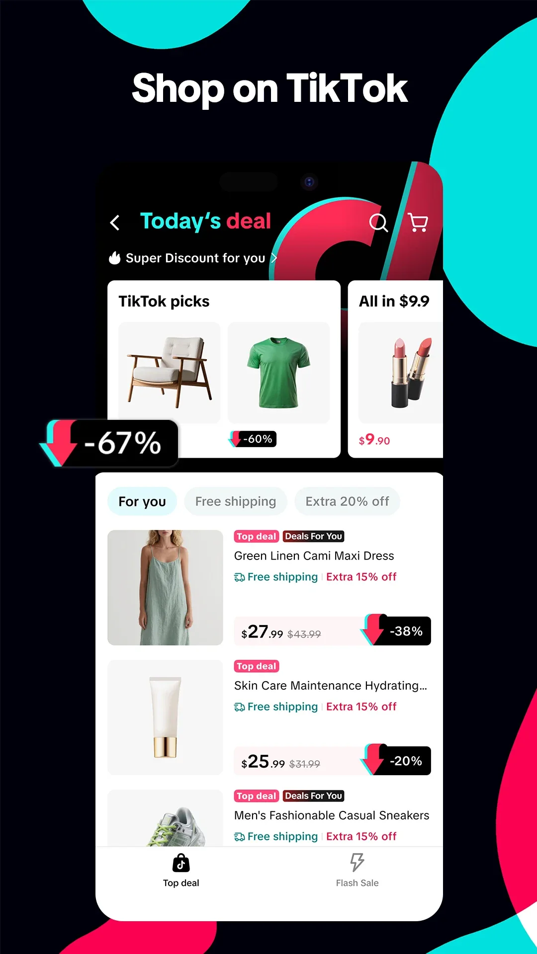
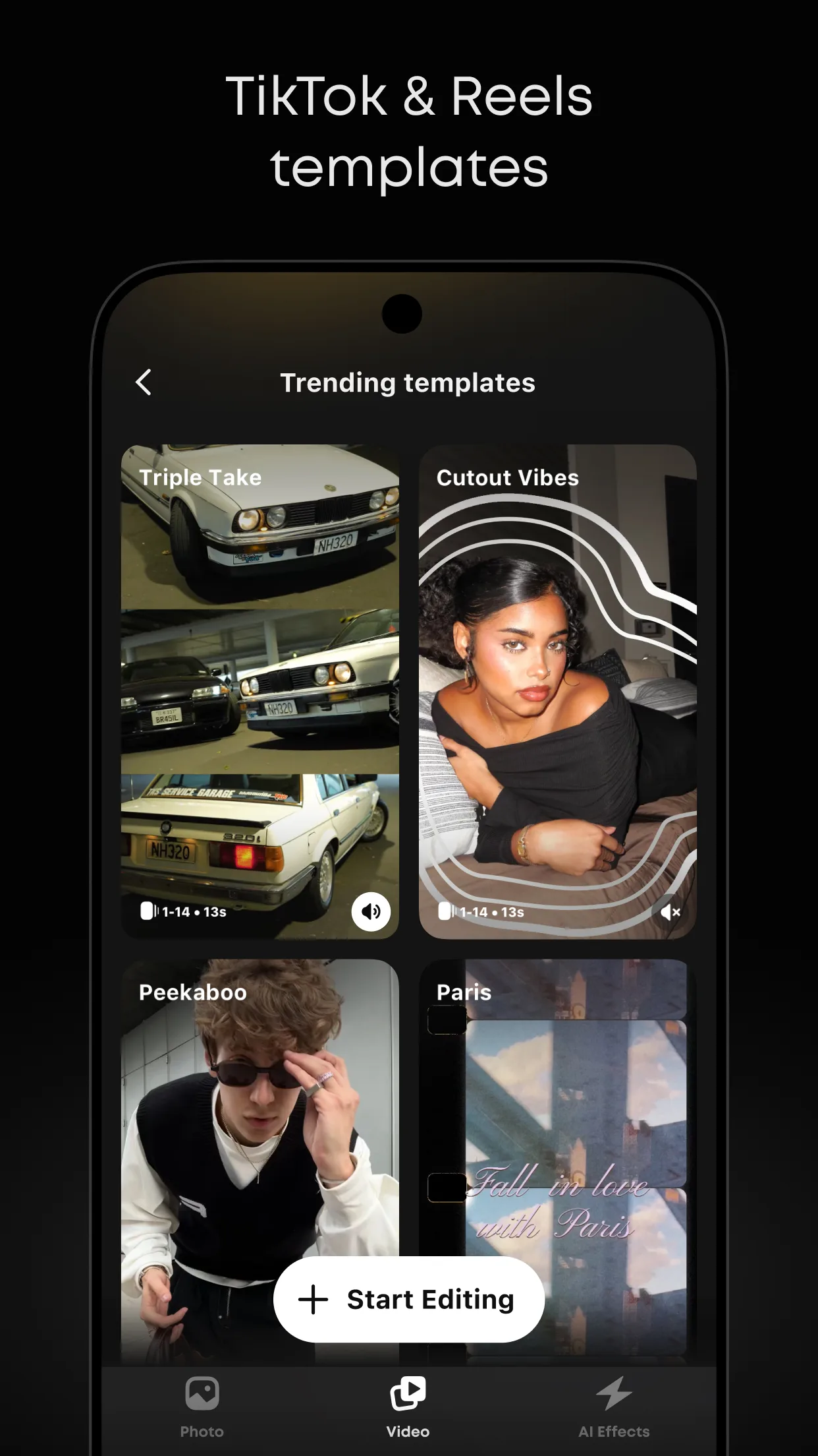
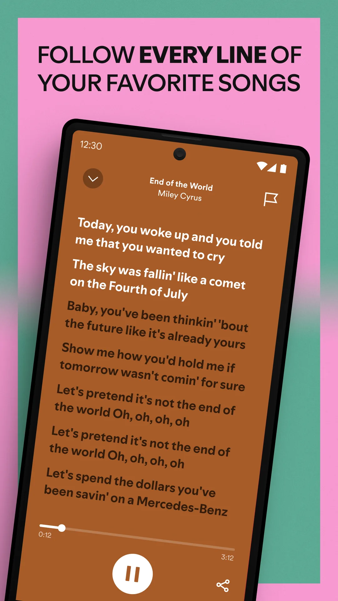
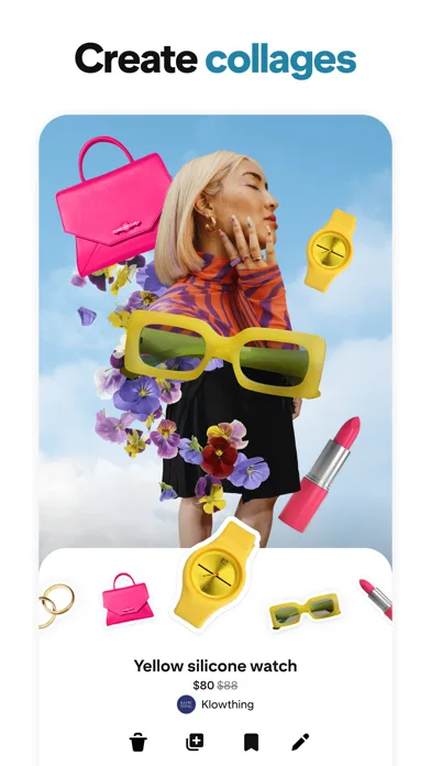
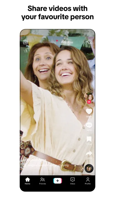
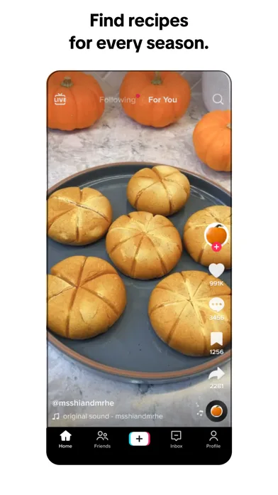
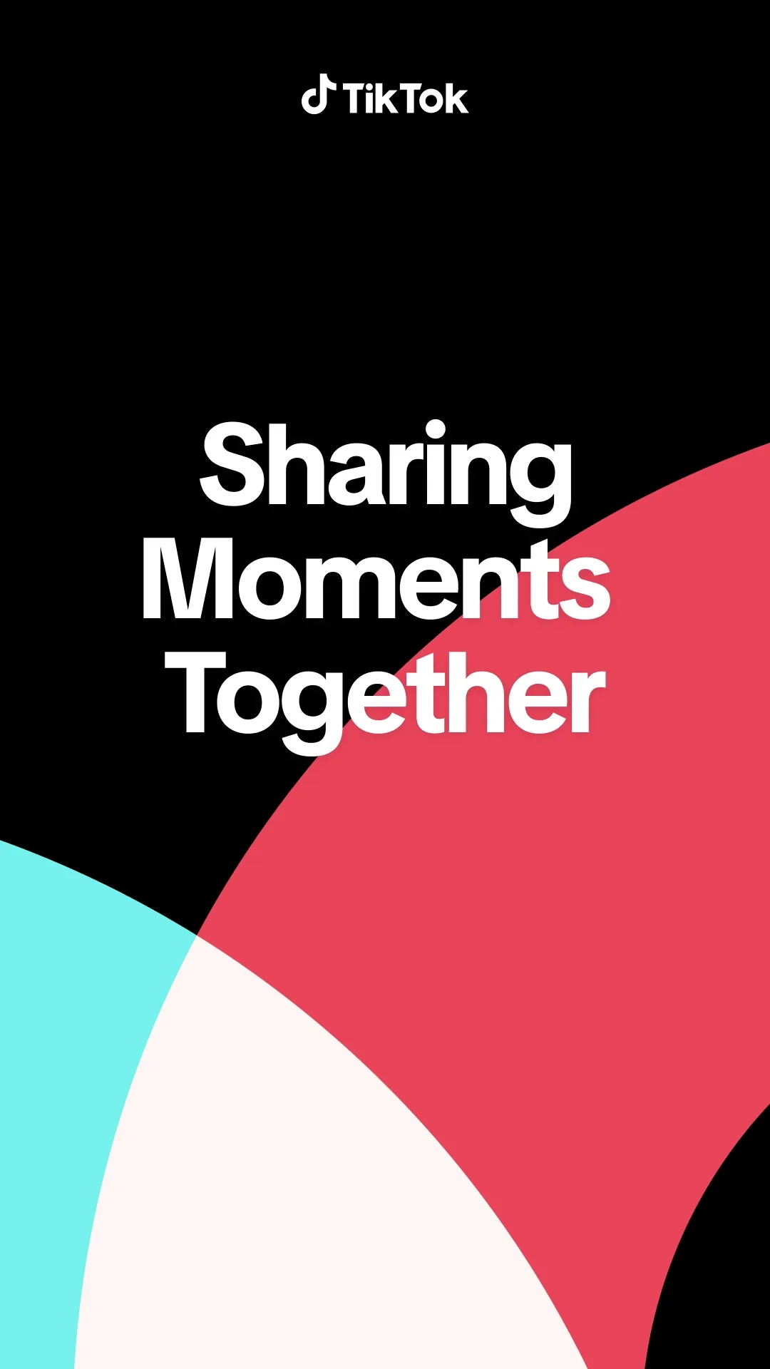
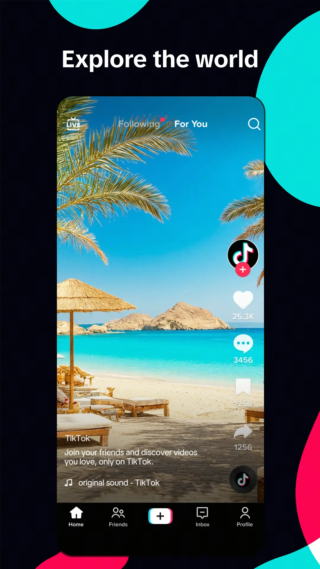
- TikTokApp Store

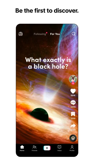
 Play Store
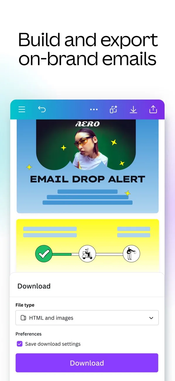
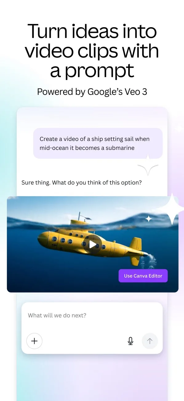
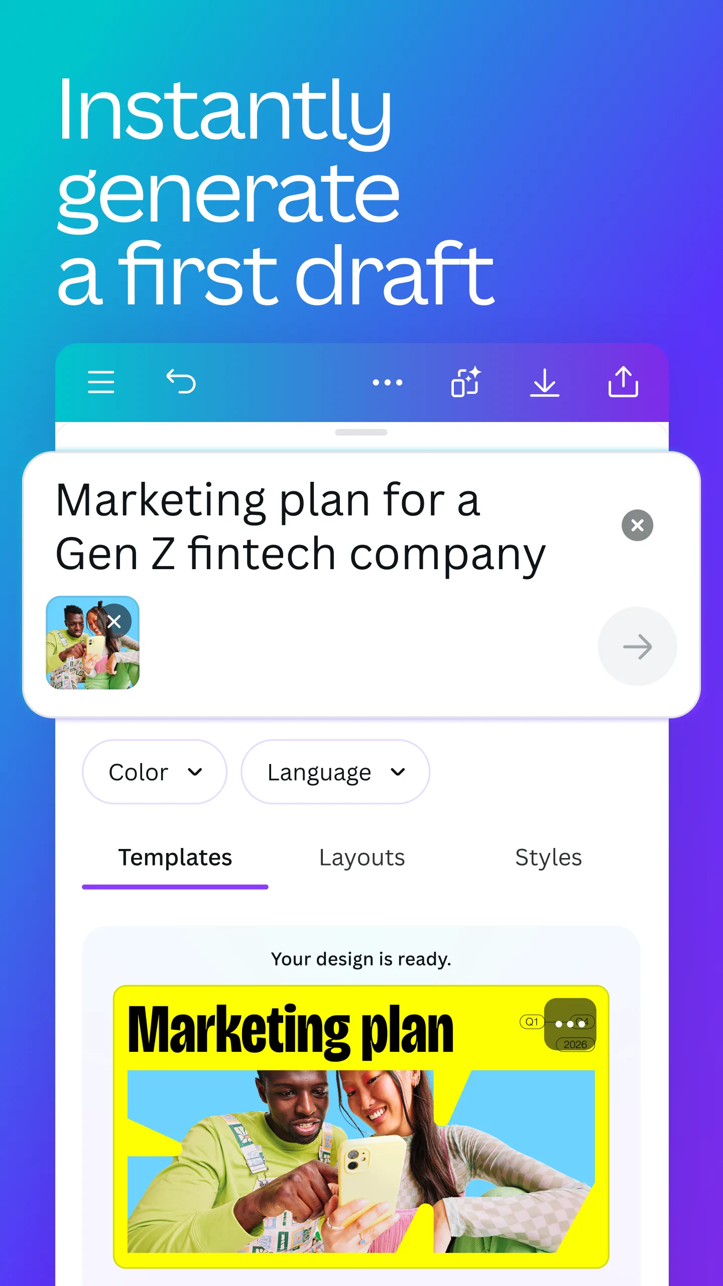
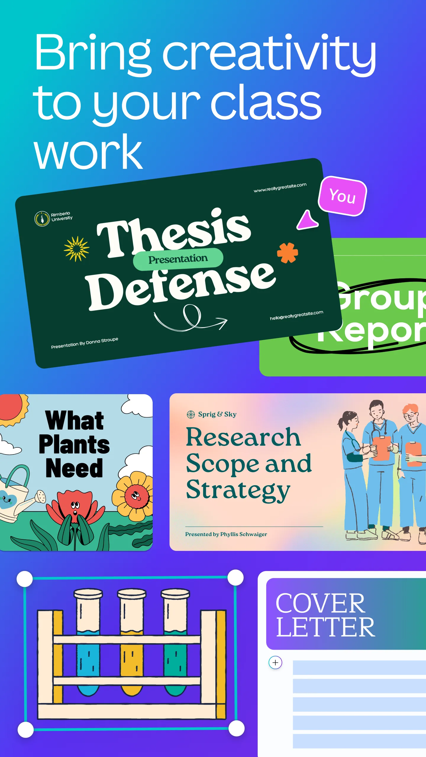
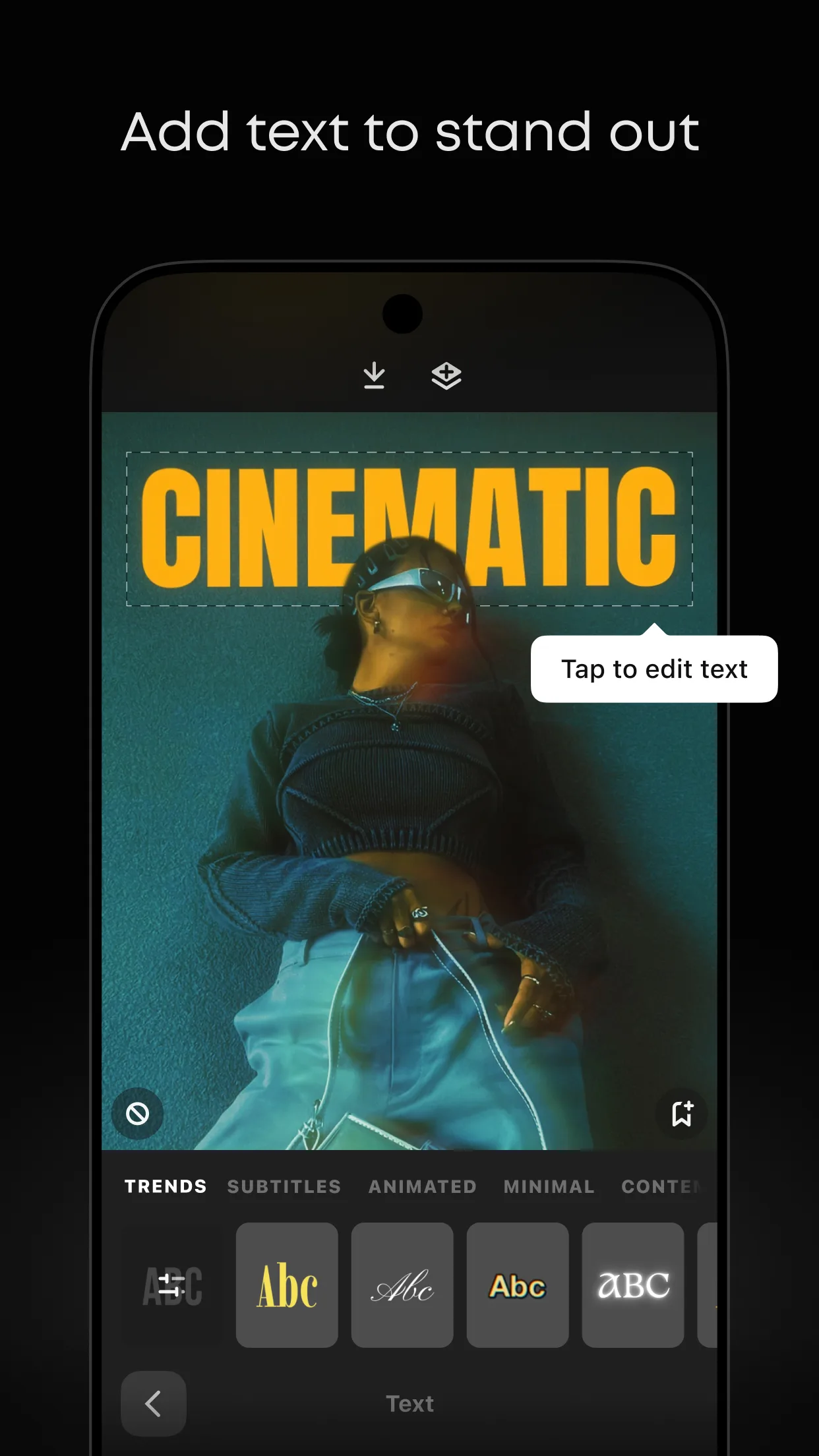
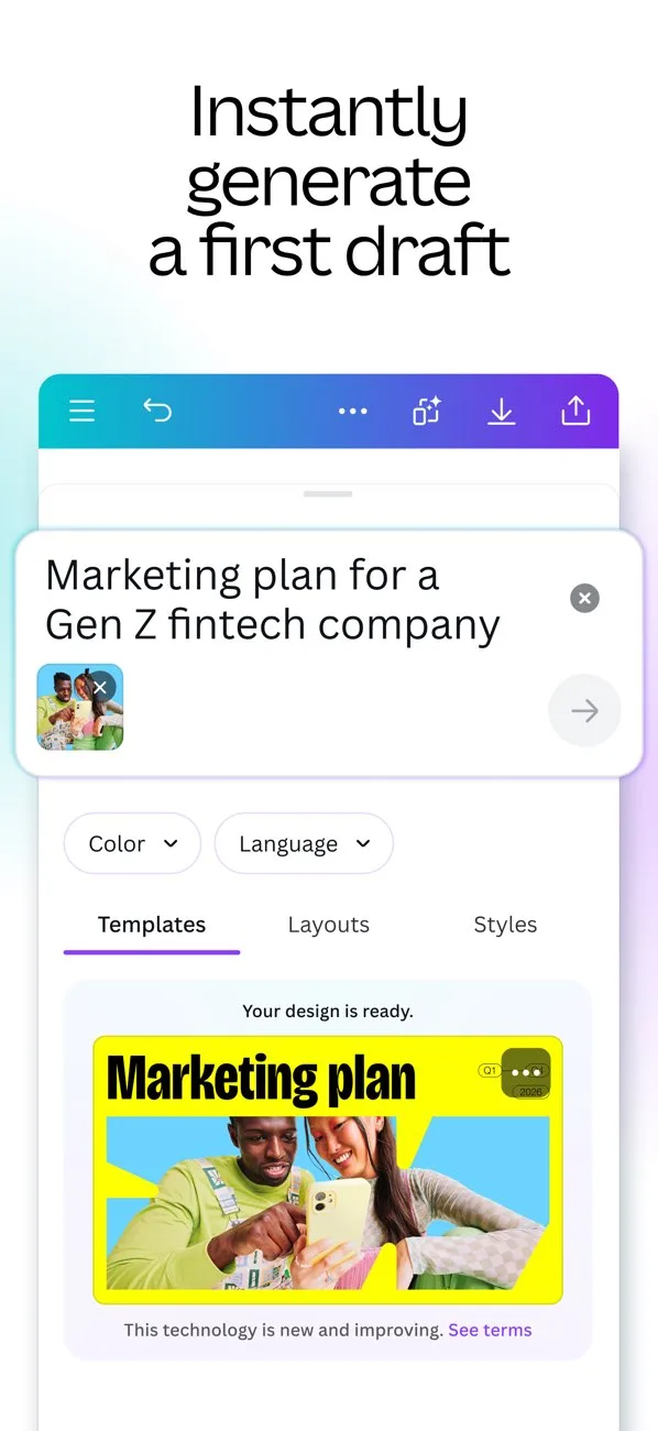
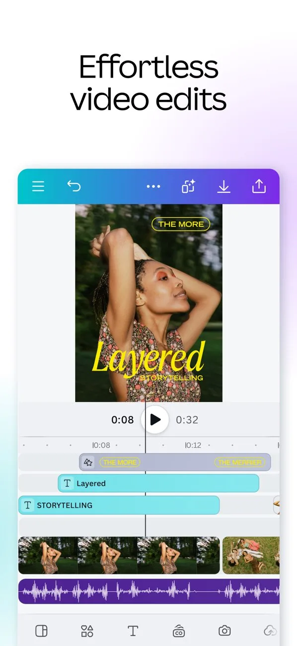
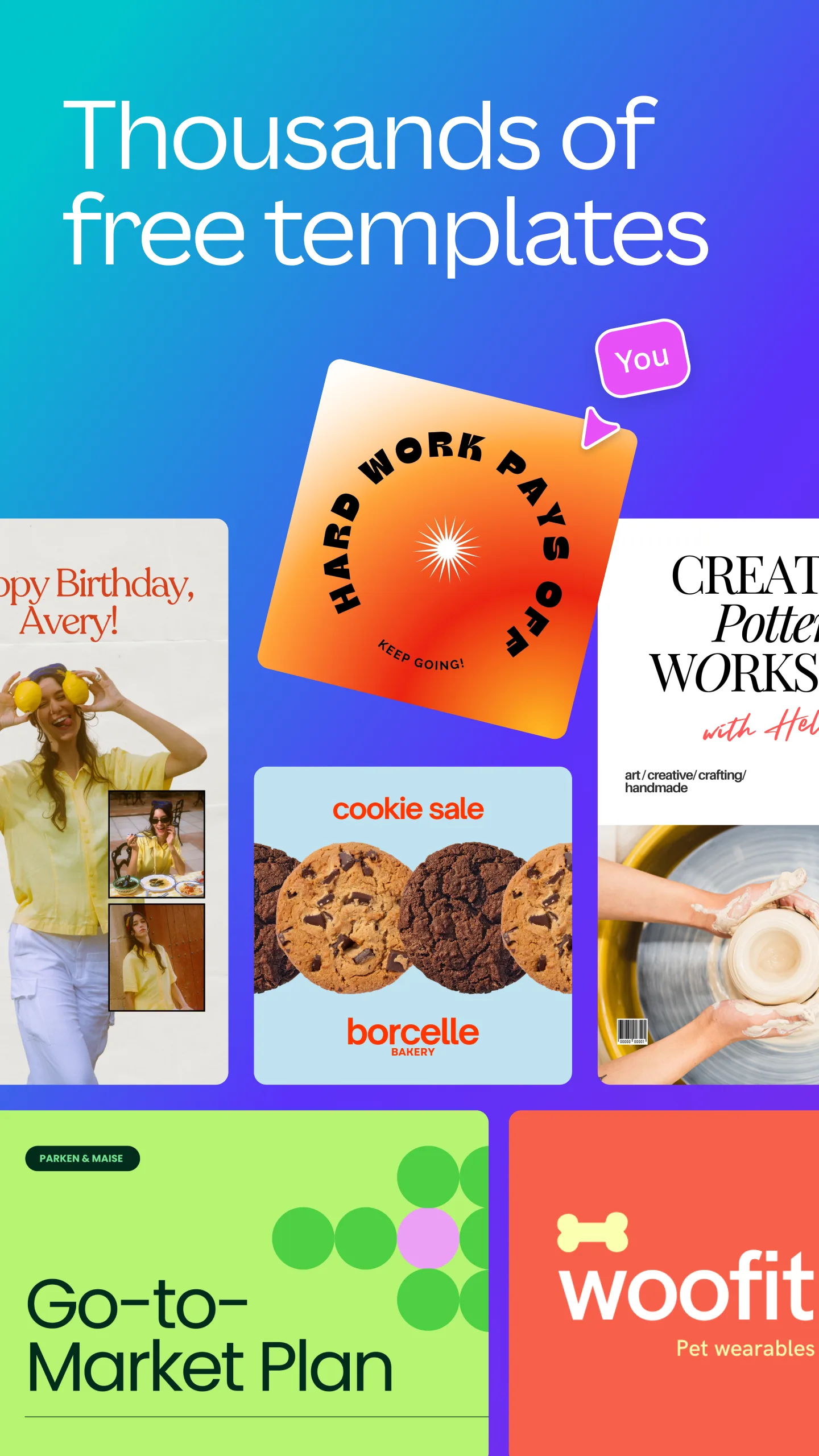
- CanvaApp Store
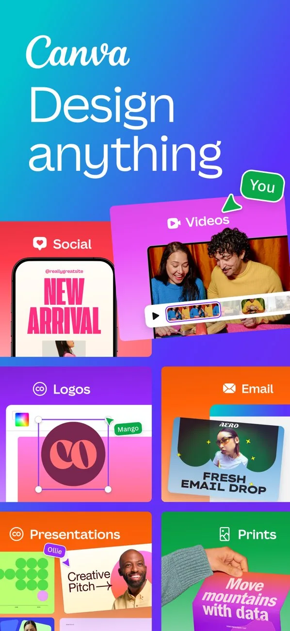
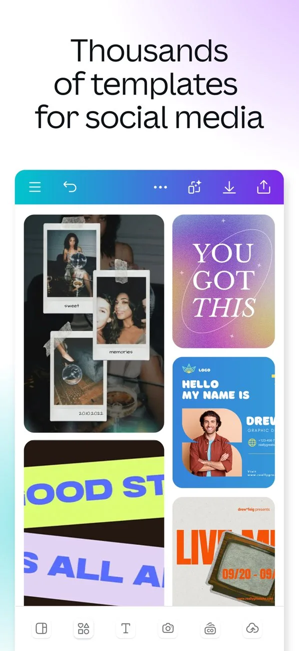
 Play Store
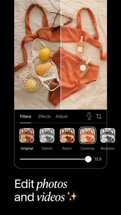
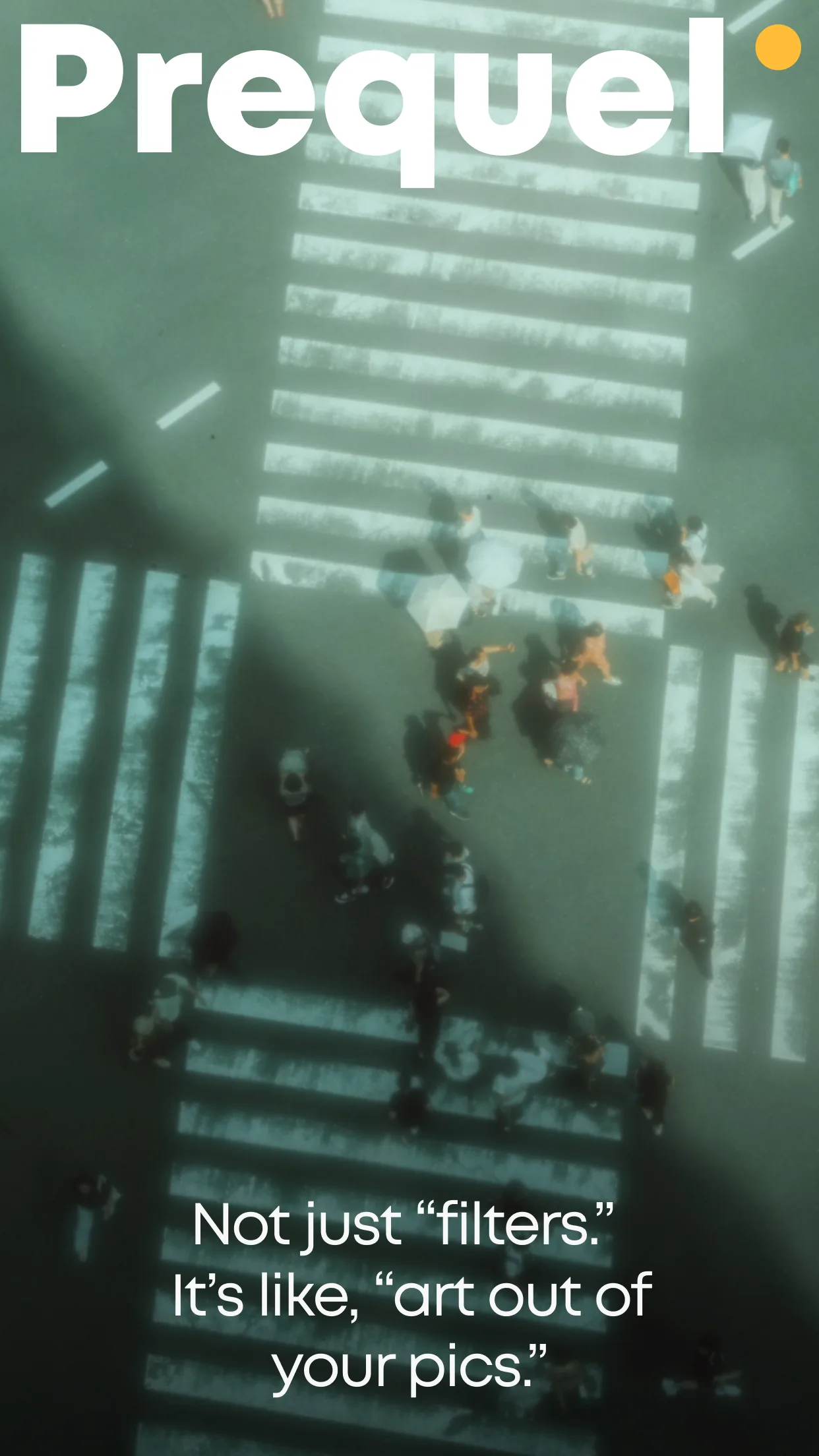
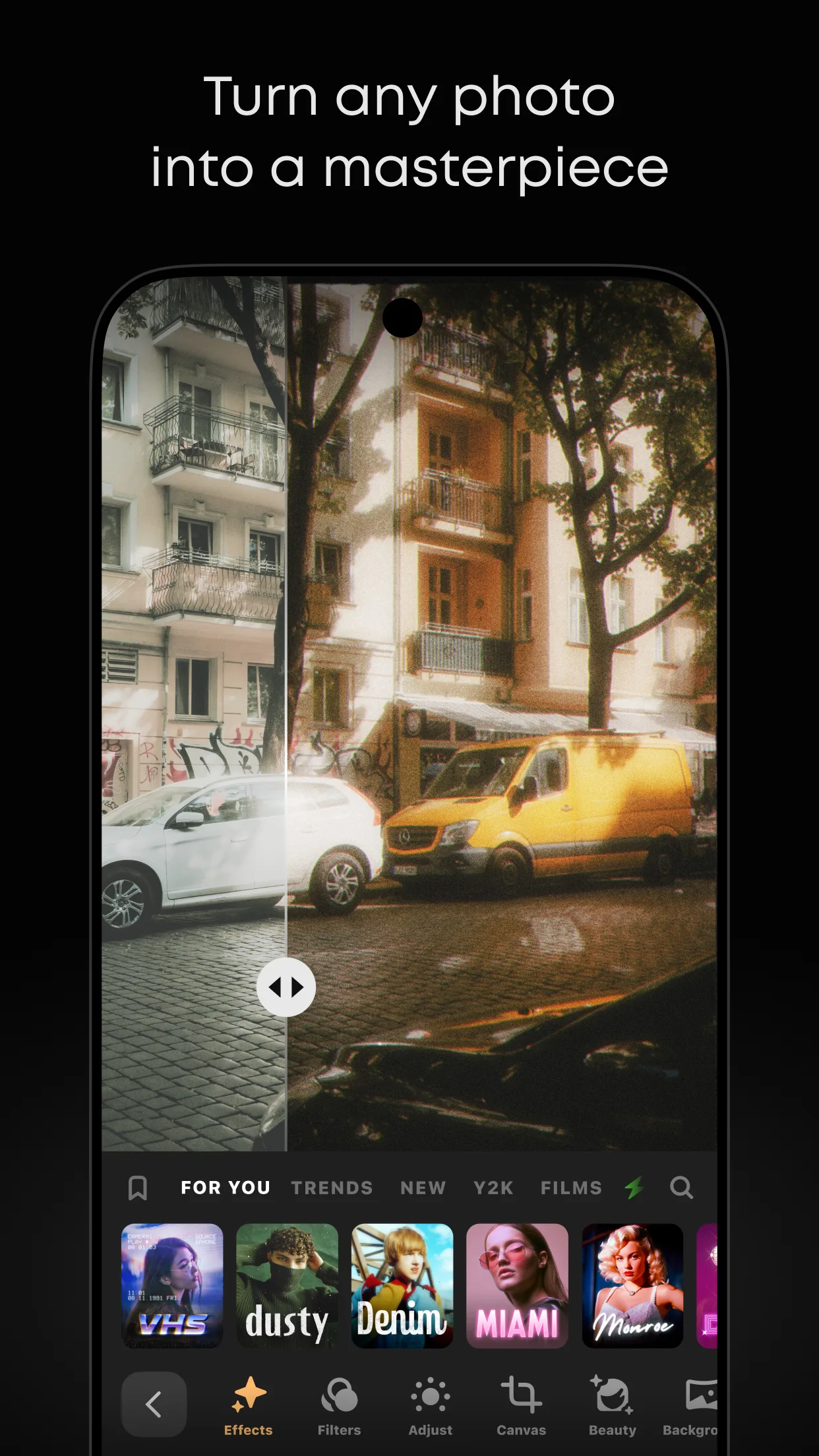
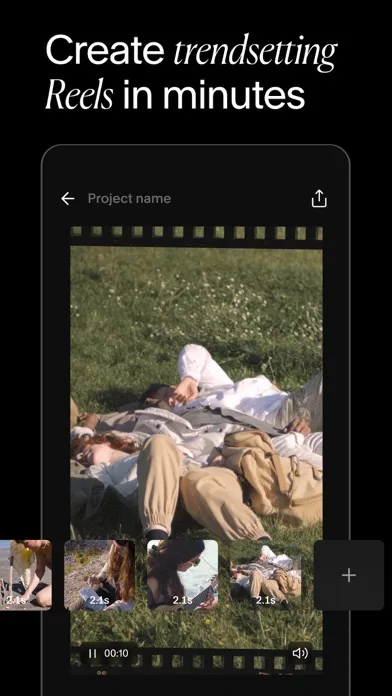
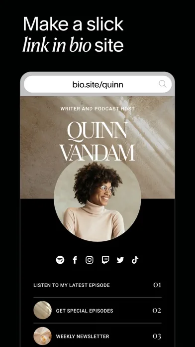
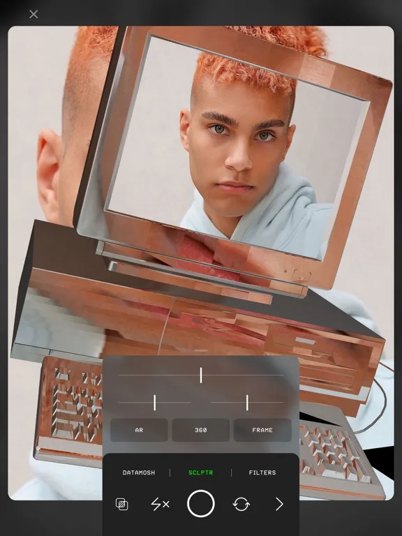
- PrequelApp Store


 Play Store

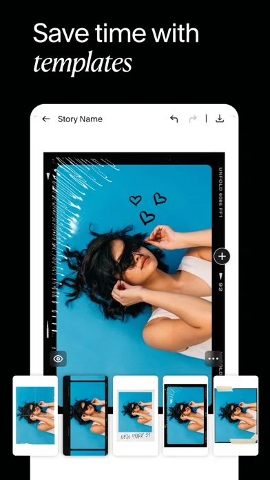
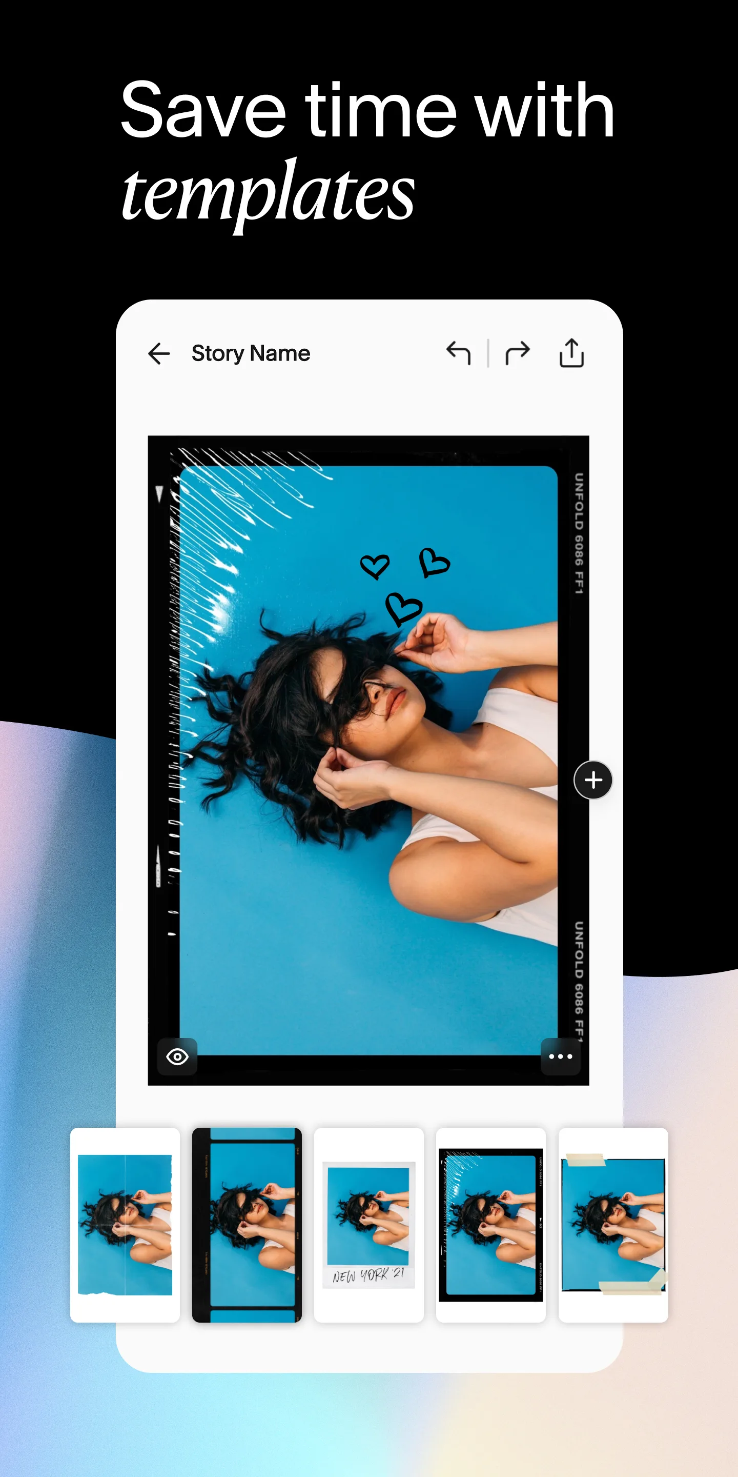
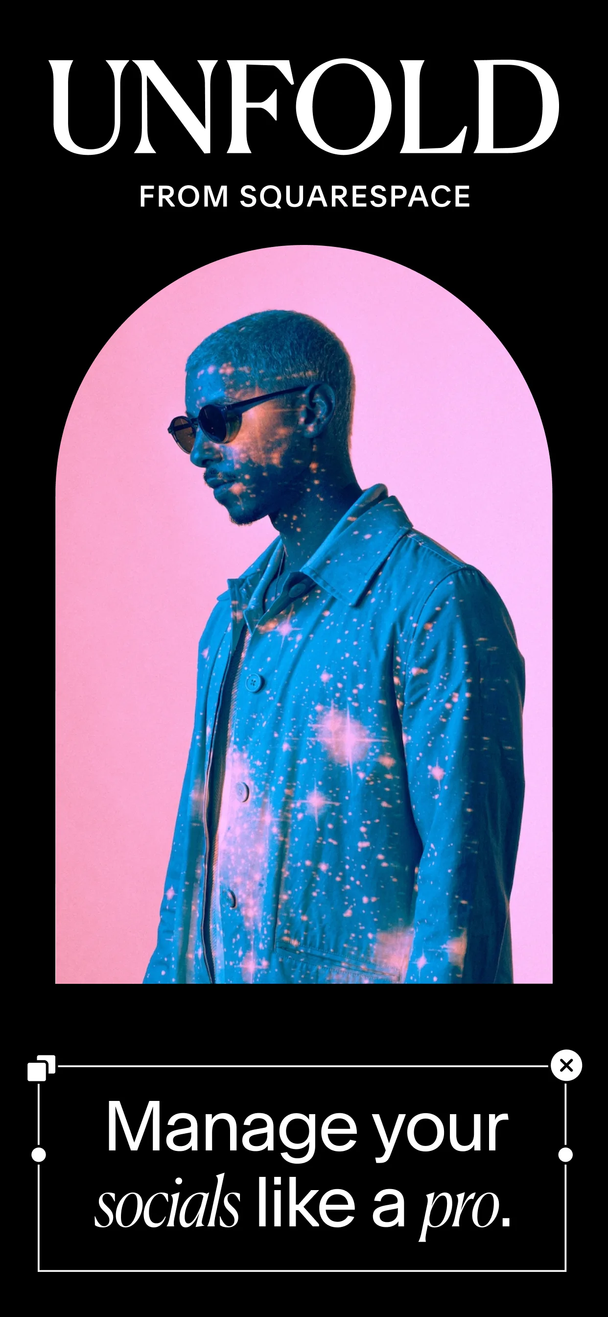
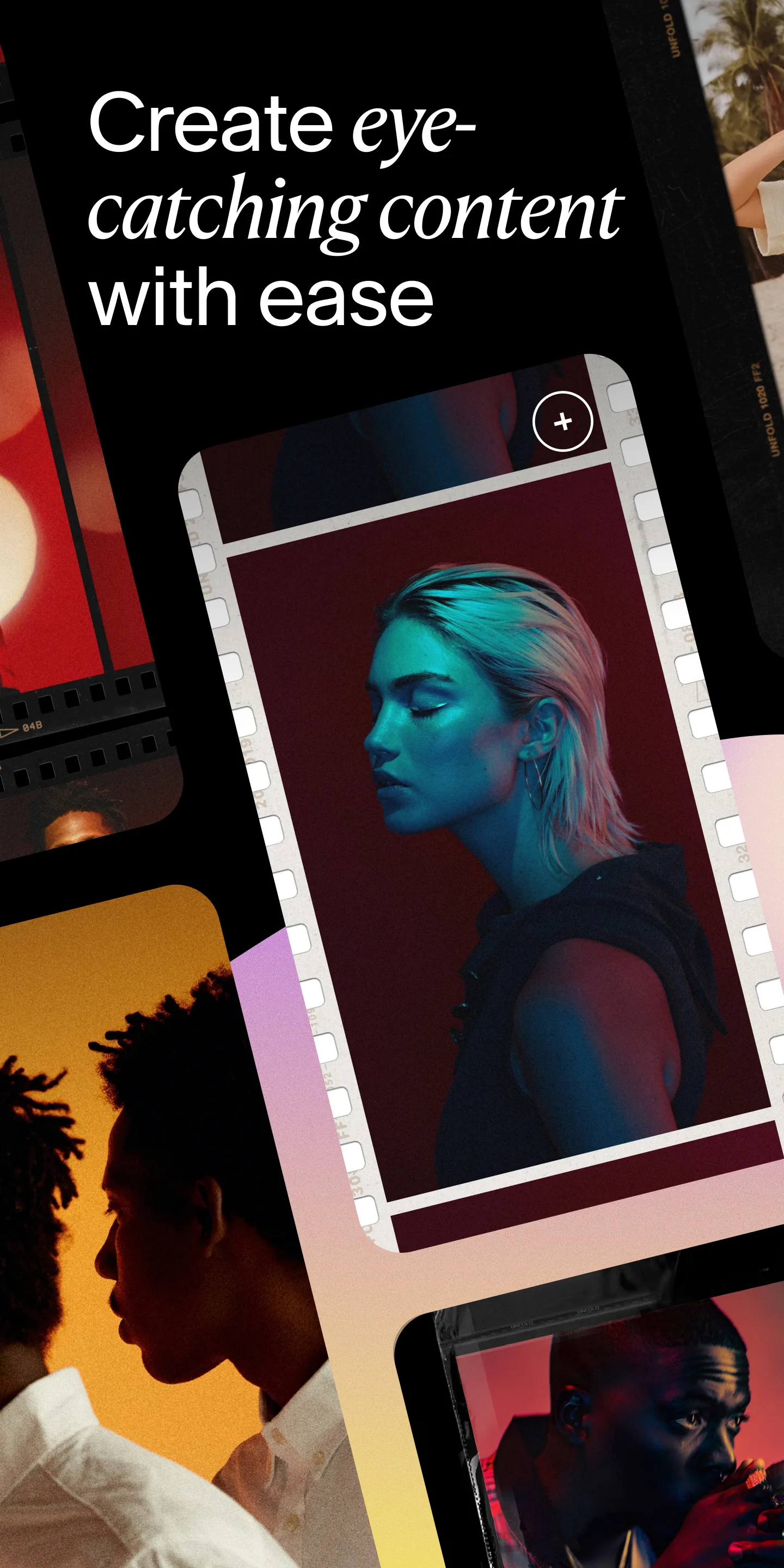
- UnfoldApp Store
 Play Store
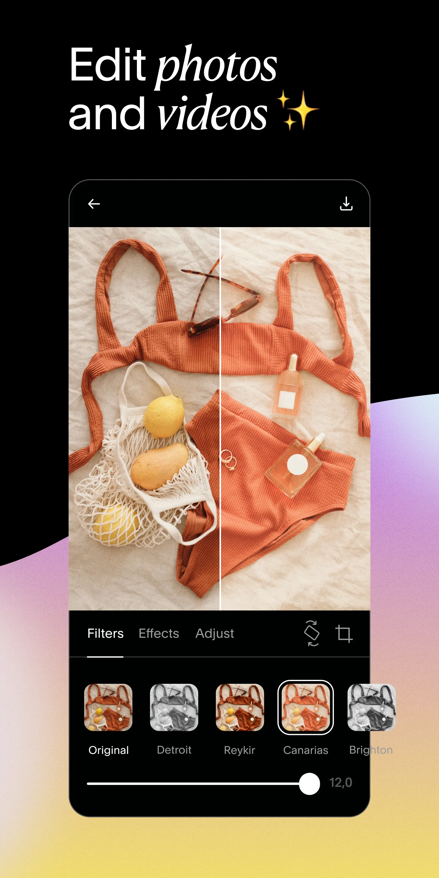
- GlitchéApp Store


 Play Store
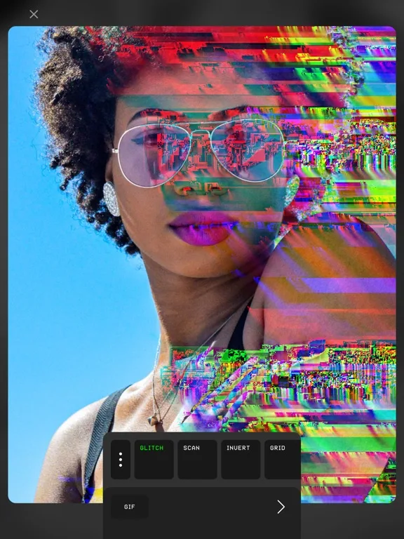

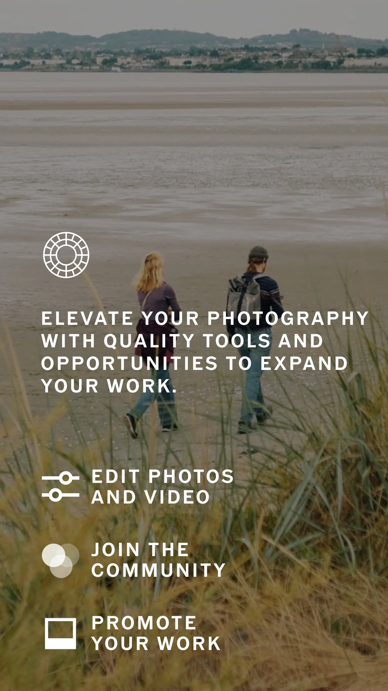
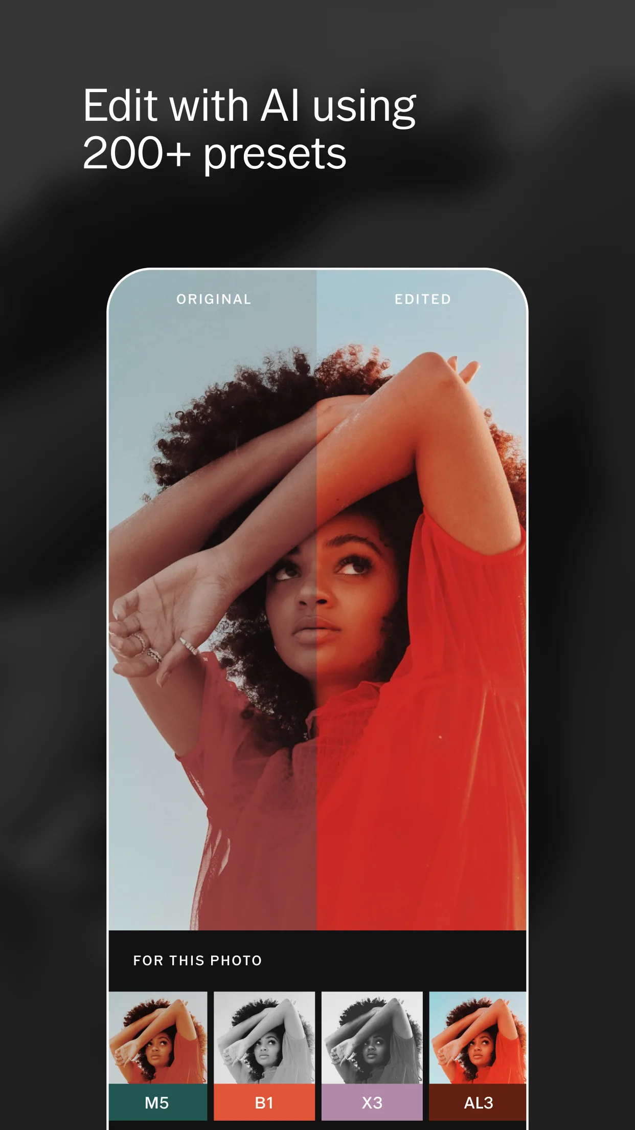
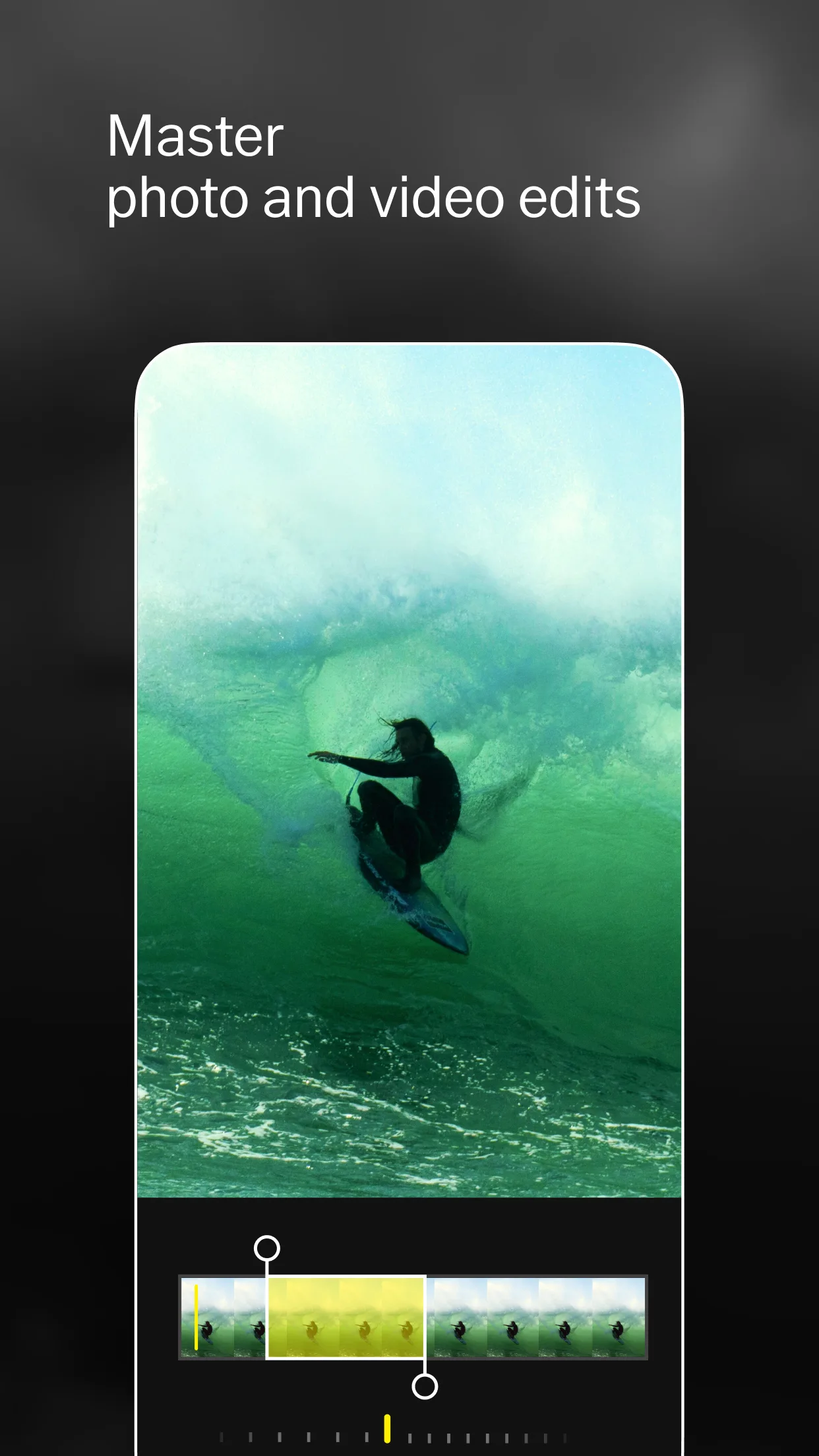
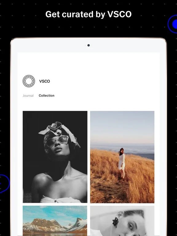
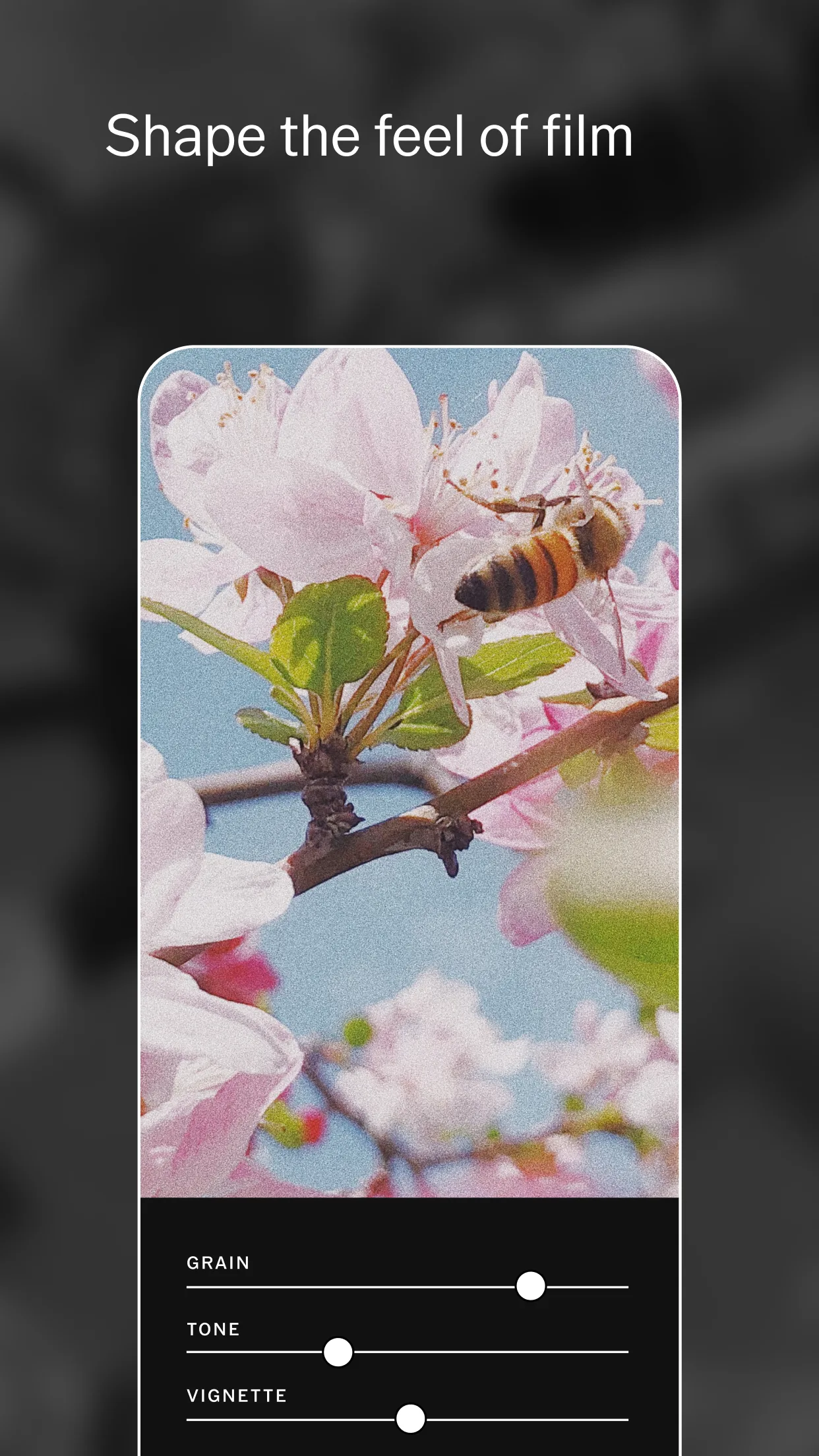
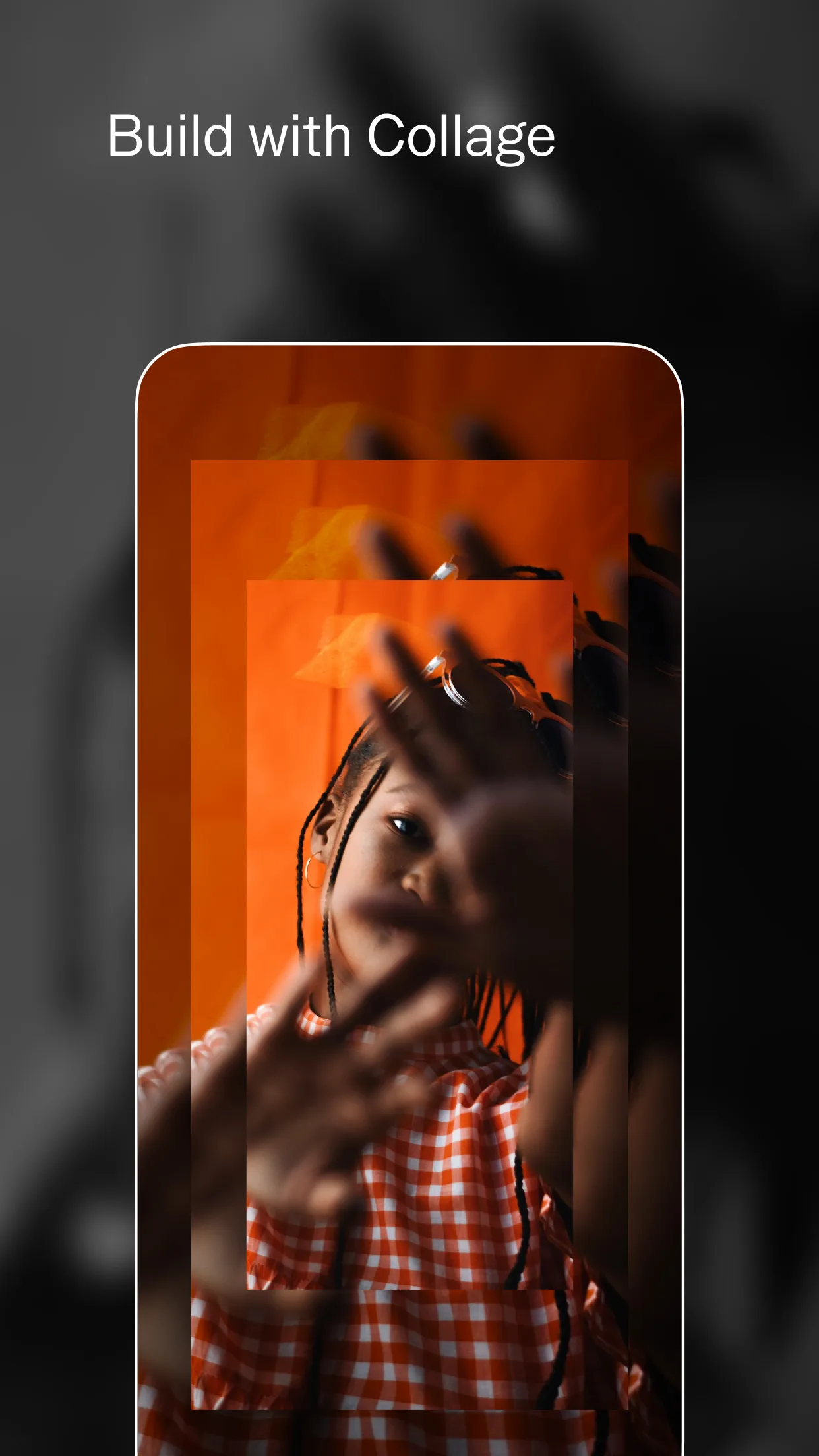
- VSCOApp Store
 Play Store