Music & Playlist App Store Screenshot Templates
Show listeners how your app helps them discover, organize, and enjoy music without friction.
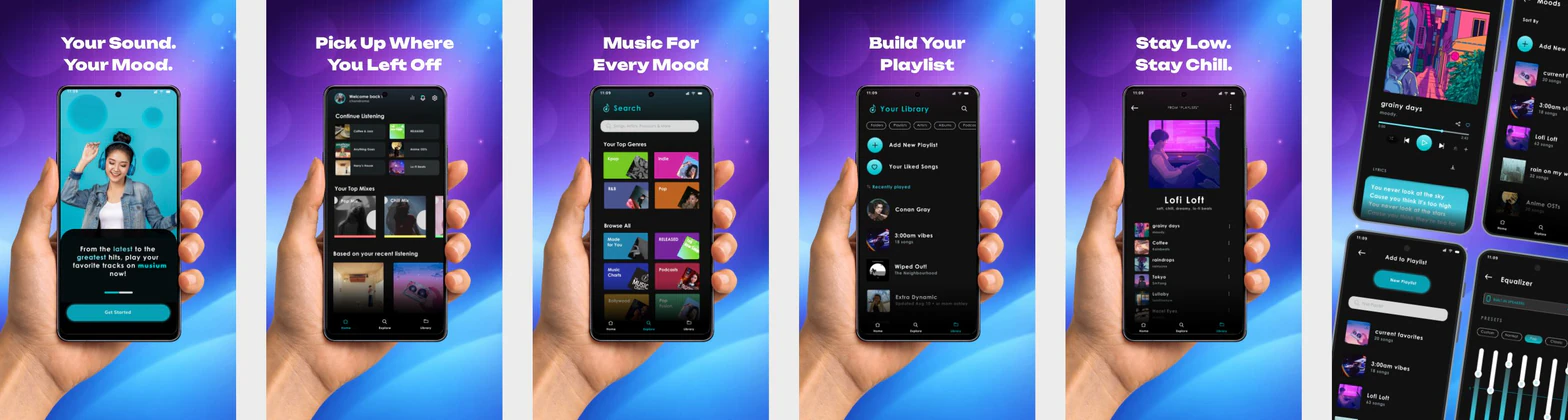
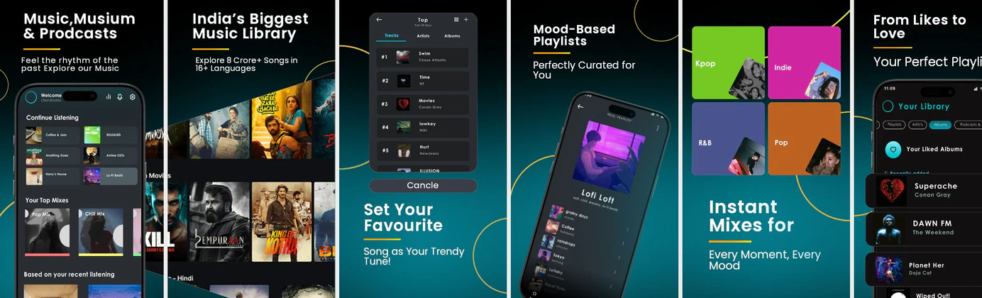
Showcase gorgeous album art, interactive audio player views, and curated playlists. Frame your music app UI in vibrant, dark-themed templates.


 App Store Screenshot Templates


 Play Store Screenshot Templates

✨ App Mockups, Ads & ASO Marketing Graphics
Music Streaming App Promotional Banner – Made for You Listening ExperienceMusic Streaming App UI Kit Mockup – Modern Audio Player & Playlist Design Music Streaming App Promo Design – Playlist & Audio Experience UI
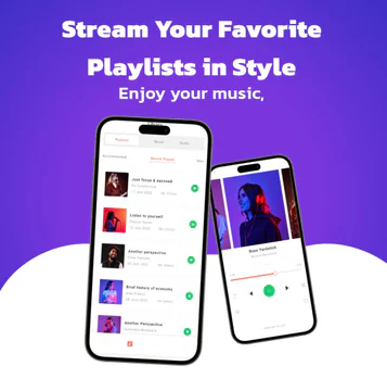 iPhone 14 Pro Max Mockup – Showcase Your Music App in Stunning Detail
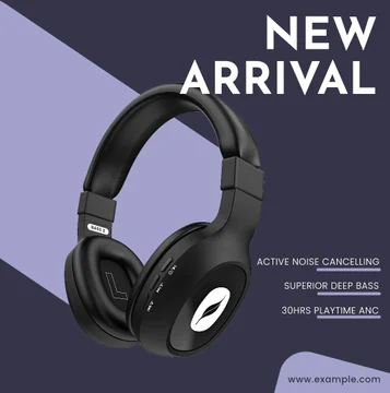 Light Purple and Dark Grey Headphone Promotional Template
 A Yellow and Black themed Headphone Marketing Template
ASO Guide: Converting Listeners in Music Apps
Music screenshots should balance emotional appeal with practical listening value. Start with personalized discovery or playlists, then show playback controls, offline access, and queue management. Users choosing music apps often decide quickly, so every frame should communicate one clear benefit with visible proof. Keep visual energy high but avoid cluttered compositions that hide controls.
Creative performance improves when screenshot sequences mirror real listening behavior. StoreMaven has reported up to a 33% download lift from optimized screenshot sets, and music apps can apply this by testing discovery-first versus player-first openings. Use short, rhythmically consistent headlines and clear iconography for downloads and recommendations. Nakxi helps teams ship these variations fast while keeping visual standards consistent across iOS and Android formats.
Music apps convert on discovery, sound quality, and playlists. Showcase rich player view cards, lyrics syncing, and offline library management. Using modern dark backdrops with colorful album graphics ensures high contrast and visual depth.
Pair screens with energetic captions: 'Listen Offline Anywhere', 'Curate Your Playlists', or 'Discover New Music Daily' to target music fans.
Music teams usually scale best in Nakxi by reusing one discovery-to-playback template and rotating genre, mood, or recommendation scenes for each campaign.
Frequently Asked Questions
Should music listings display lyrics features?
Yes, showing synced lyrics text ('Sing Along with Live Lyrics') on the player screenshot highlights a highly valued feature.
Which background colors work best for music screenshots?
Deep slate, rich black, or neon gradients work best as they reflect the energetic aesthetic of modern music players.
Should music apps emphasize playlists or player controls first?
If personalization is core value, start with playlists; if audio fidelity or simplicity is core, start with player controls. Both can work, but the first frame should match your primary acquisition hook. Keep sequence logic consistent after that opener. Testing both variants is often worthwhile.
How can music screenshots improve conversion quality?
Set clear expectations by showing real listening workflows instead of abstract branding. Include one frame for discovery and one for reliability features like downloads. This attracts users who will actually use the app long term. Better fit often improves retention after install.
How do I create music app screenshots with Nakxi?
Pick a music template from this page, open it in Nakxi's editor, swap in your UI captures, write outcome-led captions, and export App Store and Play Store sizes from one canvas. Most teams ship a first draft in under an hour without a design agency.
What screenshot sizes do music apps need in 2026?
Apple requires up to three iPhone display families (including 6.9-inch and 6.5-inch) per Apple's screenshot specifications. Google Play accepts 16:9 or 9:16 phone layouts between 320px and 3840px per side, as documented in Google Play listing best practices. Nakxi exports both store formats from a single design.