Fintech & Payment App Store Screenshot Templates
Present speed, transparency, and control in a screenshot flow built for high-intent payment users.
Highlight instant money transfers, modern debit/credit cards, and expense graphs. Frame your fintech UI in sleek device mockups.
 App Store Screenshot Templates
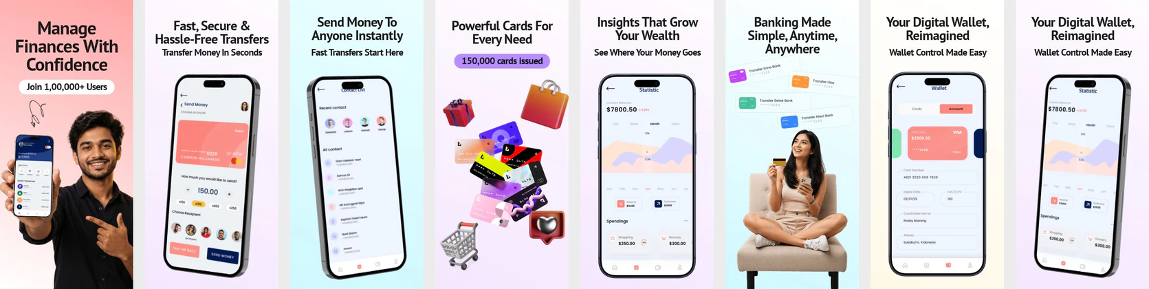
Digital Wallet App App Store Screenshots – Smart Banking & Money Transfer App Screens Smart Finance and Money Management App Store Screenshot | Professional Fintech UI
 Fintech App Store Screenshot Template – Money Management, Payments & Finance Tracker UI Kit
 Digital Wallet App Store Screenshot Template – Finance, Payments & Money Transfer UI Kit
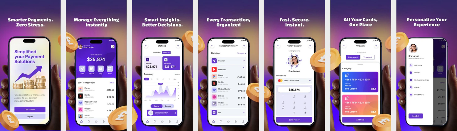 Finance & Payment App Store Screenshot Template – Purple Gradient Fintech UI
  Play Store Screenshot Templates
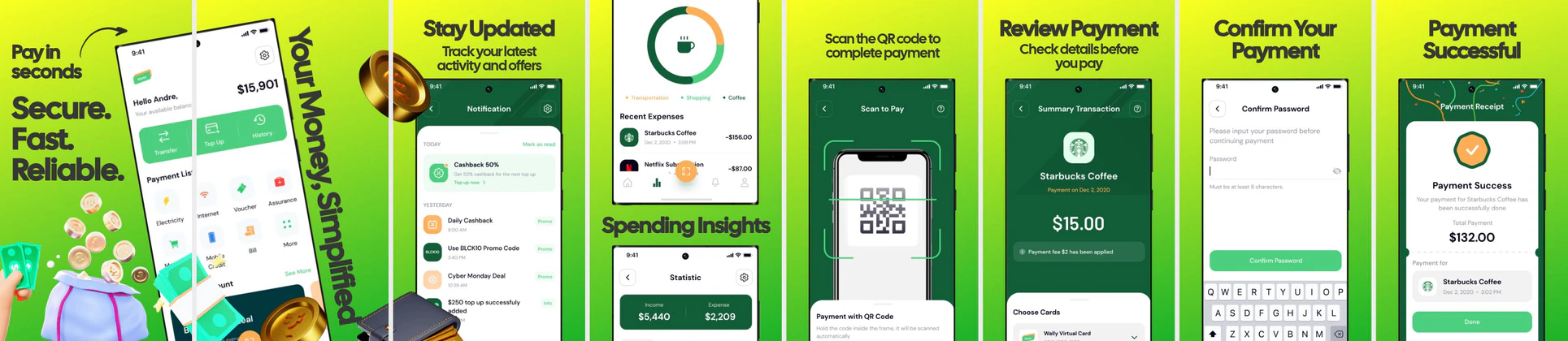

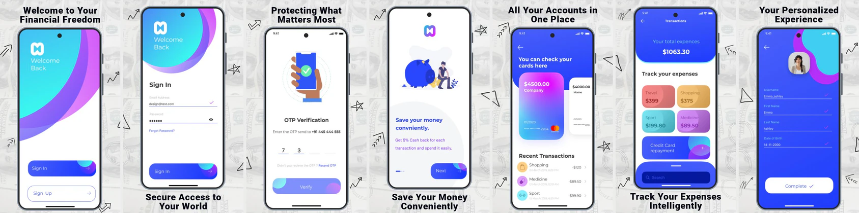
✨ App Mockups, Ads & ASO Marketing Graphics
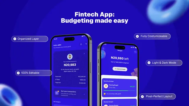
💰 Fintech Budget Planner App UI Mockup Template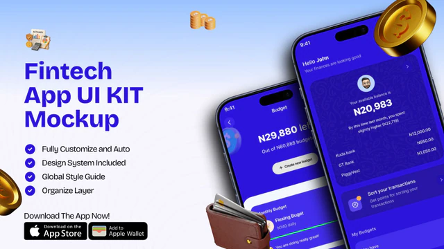 Fintech App UI Kit Mockup | Mobile Banking & Finance Template
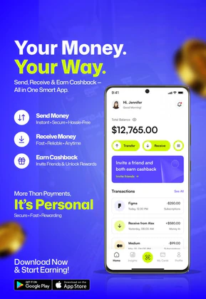 Fintech E-Wallet App Promo Banner
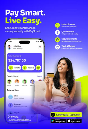 Digital Wallet & Mobile Banking App UI | Fintech Payment Template
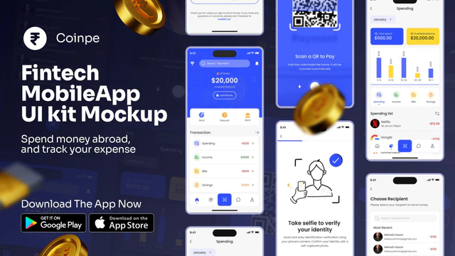 Coinpe Fintech Mobile App UI Kit
 Smart Wallet App Advertisement Banner – Fintech Mobile App Promo Design
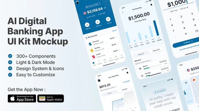 AI Digital Banking UI Kit | Fintech & Mobile Wallet Mockup
 Finance App Advertisement Design – Secure Payments & Expense Tracking
 Digital Wallet App Mockup – Fintech UI for Payments & Transactions
 Smart Payment App UI Mockup for Fintech & Digital Wallet Apps
 Car Insurance App UI Kit – Fintech Mobile Template
ASO Guide: Maximizing Installs for Fintech & Payment Apps
Fintech screenshots should prove immediate utility with as little friction as possible. Open with send or receive money actions, then show card management, spending insights, and rewards. Users in this segment compare alternatives quickly, so each image should communicate one clear gain. Keep headlines transactional and specific, then reinforce them with unmistakable in-app states like payment success or card freeze. The goal is to make product capability obvious before users read deep listing text.
Strong fintech creative also avoids overloading users with competing promotional claims in every frame. AppTweak benchmarks show better conversion patterns when the first screenshots isolate one core value instead of stacking many features. Use consistent visual language for actions and statuses, and keep CTA phrasing simple. Nakxi makes this easier by giving growth and design teams reusable structures for A/B testing across iOS and Android without rebuilding everything each sprint.
Fintech applications thrive on micro-interactions and ease of use. Your screenshots must demonstrate how quickly a user can send money, request split bills, or manage credit card balances. Highlighting zero fees or cashback programs using prominent overlay badges is highly recommended.
Nakxi’s smart framing allows you to showcase physical card previews alongside digital payment flows. Keep captions short and action-oriented: 'Send Money Instantly', 'Earn 2% Cash Back', or 'Apply in 30 Seconds'.
Fintech teams usually run faster in Nakxi by mapping each screenshot to one transaction stage, then rotating value hooks like speed, rewards, or fee transparency for testing.
Frequently Asked Questions
Should fintech screenshots display transaction histories?
Yes, showing a mock transaction history with recognizable brands (like Spotify, Uber, or Starbucks) helps users quickly relate to using the app in their daily lives.
What screenshot dimensions do I need for Google Play and App Store fintech listings?
The App Store requires 6.5" and 5.5" iPhone screenshots, while Google Play requires 16:9 or 9:16 phone layouts. Nakxi generates all required formats from a single canvas.
What belongs in the first fintech screenshot?
Lead with your highest-frequency action, such as instant transfer or payment success. This anchors your listing around practical value instead of abstract branding. Keep copy short and outcome-driven so users can scan fast. Follow with trust cues in screenshot two.
Do cashback visuals increase conversion?
They often help when shown as concrete earned value rather than vague promotion. Use one frame with clear reward context and avoid mixing too many offer types. Pair reward messaging with everyday spend UI to keep it believable. This balance tends to improve both installs and retention quality.
How do I create fintech app screenshots with Nakxi?
Pick a fintech template from this page, open it in Nakxi's editor, swap in your UI captures, write outcome-led captions, and export App Store and Play Store sizes from one canvas. Most teams ship a first draft in under an hour without a design agency.
What screenshot sizes do fintech apps need in 2026?
Apple requires up to three iPhone display families (including 6.9-inch and 6.5-inch) per Apple's screenshot specifications. Google Play accepts 16:9 or 9:16 phone layouts between 320px and 3840px per side, as documented in Google Play listing best practices. Nakxi exports both store formats from a single design.