
ScreenVault · ASO inspiration
Revolut app screenshots
Original ASO commentary on how Revolut presents itself on the stores — first frame, captions, and tests worth running. Not affiliated with Revolut.
What we measure
- First frame
- UI close-up
- Caption position
- center overlay
- Avg caption words
- 4
- Background
- soft gradient
- Device treatment
- frameless full-bleed
Listing thumbnails
Reduced-size screenshots for commentary. Copyright belongs to the app publisher. Request removal.

What this listing does well
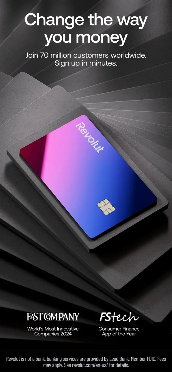
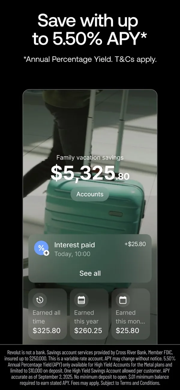
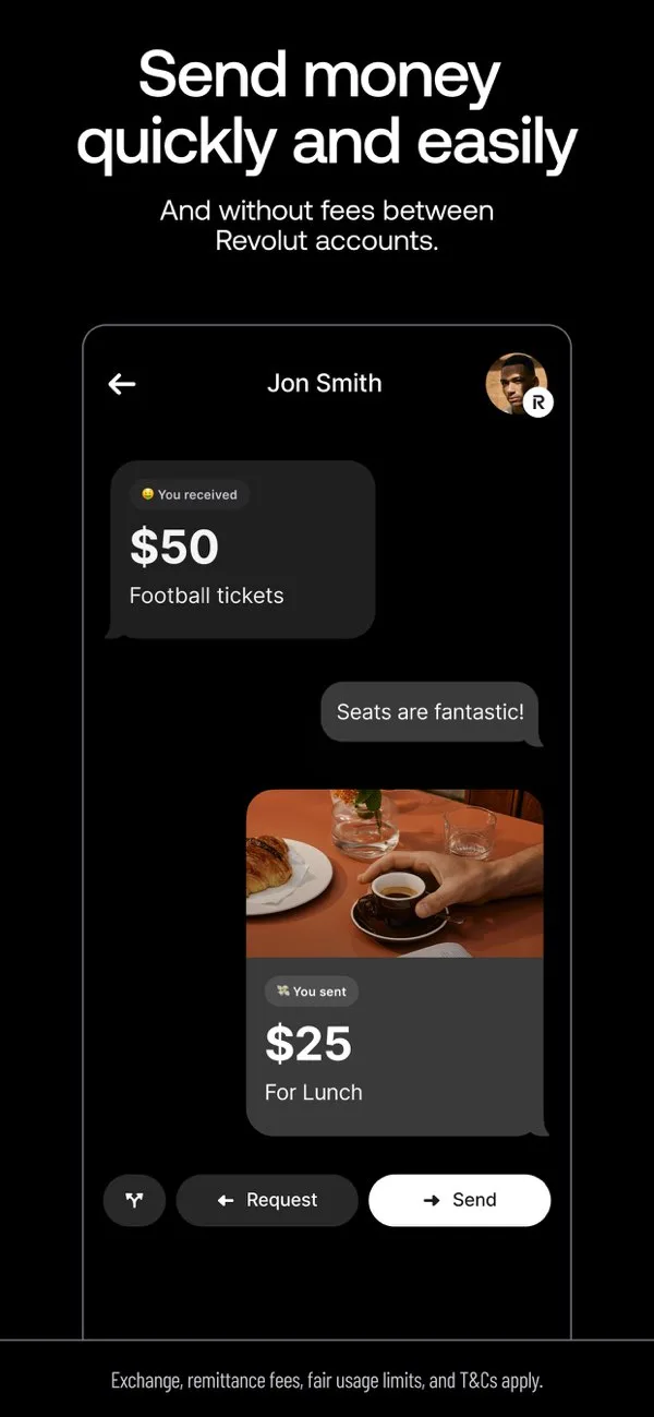
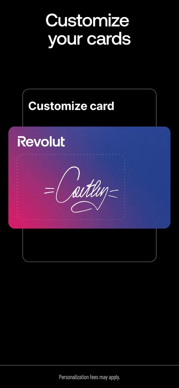
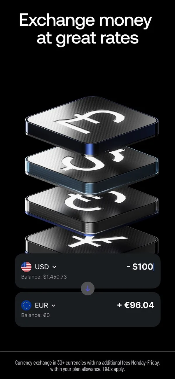
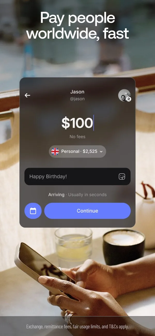
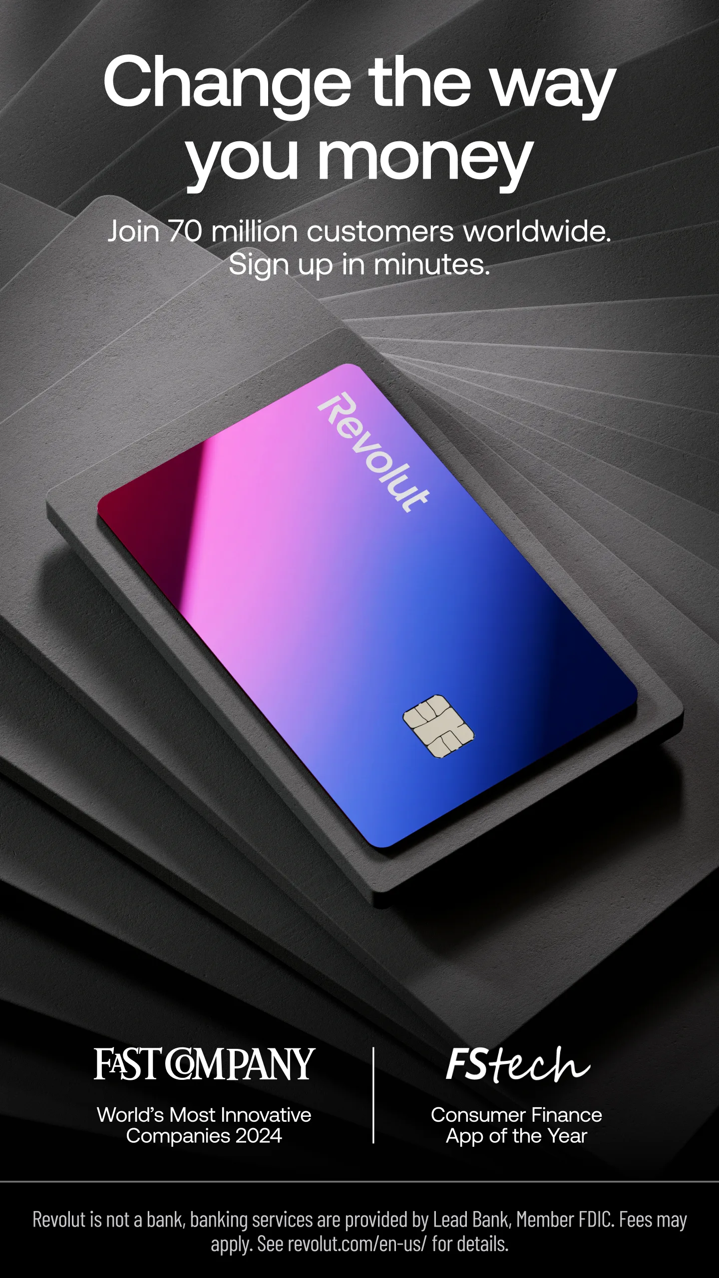
Revolut's store set leads with a UI close-up first frame, which helps visitors understand the product in one glance. Captions sit in the center overlay with roughly 4 words on average — short enough to read at thumbnail size. The gallery uses a soft gradient behind a frameless full-bleed, keeping focus on the product UI rather than decorative noise. Across 6 captured slides, the sequence stays consistent with the dark themed category patterns ScreenVault tracks.
What you could test
Test a stronger benefit line on slide 1 if the UI close-up still feels UI-heavy for cold traffic. Try moving captions from the center overlay to the opposite third on one variant to measure readability on small phones. A/B a richer gradient background to see whether contrast or atmosphere wins installs. Compare frameless vs framed exports — this set currently reads as frameless full-bleed.
Revolut's store set leads with a UI close-up first frame, which helps visitors understand the product in one glance. Captions sit in the center overlay with roughly 4 words on average — short enough to read at thumbnail size. The gallery uses a soft gradient behind a frameless full-bleed, keeping focus on the product UI rather than decorative noise. Across 6 captured slides, the sequence stays consistent with the dark themed category patterns ScreenVault tracks. Test a stronger benefit line on slide 1 if the UI close-up still feels UI-heavy for cold traffic. Try moving captions from the center overlay to the opposite third on one variant to measure readability on small phones. A/B a richer gradient background to see whether contrast or atmosphere wins installs. Compare frameless vs framed exports — this set currently reads as frameless full-bleed. This page is for ASO inspiration and commentary only. Screenshots remain the property of Revolut's publisher. Use Nakxi Screenshot Studio to rebuild a similar story structure with your own UI — not a pixel copy of Revolut. Browse more Fintech & Finance examples in the ScreenVault Fintech & Finance collection for adjacent patterns.
Start from this layout in Nakxi App Store screenshot generator