
Most Common Screenshot Patterns Among Top-Ranking Apps (2026 Evidence Review)
By Sagar Joshi
Published
Most screenshot advice is opinion dressed as data. This page focuses only on patterns that can be observed directly in public listings and platform constraints.
Treat this as an evidence-backed field guide for app store screenshot best practices, not a causal conversion-lift report.
Scope note
The observations below are based on recurring patterns seen in the Nakxi ScreenVault corpus and reviews of publicly visible App Store and Google Play listings. These observations are descriptive, not causal.
At publish time, the same corpus includes 54 tracked apps and 598 screenshot slots across both stores. Full methodology and verification path are documented here: App Screenshot Benchmark Research: Methodology, QA Process, and Pilot Dataset.
Evidence snapshot (anonymized examples)
These examples are anonymized to avoid implying endorsement. They are included to make the “evidence review” framing concrete and auditable.
| Category sample | What appears repeatedly in top listings | Why teams should care |
|---|---|---|
| Finance (cross-platform) | First screenshot emphasizes trust and control language before feature depth | Trust-first framing reduces decision friction for high-risk categories |
| Habit / productivity | Sequence moves from outcome -> workflow -> reminder proof | Narrative order improves scan clarity in browse contexts |
| Fitness | Headlines pair emotional outcome with visible progress cues | Motivation-oriented framing supports fast value recognition |
| Utility / scanner | Minimal visual noise with one headline per frame | Cleaner hierarchy improves readability on small previews |
| Gaming | Action-led first frame, then mode/mechanic proof in next slots | Genre expectations reward fast immersion signals |
For live inspiration and additional listing references, use ScreenVault.
Sources used for validation
- Apple screenshot specifications
- Apple Product Page Optimization
- Google Play screenshot requirements
- Google Play store listing experiments
- Google SoftwareApplication structured data
These documents do not tell you “the best creative.” They define constraints, testing surfaces, and data quality boundaries. That is exactly where honest screenshot strategy should begin.
6 recurring patterns in top-ranking listings
1) The first screenshot carries the primary promise
Pattern: Frame one usually communicates the clearest user outcome, not a logo splash.
Why this appears: In App Store browse contexts where only the first screenshot is visible before a tap, frame one acts as the full pitch.
Action: Write one sentence answer to “Why should someone install this?” and use it as screenshot #1 headline language for both iOS screenshot optimization and Play listing clarity.
2) One screenshot = one message
Pattern: Strong listings avoid multi-claim frames and distribute meaning across a sequence.
Why this appears: When one frame carries multiple unrelated claims, users remember none of them well enough to justify a tap.
Action: Use this baseline flow:
- Core value
- Feature proof
- Secondary benefit
- Trust element (rating, volume, social proof, or credibility cue)
- Call-to-action framing
Remove any frame that tries to communicate two unrelated promises.
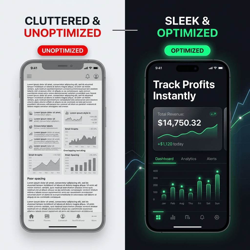
This visual is a quick proxy for practical ASO screenshot tips: prioritize one claim, keep copy scannable, and preserve hierarchy at thumbnail size.
3) Benefit-first copy beats internal product language
Pattern: Outcome language appears more often than internal feature labels.
Why this appears: Store visitors evaluate expected payoff, not internal architecture terms, during first-pass scanning.
Action: Rewrite every headline to describe user gain, not system implementation.
| Feature-heavy | Benefit-led |
|---|---|
| Smart Analytics Module | See spending trends faster |
| Advanced Reminder System | Never miss a payment |
| Multi-device sync engine | Pick up where you left off |
4) Readability is treated like a ranking requirement
Pattern: Top listings tend to keep short, high-contrast, easy-to-read text overlays.
Why this appears: Small preview surfaces punish long lines and weak contrast; unreadable overlays underperform for both human scan and OCR extraction.
Action: Test every frame at reduced size. If headline meaning is lost at small preview, rewrite or re-layout. This is a non-negotiable part of app store product page optimization.
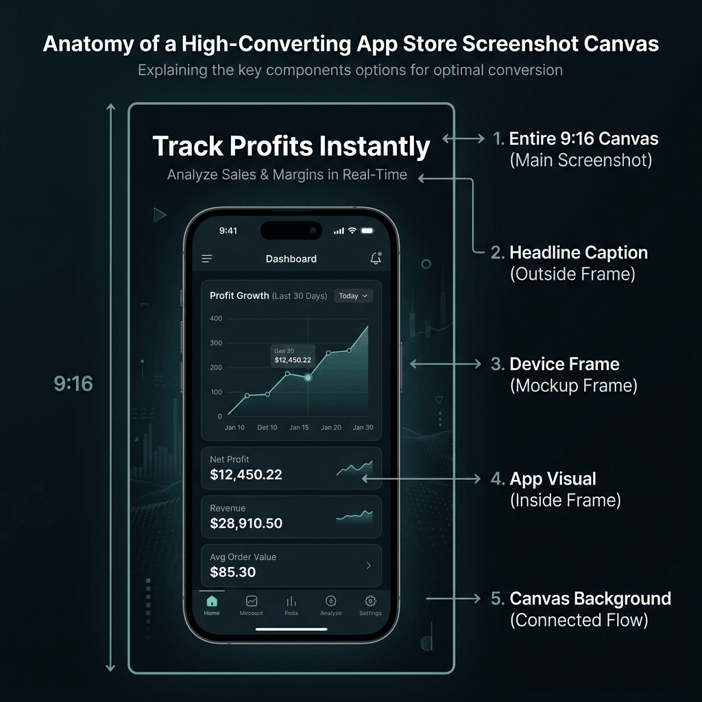
Use this teardown checklist during QA to enforce readable type, contrast, and layout hierarchy.
5) Visual system stays consistent across the full set
Pattern: High-quality sets usually look like one system, not disconnected posters.
Why this appears: Consistency reduces friction and signals product quality at a glance.
Action: Lock a style token set before design work:
- One primary font family
- One headline scale
- One spacing grid
- One frame style
- One palette with controlled accent colors
6) Category expectations are respected, not copied blindly
Pattern: Screenshot language varies by category; one visual recipe does not fit all.
Why this appears: Category intent changes proof requirements: finance needs confidence cues, gaming needs momentum cues, and productivity needs workflow clarity.
Action: Build a small category board before final design.
| Category | Common screenshot pattern |
|---|---|
| Finance | Trust, clarity, security cues, low visual noise |
| Productivity | Workflow outcomes, structure, before/after efficiency |
| Fitness | Progress framing, motivation cues, transformation signals |
| Gaming | Action-forward visuals, intensity, immersive scenes |
Practical implementation: 14-day rollout
Day 1-2: Audit and narrative
- Capture your current first 3 screenshots.
- Write your core promise in plain language.
- Identify overlap and message conflicts.
Day 3-5: Rewrite copy and layout
- Convert all headlines to user-outcome phrasing.
- Enforce one message per frame.
- Standardize typography and spacing.
Day 6-9: Platform and market adaptation
- Export correct dimensions for iOS and Android.
- Build one localized variant for your biggest secondary market.
- Check readability at thumbnail-size previews.
Day 10-14: Publish and test
- Ship updated assets.
- Run one controlled experiment where available.
- Document hypothesis, variant, and outcome before next cycle.
Two supporting patterns (after core rollout)
A) Localization is creative adaptation, not literal translation
Why it matters: Literal translation often preserves words but loses persuasion.
Action: Localize promises, social cues, and examples - not only text strings.
B) Screenshot strategy should not be static
Why it matters: Positioning changes, features ship, and listing narratives decay.
Action: Pair release cycles with periodic Product Page Optimization and Play Store listing experiments as part of your google play screenshot strategy.
Related reading
- Fix execution issues fast: 12 App Screenshot Mistakes That Hurt Installs (2026)
- See how benchmark trust is built: App Screenshot Benchmark Research: Methodology, QA Process, and Pilot Dataset
- Apply directly in workflows:
FAQ
Should I avoid numbers completely?
No. Use numbers when you can defend them with transparent methods and raw logs. Avoid numbers only when they are guesses dressed as data.
Is this only for large teams?
No. Smaller teams benefit the most from this process because clear narrative and consistent design often outperform expensive but unstructured production.
Are templates still useful if every app is different?
Yes. Templates speed structure and consistency. You still customize copy, hierarchy, and proof per category and user intent.
Do I need perfect data before redesigning screenshots?
No. You need enough signal to run one clear hypothesis at a time and iterate with discipline.
What is the fastest improvement most teams can make today?
Rewrite screenshot #1 to communicate one clear user outcome in simple language, then align screenshot #2 and #3 as supporting proof.
Conclusion
If you only change one thing this week, rewrite screenshot #1 so a new visitor understands your value in one glance.
Then run one 14-day cycle, document what changed, and feed the next iteration with fresh listing observations from ScreenVault or your own category tracker. That loop is what turns generic advice into a durable screenshot strategy.