
12 App Screenshot Mistakes That Hurt Installs (2026)
By Sagar Joshi
Published
If you ask users why they skipped an app listing, they rarely say “because your screenshot hierarchy was inconsistent.”
They say, “I wasn’t sure what it does.”
That is exactly why screenshot mistakes are expensive: they damage clarity before users even read your description.
This guide focuses on mistakes we can verify directly in real listings and workflow audits, without inflated conversion claims.
Scope note (so claims stay honest)
This is a mistake analysis guide, not a causal benchmark report.
Where we reference recurring patterns, they come from:
- ongoing listing reviews in the Nakxi workflow
- visible screenshot systems in ScreenVault
- public App Store and Play Store listing behavior
When you run your own category benchmark, publish sample window, coding rules, and limitations before publishing percentages.
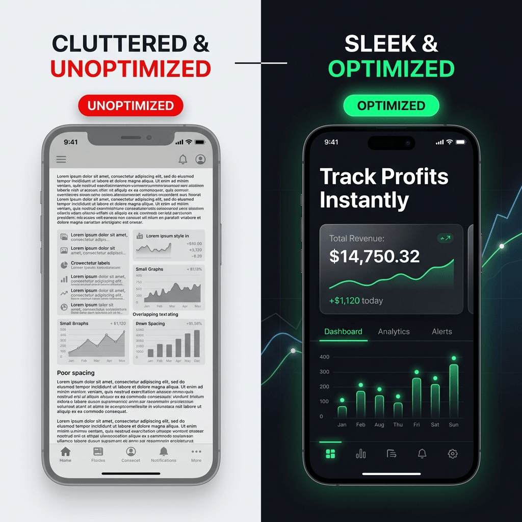
Quick visual examples
Example: unclear vs clear first frame
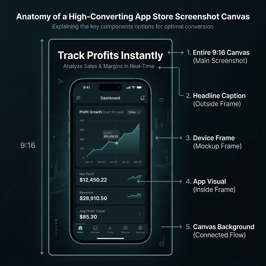
Example: screenshot structure and readability anatomy
The 12 mistakes that quietly reduce installs
1) The first screenshot says nothing useful
What happens: Teams use frame one for logo branding, abstract visuals, or a vague slogan.
Why it hurts: Users decide quickly; if value is unclear, they move on.
Fix:
- Put one concrete user outcome in screenshot #1.
- Keep headline readable at small preview size.
- Move decorative branding to later frames.
2) Trying to explain everything in one frame
What happens: Dense text, many callouts, too many UI highlights.
Why it hurts: Cognitive overload; no single message lands.
Fix:
- One frame = one promise.
- Split feature depth into separate screenshots.
- Reduce secondary labels and visual noise.
3) Feature language instead of user language
What happens: Headlines read like internal roadmap labels.
Why it hurts: Users buy outcomes, not implementation details.
Fix examples:
| Weak copy | Better copy |
|---|---|
| Smart Categorization Engine | Auto-sort your expenses |
| Advanced Reminder Module | Never miss a deadline |
| Cross-platform cloud sync | Continue on any device |
4) Readability ignored at real listing size
What happens: Typography looks fine in editor zoom, fails in listing preview.
Why it hurts: If users cannot read your promise quickly, message value is lost.
Fix:
- Preview every screenshot at reduced scale before export.
- Use strong contrast and short headline lines.
- Avoid thin display fonts for key text.
5) Inconsistent style across screenshots
What happens: Different fonts, random spacing, changing mockup angles.
Why it hurts: Inconsistency signals low product quality and rushed execution.
Fix:
- Create a screenshot style system first.
- Keep one frame style and one layout rhythm.
- Reuse spacing and text blocks deliberately.
6) Wrong dimensions or poor export quality
What happens: Cropped, stretched, or blurry outputs.
Why it hurts: Rejection risk and immediate trust loss.
Fix:
- Export to exact store requirements.
- Validate against official specs before upload.
- Avoid scaling low-resolution images upward.
Official references:
7) Screenshot flow has no narrative
What happens: Frames appear in random order.
Why it hurts: Even good screenshots fail when sequence is confusing.
Fix sequence (baseline):
- Core value
- Main feature proof
- Secondary benefit
- Trust/credibility frame
- Closing action message
ScreenVault field note: In category reviews, the strongest sets usually open with outcome, then proof. Listings that start with branding-only frames often delay clarity by 1-2 swipes.
8) “Template copy” is published without adaptation
What happens: Generic lines that could describe any app.
Why it hurts: Weak differentiation and low relevance for your audience.
Fix:
- Keep template structure, replace message content fully.
- Include category-specific language users actually search for.
- Validate claims against real shipped features.
9) Localization treated as literal translation only
What happens: Text is translated, but examples and tone remain culturally mismatched.
Why it hurts: Messaging feels foreign and conversion drops.
Fix:
- Localize user scenarios, not only words.
- Check phrasing with native-level review.
- Adapt proof points by region when needed.
10) No screenshot testing workflow
What happens: Teams update visuals based on preference debates.
Why it hurts: No learning loop, no improvement compound.
Fix:
- Test one hypothesis at a time.
- Use store experiment tools where possible.
- Keep a log: variant, timeframe, outcome, next action.
Testing references:
11) Over-promising in screenshots
What happens: Headlines claim outcomes not fully supported by product reality.
Why it hurts: Short-term click lift can become long-term trust and retention damage.
Fix:
- Ensure every headline has product proof.
- Avoid unverifiable superlatives.
- Align screenshot language with actual onboarding experience.
12) Screenshots are updated too late
What happens: Product positioning changes, listing visuals stay old for months.
Why it hurts: Store story and product reality drift apart.
Fix:
- Add a 48-hour trigger after major messaging shifts (pricing model, new flagship feature, audience repositioning).
- Run a monthly 20-minute health check on frame #1 and #2 only (headline clarity, readability, promise accuracy).
- Run a quarterly full listing audit with a fixed rubric: first-frame message, narrative order, copy quality, visual consistency, localization quality, export specs, and current test backlog.
Field notes we repeatedly see in real listings
These are recurring patterns from practical listing reviews and ScreenVault-style audits:
- Finance apps often overuse internal feature labels instead of user outcomes.
- Fitness apps frequently overload frames with too many UI highlights at once.
- Utility apps often under-explain benefit in frame #1 and rely on users to infer value.
- Indie apps commonly choose light/thin display fonts that disappear at listing preview size.
Treat these as directional notes to test against your own category, not universal laws.
A practical screenshot audit checklist
Use this before each release:
- Screenshot #1 communicates one clear user outcome.
- Each frame has a single message.
- Headlines are benefit-focused and readable at preview scale.
- Typography, spacing, colors, and framing are consistent.
- Exports match platform specs and remain sharp.
- Claims are accurate and verifiable in product.
- Localization is reviewed for context, not just translation.
- One experiment is scheduled or running.
Copy/paste version:
Screenshot Audit Checklist

[ ] Screenshot #1 communicates one clear user outcome
[ ] Each frame has a single message
[ ] Headlines are benefit-focused and readable at preview scale
[ ] Typography, spacing, colors, and framing are consistent
[ ] Exports match platform specs and remain sharp
[ ] Claims are accurate and verifiable in product
[ ] Localization is reviewed for context, not just translation
[ ] One experiment is scheduled or running
Where templates help most
Templates are not the final strategy, but they prevent common structural failures:
- enforce safe spacing and hierarchy
- speed dimension-correct exports
- maintain consistency across multiple variants
For research and inspiration before redesigning, use ScreenVault to review how top listings structure first-frame messaging and narrative flow.
Good starting points:
- App Store templates
- Play Store templates
- App Store Screenshot Generator
- Play Store Screenshot Generator
FAQ
How many screenshots should an app listing have?
Use enough frames to communicate value, proof, and trust without repetition. For most teams, five to eight screenshots are sufficient if sequence is strong and each frame has one job.
Should all screenshots use device mockups?
No. Use mockups when they improve clarity and perceived polish. Skip or simplify them when they reduce readability or make the frame visually noisy.
How do I test screenshot changes with low traffic?
Focus on high-leverage changes first (frame #1 headline and narrative order), run tests longer, and maintain a structured test log so each experiment yields learning even with limited volume.
Conclusion
Most screenshot failures are not caused by lack of design effort. They are caused by unclear message hierarchy and weak process.
Fix those two areas, and listing quality usually improves faster than expected - without exaggerated claims or trend-chasing advice.