Best Screenshot Layout for iPhone Apps (2026 Guide)
Designing the best screenshot layout for iPhone apps is not just about visuals — it’s about conversion. Based on modern ASO strategies and real app store behavior, your layout should communicate value in seconds and guide users through a clear story.
Why Layout is the Most Important Factor
Users don’t read descriptions — they scan screenshots. Research shows:
- Users decide within 7 seconds whether to install an app.
- Most users focus on the first 2–3 screenshots only.
- That means your layout structure matters more than design style.
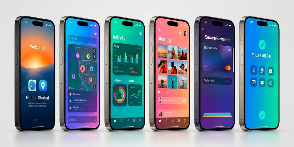
Best Screenshot Layout Structure (Proven Formula)
The most effective iPhone screenshot layout follows a storytelling flow.
High-Converting Layout Flow
| Screenshot | Goal | Layout Strategy |
|---|---|---|
| 1: Hook | Strong headline + core benefit | Focus on the primary USP |
| 2: Feature | Show main functionality | Demonstrate how it works |
| 3: Value | Problem → solution | Show the shift in user experience |
| 4: Benefit | Highlight key advantage | Why choose this app? |
| 5: Proof | Social proof / trust | Ratings, reviews, or badges |
| 6: CTA | Encourage install | Clear “Download Now” vibe |
Top apps use this exact structure to guide users step-by-step.
Layout Rule 1 — First Screenshot = Everything
Your first screenshot is the most important. If users don’t understand your app here, they leave.
Best practices:
- Show main value proposition instantly
- Use bold headline (3–6 words)
- Highlight biggest benefit
Examples:
- ❌ “Smart Finance App”
- ✅ “Track Expenses in Seconds”
Layout Styles That Work Best
1. Clean Minimal Layout
Large UI elements, simple backgrounds, and big headlines. Best for SaaS & productivity apps.
2. Split Layout (Text + UI)
Dividing the screen into a text section (left) and app UI (right). Best for feature explanation.
3. Storytelling (Panoramic Layout)
Screens connect visually to form a continuous story. Best for premium and immersive apps.
4. Mockup-Based Layout
App UI placed inside an iPhone frame. Adds realism and improves perceived quality.
Layout Rule 2 — Focus on Benefits
Most apps make the mistake of focusing on features instead of outcomes.
- ❌ “Advanced Dashboard”
- ✅ “Manage Tasks Faster”
Users care about outcomes, not just technical features.
Layout Rule 3 — Keep Text Extremely Short
- 3–7 words per screen.
- Large, readable font.
- High contrast against the background.
Research shows users don’t expand screenshots, so text must be readable instantly.
Layout Rule 4 — One Message Per Screen
Each screenshot should focus on exactly:
- ✅ One feature
- ✅ One benefit
- ✅ One idea
Don’t mix multiple messages. Clean layout = better conversion.
Layout Rule 5 — Maintain Visual Consistency
Your screenshot set should feel like one cohesive design system. Keep consistent:
- Colors & Gradients
- Fonts & Weights
- Background Style
- UI Positioning
Consistency improves trust and reinforces your branding.
Portrait vs Landscape Layout
| Layout | When to Use |
|---|---|
| Portrait (9:16) | Best for most apps (takes more screen space) |
| Landscape (16:9) | Games, media players, video editors |
Portrait generally works better because it fills more of the user’s screen during search results.
Common Layout Mistakes
| Mistake | Result |
|---|---|
| Too much text | Confusing and ignored |
| Small UI elements | Hard to understand |
| Random styles | Unprofessional appearance |
| No structure | Low conversion rate |
| Weak first screen | High user drop-off |
Pro Layout Strategy Used by Top Apps
Top-performing apps follow this exact conversion funnel inside their screenshots:
- Hook (Benefit)
- Feature
- Value
- Social Proof
- CTA (Call to Action)
Advanced Tip — Localization Layout
If you are targeting multiple countries, remember to:
- Translate text accurately.
- Adjust layout spacing for different languages.
- Maintain consistent design across all localized sets.
Localization can significantly increase conversions by making the app feel native to the user.
Final Thoughts
The best screenshot layout for iPhone apps is not about creativity — it’s about clarity, structure, and storytelling.
Key Takeaways:
- First screenshot = make or break.
- Use a structured storytelling flow.
- Focus strictly on user benefits.
- Keep text short and bold.
- Maintain visual consistency.
Your screenshots are your visual landing page — optimize them like one. Ready to create stunning visuals? Start designing with Nakxi today.