The Psychology of Scroll-Stopping Visuals: Designing Ad Creatives & Social Assets That Convert
We live in the age of the infinite scroll. On average, a user scours through 300 feet of content daily—the height of the Statue of Liberty. In this torrent of information, your creative assets have less than 1.7 seconds to capture attention before they are flicked away.
For founders and marketers, this poses a critical challenge: How do you design visuals that don’t just look “nice,” but actually stop the scroll, drive clicks, and build a unified brand across every channel?
The answer lies in combining visual psychology with a strategic asset ecosystem. Here is how to engineer high-performing creatives for Ads, Instagram, Product Hunt, and beyond using Nakxi.
Part 1: The Psychology of the “Scroll-Stop”
High-converting ads aren’t just art; they are engineered triggers.
1. Pattern Interruption & The “3D” Effect
Social media feeds are often flat—blocks of text and 2D images. The brain is wired to ignore repetitive patterns (banner blindness). To break this, you need depth.
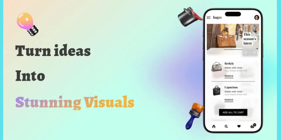
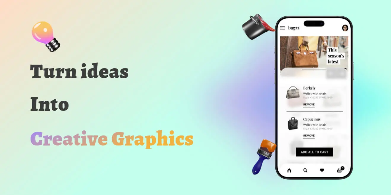
- Tilt & Perspective: Instead of a flat screenshot, use a 3D-tilted mockup. It simulates a physical object, triggering a tactile desire to “reach out.”
- Drop Shadows: Heavy, soft shadows lift your subject off the background, creating a sense of premium quality.
2. The Trust Signal: “Device-Context” Consistency
Why do ads featuring iPhones or MacBooks perform better than raw screenshots? Context. When a user sees your app running on a realistic device (like an iPhone 16 Pro), their brain instantly processes it as a “real product” that exists in the physical world.
- For B2B/LinkedIn: Use clean MacBook or Browser mockups. It implies productivity.
- For B2C/Instagram: Use hand-held iPhone mockups. It implies intimacy and ease of use.
3. Color Psychology & Dark Mode
- Dark Mode Advantage: Dark/Night mode creatives are currently outperforming light mode creatives on mobile feeds. They are easier on the eyes and pop against the typically white backgrounds of LinkedIn and X.
Part 2: The Launch Ecosystem – Designing for Specific Channels
A common mistake is designing one “master graphic” and posting it everywhere. Each platform has a native language. You need a complete suite of assets to maximize your impact.
1. Instagram & TikTok: The “Story” Format
Your launch needs to feel personal here.
- Vertical Stories (1080x1920): Don’t just resize your ad. Use this space for behind-the-scenes peeks, quick demos, or countdowns.
- The “Feed” Grid (1080x1080): Focus on single-feature highlights. A clean, square mockup of your app with a bold background color stops the thumb on the Explore page.
Here are some real-world examples of high-performing Instagram feed creatives designed with Nakxi. Notice how they use bold colors and clear hierarchy to stand out:

Budget Tours
Perfect for bold travel ads.

Fashionova
Sleek, modern retail vibe.

Kids Learning
Playful, vibrant colors.
Pro Tip: Use Nakxi to ensure your Instagram story uses the exact same device frame and gradient as your main website assets, creating subconscious brand recognition.
2. Product Hunt & Community Launch
If you’re launching on Product Hunt or IndieHackers, you’re competing for attention against dozens of other startups.
- The Thumbnail (240x240): Needs to be iconic. Use your logo or a simplified, zoomed-in app icon.
- Gallery Images (1270x760): These are your storytellers. Unlike strict App Store screenshots, Product Hunt allows more creative freedom. Use lifestyle mockups, bold typography, and direct value propositions overlaid on the image.
3. Paid Ad Creatives: Scale & Variety
If you are running paid ads (Meta/Google), you need volume and variety to prevent ad fatigue.
- Value Proposition Banners: Focus on the “Why,” not just the “What.” Combine a sleek device mockup with a punchy headline like “Automate your workflow.”
- UGC-Style Visuals: Design graphics that look like user reviews or casual usage. These often have higher CTR because they feel less like ads.
- Carousel Ads: Tell a step-by-step story. Slide 1: The Problem. Slide 2: Your Solution (App Interface). Slide 3: The Result.
Here are examples of ad creatives that use scroll-stopping colors and clear value propositions:

SaaS Aesthetic
Clean tablet mockup for B2B.

High Conversion
Bold colors for max clicks.

Launch Promo
Engaging design for new apps.
Part 3: Visual Consistency is King
A disjointed visual identity confuses potential users. If your Instagram ad looks moody and dark, but your Product Hunt page is bright and neon, you break the trust chain.
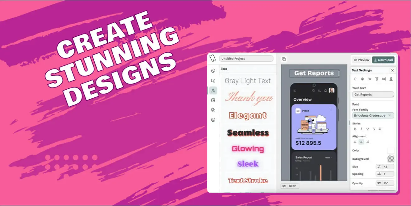
Using a unified design studio like Nakxi ensures all these assets share the same DNA. You can:
- Import your screen.
- Generate a Product Hunt banner with a Device frame.
- Instantly swap the frame to an iPhone and resize the canvas to 9:16 for Instagram Stories.
- Apply the same brand background to both.
Conclusion
Great marketing is about reducing friction. It’s about delivering your value proposition visually, instantly, and emotionally across every touchpoint.
Don’t just rely on one good image. Build a complete visual ecosystem—from scroll-stopping ads to engaging social stories—and watch your conversion rates climb.