How to Create App Store Screenshots That Actually Convert (2026)
Your app screenshots are the single most visible element on your App Store or Google Play listing — and they often decide whether a user installs or scrolls past. Yet most developers treat them as an afterthought, uploading raw simulator exports with no headlines, no device frames, and no clear message.
This guide covers everything you need — sizing, layout, messaging, ASO strategy, and tools — to create professional app screenshots that rank and convert in 2026.
Table of Contents
- Why App Screenshots Matter for ASO
- What Makes App Screenshots Look Premium
- Step 1 — Use the Right Screenshot Size
- Step 2 — Use Device Mockups
- Step 3 — Focus on Benefits, Not Features
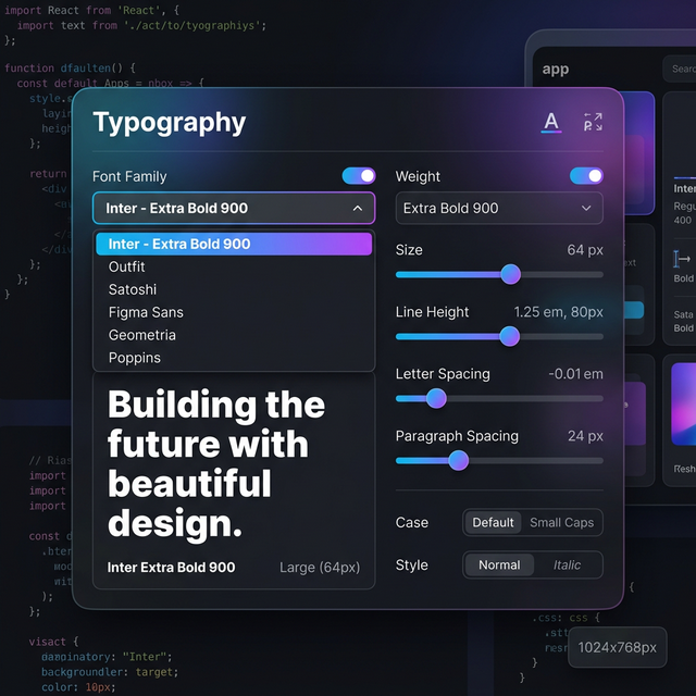
- Step 4 — Use Clear Typography
- Step 5 — Maintain Visual Consistency
- Step 6 — Apply an ASO Screenshot Strategy
- Step 7 — A/B Test Your Screenshots
- Step 8 — Localize Your Screenshots
- Step 9 — Use the Right Screenshot Tool
- Common Mistakes to Avoid
- Design Checklist
- FAQ
- Conclusion
Why App Screenshots Matter for ASO
When users land on your app listing, they make a download decision within seconds — before reading your description, before checking reviews. Screenshots are the fastest signal of quality and value.
Premium app screenshots help you:
- ✅ Improve first impressions instantly
- ✅ Increase App Store and Play Store conversion rates
- ✅ Support your overall ASO (App Store Optimization) strategy
- ✅ Build brand trust with new users
- ✅ Stand out against competing apps in search results
Apps with visually polished, benefit-focused screenshots consistently outperform those without — across every app category and market.
New to ASO? Read our guide: What is ASO and how screenshots affect app store optimization
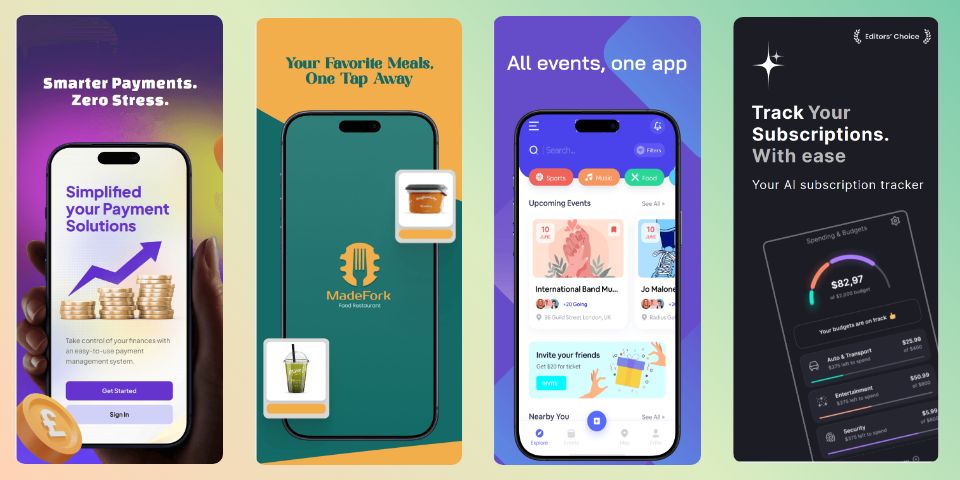
What Makes App Screenshots Look Premium
Premium screenshots are not about complex design. They’re about clarity, structure, and professional presentation.
| Element | Why It Matters |
|---|---|
| Clean layout | Reduces cognitive load, keeps focus on the app |
| Strong visual hierarchy | Guides the eye to the most important message |
| Consistent color palette | Signals professionalism and brand identity |
| Professional typography | Makes text readable and authoritative |
| Device mockups | Adds depth and makes UI easier to understand |
| Benefit-focused messaging | Converts curious users into installs |
The goal is simple: make a user understand your app’s value within 3 seconds.
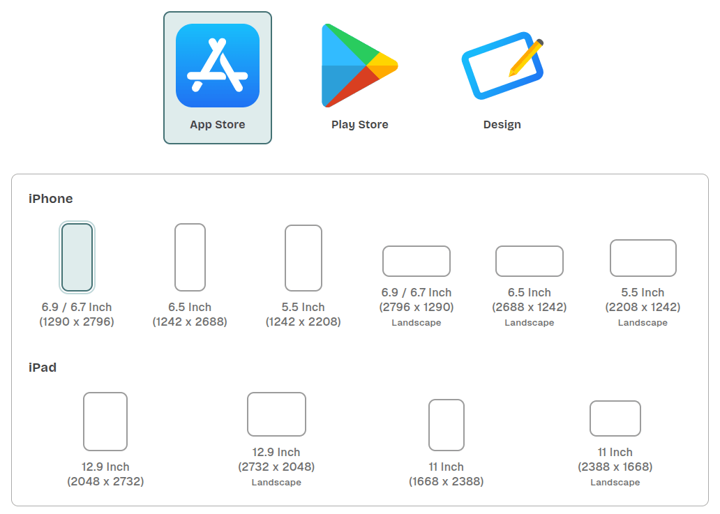
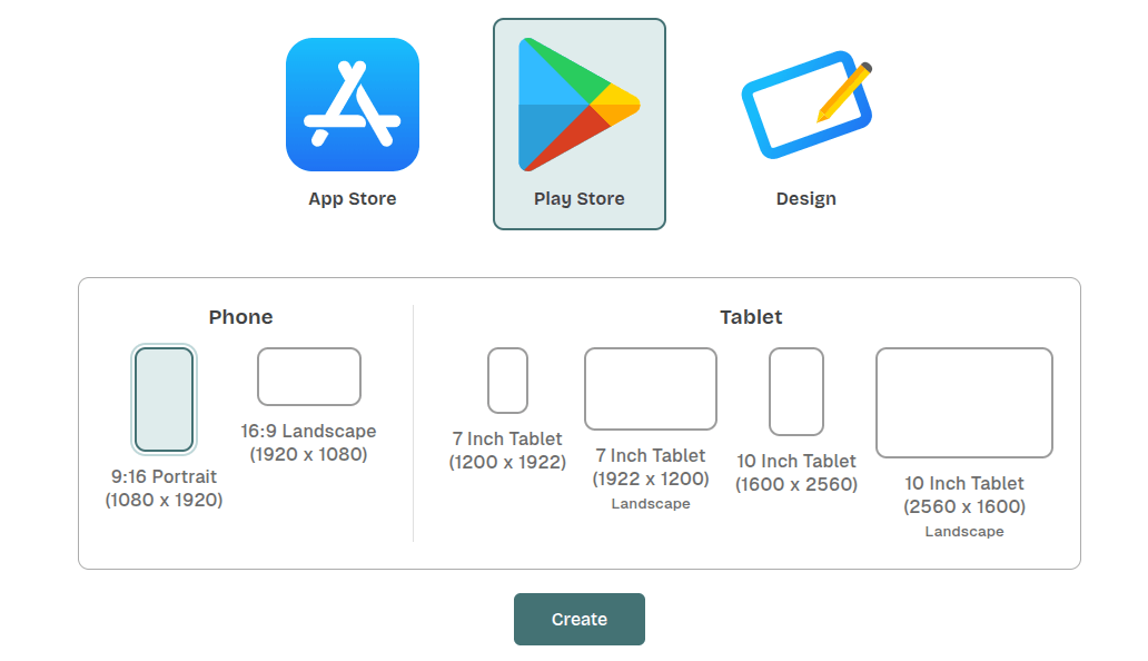
Step 1 — Use the Right Screenshot Size
Always design according to official platform guidelines. Using incorrect dimensions leads to blurry, cropped, or rejected assets.
App Screenshot Size Reference (2026)
| Platform | Recommended Size | Notes |
|---|---|---|
| iOS App Store (iPhone 15 Pro Max) | 1290 × 2796 px | Required for modern listings |
| iOS App Store (iPhone 8 Plus) | 1242 × 2208 px | Older fallback |
| Google Play Store | 1080 × 1920 px | Standard portrait |
| iPad (Pro 12.9”) | 2048 × 2732 px | Required for tablet listings |
| Google Play Feature Graphic | 1024 × 500 px | Banner shown at top of listing |
Pro tip: Design at the largest size first, then scale down — never scale up.
For the full, always-current specification list, refer directly to the official guidelines:
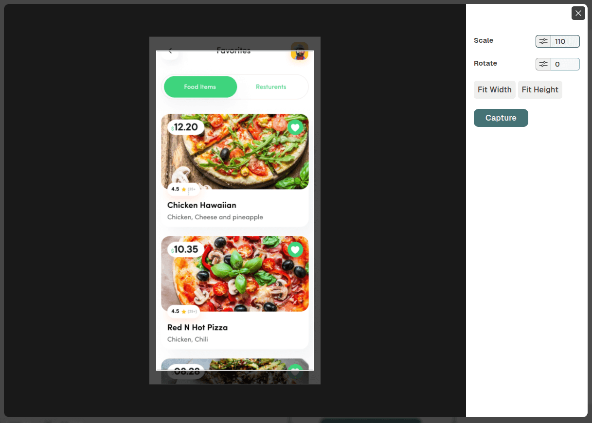
Step 2 — Use Device Mockups
Placing your app UI inside a realistic device frame is the single fastest upgrade you can make to your screenshots.
Why device mockups work:
- Add visual depth and context
- Make it immediately clear what type of app it is
- Give a modern, polished appearance
- Increase perceived credibility and trust
How to do it well:
- Use the same device model and angle across your entire screenshot set
- Avoid combining flat screenshots with 3D mockups in the same listing
- Match your device color (black/silver/gold frame) to your screenshot’s color palette
- Never stretch or distort the UI to fit the frame — crop or reframe instead
Use a dedicated screenshot tool to apply frames automatically rather than doing it manually in Photoshop or Figma. This saves hours and ensures pixel-perfect alignment.
Step 3 — Focus on Benefits, Not Features
This is the most common mistake developers make when writing screenshot captions.
| ❌ Feature-focused | ✅ Benefit-focused |
|---|---|
| ”Smart Notification System" | "Never Miss an Important Update" |
| "Advanced Analytics Dashboard" | "See Exactly Where Your Money Goes" |
| "Multi-device Sync" | "Pick Up Where You Left Off — Anywhere” |
A feature describes what the app has. A benefit describes what the user gets. Users buy outcomes, not specifications.
Recommended Screenshot Flow (5-Screen Strategy)
| Screenshot # | Purpose |
|---|---|
| 1 | Main value proposition — Your strongest hook |
| 2 | Key feature — The thing users love most |
| 3 | User benefit — Emotional payoff |
| 4 | Social proof — Ratings, reviews, user count |
| 5 | Call to action — “Join 500,000+ users” |
Most users only see screenshots 1–3 before deciding. Make those count.
Step 4 — Use Clear Typography
Typography directly affects whether users read your message or skip past it.
Best practices for screenshot text:
- Use bold, high-contrast headlines that are readable on small screens
- Keep captions to 3–6 words maximum
- Maintain generous spacing between text and UI elements
- Use a maximum of 2 font styles per screenshot set
- Avoid light or thin fonts — they disappear on mobile displays
- Test legibility by viewing your screenshot at thumbnail size (about 200px wide)
Recommended free fonts for screenshots:
- Inter — clean, highly legible, widely used in modern apps
- Outfit — geometric, strong contrast, works well for bold headlines
- Plus Jakarta Sans — modern feel with excellent readability at small sizes
App store screenshot templates from professional tools already follow these rules by default, saving you time.
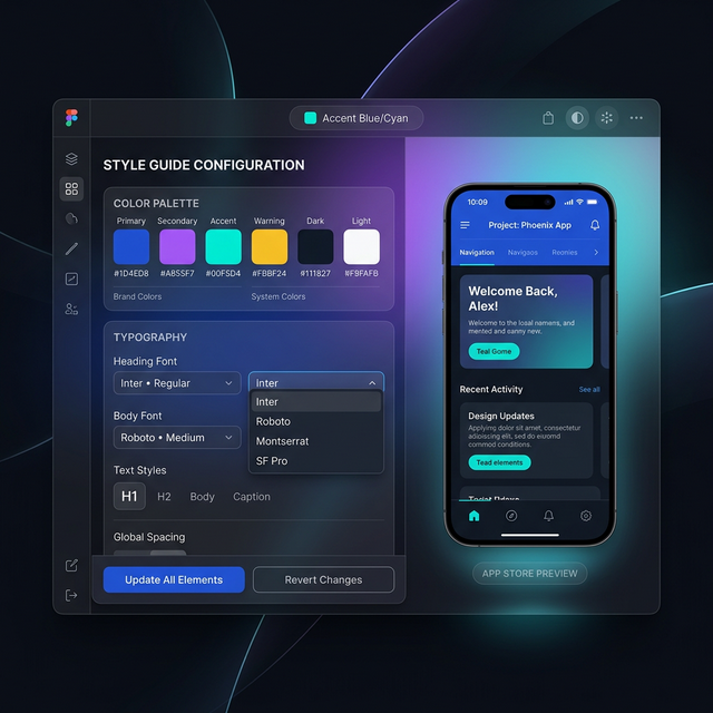
Step 5 — Maintain Visual Consistency
Your 5–8 screenshots should feel like a single branded experience, not a collection of unrelated images.
Keep consistent across all screenshots:
- 🎨 Color palette (2–3 primary colors max)
- 🔤 Font family and sizing
- 📐 Layout structure and element positioning
- 📱 Device mockup style (same model, same angle)
- 🖼️ Background theme and gradient style
A practical consistency check: Open all your screenshots side by side at thumbnail size. If they look like they could belong to different apps, something is off.
Inconsistency is the #1 signal that an app was designed without professional care. Consistency = trust.
Step 6 — Apply an ASO Screenshot Strategy
Your screenshots are a core part of your App Store Optimization (ASO) strategy — not separate from it.
ASO screenshot best practices:
- Lead with your strongest benefit in screenshot 1 — this is what shows in search results
- Create a visual narrative across all screenshots, not isolated images
- Highlight your unique differentiator that competitors don’t have
- Avoid overloading screens with text — less copy converts better
The ASO compounding effect:
Better screenshots → higher conversion rate → lower effective CPI → better algorithmic ranking.
This isn’t hypothetical. Both Apple and Google’s algorithms factor in conversion rate as a proxy for listing quality. An app that converts 8% of listing visitors will rank better than a comparable app converting 4% — all else being equal. Your screenshots are the biggest lever available to move that number.
Step 7 — A/B Test Your Screenshots
Creating good screenshots is a starting point. Finding your best screenshots requires testing.
Both major platforms offer native A/B testing tools:
- Apple App Store — Product Page Optimization (PPO) lets you test up to 3 treatment variants against your original, with automatic traffic splitting
- Google Play — Store Listing Experiments work similarly, allowing you to test screenshots, icons, and feature graphics
How to run an effective screenshot A/B test:
- Change one variable at a time — test different screenshot #1 headlines, or a different color palette, but not both simultaneously
- Run tests for at least 2–4 weeks — shorter windows produce inconclusive data due to traffic variance
- Look at install conversion rate, not just impressions — a variant with more views but fewer installs is still losing
- Document every test and result — ASO is cumulative; what you learned from test 1 informs test 3
What to test first: Screenshot #1 has the highest leverage since it shows directly in search results. Test different value propositions in the headline before testing anything else.
Step 8 — Localize Your Screenshots
If your app targets multiple countries or languages, localized screenshots can significantly increase installs in each market.
Why localization matters beyond language:
- Non-English speaking markets often have higher download rates for apps with localized visuals
- Localized screenshots signal to users that the app was built for them, not just translated
- App stores surface localized listings more prominently to local users
Localization strategies:
- Translate all caption text into the local language
- Adapt visuals to reflect local culture or context
- Adjust color choices where cultural meaning differs (e.g., red = luck in China, danger in the West)
- Use region-specific social proof (local user counts, local press mentions)
Technical workflow:
- In App Store Connect, go to your app’s page → select a language/territory → upload the localized screenshot set for that locale
- In Google Play Console, go to Store presence → Store listing → scroll to “Store listing localization” and upload per language
- At minimum, localize for your top 3 traffic markets — you don’t need to cover every locale to see results
With Nakxi, the translation step is handled automatically — one-click translation adapts all your screenshot captions across languages, so you only need to review and export rather than redesign from scratch.
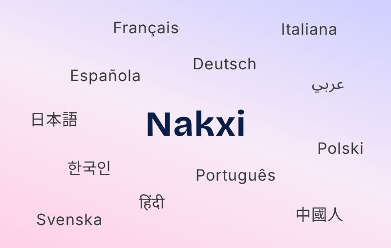
Apps that localize screenshots consistently outperform single-language listings in non-English markets.
Step 9 — Use the Right Screenshot Tool
Choosing the right tool affects your workflow speed, output quality, and ability to iterate quickly.
What to look for in a screenshot tool:
- Correct platform presets (don’t manually enter dimensions)
- 3D device frame library with current device models
- Auto-resize to all store dimensions from one design
- Typography and layout controls for caption design
- Export in required formats (PNG, JPG at specified resolutions)
Best App Screenshot Generator Tools in 2026
| Tool | Best For | Templates | Auto-resize | Localization |
|---|---|---|---|---|
| Nakxi | All-in-one ASO workflow | ✅ 100+ | ✅ | ✅ One-click |
| AppScreens | Automation & localization | ✅ | ✅ | ✅ Multi-language |
| Previewed.io | Animated & video mockups | ✅ | ✅ | ❌ |
| The App Launchpad | Beginners & template variety | ✅ Large library | ✅ | ✅ |
| Figma + plugins | Full custom design control | Via plugins | Manual | Manual |
Most indie developers and small teams benefit most from a dedicated screenshot tool rather than a general design tool. General tools like Figma give you control but require you to manually manage dimensions, device frames, and export settings — overhead that adds up quickly when you’re shipping regularly.
Common Mistakes That Make Screenshots Look Cheap
| Mistake | Why It Hurts |
|---|---|
| Too much text on one screen | Looks cluttered, users stop reading |
| Random or mismatched colors | Signals low quality and poor brand care |
| Small, hard-to-read UI elements | Users can’t understand what your app does |
| No clear headline or message | Low conversion — no reason to install |
| Low-resolution or blurry images | Immediately destroys brand trust |
| Inconsistent mockup styles | Looks rushed and unprofessional |
| Ignoring the first screenshot | Most critical real estate, often wasted |
| Raw simulator screenshots with no design | Communicates that you don’t care about UX |
Fixing even 3–4 of these can meaningfully lift your conversion rate.
Professional Screenshot Design Checklist
Use this before submitting your app listing:
- Correct screenshot dimensions for each platform
- Clear, benefit-focused headline on every screen
- Consistent colors, fonts, and layout across all screenshots
- Device mockups applied (matching model and angle)
- First screenshot contains your strongest value proposition
- Text is short, bold, and readable at small sizes
- No cluttered UI or overlapping elements
- ASO-friendly layout (key message visible without tapping)
- Localized versions created for key markets
- Screenshots exported at correct resolution and format
- A/B test scheduled or running in App Store / Google Play
FAQ
Q: How many screenshots should I upload to the App Store?
A: Apple allows up to 10, Google Play allows up to 8. Aim for at least 5 — the first 2–3 are most critical as they show in search results before the user taps your listing.
Q: Do screenshots affect App Store rankings?
A: Not directly — but they heavily impact conversion rate, which does affect ranking. Higher conversion → better algorithmic placement. Think of screenshots as an indirect ranking factor.
Q: Should I use portrait or landscape screenshots?
A: Portrait works best for most apps. Use landscape only if your app is primarily a landscape experience (games, video apps). Both stores accept both orientations, but mixing them in the same listing can look inconsistent.
Q: Should I use video previews instead of screenshots?
A: Video previews (app previews on the App Store, promo videos on Google Play) can be highly effective, especially for games and interactive apps. However, they require significantly more production effort. Most teams should optimize static screenshots first — video is a next-level upgrade, not a replacement.
Q: How often should I update my screenshots?
A: Review with every major update, and A/B test at least once per quarter. Seasonal or feature-specific updates can also lift conversions.
Q: What’s the difference between a feature graphic and a screenshot?
A: A feature graphic (Google Play only) is a 1024×500 px banner shown at the top of your listing. It’s separate from screenshots and is required for your app to be featured by Google. It typically shows your brand identity rather than specific app screens.
Q: How do I know if my screenshot A/B test is statistically significant?
A: Both Apple’s PPO and Google’s Store Listing Experiments show a confidence indicator within their dashboards. As a rule of thumb, don’t call a winner until you’ve seen at least a 95% confidence level with a meaningful traffic volume (typically 1,000+ impressions per variant).
📝 Conclusion
Good app screenshots are not about making your listing look busy or impressive. They’re about answering one question, fast: “Why should I download this?”
When done right, optimized screenshots:
- Improve first impressions before users read a single word
- Directly increase app installs and reduce abandonment
- Support your broader ASO strategy and ranking
- Build brand trust that carries over into long-term retention
The steps in this guide — sizing, device mockups, benefit-focused copy, consistency, ASO strategy, A/B testing, and localization — each compound on the others. Working through them systematically is how apps go from mediocre listings to consistently converting ones.
Try Nakxi for free → — the fastest way to go from raw screenshots to store-ready visuals, without the design overhead.